http://www.etsy.com/listing/89195346/california-love-nail-and-string-tribute
Crazy! I NEED this for my office!!

http://www.etsy.com/listing/89195346/california-love-nail-and-string-tribute
Crazy! I NEED this for my office!!

Photos courtesy of Eye Poetry Photography
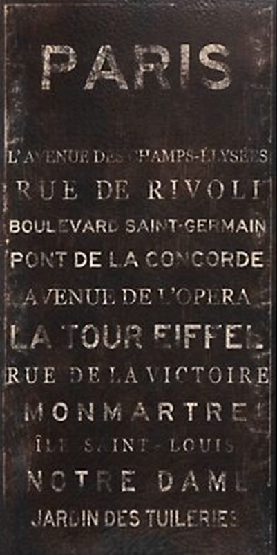
While I am still 100% in love with the Paris prints I ordered from Etsy, I am re-thinking these prints for the bedroom. I truely believe that the bedroom should be a sanctuary that prepares you for sleep – keep TV to a minimal, maintain soft colors etc. While these prints are not “loud” and I am not shrouding the room in red, I worry that these pops of bright color will derail the soothing vibe I want to keep.
I mentioned before that the rest of the house stays within taupes, tans, greys, and blues… and one of my favorite photographers (in fact the very one who snapped the “red” portraits of Paris) has added to her gallery, and there are some dreamy photos with blue’s and soft colors, soft focus lenses, and its all dreamy loveliness. So pretty. I think they are keepers, and I think my bedroom vision is about to change!


Speaking of Paris… city of lights… Kris and I watched Midnight in Paris this weekend. While I enjoyed it, I wasn’t in love with the plot, however, it made me want to go to Paris so bad, it hurts! Kris and I have been talking about planning our vacation this year, and I think Paris just flew to the top of the list.
I’ve only been there once, and it was in the dead of winter. I brought my warmest coat, but being from California, I clearly had no idea what to expect. It was bone chillingly cold – the coldest wind you can imagine! Dark gray skies… very moody. At the time, I was backpacking through Europe with my best friend Kira, and despite our strict budget, we ended up ducking into lot’s of overpriced cafe’s to warm up.
Our trip through Paris is actually pretty laughable, but it’s another story for another time.
Now, to start work on a new vision for our bedroom!

It’s official – we are moving in at the end of the month! We had spent several very long months dedicated to hunting out THE best place in San Francisco in this terrible market. For a while, it seemed luck was not in our favor, and after several mini meltdowns (on my end), we found a place… and its just one block from where I live now! The irony! I am looking for movers, and can’t wait to see their faces when I tell them to take the furniture down the street. I also can’t wait to see their faces when I tell them I am moving out of a four-floor walk up… ayayay!
As we are gearing up to move, and inevitably merge our assets, the inevitable “whose stuff are we bringing” conversation has come up – multiple times. While Kris has accepted the fact that his college Ikea black bachelor sofa is not making the journey, I have relented that some of my more girly pieces will be going on Craigslist. Even though I am sad to part with some of my single-self purchases, I am so excited to start our life together, and furnish our new place with things that reflect BOTH of us. Yes, compromise is like brussels sprouts – hard to swallow, but you know its good for you. In fact, I’ve actually begun to enjoy the taste 🙂
The tough part is that Kris loves everything ultra modern, while I am drawn to more classic pieces. If he had it his way, he’d live in a world of angular furniture, sharp edges, and lots of metal and glass. As for myself, I’d love to live in the pages of Pottery Barn.
After much discussion, and shoving many MANY design magazines in front of Kris’s face, we have come to a compromise. Classic contemporary. There will be no faux finishes, no frills, floral, or shabby chic touches. There will also be no glass tables, anything with metal poles for legs, and no uncomfortable furniture. We will focus on classic lines and muted colors for the core pieces (sofa, etc), with pops of color and patterns in the accessories (throw pillows, artwork, and rugs). The real challenge is the artwork, but after some digging around online, I have found a few great pieces that really suit both of our tastes fairly well!


I happen to LOVE this one – especially as a compliment to one of the first two. I can already hear Kris saying that it is way to frou-frou, but I think the colors pair really well with the abstract greys and tans and taupes and blues from the first two paintings. This is from ZGallerie as well, and it makes me wonder if the buyers had the same thing in mind when they purchased both of them.