

I had been thinking of changing out the layout of our gallery wall recently, and then began toying with the idea of swapping out the art we had framed.
I know… the gallery wall had only been up a few months, but there was something about it that never felt 100% right to me. I LOVED the La Baule print that had been there before, and the punches of yellow and blue brightened things up in here over the summer months, but it seemed too bright for fall.
Here’s how it stood a few weeks ago…
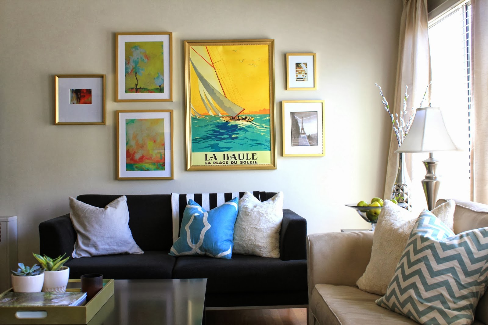
The bright yellow and blue demanded other bold bright prints to help balance it, but the abstract prints to the left always felt too matchy-matchy. I also felt that there were too few frames, and the frames were too homogeneous. We needed more variety – in both the art and frames, and with fall on it’s way, I wanted more muted colors.
Originally, I’d been imagining a clean white gallery wall. Here were a few inspirations I was looking at…


I then found an Etsy artist that I kind of fell head over heels for…
I admittedly went to town with her pieces, and it was a challenge to choose a few instead of adding all of them to my cart. I am not kidding, limiting myself to just three was the hard part – there were so many that I absolutely LOVED.
One of my favorites is the framed print at the top of this group (pictured below) – the colors aren’t accurately captured in this photograph, but her paintings have such saturated color.
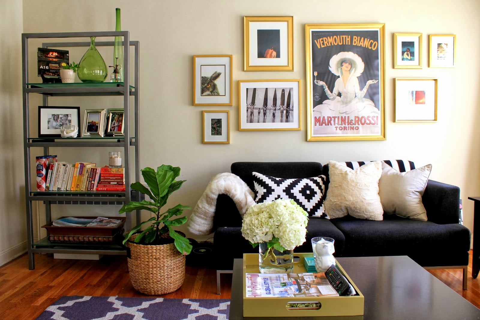
The peachy color of the girls skin against the deep navy and dark peacock blue is so pretty in person… I also think that the dark background helps balance out the black background on the Martini & Rossi poster.

This is perhaps my favorite piece – she’s also from the Clare Elsaesser collection and the colors are so pretty…
It is actually called, Married to the Sea. Isn’t that just the best name??

Check our her Etsy Shop… there are SO many gems in there, and totally affordable!
A few more that I love… this one is similar to the one I have framed, but with more of the grey blue tones… And this one is so fun – perfect for warmer months, but with the weather cooling down, the more moody colors and intense images were speaking to me. SO GOOD!
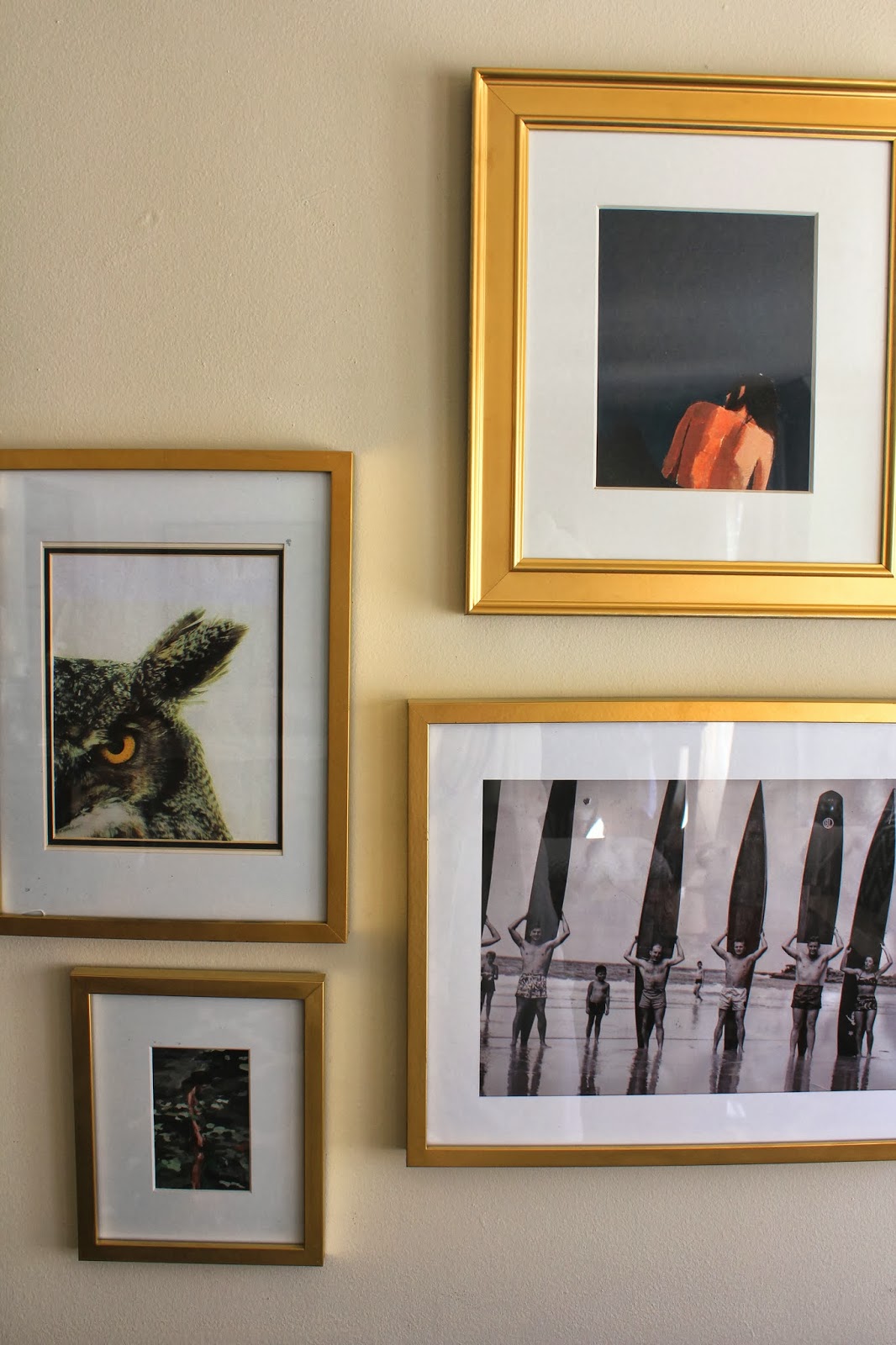
Speaking of moody… check out that owl!
I’ve been hoarding that print for over a year now, and he is so creepy and weird… he actually looks kind of evil, but I’m obsessed with him. He’s so beautiful. How could you not love him?!
And then there’s the vintage surf print… front and center, just for my honey. I found this at the antique shop near our house before it moved locations, and knew that Kris would not only love it, but really appreciate that I was incorporating one of his passions into our decor.

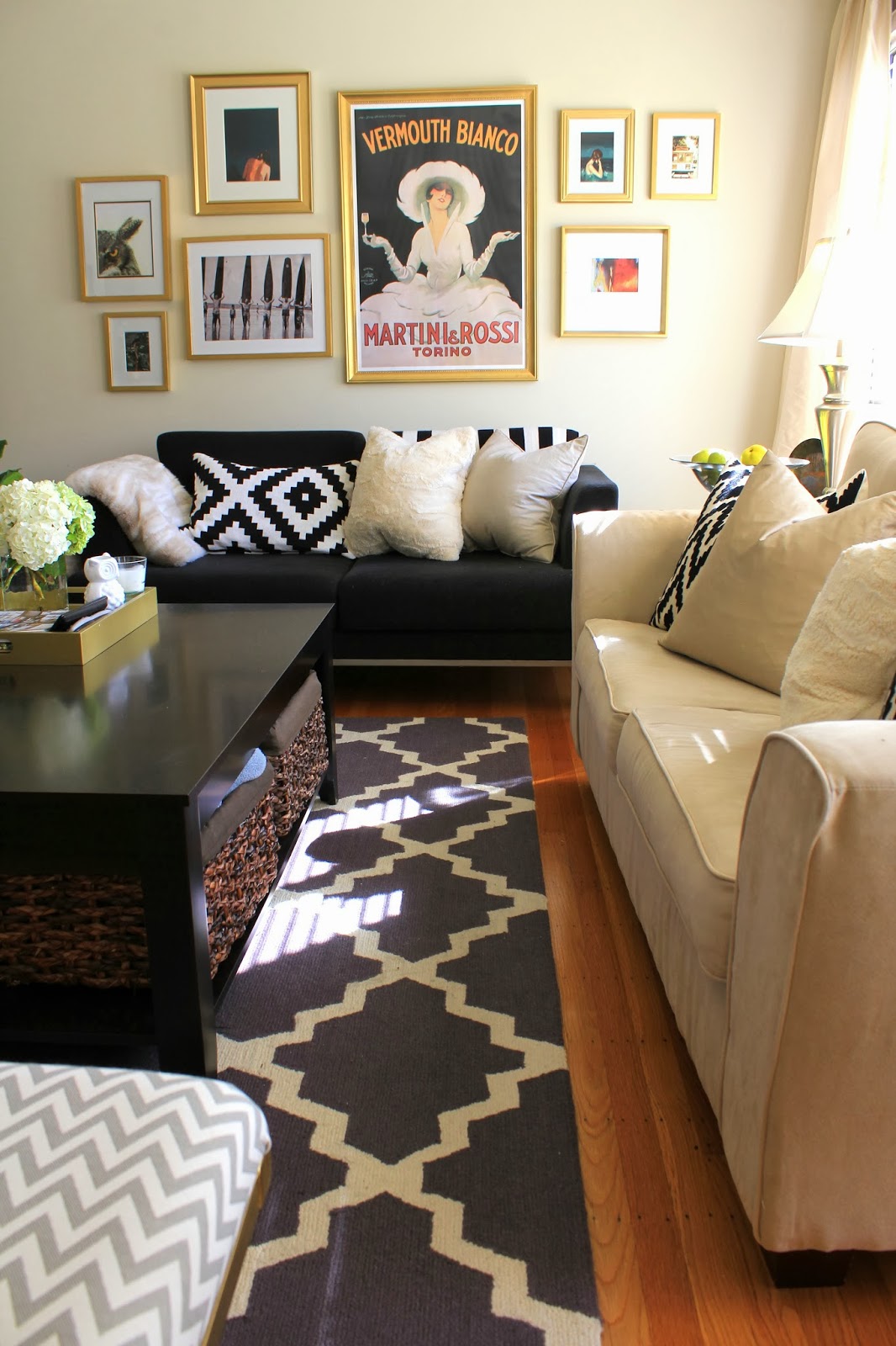
The faux fur pillows are still alive and well, and down below are two new additions from West Elm…
I am trying to be more careful with my patterns, especially when our rug makes SUCH a statement, but with all the blacks and grays and whites, it’s not nearly so busy…

And here’s a peek at the entire room from the entryway.
The light is definitely changing with fall – the mornings in here are flooded with that sunshine-y yellow light, and it is the best way to start the day.


While we’re on the subject of our living room, don’t you think a natural wood coffee table will really look great in here?? I do… maybe I’ll add that to my Christmas wishlist 🙂
Happy Thursday!!
