Refinishing our Hardwood Floors

So here’s the good the bad and the ugly about our experience refinishing our floors.  Really just the good, but I wanted to post about what we learned, and what we did, since there was not a lot of information out there when I was in the research phase.

Specifically, about choosing a stain!!

IMG_2705

I WISH this post had existed several months ago, when my husband and I were agonizing over deciding on what color to stain our floors.  And I do mean, AGONIZING.  Who knew there were so many stain colors, combinations, and methods of application… not to mention, once you throw in what kind of wood floors you’re working with, there is yet another variable in the equation of figuring out how your floors will actually turn out.

Let’s start at the beginning though, shall we?  Rewinding the clock back to December – Kris and I bought our house in December, and the sale closed right before Christmas. I knew, even before it was officially ours, that the first thing I wanted to do was refinish the floors.

This is a beautiful, old Victorian, and when I say it’s “old”, I mean OLD.  It was built in the 1890’s, and it still has the original hardwood floors.  When I found that out, I was SO excited – it is SUCH a pot of gold, but they had seen better days.

Ok that’s an understatement…

They were scratched to hell from years of abuse, and the nail pattern was VERY obvious on the light wood.  Also, the nail holes looked like big dark spots as the nails had rusted at some point.  There were also stains from water damage, and animal urine (which, I should note, the entire house smelled of).  The areas where the furniture had sat were much darker due to sun damage on the surrounding areas. And finally, there were a few very poorly done patch jobs in recent years.

Take a look for yourself:

IMG_2330

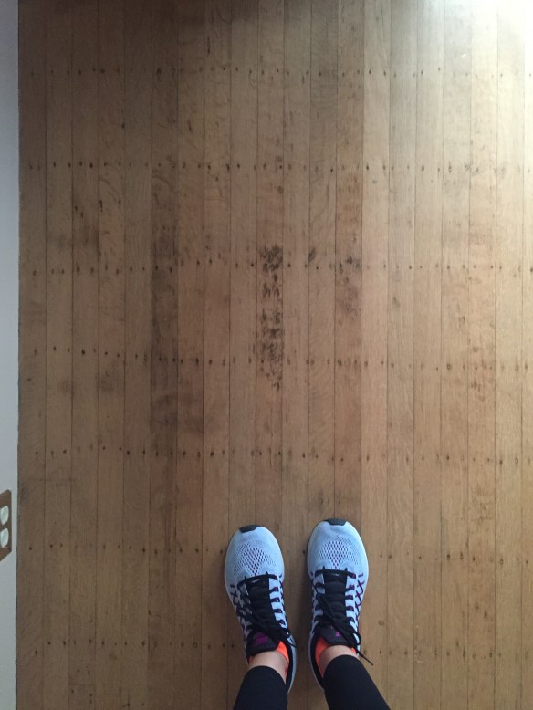
Look at all the scratches, discoloration, and the very noticeable rows of nails… also in the picture below you can really see how the sun bleached certain areas.IMG_2343

And here is one of the former pet’s favorite spot to go potty… so special…IMG_2367IMG_2368

The shoddy patchwork was invisible to me at first, but as soon as it was pointed out, it was all I could stare at… not only did they use a different type of wood, but they used short little nubby slats laid down next to slats that ran the entire length of the room.  I mean, it’s only a few dollars more to replace it with a longer slat!!  I mean, it literally would have been a difference of $50 to do it right the first time!!  UGH!!IMG_2369

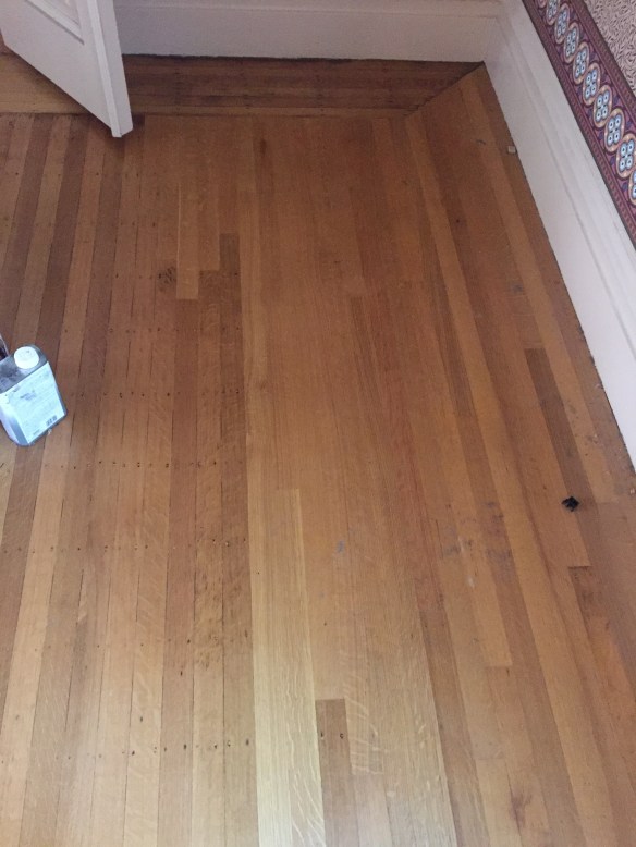
BUT, even with the damage, these floors were giving me heart eyes – they were original to the house, and made of gorgeous white oak, which is hard to come by these days. Nothing a little sanding, staining, and minor re-patching couldn’t solve.

We decided that before we moved in, we’d have the wood floors refinished, to save us the headache of trying to do it down the road after we were moved in, and I am still SO HAPPY we made that decision.

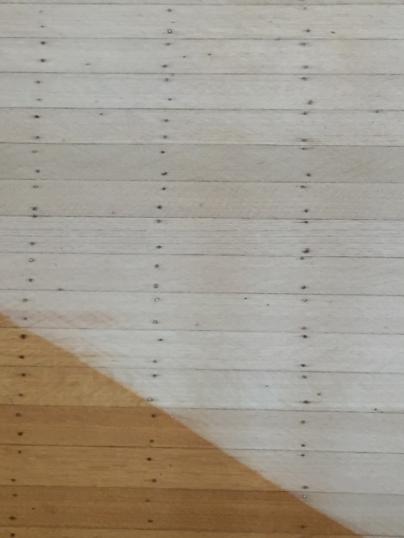
Just look at what a difference a single pass with the sander makes:

IMG_2374IMG_2373IMG_2372

We worked with some local flooring contractors who were ROCKSTARS!!  Side note: If anyone in the bay area is looking to have their floors re-done, email me, and I’ll send you their information.

Anyway, as they got to sanding, we needed to choose a stain for the floor.  I kind of loved the light white look of the sanded wood, but with the nail holes, we knew we needed something darker to help camouflage them.

Our flooring guy also advised us away from anything too dark because it shows dirt so much faster than lighter colors.

As we looked online for hardwood floor inspiration, I had an aversion to anything too “red”, Kris didn’t want anything too “yellow”, and we agreed that it couldn’t be too grey and weathered because our house was traditional… and a beachy / rustic floor would not mesh well with the traditional, intricate moldings, and Victorian details running throughout.

We decided on a mid-tone brown – nothing too red, yellow, or grey… and nothing too dark or too light.  I felt like Goldilocks trying to convey what we were looking for to our contractor.  He probably thought we were nuts.

After articulating what we were hoping to achieve,  we went back online to find floors we liked, that listed what stain color they used. Unfortunately, it was not easy to find.  We kept finding:

  • Floors that we liked, but that didn’t list what stain they used
  • Floors that we liked, where the wood was a completely different type than ours (so it wouldn’t turn out the same on ours)
  • Floors where the wood was also white oak, but the stain was not the same look that we were hoping for

We showed our contractor a bunch of pictures for reference, and since we didn’t have an exact example with stain colors we could replicate, (and seeing that I had a very “particular vision”), he decided it would be best if he laid down stain samples for us to look at in real life.

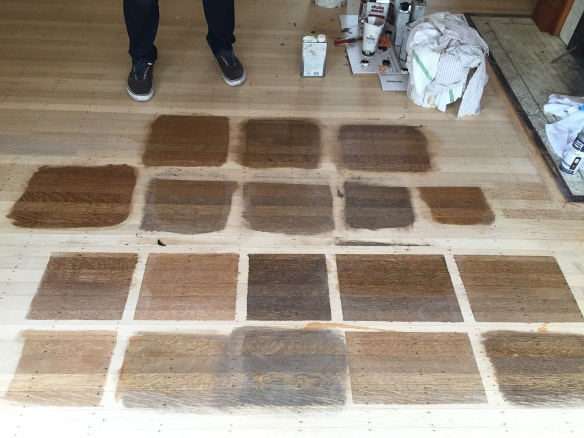
Which leads us here:

IMG_2705

Yeahhhhhh…… almost 20 samples later, we were completely unsure which to choose.

To be fair, we started with about 5 squares… but none of them were quite right.  So we sampled a few more, then a few more, then a few more.  It’s like that book, “If You Give a Mouse a Cookie.” #amiright

Anyway, I may have needed 20 samples to make a decision, but I’m hoping that these pictures help someone else who is re-doing their floor because this information is hard to come by!!

IMG_2493

If you like any of these, here’s what they each are:

Right row, bottom to top: 

  • Minwax: Provincal
  • Minwax: Jacobean
  • 1 part Minwax Jacobean, 2 parts Minwax whitewash
  • 1 part Minwax Jacobean, 1 part Minwax whitewash


Middle row, bottom to top: 

  • 1 part Minwax Dark Walnut, 1 Part Polyurethane
  • Minwax Dark Walnut (applied to dry wood floor)
  • Minwax Dark Walnut (applied to wet wood floor)
  • Minwax Eary American (applied to dry wood floor)
  • Minwax Eary American (applied to wet wood floor)


Left row, bottom to top: 

  • 2 part Minwax Dark Walnut, 1 Part Polyurethane
  • 1 part Minwax Jacobean, 1 part Minwax whitewash (applied to wet wood floor)
  • Minwax: Provincal (applied to wet wood floor)
  • Minwax Fruitwood (applied to dry wood floor)


Also, for hardwood flooring novices who are like, with water??  Polyurethane??  White wash??? What do those do?? Here’s a brief education:

Treating the raw wood with water before staining opens up the grain – the result is that the wood soaks up more stain, and ends up being darker, with a more pronounced grain.  Using the same mixture on non-water treated wood is lighter, more stain wipes off than gets absorbed, and the grain is more subtle.

We really preferred how our floors looked when the stain was applied without water-treating due to the variance in wood grains – the water treatment made our floors too dark and too busy, so we liked how the stain looked when applied to dry wood.

In a few of these samples, we mixed polyurethane with the stain to lighten the color – it was like diluting the stain without changing the tone.

Adding white wash stain to the colors made them appear more grey – not a look we liked for our house, but would be really great in the right home.

In the end, we ended up choosing 1 part Minwax Dark Walnut, 1 Part Polyurethane – middle row, bottom sample in the above – and they turned out AMAZING!!  It’s really hard to capture the true color of the finished floor in photos, and I have more (better) photos to share, but for now here’s a few:

How amazing is this mahogany inlay in our kitchen?!?!  I am SO obsessed.  I snapped this at night with the lights on, so they look a lot more yellow and red than they do in real life…

IMG_2991

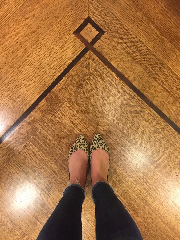
In these photos below, you kind of get a sneak peek of how our living room used to look (heavy dark red curtains, dark red damask wallpaper, beige trim, and hunter green trim). BUT, despite the really dark and awful wall paper, and low light, the floors are pretty true to color – a rich, true brown – not too dark, and not too light.IMG_2913IMG_2909

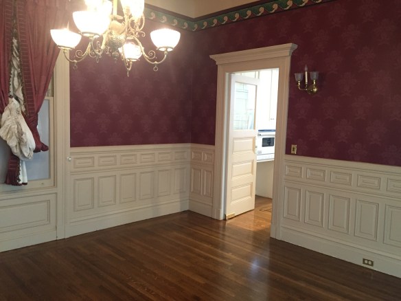
The picture below is a grainy iPhone pic, that I snapped just before the sun went down, but you can see that the floors aren’t TOO dark.  Just dark enough to really camouflage some of the really bad stains, and the nail holes.IMG_2884

And a blurry close of of that inlay trim… so SO pretty!IMG_2877

And finally, just a really close up photo of the stained wood, and nail holes… they pretty much disappear from afar, but are still noticeable up close.  It doesn’t bother me, and I think anyone who is buying an old home will also appreciate their history.

Despite sanding, there are still little nicks here and there (so if you are also sanding old floors, don’t expect them to look like they were just laid), but it’s part of our house’s story, and I really love how they turned out.IMG_2709

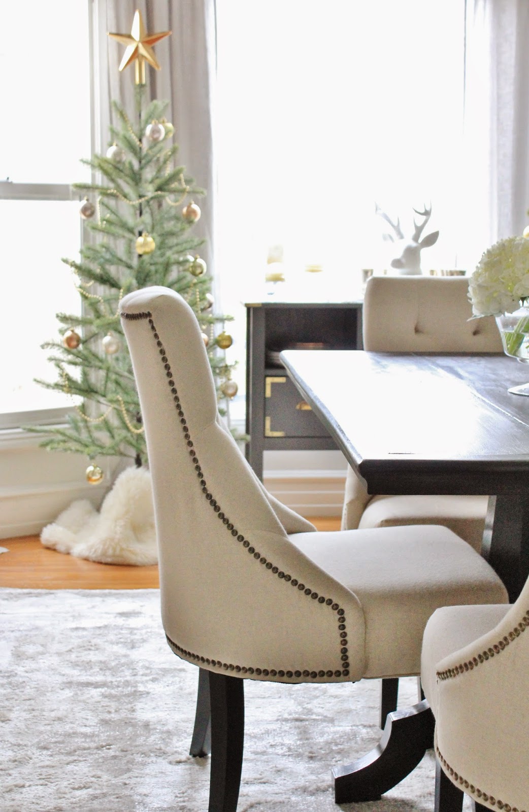
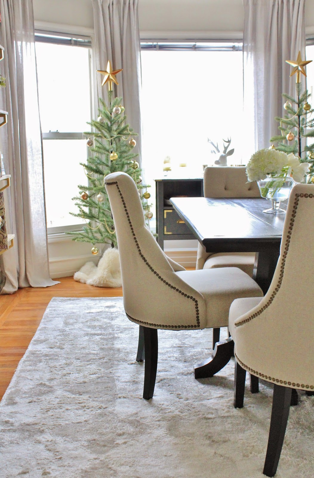
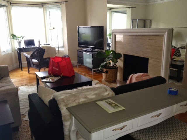
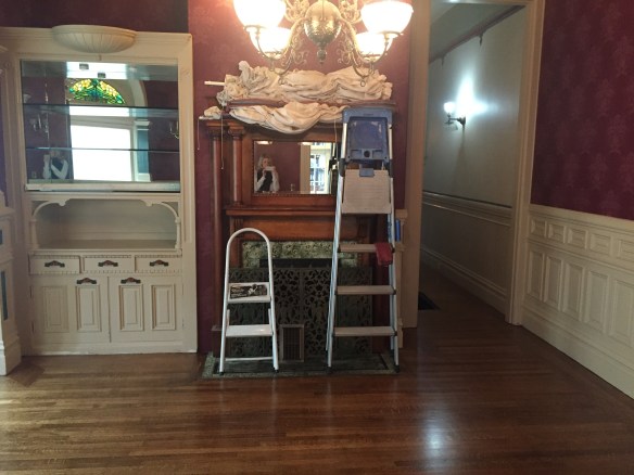
Since we finished the floors, we’ve moved in and this place already looks SO DIFFERENT.  Keep in mind, I took these pictures back in January, and it’s almost April!  In the last several months, we’ve made A LOT of progress stripping wallpaper, and painting.

More specifically, painting trim.  There is A CRAPLOAD of trim… which I love… it’s just very detailed, so it takes forever to paint, which I don’t love.  Some days it feels like I’ll be painting trim until I die, but I’ve made a lot of headway in recent weeks, and I can’t wait to share some before and after photos soon!!!

It’s really starting to come together, and I’m seeing parts of the house take shape, which makes me so excited for phase II… decorating 🙂

Hello…. It’s Me………

IMG_2458

Ha!  Couldn’t resist a little Adele reference!!

But really… I haven’t completely disappeared. Ok, I have, but for very good reasons!!

I had mentioned before that my hubby and I were in the process of looking for a house, and while it took several months, many weekends of endless open houses, multiple offers, and a few broken hearts, I am happy to be able to finally say…. WE BOUGHT A HOUSE!!!!

**queue confetti**

Now that we have closed, I feel good about making that announcement, and being able to finally talk about it here!  She’s (I’ve decided that the house is a “she”) a beautiful old Victorian with her own set of quirks, and I’m obsessed with her.

There is a post coming soon where I’ll take you through the particulars – what we love, what we hate, and what we hope to do to truly make her shine.  We’ve already started in on a few projects, and I cannot wait to share!!

xo


Dining Room Updates and Holiday Touches

I realize that Christmas is over, but before the holiday decor comes down I wanted to share some pictures of our dining room all dolled up for December.  
The last pictures I shared with you of our dining room were quite a while ago, so we can treat this as a bit of a house tour as well to showcase some of the pretty little updates that have been made in here recently.  For those of you too lazy to click back through that link, here’s where the dining room had been:
It was fine before, but there were lots of little things that bothered me.  It wasn’t 100% our taste, and it felt really busy to me.  Kris loves modern things, so lots of pattern and color isn’t up his alley.  Myself, I’m drawn to more classic pieces, so the tribal rug – as much as I loved the blue – never felt right.  To me, the combination of the shelves, with the color and pattern on the rug, with the block of black in the middle of the room was disjointed.
Aside from the rug, and the chairs around the table, you might wonder what else has changed…
Look closely at the walls.  They’re no longer full of holes, scuffs, and cracks (not that you could easily see that in any of the pictures, but trust me when I say that they’d seen better days).  They got patched and painted!  And it doesn’t stop there.  The peeling paint on the heater got sanded off, and primed and painted.  Hallelujah!!
Between the fresh coat of paint, a second set of shelves on the left wall, the new rug, and the new chairs, this room went from feeling kind of chaotic and busy (to me), to completely calm. 
Because the shelves take up the entire left wall of this room they make a big statement  There is a lot going on – lots of color in the books, art and accessories.  Take all that, and with the blue patterned rug, the art next to the shelves, and the gallery wall on the opposite side and there was just too much going on.  Now, the room feels more balanced to me.  Taking out the bold rug, and using muted tones throughout the entire room allows the bookshelves to shine, instead of competing with them.
Normally, I’m not one to go with all whites and greys and taupes in a room, but since the bookshelves are the focal point, I absolutely LOVE the monotone palate.

Can I just take a second to tell you how much I love our new dining room chairs??

These are the Lydia chairs from World Market and they are an absolute steal for the quality.  Super plush padded seats, nice tight tufting, sturdy frame, and individually hammered nail heads trimming out each of the seat backs.  There is good support, and they are really comfortable.  Aside from the positive practical aspects, they are so pretty.  The linen and the nailhead is such a natural marriage together, and the tufting just sort of puts them over the top for me.  In a good way 🙂

I especially love that the nailhead runs around the sides and back, so that when they’re tucked into the table, you still get that great detail.

It’s love.

You’ll notice peeking out behind these chairs are two mini Christmas trees.  Tree twins in the dining room.

Since I work from home a lot, it’s been so nice to have the holiday decor spreading into this space as well as our living room.  The trees in here, along with stars, ornaments, and garlands are all from Ikea.  The ornaments in here are actually the same ones I’d used in the garland in our living room.  I really like the continuity from one room to the next – especially as these spaces are open to one another.

I once read in House Beautiful that one secret to making a small home feel bigger is to use the same color palate in every room.  I have never forgotten that, and ever since focusing the colors in our house to grey, black, white, tan, gold, and various shades of blue, it really has made it seem bigger.  Keeping the green and gold going in here from the living room makes it feel less busy, even though we have two relatively tall, fully decorated Christmas trees in a not-that-big space.


The tree’s themselves were really easy to put together, and from a glance look pretty realistic.  I love that the branches are spaced out.  It gives off that sort of sparse look that I’ve always admired in Nordic holiday design.

Not sure what I mean?  You can see some good examples of that sparse, minimalistic type of tree herehere, and here.


Up close, I loved that the ornaments ranged in tone from gold, to copper, to a pale frosted pink (shh don’t tell Kris).  I also loved that they are made of plastic, so they were light as a feather, and didn’t weigh down the branches at all.

Not sure if you noticed, but there is also a fairly large white ceramic deer head on our wine rack.  He made an appearance last year in our “winter wonderland” of a hallway, but this year, he looks so at home in between these trees.

Also, notice the “tree skirts”?  They’re from Ikea too.
They actually aren’t tree skirts at all – they are just the mini Sheepskin Rugs wrapped around the tree base, but I love how soft they are, and how they totally go with the mono-tone color palate of this room.  I could only find the faux sheepskin’s online, but if you can, get the real ones.  They drape so much better than the fake ones, and are SO SOFT.  Huge bargain too.  Something like $25.  I’ve had ours for a little over a year now – I like draping them over the backs of our not to comfortable wicker chairs for a little extra cushion, but for the holidays, they are serving as tree skirts in the dining room. #makethemostofwhatyouhave
Let’s talk about the new rug for a moment…
Hellloooooo loverrrrr!

Unsurprisingly, I agonized over the decision to sell our blue rug and get something else for way too long. I was never 100% happy with the blue one – it was always just a little too small for the room, and a little more “Aztec” than I’d been anticipating, which felt kind of forced in our more traditional dining room – so when RugsUSA had another huge sale over Labor Day (yes, that long ago) I decided it was time to make a change.

I thought about another natural fiber rug since we’ve had such a great experience with our other ones so far, but worried it would be too bland.  I looked at rugs similar to the one we had in our old living room (it now lives in our bedroom) but didn’t want another trellis pattern that competed with the bold navy trellis runner we had in the hallway.

I ended up finding the Tanger Kambal Moroccan Trellis rug from RugsUSA, and while I liked it online, I was still waffling a bit on my decision against a natural fiber.  Ultimately, I ended up ordering it since it was on sale for 75% off, but I second guessed my decision up until the day it arrived.  All I can say is THANK GOD I just pulled the trigger, because I absolutely love everything about it.

It’s hard to tell from these photos, but the print is a light grey quatrefoil on a cream background.  It’s a bit bigger than the old one, soft as a freshly washed golden retriever puppy, and it has a really pretty sheen. Depending on which way the nap is laying, the color changes.  For instance, if I’m in the living room looking at the dining room, it kind of looks like an all white flokatti rug, but as you walk closer, you realize there’s a pattern in it.  I just LOVE that.

One person complained online that the grey was more taupe in real life than the silver depicted online.  She is right, however that is one of my favorite parts about it.  It’s a color that can only be described as “greige”.  It’s not grey, but it’s not beige.  It’s somewhere in the middle which is preferable in my opinion.  It means that we won’t be tied to grey or tan in whatever room it finds itself in in the future.

Anyway, back to Christmas decor…

Here’s a close up of the fake tree branch… looks pretty good, eh?  Also forgot the mention before that the branches are moldable.  They must have wire in them, so you can bend them a bit to look less perfect and more real.

Notice how you can see me in my jammies in the reflection of that ornament?  Ha!  No judgement!  I actually took these pictures during a power outage, when San Francisco was pretty much shut down from a major storm.  What else would one be wearing other than jammies???

And here we are looking back at the bookshelves.  I’d already posted about the one on the right, but the shelves on the left weren’t there yet last time I wrote about our dining room.  

Here’s how this wall used to look:

It actually makes a HUGE difference in this room now to have the double sets of shelves – it never felt balanced to me with the painting next to it.  After a few days I knew I’d need to stain a second set of shelves stat, otherwise it would drive me bonkers.
Also, notice in the picture above how ragged the heater looks with the peeling paint?  Sanding that off and re-coating it with heat resistant primer and paint has made one of the biggest changes to me.  That peeling paint drove me absolutely nuts for the last year, so I’m happy to be able to point out how much better it’s looking!

And here’s a peek at the other side of the room – our pretty painting has space to breathe over there, and really shines now that it’s not crowded by other stuff.

It just feels really calm and pretty.

And there’s nothing like fresh flowers to make a room feel pulled together…

Not that I’m an expert in arranging flowers, but I’ve found a few little tricks that promise a knockout bouquet every time.

Stick to a single color palate (mixing colors can get tricky, so staying with one color – all red, all white, all blue and purple, guarantee that it won’t turn out looking like a hot mess will look more professional once it’s finished).

Group flowers in an arrangement by type.  This is optional, but I find I like the look better, and find more success when I group flowers this way.  Keep the large fluffy flowers together, fill in blank spots and edges with smaller fluffy flowers, fill in sparse edges with groups of smaller skinnier stalks.  For instance right now, I’ve got two hydrangia’s grouped together taking up 1/3 of the bouquet, three extra fluffy mums together taking up another 1/3 of the arrangement, and a few stalks of snapdragons taking up the last third – all white.  And it just works.

Let the flowers drape as they would in real life. Tulips want to fall over all loosey goosey.  Let them. They are rarely going to stand up straight, so pick a vase that will accentuate them draping over the side. Don’t try to force a flower to do something it wouldn’t normally.  These are wise words from the Barefoot Contessa.

Cut the stems short.  This isn’t a hard and fast rule – if you get long stemmed roses from your honey, keep them long – but I find that arranging shorter stems turns out a more professional looking arrangement every time.

Do you guys have any tips on arranging flowers?  I would love to know!

Taking a closer look at the shelves, you’ll notice that I didn’t go wild with Christmas Decor, but I did nestle in a few of my seasonal favorites… here, a few ornaments behind that handsome deer statue.

The below looks especially wintery, but actually the only addition here was the snowflake… the owl is a year round staple, as is that antler candle holder, but it does help that the coral is white to round out this little vignette.

All my old music boxes get a special place up here in December.  They are fragile, but I love them so much.

These garlands were really inexpensive from Michaels, and while I’m not hugely fond of the glitter, they look really nice woven across the top of the shelves.

Oh hello, inappropriate singing Santa!

All I’ll say is that his guitar mysteriously disappeared (Kristopher!  Ahem!) and his hand that was supposed to be strumming the guitar looked like it was doing something else.  Oh my.

After he was scolded for hiding the guitar, Santa is back to being “G” rated.

So that’s the updates in our dining room – in life, and for the holidays!
There are a few more updates I’d like to make in this space, but I’m really happy with how the dining room has transformed so far.  With our wedding this summer, I think my focus will likely turn to that this next year, and changes around the house will really slow down, but we’ve come so far in just 11 months.
I’ll be posting a 2014 recap, and can’t wait to get all the before and after pictures together for that.  Looking back through some older posts really illustrates how far we’ve come.
I will also say, I’ve been really trying to focus on the quality of the photographs I’ve been taking.  I broke out my tripod that had never been used, and I think that really helped.  I also was playing around with the settings to make sure that the light from the windows didn’t blow out the images as badly as they had in the past.  I wanted to see the drapes, the trees, and the dining table.  Not one or the other.
I’m learning!  Slowly, but I’m learning.  Hoping the pictures continue to improve!

Anyway, hope you all enjoyed!  We’ve now gone through updates in the living room and the dining room.  What’s next?  The bedroom – it’s not all THAT exciting and different from our old bedroom, but we do have some new bedding in there that I’m excited to share with you all.

What are your thoughts on our dining room updates?  Of the rug?  The new chairs?  The second set of shelves?

Would love to know!

xoxo

Holiday Fireplace and a DIY Garland

Are you guys ready for some holiday house updates?????????

Let’s dive right in!

The fireplace is the center of our living room, and an obvious focal point to decorate for the holidays.  I was so excited to be able to string up garlands, and doll it up this year since our old apartment didn’t have a central focal point in the living room.  Everything was centered around our TV which was practical, but not the most attractive option.

As stoked as I was to decorate the fireplace, I REALLLLLLYYYYYYY wish that it had a mantle.  If you look closely, you’ll notice that it’s a flat facade, surrounded by a piece of crown molding, so there’s no spot for long beautiful taper candles, leaning art, or cool decorative accents like that on top of it.

I’ve spent many hours scheming about how to create a mantle here, but with the fireplace being completely surrounded on all sides by a slab of mirror, it just won’t work… unless I dare risk 7 years bad luck by breaking it… which I’m not down for. Sometimes we just have to make do with what we’ve got…. right??  Kind of the story of my life, but let’s be honest – I’m just happy to have a fireplace to decorate this year!

When I lived here before, I always loved how we strung a pre-lighted garland across the fireplace, but after digging that garland out of storage it was looking pretty sad.  It was all smushed, and had little (if any) resemblance to real greenery.  Imagine something like this… but faded, and flattened after being stored in a box for several years….

It was time to find a new game plan for our mantle – I loved the idea of a garland, but wanted it to be super full, and really eye-catching.  And what would be more eye-catching than a bunch of gold ornaments strung together and wound up with fairy lights and greenery??  This garland DIY is super easy to pull together, so for anyone looking for a fun holiday project, this is the one for you!  In fact, the more wine you drink while working on it, the better.

May I present to you our Gold and Green(ery) Garland.  It’s two separate garlands woven together to make one massive, awesome, holiday focal point.  It’s sparkly – especially once the garland is plugged in at night – and a little over the top but I’m totally in love with it.

The ornament garland was a DIY project I worked on one afternoon while catching up on bad reality TV.  Nothing to get you in the holiday spirit than watching the Kardashian’s bicker.

I actually tested it out last year on a smaller garland that we now have hanging in the kitchen (yep, even the kitchen got a little holiday love in 2014), and making it is soooo easy.  Look back at this post for the original instructions, but there isn’t much to explain.  
Basically you need to start with a TON of ornaments – do not use glass.  They WILL shatter.  I used 4 boxes of plastic balls in assorted gold tones from Ikea… LOVE the Ikea holiday section this year.  They win the award for “best everything”.  More on them later… back to the DIY.
Start with tons of balls {insert joke here}.
Get your hands on a long strand of thick wire.  Ribbon might work but I like that the wire forms to the shape you want.
Sting balls onto wire while accidentally drinking the better part of a bottle of wine and watching trashy TV.
Here’s what you’ll end up with:
Super technical DIY project *wink wink*
Once I had all the ornaments strung on the wire, it was time to hunt down a pretty green garland to replace our sad looking one.
I wanted one that was hefty, and that looked natural (at least somewhat).  I looked into ordering a fresh garland for about two-seconds until realizing fresh garlands in SF ran about $160.  Um, no thanks.  
Off to Michael’s I went (with my coupon of course) and scored this beauty for something like $25.  I think without the 40% off coupon it was in the high $30 range.  Still, not bad for a lighted green 9′ garland with pine cones interspersed and several types of faux greens in the mix.

Once I got the green garland home, I wound the two garlands around one another, and secured them to the wood molding around the fireplace with two small nails, and more of the wire that I’d used to string the ornaments.

The nails will leave the smallest of holes, and will be easy to conceal with wood putty, and a coat of white paint.

Another new addition to our holiday fireplace, is this starburst mirror.

I love a good starburst – we have one hanging over our bed as well – but this is one of the best finds of my shopping career… EVER.

Such a score!

I consider myself to be a pretty serious bargain hunter – not on the same level as those crazy extreme couponers, but I take the sale sections seriously.  As I was at the Home Depot over the weekend, wandering the aisles in search of a ceiling medallion (another story for another day), I found myself in the aisle with decorative moldings, hollow core doors, and what else… mirrors!

Easily distracted, I ventured over to the mirrors, and there, hanging on the wall was a mirror very similar to this one that I’ve been trying to hunt down!!  It was a bit smaller than I’d wanted, but I was intrigued.  I picked up the box below the sample mirror, and guess what?  It a box for a completely different mirror.  A sunburst mirror.

A sunburst mirror that was marked down to $6.

SIX DOLLARS.

I cannot make this stuff up.

I grabbed that box so fast, and was out of there before anyone could fight me for my $6 mirror.

Not only was it SIX DOLLARS (which I still cannot wrap my mind around), but it was bigger than the octagonal mirror I was originally admiring, and it fills out this space above the fireplace so well.

Here she is close-up – isn’t she pretty??


I also love that the center of the sunburst is convex, so it sort of distorts the reflection.  Very cool.

It was a Christmas miracle actually.  I’ve been agonizing over what to hang here for a while.  The empty expanse of mirrors above and on the sides of the fireplace felt really 80’s to me.  
On the one hand, all these mirrors make the room feel larger, but with no mantle above the fireplace to lean art on, place picture frames, flowers, branches… basically anything to draw the eye up, and compliment the spot above the fireplace, it was just so empty.  It needed something.
I toyed with the idea of trying to hang a large piece of art here, but wasn’t loving that idea.  Every time I had Kris hold something up there it just felt odd.  I also toyed with the idea of hanging a mirror over here, but never found the right thing 

I am so thrilled with how this looks but I’m not completely sold on the ribbon that secures it to a nail above the mirror.  For now, with the holidays, it’s fine, but I’m not sure if the ribbon will stay – perhaps a string of clear fishing wire or something similar would be best, so it looks more like it’s mounted to the mirror, and less like it’s dangling from above.
Surprisingly enough, Kris is on board with the ribbon, so if we do keep it, I won’t have to worry about his complaints.
Also in the living room are several wrapped presents – I like to get them wrapped and under the tree as early as possible since they just add to the festive feel.  I’m liking the simple feel of this brown paper, and bold ribbon, and a sprig of douglas fir finishes it off so nicely!  And guess what… the branches were free! I may or may not have been scavenging the discard bins at the Christmas Tree Tent at Home Depot, but it’s fair game!  The guys working the saws at the tree lot confirmed that these branches that get stripped from the bottoms of the trees are headed to the chipper at the end of the day, so I see it more as rescuing them.
And how awesome is that red cardinal ribbon??  Michaels was having 60% off their ribbon over the weekend, so 25 yards of this stuff was $3.  Yes please!!  Red cardinals and festive tartan ribbon for everyone!!!

I’ve been spoiling myself this year with fresh flowers only in the house, and have found that I can make hydrangeas last for a solid month, if I take care of them JUST right.  I made this arrangement feel a bit more holiday-like with the addition of woodsy greenery, and some cool burgundy branches.
Apparently hydrangeas like HOT water, with a little bleach.  Cut the stems vertically so they can soak up as much water through their woody stem, and they are good to go. I learned this little trick from an episode of the Barefoot Contessa, and I never forgot it!  Just change the water out once a week, they tend to last and last and last.  
I think my record was 7 weeks of keeping a cut hydrangea alive. #impressive
So that’s our holiday mantle fireplace!  More festive updates coming your way soon, but the whole house got decked out – there’s a tree, an inappropriate Santa, and a really festive dining room still to share!

Living Room Tour

Keeping good on my promises you guys!  I really wanted to start back writing on my blog somewhat regularly, and sharing some of the exciting updates we’ve made to our place!  First up, our living room.

Since moving back into our new/old apartment in February, I’ve been working slowly but steadily to attack each room with updates.

I actually used to live in this apartment with my best friend Kira, but when Kris and I moved in together, he and I found a new apartment, and Kira stayed in this one that we shared. Fast forward almost two years later, she decided to move cross-country to Chicago, so Kris and I moved back in. It has a great layout, lots of natural light, and so much more space than we had in our first place together.

The only problem was that after 5 years of wear and tear, things were looking a little worn.

I’ve got to say, it was somewhat of a surreal experience to be living back in an apartment that used to be mine – it wasn’t the normal process of getting to know all the quirks of a new home.  I already knew that the fake drawer front below the sink fell out from time to time…. that there is a super creepy clicking sound in the middle of the night as the steam heat turns on and the pipes warm up… that you have to open the refrigerator to open the dishwasher.  Nothing about the apartment was a surprise, but instead of feeling like I was coming back home, it felt like I was moving into a strangers’ apartment.  The apartment was the same, but somehow it had changed in the time I was gone.  It was older.  There were more holes in the walls.  There were more scuffs in the paint.  Nothing abnormal, just older, more worn, and not mine.

Luckily for me, the process of getting everything updated and back in tip-top shape felt like a fun project to tackle instead of a massive undertaking.  It’s been a slow process, but don’t they say “slow and steady wins the race”?  It’s taken me almost a year, quite a few gallons of paint, spackle, sandpaper, and elbow grease, but it’s feeling refreshed, and most importantly, like it’s ours.

Today I want to share with you the living room – it’s the room where we spend the most time, and one of my favorite spots in our house. Here’s where it started a few days after we moved in.

Here’s what we started with:

The Bones of the Room:
The walls were all scuffed from the multiple moves, had tons of holes from past pictures and shelves, and were painted a yellowed beige color.  The fireplace had a really dirty, cracked stone facade in a peach-y color.  The curtain rods I’d hung up when I was 24 years old weren’t hung straight, and were staggered to fit into the tight bay window space.

The Furniture:
We started with two sad looking love seats that I’ve been dying to replace for the past two years, a console table that really felt out of place for not only the space but our style.  We had our huge, dark, bulky coffee table, that took up more space than the love seats, and matching side tables.

This is not to say that I hated everything we owned.  Quite the opposite.

I really tried to be creative in our last apartment with how to make what we had work for our space – while nothing matched, and everything was a mish-mash of our starter furniture from our early 20’s, I used new throw pillows and decorative accessories to doll things up, and I’ll always think back fondly of our first apartment together, and all the things in it.

The truth was, all the stuff we were holding onto wasn’t functioning well with the new layout, and it wasn’t comfortable.  Aside from nostalgia and feeling frugal, there was literally no reason to hold onto any of it anymore.  What was worse, our old furniture, paired with the dingy walls felt especially bland and actually kind of dark and dingy, despite the light color palate.

This past year was a big one, and for so many reasons, it felt like the start of a new chapter. I turned 30 and got engaged, so moving into a new place felt like the perfect opportunity to get rid of the falling apart “starter” furniture we’d been holding onto, and invest in things we love… pieces that we’d take with us to our future homes, and have for a long time.  What I wanted was a bright space that felt new, while highlighting the lovely architectural details this space has to offer, and pieces that could transition from an apartment to a home that we own.

So what updates did the space get??

Well first, we painted – all the walls got a coat of Intense White by Benjamin Moore.
Displaying FullSizeRender.jpg
The first rule of renting is to not make changes that the landlord won’t approve of.  This color is so fresh, light and neutral, we won’t be re-painting when we move out.

It’s hands down my favorite color of grey – coming from the same color card as Grey Owl, it’s the lightest on the paint card, but it is definitely grey – not white, despite it’s name.  It’s a very bright, clean neutral grey, and doesn’t err on the blue side which absorbs light, and can make a room feel dark.  The first color I painted was very blue, and I ended up having to paint this room twice.  Lesson learned – paint swatches and lots of research when it comes to grey.

The trim got a coat of Decorator’s White – another Benjamin Moore color, and together the trim and walls look really crisp and fresh.
Displaying FullSizeRender.jpg

My goal with the walls was to minimize all the imperfections – cracks in the wall, paint blobs from drips the last time this room was painted, and little bumps and nicks, holes from pictures and shelves but as you can see it’s not perfect.  I patched all the holes in the walls with spackle, sanded them down, but it’s an old building, and these walls are plaster from the 30’s, so there’s not just 5 years of wear and tear, but almost 80 years… at least. While there are still some lumps and bumps, the paint and the touch-ups changed how bright and new the room felt.

Simple, easy to do, and inexpensive fixes with paint = huge difference.

I also updated the fireplace.

I posted about that process a few months ago, and we’re still loving the updates.  The stone that was there was not very beautiful to begin with, and was so dirty and cracked – even scrubbing it, the years of soot were not going anywhere.
Here’s a close up of how it looked before:
Let me also add, that this “before” picture was taken AFTER scrubbing and scrubbing… the dirt was not going anywhere.
Here was how it looked during it’s facelift:
And a few more pretty afters:

Inside the fireplace, you’ll notice an abundance of candles.  I would NOT light a fire in the fireplace at this point.  It hasnt been used in years, it likely is full of soot and god knows what else, and I don’t want to risk setting this building on fire.

So candles are a good alternative – they are super cozy at night when they’re all lit, and in the day, they offer a pretty architectural element.  As we burn them, I love the wax drips that come down the sides.

The contact paper is holding up really well, and everyone who comes over always comments how much they love it.  No one knows it’s not marble, and I’m certainly not going to be the one to tell them 🙂  Read about the whole process here.

Another update?  The old coffee table (which was part of a matching set) got sold to a new home on Craigslist, and we replaced it with this beauty.

This is the Box Frame Coffee Table – Café from West Elm.  Overall, we’re really happy with it.  The wood is such a pretty warm color, the metal frame is incredibly sturdy, and without the storage shelf on the bottom that we had on our last coffee table, it invites less clutter, and looks really open and light.  My ONLY complaint is that it scratches easily.  It came with a few small scratches in it already, but after waiting for months for it to be delivered (it was back-ordered) the tray camouflages those little scratches, and some good wood oil also helps them disappear.

Padded coasters are our best friend.

You might also notice that those awful mis-matched love seats are gone.  Woooooo hoooooooo!!

They’ve also gone to greener pastures on Craigslist, and we replaced them with the BEST sofa ever made.  It’s the PB Comfort Square sofa, with chaise from Pottery Barn.

First I want to say how much we love this couch.  Second, let me say that Pottery Barn was THE WORST company to work with from a customer service perspective.  Truly awful.  I won’t go into all the dirty details on here since everything ended well, and we love the sofa so much, but if anyone wants to hear about our experience, send me a private message.

What we love most about it:

It has really deep seat cushions, a nice high back, and it’s BIG.  It looks kind of dainty in these pictures, but Kris and I can both lay down on it without touching – he’s 6’3″ and I’m 5’8″.  The pillows on the sofa here are 24″ square, so you can really see how large it is from a scale perspective.  It’s amazing.

A few more glory shots of our amazing sofa…

We got the cushions filled with down, and let me just say, it’s worth the extra money my friends.  Not only can we re-fluff the cushions, but it adds this element of sinking in and being so cozy when you’re curled up on it in the evenings.

Here’s a close-up of the fabric.

Displaying IMG_3524.JPG

We ordered the Textured Twill in Oatmeal after seeing it in the store on another sofa.  It is really durable for scrubbing IN CASE something spills, but has the look of a more organic linen which I love.  The other twill options are flat looking – similar to denim almost – and this color is wonderful at masking everyday wear and tear.

Kris was the one who wanted it, and he could not have made a better call here.

Final details?  The new lamps, the woven rug, layered with the cowhide from our last apartment, the new pillows, and long white linen curtains.

I ordered the pillow covers off of Etsy, and agonized over which to get.  I loved the large greek key trim, but matching the navy velvet was tough.  I wanted a small scale print to coordinate, and ended up with this Schumacher fabric.  I love the heavy weight of each – perfect for the colder months right now, and my mom and I are working on others pillow covers that we’ll swap in for the spring / summer months.

The knit creme colored throw was a find at Ikea (of all places), and it’s so cozy, and adds a bit of texture to the sofa.  It also lives on the chaise lounge, and protects the sofa from dirty feet.

You can kind of take a peek into the entry and the dining room, but more updates on those spaces later…

The lamps are from Target, the side tables were the ones we had in our last apartment, and while I wasn’t crazy about them before, they don’t bother me anymore now that the big bulky coffee table is gone.  They just sort of blend into the background, and the idea of replacing them is in the very very VERY distant future.  Like years maybe.

The large frames are from Ikea also.  A great find – the wood ties in with the coffee table nicely, and you cannot beat the price for a frame that size.  The sailing prints are from Art.com, and as my dad aptly pointed out, I’ve hung them in the reverse order.  It’s actually two prints of one single boat!

Oops!  Need to rehang those…..

There are a few last pieces to finish to room off – a nice chair to fill in the seating area around the coffee table, a small side table for placing cold drinks, and a few more small details, but I’m really happy with where we’ve come in the last year.

It feels clean, refreshed, and is incredibly comfortable and welcoming, which to me was the most important part.  It was impossible to lounge around watching movies on those old teeny love seats, and all the furniture we’ve got now, are things I want to keep for a long, LONG time.

OH!  And I almost forgot one of my favorite things… rounding out our coffee table is the new book from Erin Gates – Elements of Style.  I love her so much, and her book is absolutely beautiful – from the striped spine that kills me, to everything inside.  One of my favorite books to flip through – not a surprise coming from her #designporn

So that’s where we are!

It’s taken a year to get here, and I’m sure that there are more (minor) changes to come, but I’m so happy with the space as it stands now, and let’s be honest… I’ve got a wedding to plan, so our house will be the furthest thing from my mind in a few months.

Next update coming your way… the dining room!

Happy Monday friends!
xoxo

Sprucing up the Entry

So… our entryway / frontdoor has gotten a bit of a facelift.  
Actually, if we want to be more accurate in comparing hallway updates to plastic surgery, it’s more like our entryway got some botox.  Nothing radical.  Nothing over the top.  No nips and tucks… just a bit of an enhancement.  
Wait… would this update be more of a boob job then?  Ugh, whatever.  It’s looking better.  Let’s just say that.  
Here’s how the hallway looks now as you walk through the front door. 

Pretty wreath.  Some nice color in the runner.  My pretty bar cart.

And here is the hallway, staring back at the front door from the other end.  New mirror, new plant, and yes… a freshly painted door.

<>

I mean LOOK at that thing!  A work of art, pretty much.
I am so thrilled with how it came out – the grey is perfect, and it brings some much needed contrast to the entry.  It’s looking pretty good in here… not that it looked bad before.  It was just sort of blah beforehand… kind of empty and unfinished.  

Now that you’ve seen it’s current (aka gorgeous) state, let’s look at how it started.  Per usual, I took one before picture, and called it a day.  When will I learn?!

Here’s how the hallway / entrance looked beforehand:
It wasn’t BAD… it just was very white, and very empty.  The mirror had actually just been hung – literally MOMENTS before I took this picture.  It actually looked MUCH emptier in there beforehand, so this “before” is actually an improvement on the real “before”.  That wall to the left of the door has been completely empty since we moved in back in January.  
Really, this space started as just a blank slate – white walls, white door.  Plain, and calling out for some color.
Via Pinterest, I’d seen a few interior doors painted dark colors, and so decided to tackle our plain hollow core door.  The hardware on it is pretty ugly, with the exception of the peep hole.  The pretty brass peephole probably cost more than the entire door, knob, hinges, and lock, so I wanted to feature it prominently.  What color looks good with brass?  Grey.  And black… but grey is where it’s at.  I didn’t want to go too dark on the inside of this door, and honestly black looks better with a glossy finish, which on a lumpy, bumpy door equals bad paint job.
I wanted a quick and easy project, and feeling too lazy to head to the hardware store for a fresh can of grey paint, I improvised.  What I really did was mix a bunch of leftover paint together to make a color that suited my needs, but let’s just say I created a “custom paint for the door”.  

**Note: do not try to mix custom colors if you need a lot of paint otherwise you’ll run out, and never be able to match the color you started with**
I keep all the extra paint that is leftover from projects in a cabinet in the kitchen for easy access. I knew I wanted to paint the door a dark color since the rest of the hallway was all white.  I also knew that I didn’t want a glossy paint since it would show every. single. imperfection (which our front door has plenty of).  I also knew I didn’t want it to be completely black.  I was looking for a dark grey with blue undertones, so I brought out the remainders of my can of eggshell finish “Grey Owl” (a very light grey) from our dining room in our last apartment, along with some satin finish black paint that I used on our dresser and nightstands, and a can of blue outdoor paint I’d used on the deck chairs.  
Yes, all the paints had different finishes, and all of them are meant for different kinds of projects, but I knew that mixed together they’d be ok.  The outdoor paint is very matte and kind of rough, so the texture this added to the mixture meant no priming needed!  Score for me!  
It’s possible that the door would end up being hideous… streaky… peeling… or just a wierd splotchy color, but IT’S JUST PAINT.  This is the mantra I repeat to Kris whenever he think’s I’m having a bad idea… and it’s true!  It really is just paint.  If you mess up, you can re-do it. It’s not a huge commitment (coming from the girl who had to paint the living room twice), so when you want to tackle a project but feel like it’s a big change, or you’re worried you might mess it up… trust me when I say, paint is so easy to change, so don’t over-analyze it.  It works out 99% of the time.
Anyway, back to my “custom paint mixture”… I didn’t have a fancy bucket for mixing, but I did have an empty jar of tomato sauce from dinner the night before.  I cleaned it out REALLY well and made sure it was thoroughly dried before pouring paint in.
It turned out to be the perfect vessel for mixing paints, because you could screw the lid on and just shake it up.  Could not have been easier.  I mixed, and tested a few swatches on the door until I found a color I liked, and then I got to work.  I used a short handle brush for cutting in around the door knob, deadbolt, and peephole, and I rolled the rest with a flat foam roller.

 It took about 3 coats to really get an even color on the door, and while you can see the brush strokes of previous paint jobs, it doesn’t bother me.  This is the exact reason I wanted a more matte paint… glossy paint magnifies every single imperfection x1000, so can you imagine how prominent the imperfections would look with a glossy paint?

Isn’t that peephole just amazing?  I love it! It was hard to cut in on those little details, but what paint got on the brass, I just wiped off with a wet paper towel immediately and all was good.

See those little holes below the peep hole??  What ARE those?

The paint was still wet when I snapped these close-up pictures, so you can really see the brushstrokes of paint-jobs past.  Also… notice the hinges?  They now match the peephole thanks to a quick once over with my gold leaf pen.

Another really minor change that I appreciate every day when I head out the door??

The speaker.

See how old, and gross the old speaker was?  This is for the intercom system so that we don’t accidentally buzz and ax-murderer into the building, and it’s “harvest gold” as my mom calls it.  A super popular household appliance color of the 70’s and 80’s.  Why?????

 
I’m not sure this is harvest gold as much as it is “faded baby poop” – either way, it was ugly.
But not anymore!!  It got a coat of white paint to match the walls, and all is right with the world again…

Look how it blends in and just dissapears!  Such a small change, but I swear it makes a WORLD of difference.

This wreath on the door came from Smith and Hawkins for Target, and is made of live moss.  I’m not entirely sure how to care for it, but I’ve spritzed it a few times with water, and it seems happy so far.  I realize now that I need to fix the hanging mechanism, since you can see the hook very clearly in these pictures, but that’s an easy change.

Our bar cart got a few additions to glam it up… striped straws, a new, BEAUTIFUL live orchid with the largest, thickest petals you’ve ever seen, and a new (to me) ice bucket.

The ice bucket is actually of the Mad Men era, and belonged to Kris’ grandmother who passed away earlier this year.  She made it to 100 years old my friends!

I never did get to meet her, but love that we have something that was hers.  There are little nicks and scratches here and there, but when we use it, and see those imperfections, I’ll think of all the parties (and cocktails) they probably had over the years.

Come to think of it, with all the nicks, it seems they used it a lot… I think her and I would have had quite a bit in common 🙂

On the wall opposite the bar cart hangs one of my FAVORITE flea market finds from a few weeks back.  I am SO in love with this mirror.  Last week I posted about the mirror at the flea market that got away… it just seemed silly to get both this one and the octagonal mirror in the same day, but I am so glad that I came away with at least one of them. It’s one of my favorite things that I own.
There was no hesitation in purchasing this one, and thank god, because it is PERFECT for this space.  It’s the perfect size for this wall (narrow, but not too narrow), and it’s just so nice to have a spot to check your hair before running out the door.

The mirror is nice and light – physically, and visually… it doesn’t weigh that much, and the light wood is so pretty!  I just LOVE the carved details, and the little feet on the bottom kill me!  Mini pineapples!!

The final addition to this space was some fresh greenery – my newest fiddle leaf fig that I haven’t killed (yet).  It doesn’t stick out or block traffic flow between rooms (which I was worried about when I first moved it here), and it is just so fresh and lovely.

The rug was the first thing that went down in this hallway, and about 5 months later, we’re still in love (me and the rug).  The blue packs a punch… it’s navy, but still very vibrant, and it’s holding up SO WELL.  Very little shedding, which I’ve been happy about, although it is a magnet for lint like you wouldn’t believe.

So that’s it – a little paint, and some well placed accessories and we’re in business!  Very very happy that the hallway isn’t all bare, and empty and sad anymore.  One more side by side before and after??
Oh okkkkkk, since you asked!

Don’t you just love quick and easy fixes?  I think a coat of paint, and some well placed accessories really brought this space from plain, to pretty.

Happy Monday!!

DIY Art – Gold Arrow Copy Cat

Hey friends!!  Happy Wednesday 🙂
Not sure if you remember, but a while back I’d posted about DIY art.  It all started with the inspiration photo above from House Tweaking.  Her post is great, but the comments… yowzers!!  Apparently people had some harsh opinions about her having painted over one UGLY piece of art that she didn’t love.  I myself could not care less – especially since I LOVED how the arrow art came out.  Clearly.
Loved it so much in fact that I recreated it for our own house!
May I present to you, my own version of the inverted arrow art…

It’s not the easiest to photograph, especially when it’s hanging on a wall in a room that is currently being used as a catch all storage area for things like empty boxes, a loveseat that we just sold, and wood.  Lots and lots of wood that will soon become a planter for our deck.

I pushed some of the junk out of the way in an attempt to stage some pretty things around the art, and it was not my best effort… for sure… but you can totally see the paintings scale here.  Its quite large.

The canvas I used was actually re-purposed – my best friend left an old black and white stretched canvas print from Ikea when she moved across the country, and it made the perfect piece for me to experiment on. No one was going to miss that print.

So I painted over it.

Two coats of white got rolled on and after it dried, I went to work taping off my arrows.  I did some vague measurements, since eyeballing the middle of a 40″ canvas is not as easy as you’d think, and taped the arrows out.

I got a mix of gold paints – including a bronze, and two different shades of gold from the Martha Stewart line. Not to diss Martha, but I was not impressed.  All the metallic shades were flat (not metallic really at all) and the gold looked mustard-y to me.

Back to Michael’s I went in search of the magical Liquid Leaf.  It’s nice and shiny, and I’ve used it on projects before so I knew it would work well.

You can see close up that I painted it on thicker in some areas for more dimension – sort of a 3-D gold effect, and it looks really pretty in different lights.

The gold leaf paint dries in minutes, so I peeled the tape off as soon as I finished, and that was that. Insta-art!

I’m certainly no artist, but it was fun to play the part one foggy afternoon a few weeks ago.  
And better yet, we now have a virtually free piece of art that is a nice focal point in our junk room office.
And even better still, we didn’t have to throw out a perfectly good canvas even though we didn’t like the art, so I like to think we’re also saving the environment… even just a little…

So easy!  Happy Wednesday friends!

Kitchen Inspiration for Phase II Updates

Hello friends!!

Thanks for all the kind words on our little kitchen facelift that I’d posted about earlier in the week!

So far, the grout paint is holding up really well!  We’ve had it for about a month now, and so far so good – we cook / clean a lot, so we’re not being gentle on these counter-tops by any means.  I’ll keep you posted though on how it wears long term.

In my last post, I’d mentioned that this was “Phase I” of the kitchen update… part of me is still debating if we need a Phase II, but here’s a little hint about what I’ve been dabbling with for a potential Phase II…

Don’t you just love???
Obviously these kitchens are all so lovely, and I would just be making superficial updates to our dated kitchen from the ’80’s (we rent!) but there is a lot we could do to doll it up a bit…
I adore the look of dark lowers and light upper cabinets – it’s like a tuxedo… but not.
The reason I’ve been toying with this is that our kitchen is feeling really “white” – this isn’t a bad thing considering before the few updates I’ve made, it was feeling really “yellow”, but with the white tile counters, the white cabinets, the white appliances and the white floor, I think dark lower cabinets would look really nice.
This is what things are looking like now:

Don’t get me wrong, I think this is a great place to be considering where we started, but don’t you think dark grey lower cabinets would look really good???
There are other things I want to work on before painting these lowers – like painting the bathroom which will be super challenging to cut in around the sink, the multiple windows and doors, and get in behind the toilet – but it’s a thought.
Another idea I’ve been dabbling with for the kitchen… more grout paint… but this time on the floor.  Same situation – white tile (it’s linoleum, but is made to look like marble) but with that hideous dark grout!  We have two large jute area rugs to mask all those gridlines (it makes you dizzy!) but I’d love for the floor grout to be white too.  If I am crazy enough to attempt this, then the kitchen really will be white on white on white, with more white, so the lowers will almost NEED to be painted.
Right??
Am I crazy to be thinking about this?  Possibly… but I somehow can’t stop thinking about it!
Ok, so this is admittedly not my finest attempt at rendering something, but what do you think…
I’m thinking… me likey….

Kitchen Counter Makeover – Painted Grout

So our kitchen got a bit of a makeover recently!!  Actually, “a bit of a makeover” is an understatement.  The tile counter-tops got a total face-lift thanks to some industrial strength grout paint.  This whole space is feeling dramatically different than it did when we moved in and I hardly spent a dime doing the updates.
I finally got around to snapping some pictures of all the progress I’ve made on our kitchen today, and cannot wait to share the before and after’s with you!  I’m calling this “Phase I” of our kitchen’s makeover, and it’s quite a dramatic transformation.  
Here is what the kitchen looks like as of this afternoon:
Trust me when I say that this is a dramatic improvement from where we started!
It now feels bright and clean, and so much newer and modern than it did just a few weeks ago.  All I did was paint.  Paint on the walls, and paint on the grout.  Sounds weird, but grout paint is a thing.  I used a different brand for our shower a few months back, and while I was happy with those results at the time, I had no idea that there were better products out there.
After doing some research I discovered a product called Polyblend Grout Renew.  
I’m telling you, this stuff is life changing.  It has AMAZING reviews online, and two of my favorite bloggers from Young House Love, used it on the tile entryway of their new home.  Apparently its holding up to foot traffic, so I knew I had a good shot using it on our counters.  This particular brand of grout paint has a sealer built into it, so I wasn’t as worried about doing a light color on the grout as I would have been otherwise.
Ok, so before I get into the process of how to apply the paint, and revamp old, disgusting grout to your heart’s content, let’s see a few “before” pics… shall we?
So this is what the kitchen counters looked like when we started the process…
Woof.

They were bad my friends.  Like so bad, these pictures don’t really do their grossness justice.

As you can see, the off-white tile had dark brown grout.  Not an attractive combination.

The walls and back-splash were all yellowed out paint that only made said grout / tile look even worse. Everything about the combination of the paint and dark grout made the kitchen feel dirty and dated – very 80’s, and not in a cute Cindy-Lauper-teased-hair-Breakfast-Club kind of way.

Before you can start painting the grout, first you have to clean it, and I’m not talking about wiping it down with a Clorox Disinfecting Wipe.  You need to get Sulfamic Acid Cleaner.  What is this, you ask? It’s a very smelly, apparently toxic, cleaning agent that will lift YEARS of grime from your grout.  I found this out first hand.

As a heads up, this is not a job you can knock out in one night – the cleaning took me several hours at least, and then you have to let the grout dry really well before painting, or the grout paint won’t adhere.

Let’s start by talking about the cleaning process… The container had good instructions on how to mix it up, but not much about what to do after, and I wasn’t able to find much online, so here’s what worked for me:

Wear gloves – don’t try to do this without them. I also wore safety goggles because this stuff seemed pretty toxic and I value my vision.  Once you’re all suited up, get your grout wet with water so it will absorb the cleaner evenly.  Then mix the Sulfamic Acid per the instructions on the container, and apply to counters with a sponge you will never use again.  After applying it to the counters, everything happens pretty quickly.  After a few minutes you’ll notice things getting a little gummy.  That’s grease.  And grime.  And unidentifable grossness that has built up over time.  This is supposed to happen. Let it.  Once it’s really gumming up, start scrubbing.  I used a plastic bristle brush and it worked beautifully.  Once the gummyness comes up, rinse with clean water.  It’s going to take a lot of water, and much more scrubbing, because the grease smears around.  It doesn’t just lift off like you think it will.  It’s all super fun (insert sarcasm here) but once its clean, you’ll notice a difference. A HUGE difference. Your grout will literally be restored to its original color.  Prepare yourself to be shocked.  I thought the grout in here was dark brown.  It was actually light brown – equally unattractive, and really really gross to think about.

Anyway, once the grout is clean, let it dry out – overnight at least – and then get to painting.  Super simple.  I used a stiff bristle toothbrush, and you just work the paint into the grout.  It will get on the tile.  You have two options – wipe it immediately, or let it dry and remove it later.

I started out doing option 1, and it was tedious.  Especially since covering brown grout with white paint required two coats for full coverage (3 coats in some places).  I found that it was easy enough to get off the tile after it was all dried.  I actually let it cure for a few days, then got the counters wet, and the paint on the tiles literally rubbed off with a finger / paper towel.  Soooo much easier than wiping as you go, but do what feels right.

Anyhoo, that’s the whole process!  I’m not going to lie, it was a bit back-breaking to lean over the counters, but I put on some good music, and spaced out.  It’s pretty mindless and easy except for the leaning over part, but it was 100% worth the outcome! Our kitchen feels brand new to me and so much fresher.  In total, it took me about 3 nights to finish – one night to clean, one night to paint, and one night to clean the paint off the tiles where it went out of bounds.
Here are some more pictures of our kitchen counters after their facelift:

Love!!  It’s LOVE!!  After the counters were looking all clean and new, I decided the walls and back-splash needed some love too. Out came the paint, and a few hours later I was in a bright, clean grey and white haven.

The Polyblend Grout Renew Grout Paint comes in a bunch of different colors (and multiple shades of white), so I bought two and tested them out.  I brought home the Antique White and the Snow White colors, because I didnt want the end result to look too white next to our off-white tile.  The tiles started out looking really beige but it turned out that they were much more white than I originally thought.  After testing both colors of grout paint, I ended up going with the Snow White (which is the whiter one).

As you can see, it’s not jarring, and it looks really natural.  In the end, our tile is actually pretty white, and it was just the yellowing walls and disgusting brown grout that made them look so beige.  Who knew?!

Anyway, do you want to see a series of before and afters side by side to compare??

That’s the best part of these posts…

Here we go!

And just becuase I knew you wouldn’t be able to get enough of how fresh and lovely our kitchen is looking, I snapped a few more pics “just because”…

Here’s how clean and pretty our sink is looking now…

Like a breath of fresh air I tell you!!  I actually enjoy cooking in here now!!

 And here we are looking back the other direction from the sink… nothing but clean countertops, all the way down!!

 These next two photographs were taken standing behind the stove (in my little desk / office area that I’d posted about here) looking back towards the dishwasher…

And, that’s the update!  What do you think?

It’s unfortunately not quite as dramatic in pictures as it is in person, but trust me when I say that a coat of paint on the walls, and grout paint on the counters have transformed this room from a gloomy, dated, grease-fest, to a bright, airy, food sanctuary.

It’s night and day my friends.

Dining Room Updates

Hola friends!!  More updates on the apartment!

Things are getting done around here – art hung, walls painted, and now we’re slowing down because it feels like we live here for real, instead of that “just-moved-in can’t-find-the-cheese-grater” temporary feeling.  Do you know what I’m talking about?  To put it simply, we’re feeling completely settled now, so I thought I’d share a few pictures of the dining room.

You’ve already seen a few snapshots from this post when I hung the shelves up, and this post where I put up pictures of the linen curtains in here, but here’s the room in it’s fairly “finished” state.

The rug in here is new for this apartment – I’d blogged about it here – and when it first came, I was not 100% sure about how I felt.  Looking at these pictures, I’m still not fully sure it’s love, but I like it.  I like the colors, and how it feels really tied in with the rest of the house, and it’s got a nubby, earthy texture that is cool.

It’s not plush and soft under foot, but I don’t think it’s supposed to be.  It looks cool with the weathered stain on the shelves and the tripod lamp, so for now, it stays.

With the shelves on that wall, I had a hard time deciding what should go next to it.  For now, we’re sticking with the large abstract canvas that was hanging in the living room of our last apartment.  I like them together, and feel like the large scale art balances the “heavy” feeling shelves out.

I have yet to really photograph the other wall in here (you can kind of see in the first picture), but there is a smallish gallery wall happening, and I’m really happy with how it turned out.

Other plans for this space…

A NEW TABLE:
This table, as much as I love the pedestal is very rickity, and smallish.  Not that we need a huge table, but something that doesn’t creak when you set your elbows on it would be nice.  In the interim, it needs a good coat of paint – you can really tell from the above photo that it’s looking shabby, and when we sell it, it can’t be looking like this.  For now, this table is fine, but a new one is on the wish list.

Kris really liked this one from West Elm:

I was thinking of something a bit more like this:


A FRESH COAT OF PAINT
I was feeling a bit “painted out” after repainting both the living room, and most recently, the kitchen, but this room is in serious need of freshening.  There are scuffs and holes galore, and the scuffs are permanent.  I went through two Mr. Clean Magic Erasers, and they didn’t even make a dent. You know how powerful those things are too!

Also the heater vent…  Ugh, the peeling paint just kills me, but before that gets painted, it needs to be sanded.  Not a project I’m looking forward to, but an update which will eventually make a really HUGE difference.

The vent will be white, but I’m not 100% sure on the walls – perhaps my go-to favorite, Intense White by Benjamin Moore (which is really a light grey)- but maybe a stark white (like Decorator’s White – Benjamin Moore) would be nice…

A NEW OVERHEAD LIGHT
A pretty chandelier or pendant would look awesome in here – especially since we decided to keep this as a dining room with a table in the center.  I conveniently left the current light out of the pictures, but it’s one of those flush mount boob lights that is just so ugly.  The great thing about lighting is that we can re-install the boob lights when we leave, and bring our chandelier / pendant with us into our next space.

We have a chandelier that I bought last year and never installed, but I think it might be better in our bedroom… or the entry.  I’ve always admired the Clarissa series of chandeliers from Pottery Barn… the long one is really lovely over a dining room table:

But the Orb Chandlier from Ballard is also really cool, and I think a bit more to Kris’ tastes…

Thoughts?

Does anyone have any recommendations on (not super expensive) pendants or chandeliers you’ve seen recently?