Living Room Tour

Keeping good on my promises you guys!  I really wanted to start back writing on my blog somewhat regularly, and sharing some of the exciting updates we’ve made to our place!  First up, our living room.

Since moving back into our new/old apartment in February, I’ve been working slowly but steadily to attack each room with updates.

I actually used to live in this apartment with my best friend Kira, but when Kris and I moved in together, he and I found a new apartment, and Kira stayed in this one that we shared. Fast forward almost two years later, she decided to move cross-country to Chicago, so Kris and I moved back in. It has a great layout, lots of natural light, and so much more space than we had in our first place together.

The only problem was that after 5 years of wear and tear, things were looking a little worn.

I’ve got to say, it was somewhat of a surreal experience to be living back in an apartment that used to be mine – it wasn’t the normal process of getting to know all the quirks of a new home.  I already knew that the fake drawer front below the sink fell out from time to time…. that there is a super creepy clicking sound in the middle of the night as the steam heat turns on and the pipes warm up… that you have to open the refrigerator to open the dishwasher.  Nothing about the apartment was a surprise, but instead of feeling like I was coming back home, it felt like I was moving into a strangers’ apartment.  The apartment was the same, but somehow it had changed in the time I was gone.  It was older.  There were more holes in the walls.  There were more scuffs in the paint.  Nothing abnormal, just older, more worn, and not mine.

Luckily for me, the process of getting everything updated and back in tip-top shape felt like a fun project to tackle instead of a massive undertaking.  It’s been a slow process, but don’t they say “slow and steady wins the race”?  It’s taken me almost a year, quite a few gallons of paint, spackle, sandpaper, and elbow grease, but it’s feeling refreshed, and most importantly, like it’s ours.

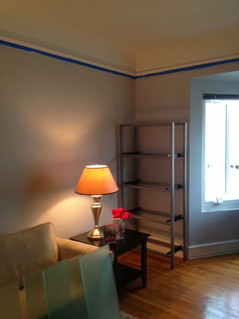
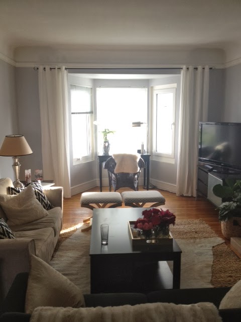
Today I want to share with you the living room – it’s the room where we spend the most time, and one of my favorite spots in our house. Here’s where it started a few days after we moved in.

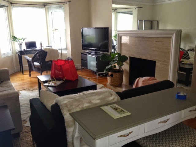
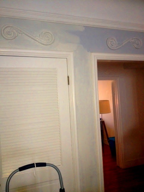
Here’s what we started with:

The Bones of the Room:
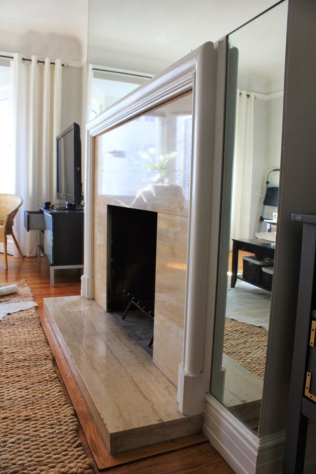
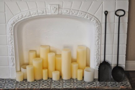
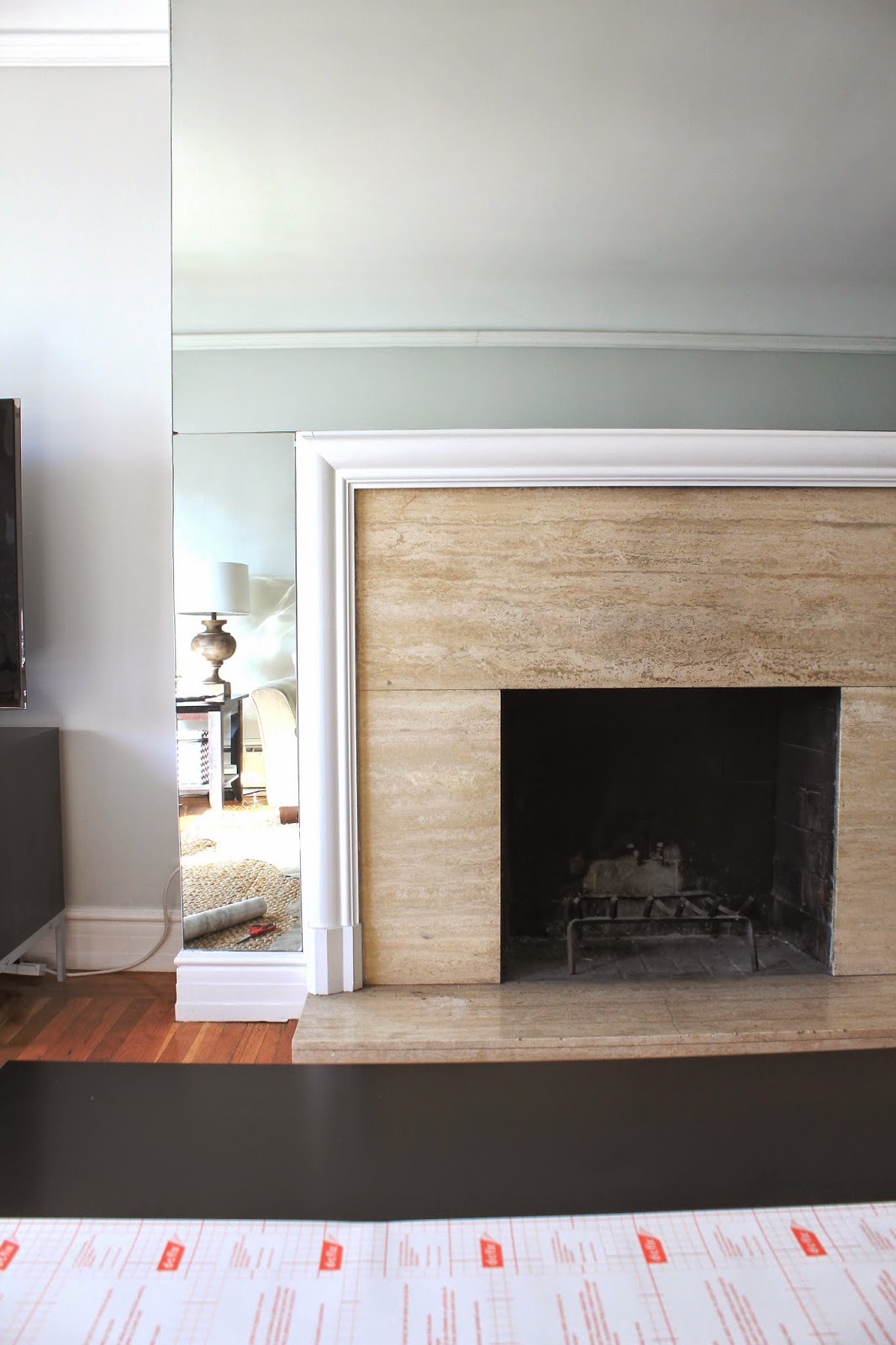
The walls were all scuffed from the multiple moves, had tons of holes from past pictures and shelves, and were painted a yellowed beige color.  The fireplace had a really dirty, cracked stone facade in a peach-y color.  The curtain rods I’d hung up when I was 24 years old weren’t hung straight, and were staggered to fit into the tight bay window space.

The Furniture:
We started with two sad looking love seats that I’ve been dying to replace for the past two years, a console table that really felt out of place for not only the space but our style.  We had our huge, dark, bulky coffee table, that took up more space than the love seats, and matching side tables.

This is not to say that I hated everything we owned.  Quite the opposite.

I really tried to be creative in our last apartment with how to make what we had work for our space – while nothing matched, and everything was a mish-mash of our starter furniture from our early 20’s, I used new throw pillows and decorative accessories to doll things up, and I’ll always think back fondly of our first apartment together, and all the things in it.

The truth was, all the stuff we were holding onto wasn’t functioning well with the new layout, and it wasn’t comfortable.  Aside from nostalgia and feeling frugal, there was literally no reason to hold onto any of it anymore.  What was worse, our old furniture, paired with the dingy walls felt especially bland and actually kind of dark and dingy, despite the light color palate.

This past year was a big one, and for so many reasons, it felt like the start of a new chapter. I turned 30 and got engaged, so moving into a new place felt like the perfect opportunity to get rid of the falling apart “starter” furniture we’d been holding onto, and invest in things we love… pieces that we’d take with us to our future homes, and have for a long time.  What I wanted was a bright space that felt new, while highlighting the lovely architectural details this space has to offer, and pieces that could transition from an apartment to a home that we own.

So what updates did the space get??

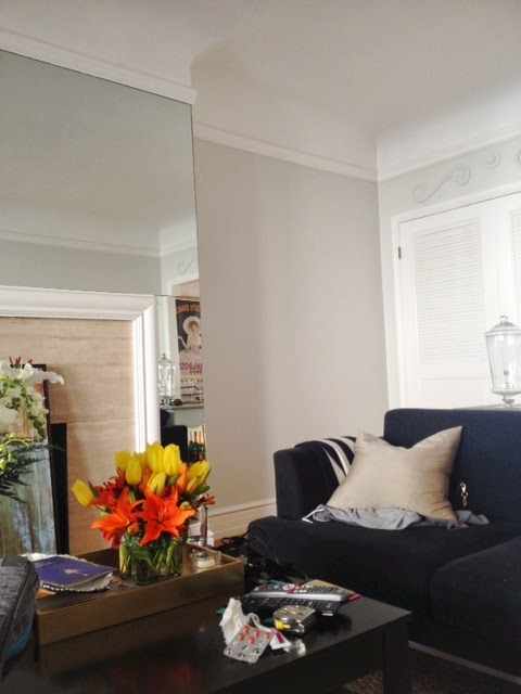
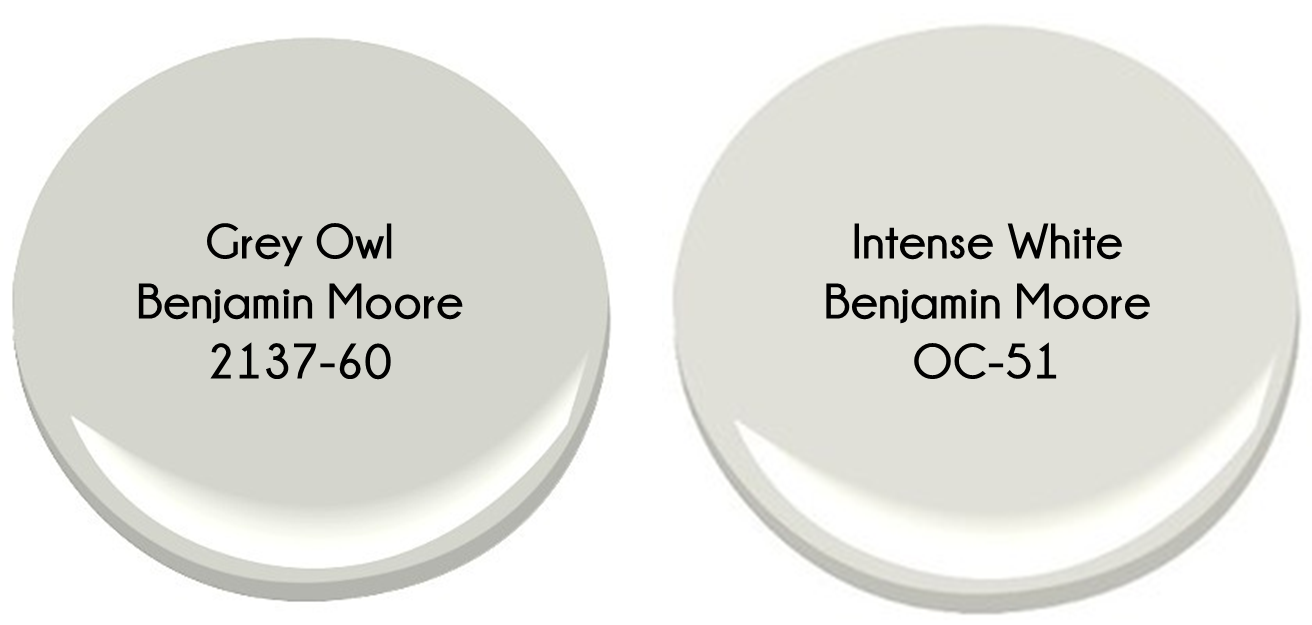
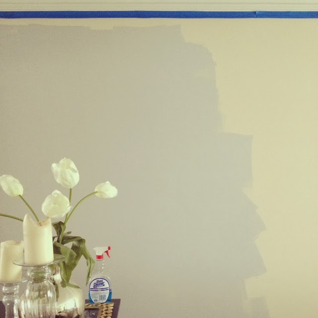
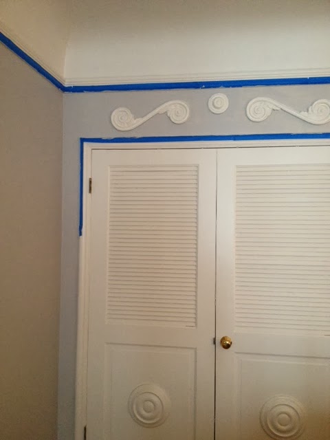
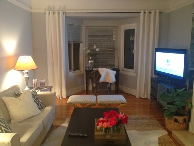
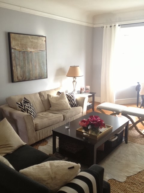
Well first, we painted – all the walls got a coat of Intense White by Benjamin Moore.
Displaying FullSizeRender.jpg
The first rule of renting is to not make changes that the landlord won’t approve of.  This color is so fresh, light and neutral, we won’t be re-painting when we move out.

It’s hands down my favorite color of grey – coming from the same color card as Grey Owl, it’s the lightest on the paint card, but it is definitely grey – not white, despite it’s name.  It’s a very bright, clean neutral grey, and doesn’t err on the blue side which absorbs light, and can make a room feel dark.  The first color I painted was very blue, and I ended up having to paint this room twice.  Lesson learned – paint swatches and lots of research when it comes to grey.

The trim got a coat of Decorator’s White – another Benjamin Moore color, and together the trim and walls look really crisp and fresh.
Displaying FullSizeRender.jpg

My goal with the walls was to minimize all the imperfections – cracks in the wall, paint blobs from drips the last time this room was painted, and little bumps and nicks, holes from pictures and shelves but as you can see it’s not perfect.  I patched all the holes in the walls with spackle, sanded them down, but it’s an old building, and these walls are plaster from the 30’s, so there’s not just 5 years of wear and tear, but almost 80 years… at least. While there are still some lumps and bumps, the paint and the touch-ups changed how bright and new the room felt.

Simple, easy to do, and inexpensive fixes with paint = huge difference.

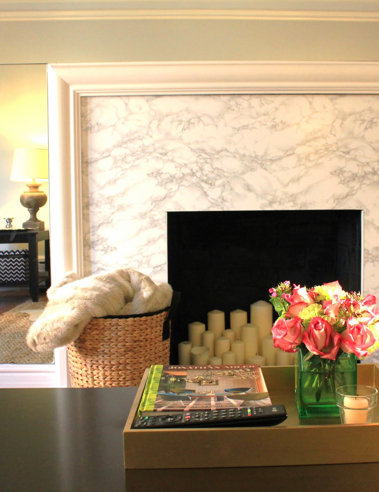
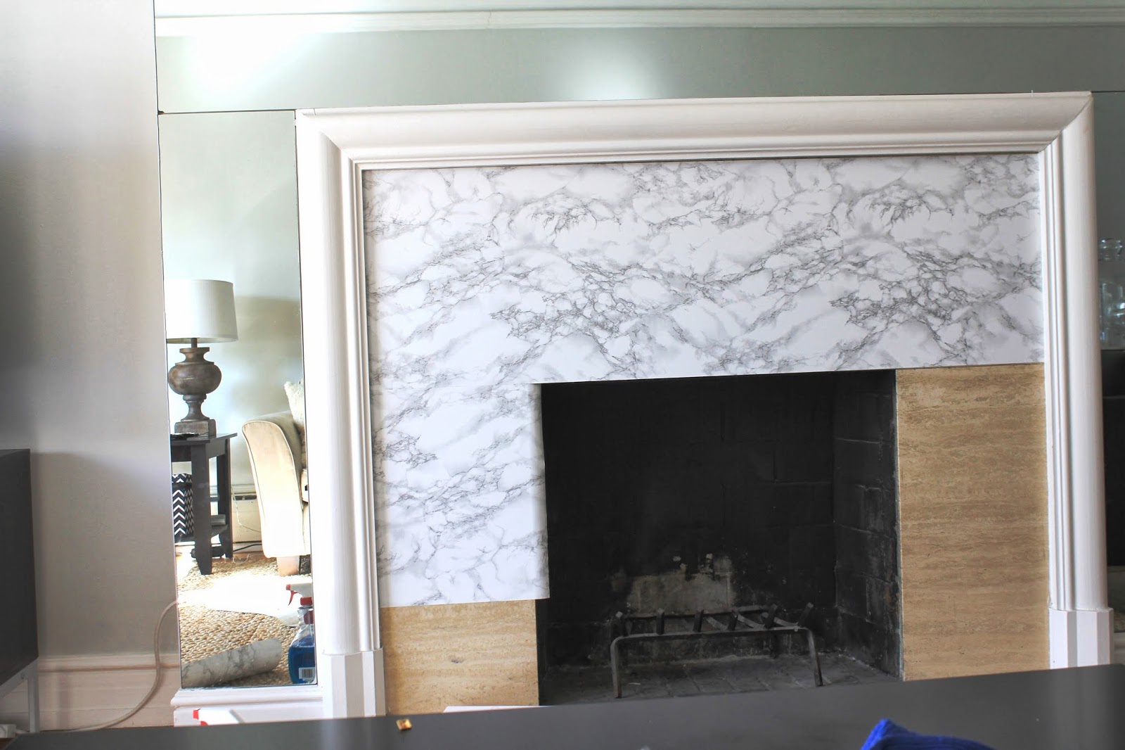
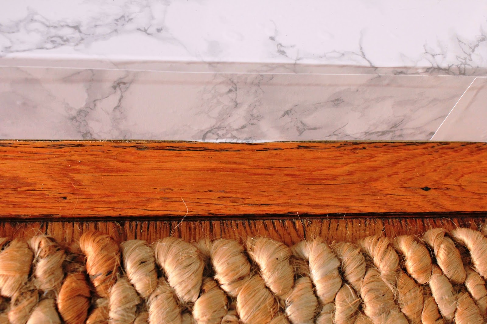
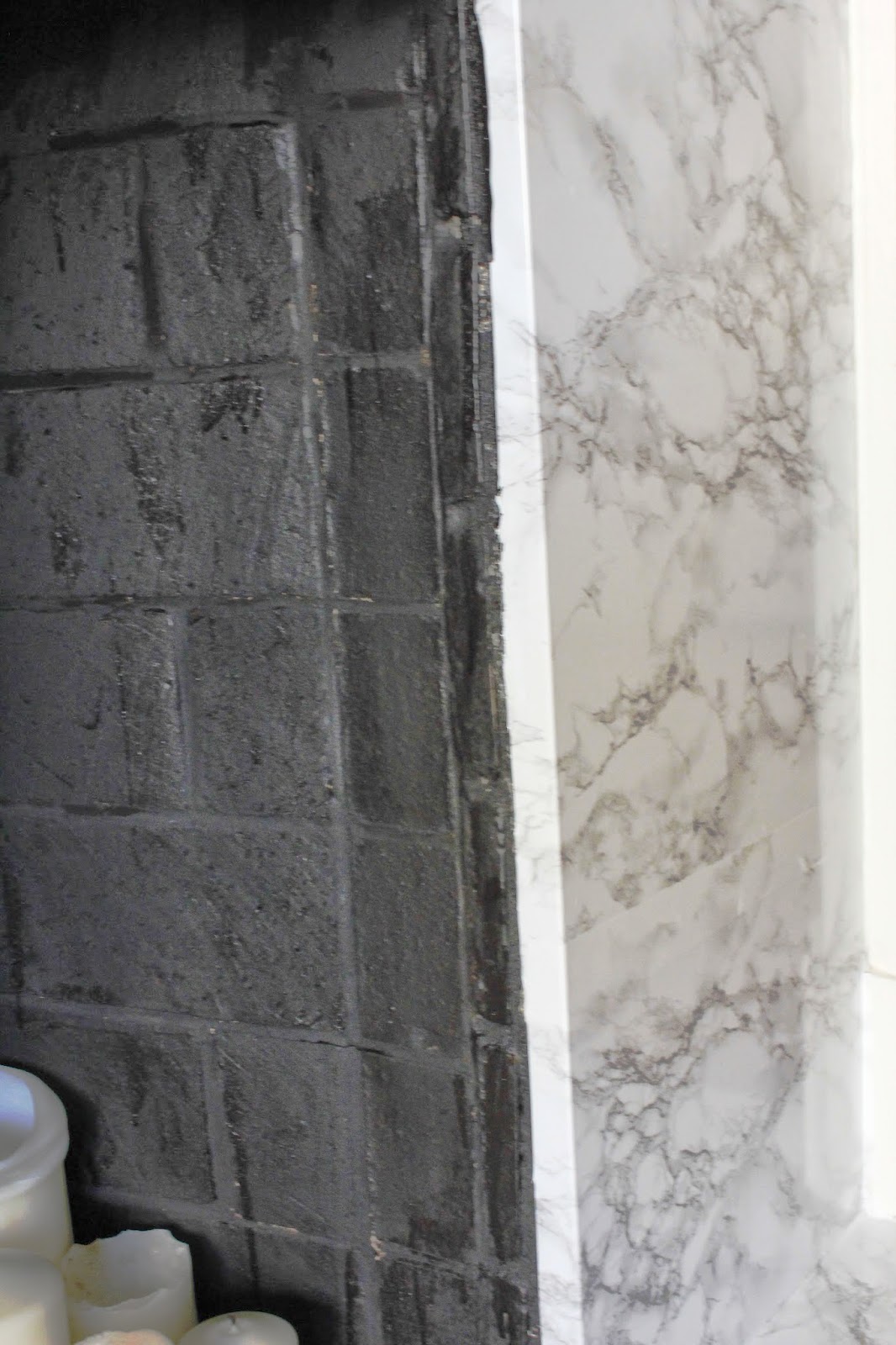
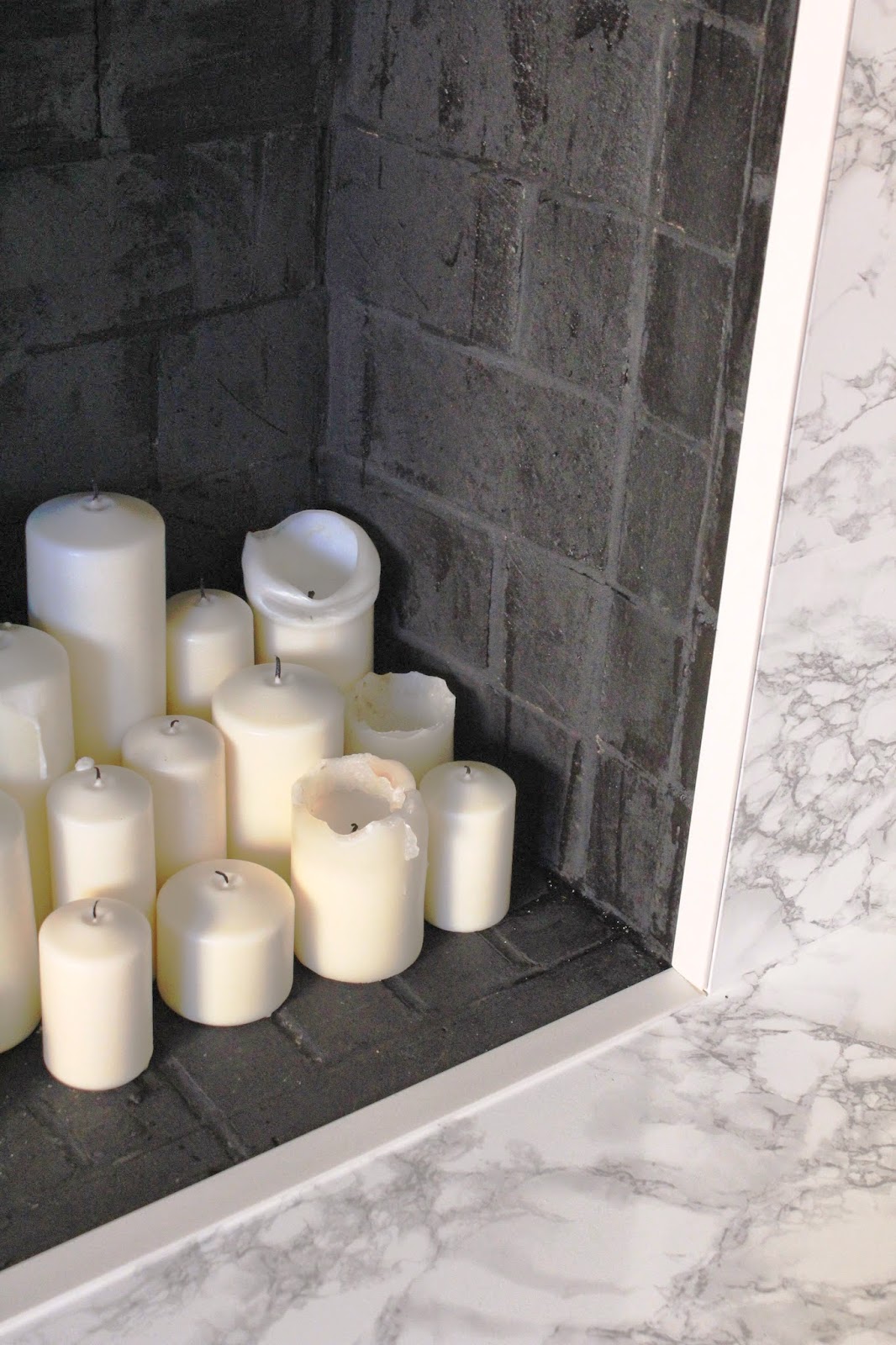
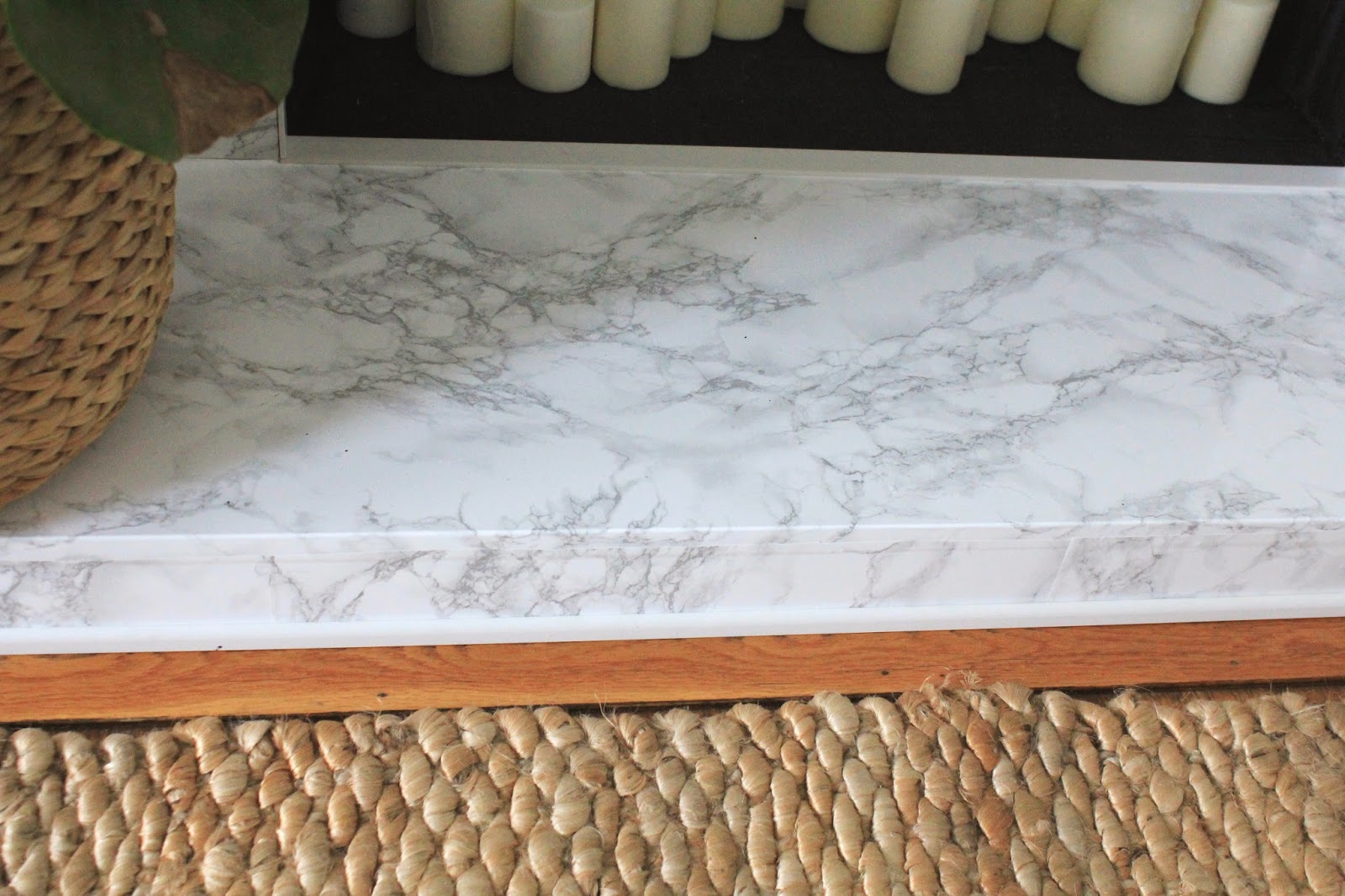
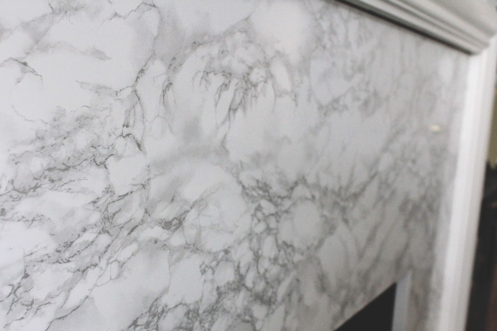
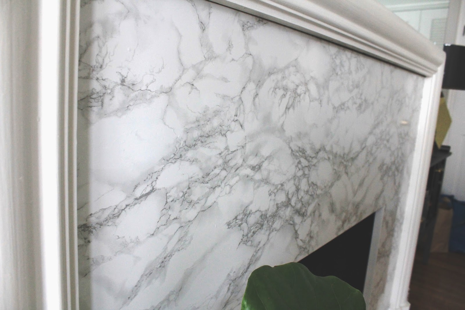
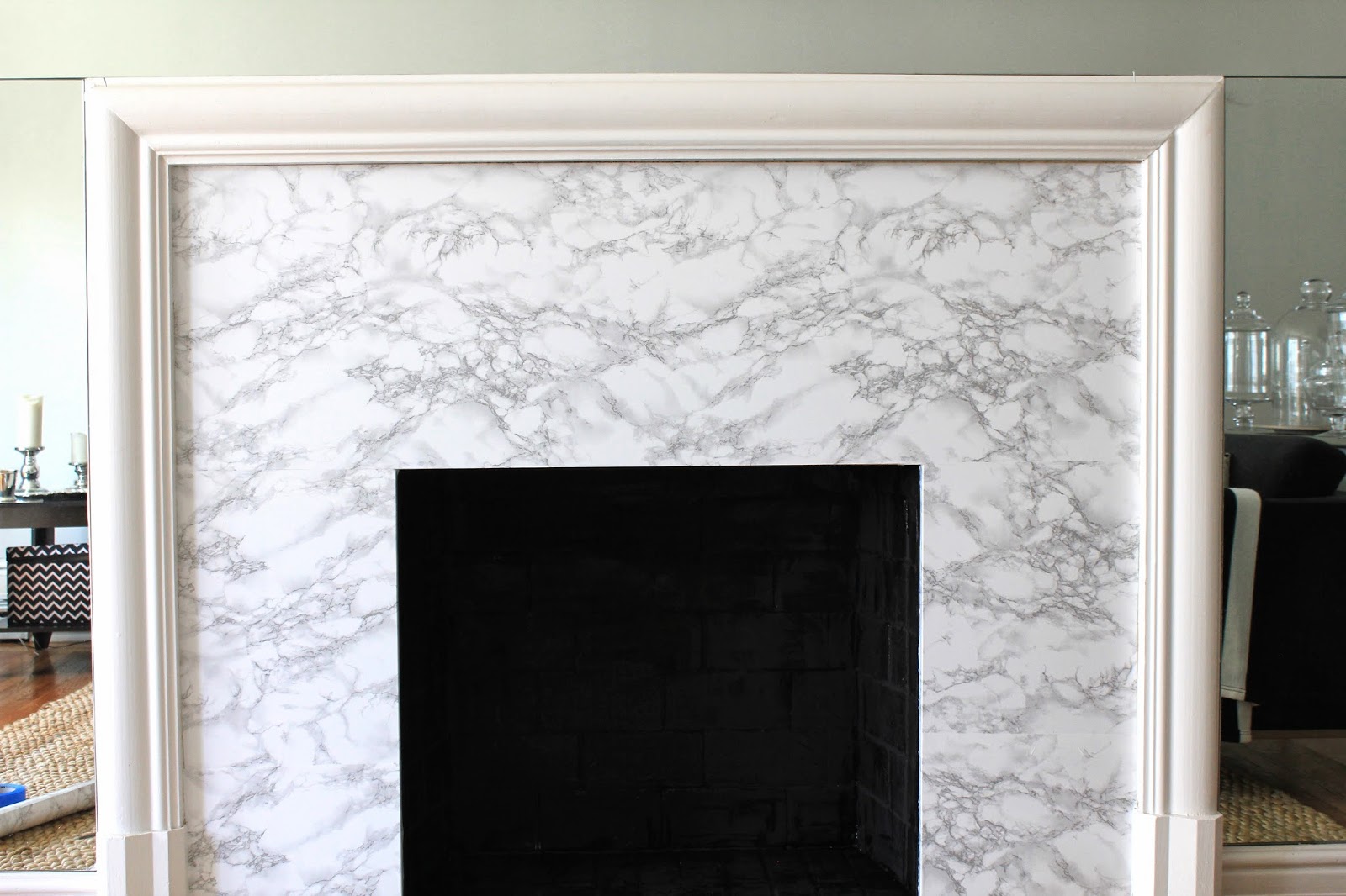
I also updated the fireplace.

I posted about that process a few months ago, and we’re still loving the updates.  The stone that was there was not very beautiful to begin with, and was so dirty and cracked – even scrubbing it, the years of soot were not going anywhere.
Here’s a close up of how it looked before:
Let me also add, that this “before” picture was taken AFTER scrubbing and scrubbing… the dirt was not going anywhere.
Here was how it looked during it’s facelift:
And a few more pretty afters:

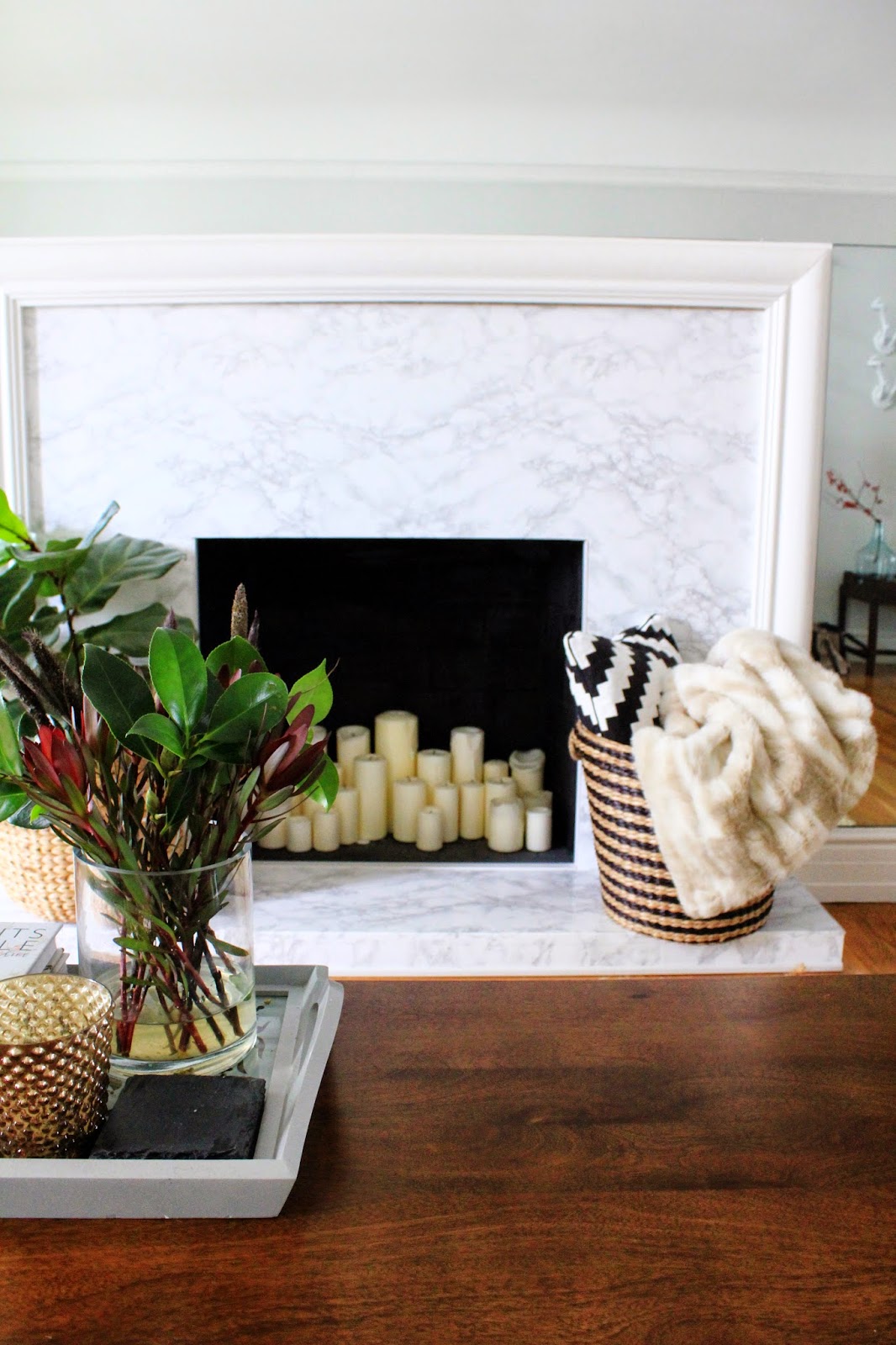
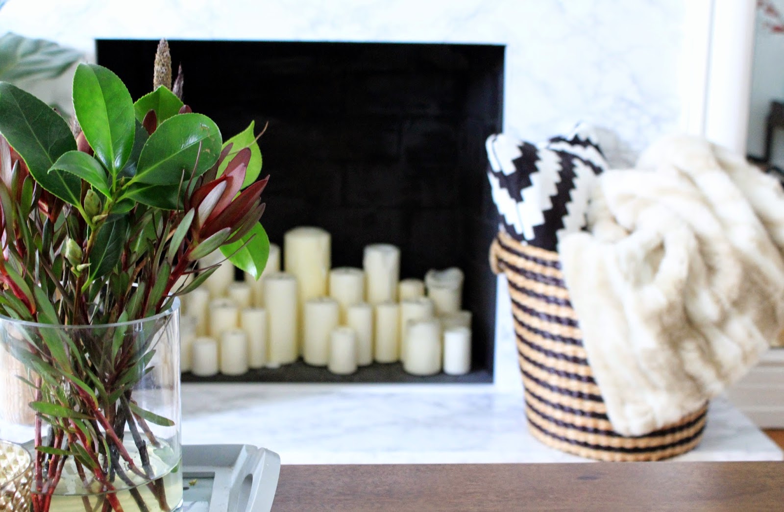
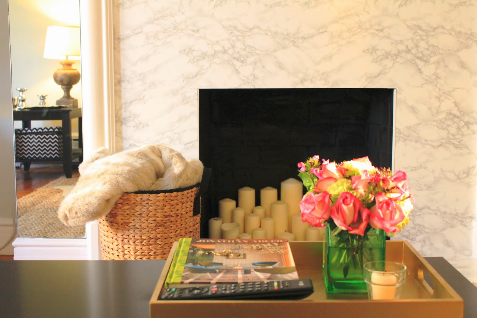
Inside the fireplace, you’ll notice an abundance of candles.  I would NOT light a fire in the fireplace at this point.  It hasnt been used in years, it likely is full of soot and god knows what else, and I don’t want to risk setting this building on fire.

So candles are a good alternative – they are super cozy at night when they’re all lit, and in the day, they offer a pretty architectural element.  As we burn them, I love the wax drips that come down the sides.

The contact paper is holding up really well, and everyone who comes over always comments how much they love it.  No one knows it’s not marble, and I’m certainly not going to be the one to tell them 🙂  Read about the whole process here.

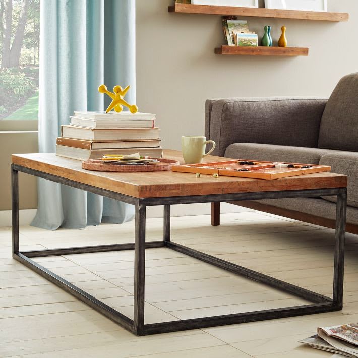
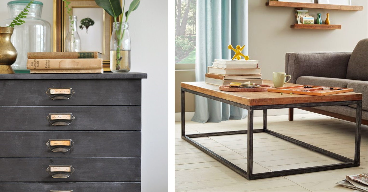
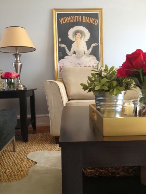
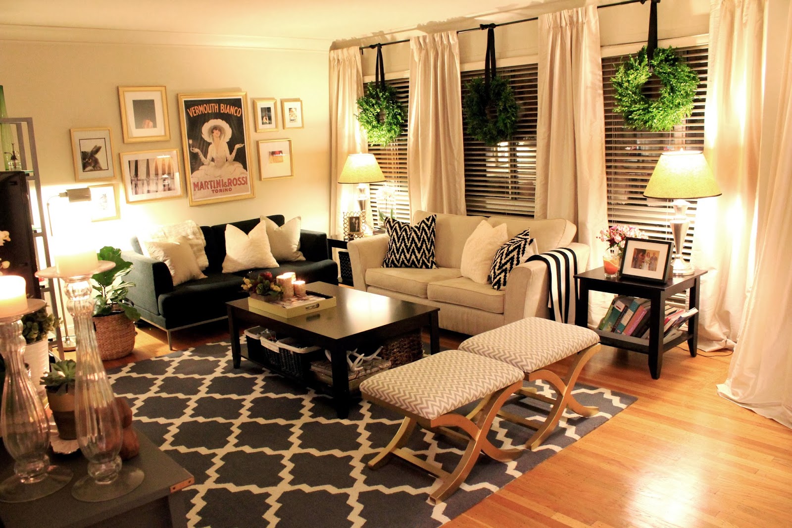
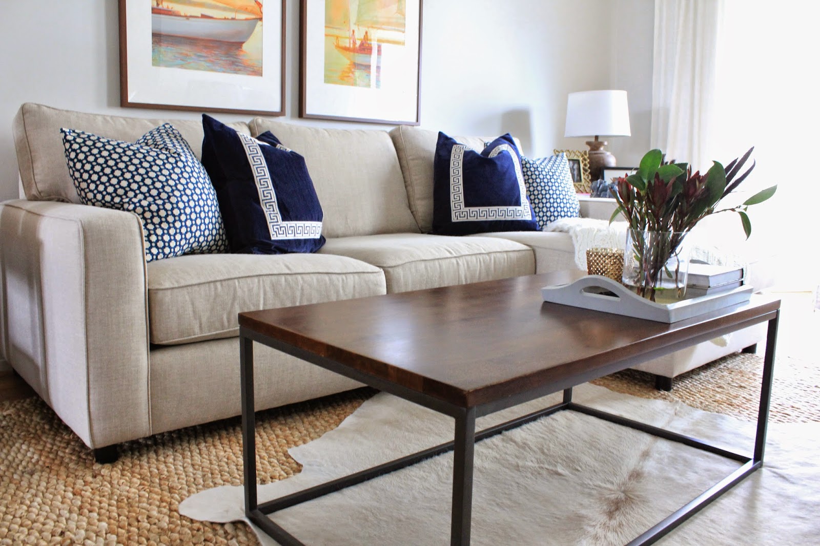
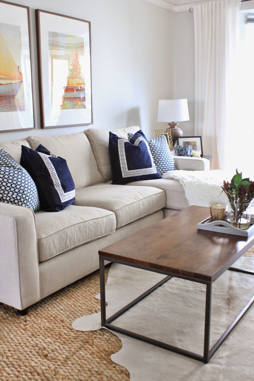
Another update?  The old coffee table (which was part of a matching set) got sold to a new home on Craigslist, and we replaced it with this beauty.

This is the Box Frame Coffee Table – Café from West Elm.  Overall, we’re really happy with it.  The wood is such a pretty warm color, the metal frame is incredibly sturdy, and without the storage shelf on the bottom that we had on our last coffee table, it invites less clutter, and looks really open and light.  My ONLY complaint is that it scratches easily.  It came with a few small scratches in it already, but after waiting for months for it to be delivered (it was back-ordered) the tray camouflages those little scratches, and some good wood oil also helps them disappear.

Padded coasters are our best friend.

You might also notice that those awful mis-matched love seats are gone.  Woooooo hoooooooo!!

They’ve also gone to greener pastures on Craigslist, and we replaced them with the BEST sofa ever made.  It’s the PB Comfort Square sofa, with chaise from Pottery Barn.

First I want to say how much we love this couch.  Second, let me say that Pottery Barn was THE WORST company to work with from a customer service perspective.  Truly awful.  I won’t go into all the dirty details on here since everything ended well, and we love the sofa so much, but if anyone wants to hear about our experience, send me a private message.

What we love most about it:

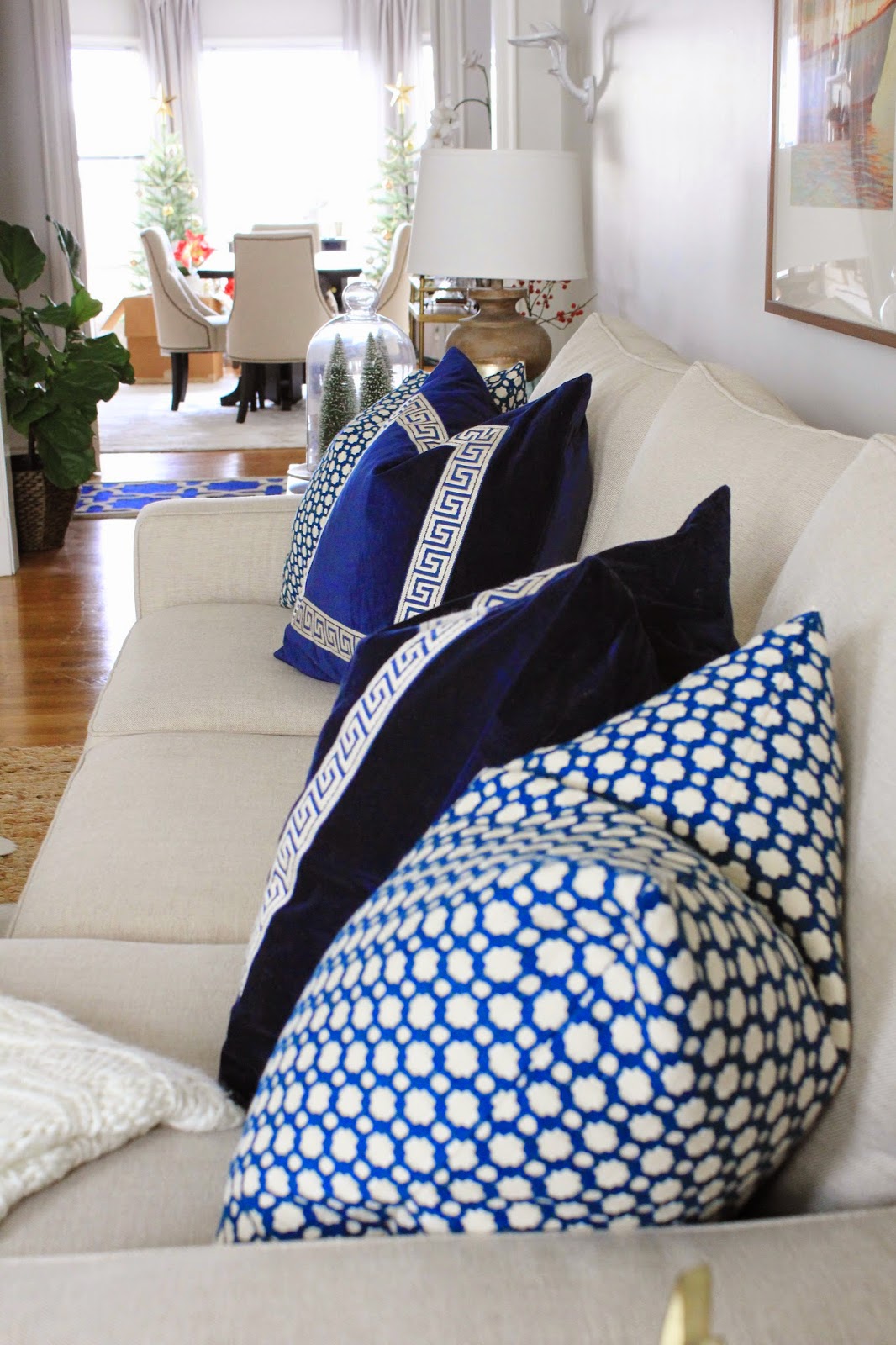
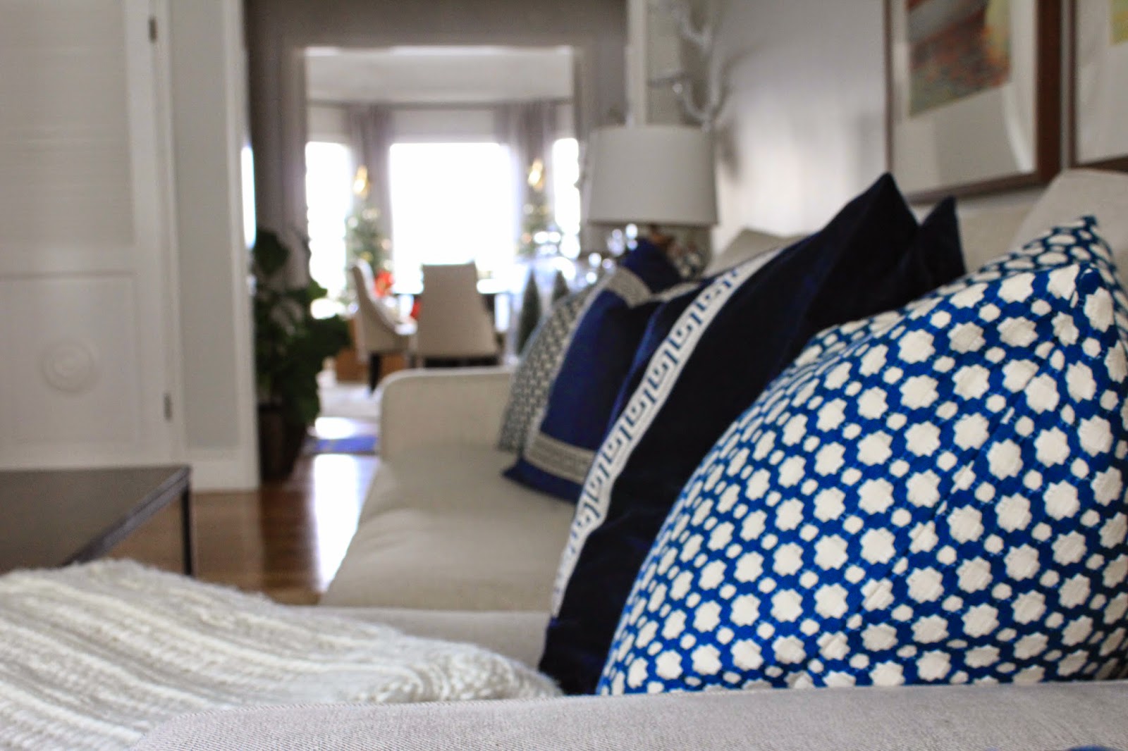
It has really deep seat cushions, a nice high back, and it’s BIG.  It looks kind of dainty in these pictures, but Kris and I can both lay down on it without touching – he’s 6’3″ and I’m 5’8″.  The pillows on the sofa here are 24″ square, so you can really see how large it is from a scale perspective.  It’s amazing.

A few more glory shots of our amazing sofa…

We got the cushions filled with down, and let me just say, it’s worth the extra money my friends.  Not only can we re-fluff the cushions, but it adds this element of sinking in and being so cozy when you’re curled up on it in the evenings.

Here’s a close-up of the fabric.

Displaying IMG_3524.JPG

We ordered the Textured Twill in Oatmeal after seeing it in the store on another sofa.  It is really durable for scrubbing IN CASE something spills, but has the look of a more organic linen which I love.  The other twill options are flat looking – similar to denim almost – and this color is wonderful at masking everyday wear and tear.

Kris was the one who wanted it, and he could not have made a better call here.

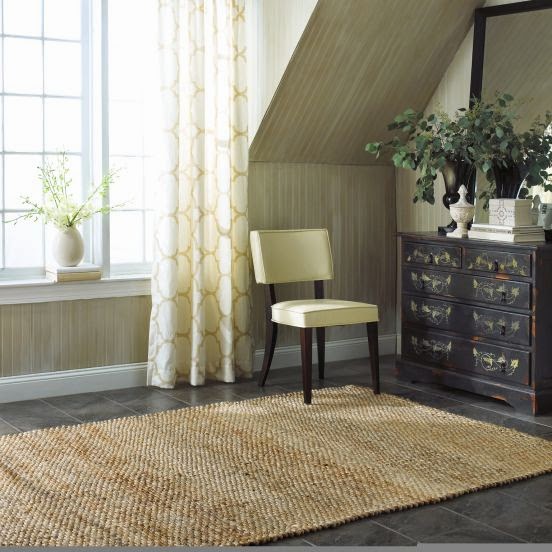
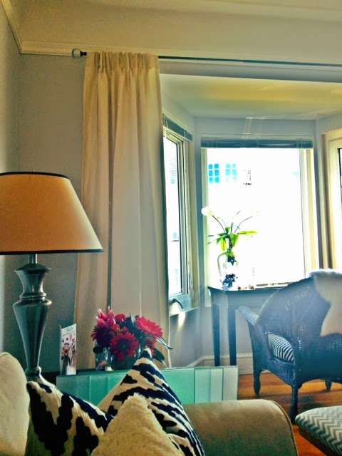
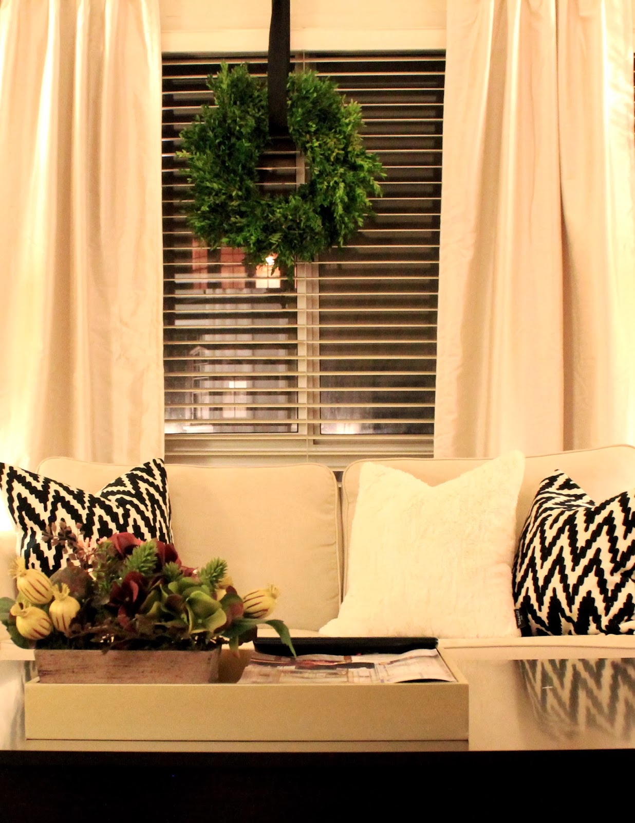
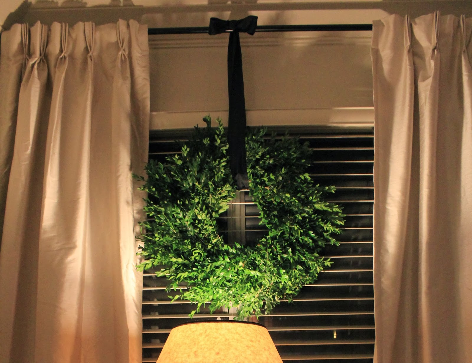
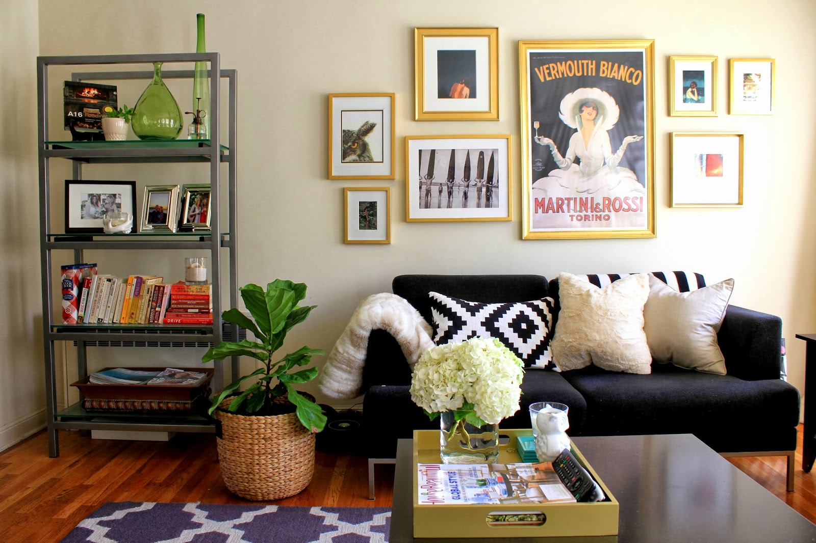
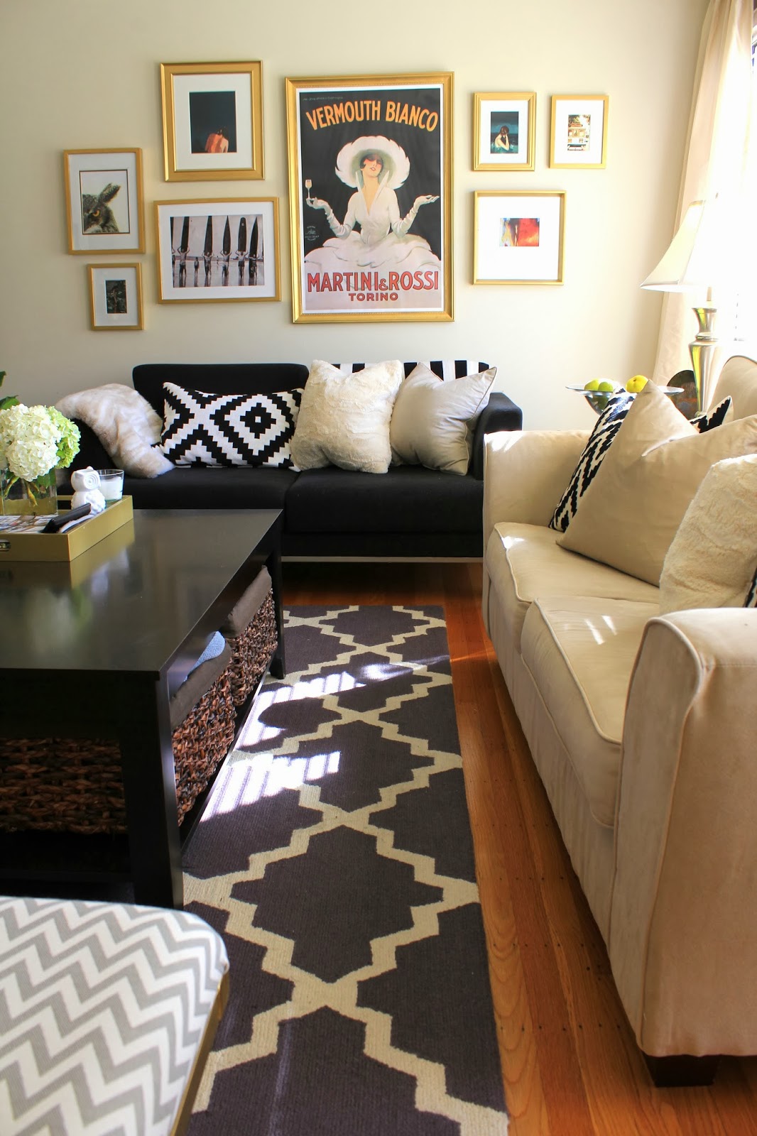
Final details?  The new lamps, the woven rug, layered with the cowhide from our last apartment, the new pillows, and long white linen curtains.

I ordered the pillow covers off of Etsy, and agonized over which to get.  I loved the large greek key trim, but matching the navy velvet was tough.  I wanted a small scale print to coordinate, and ended up with this Schumacher fabric.  I love the heavy weight of each – perfect for the colder months right now, and my mom and I are working on others pillow covers that we’ll swap in for the spring / summer months.

The knit creme colored throw was a find at Ikea (of all places), and it’s so cozy, and adds a bit of texture to the sofa.  It also lives on the chaise lounge, and protects the sofa from dirty feet.

You can kind of take a peek into the entry and the dining room, but more updates on those spaces later…

The lamps are from Target, the side tables were the ones we had in our last apartment, and while I wasn’t crazy about them before, they don’t bother me anymore now that the big bulky coffee table is gone.  They just sort of blend into the background, and the idea of replacing them is in the very very VERY distant future.  Like years maybe.

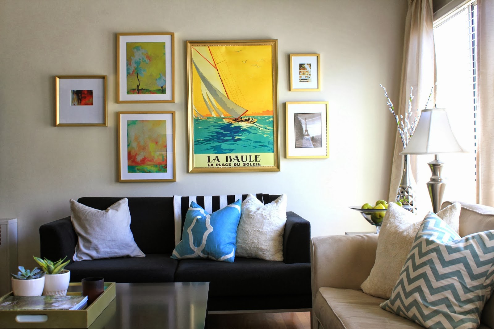
The large frames are from Ikea also.  A great find – the wood ties in with the coffee table nicely, and you cannot beat the price for a frame that size.  The sailing prints are from Art.com, and as my dad aptly pointed out, I’ve hung them in the reverse order.  It’s actually two prints of one single boat!

Oops!  Need to rehang those…..

There are a few last pieces to finish to room off – a nice chair to fill in the seating area around the coffee table, a small side table for placing cold drinks, and a few more small details, but I’m really happy with where we’ve come in the last year.

It feels clean, refreshed, and is incredibly comfortable and welcoming, which to me was the most important part.  It was impossible to lounge around watching movies on those old teeny love seats, and all the furniture we’ve got now, are things I want to keep for a long, LONG time.

OH!  And I almost forgot one of my favorite things… rounding out our coffee table is the new book from Erin Gates – Elements of Style.  I love her so much, and her book is absolutely beautiful – from the striped spine that kills me, to everything inside.  One of my favorite books to flip through – not a surprise coming from her #designporn

So that’s where we are!

It’s taken a year to get here, and I’m sure that there are more (minor) changes to come, but I’m so happy with the space as it stands now, and let’s be honest… I’ve got a wedding to plan, so our house will be the furthest thing from my mind in a few months.

Next update coming your way… the dining room!

Happy Monday friends!
xoxo

Our Hamptons Inspired Living Room…Coming to Life

Hey guys!!  Just wanted to check in with you – we’ve been making some real progress on the house which I swear I’m working on photographing and posting.  The deck is well on it’s way, the dining room is in a good place (for now) and our kitchen nook has officially become Kris’ office (and my little DIY spot for sanding, painting, building, and re-vamping).  It’s been a huge mess for the most part over the last few weeks, but I have a few photos in a cleaned up state.  I hope to share with you later this week!

In the meantime I wanted to check in with you all on our living room.  Last time I posted about it, I’d talked about the new sofa we bought, along with the new coffee table.  Neither have arrived – actually the coffee table was supposed to be here this week but the delivery date has been pushed back.  SO FRUSTRATING.

Anyway, in anticipation of these two key pieces arriving, I put together a final inspiration board for how I see this room coming together.

It looks something like this…

I’ve been putting in A LOT of thought to how I want it to look, and feel.  I’ve posted some inspiration photos that I keep close to me at all times.  I’m still feeling really drawn to a more organic, preppy, “Hamptons” look.  Woven rugs, pretty wood in the coffee table, lamps, and picture frames, and LOTS of white and blue.

It just feels so fresh and calm to me.

Most of the details in this inspiration board are already ordered or purchased, but the finishing details are still in flux.

What still needs a decision??

The pillows – I’m planning to enlist the talent of my lovely mother to help me make larger 24″ pillows for our now much larger sofa.  Right now we have 20×20″ pillows, which are nice, but since the new sofa will have a back close to 10″ taller than our current love seats, we are going to need something beefier on the sofa, so they don’t look dwarfed.  I noticed that Pottery Barn was using 24″ squares on their sofas, and loved how it filled the couch out.

In terms of fabric, I’ve been toying with many different patterns but one thing is for sure – a small scale blue and white stripe is happening.  I’m leaning towards the Covington Darlington pattern in the Mariner colorway.

I found it at Joann’s in person, but can’t seem to find it online now!  Grr!  It actually does not look quite so vibrant in person – its just really pretty and nautical.  Love.

Having this small scale stripe will read as almost a solid and will allow me to experiment with a larger pattern on the other pillows.  I learn slow, but I learn well people!

I definitely want some sort of Ikat or “enthnic” type pattern.  Not sure if that’s the right word.  Tribal?? Worldly?  Who knows… not that concerned with labeling it to be honest.  A few patterns I still looovvvveeeee??

Duralee Kalah Blue.

I’ve posted about this one before, here and here… and I’m still totally in love with it.  So much.  It’s just such a classic, and the blue is so rich and pretty.

Also, loving the Robert Allen Khandar Indigo.

I loved that the blues in this one were more light, and the background was a crisp white fabric.  But is it as classic as the Kalah blue??  Will I love it long term?? So confused.

And the final option that keeps coming back to me is the one I used in the mock up… the Duralee Woodblock Print in Indigo

Just love.  Almost as much as Kalah blue – it’s more imperfect and handmade looking, whereas Kalah blue is more refined and “fancy” feeling.  Do you agree?

Still not sure which fabric to order, so if you have an opinion, I’m open to hear it!!

Other “up in the air” details – the art.  I have the frames, but no art.  I’ve been agonizing over this a bit because I haven’t found anything I am obsessed over.  I like the sailing prints I used in the mock up, but I was really hoping to find something with more blue in it.  We have quite a few “warm” colors going on in the sofa, the natural fiber rug, the baskets, the wood table… I don’t want to make it TOO warm. Does that sound weird?

I haven’t ordered the prints yet, but I do like them.  Very calming colors, and they make me think of my dad (who loves to sail), and I really love that.  I definitely want to make a decision soon though so that the walls don’t stay empty for long after the sofa arrives.  Since we’re getting rid of both love seats, and the new coffee table is a smaller scale than our current one, the room is going to feel a bit empty at first… especially because we don’t have anything to replace the second love seat with yet.

We are thinking of putting a chair in it’s place (like the inspiration mock-up), and that’s the last “big” piece we will be purchasing for this room.

I want something comfortable.  Something you want to sink into, but also something tailored.  I found this one at Ballard – it’s the Manchester Chair:

Definitely want to check out a few other sources like Macys, since they are always having amazing sales, but I love that you can pick your fabric on this one…

Kris keeps pushing for a recliner – woof.  In his defense, we saw one at Room and Board that was a caramel leather, and really sleek – no clue it was a recliner, but it still wasn’t really my taste.  We will see – if we can find one that is a compromise of comfort and style, then maybe I’ll eat my words, but when I think of a recliner, I think of something like this, and that makes my stomach turn.

Anyway, that’s where things stand as of now!  Hopefully, next time I’m talking about the living room, it’s to post pictures of our fabulous new sofa!!!  Yay!

Fingers crossed that it doesn’t get delayed like the coffee table!

xo

Plans for the Living Room

Soooo… there hasn’t been much news on here about what’s going on in the living room… and that’s because not a ton has been going on in there since our fireplace update.
I need to take some “before” photos, even though they’re more “during” photos – while the rug from the living room of our last apartment has made itself a new home in our bedroom, the furniture currently in there is the same as before for the most part.  Here’s a little refresher from before we moved:
Two love seats… lots of dark fake wood furniture…  I did the best that I could with what we each brought to the apartment together, and we made it work for two years.  I actually kind of liked it once I distracted from all the things I wasn’t loving (black man couch… super duper modern everything…)
Well, things are about to change… and SOON!
We just bought THIS sofa from Pottery Barn a few weeks ago. It looks a bit dwarfed in this photo, but it’s big.  Really big.  And sooooo comfortable! I can’t even put it into words.

We opted for the upholstered version and it’s being made for us in this fabric:

It’s got a subtle texture like linen, and little nubby bits here and there, and it’s perfect.  PERFECT.

I originally wanted white, but everyone talked me out of it.

I mean I get it – it’s just not practical.

I already know how anal I’m going to be once we get our new sofa.  People will have a glass of red wine and I’ll be holding my breath the entire time.  And with a white sofa… I can’t even imagine the sticky baby fingers of the adorable blonde babies we’ll eventually have near this thing.  This sofa is an investment for us… something we see having for the next 10 years (at least), so I figure a textured fabric with a little grey and a little tan will help mask spills, and dirt over time.

We saw this fabric on a sofa in the store (photo below), and absolutely loved it – Kris was actually the one who noticed it.  The below picture is a really accurate representation of how it looks in real life. Much lighter than the above swatch, and I’m hoping I love it as much when this thing arrives in another month…

I’m also thrilled that we’ll be getting rid of our current coffee table in the very near future.  After buying the new couch, we also bought the Box Frame Coffee Table from West Elm.  God I love that store.

Anyway, scroll back up to the picture of our old apartment for a reminder about what our current coffee table looks like.  I HATE the storage on the bottom.  It was practical for our apartment that literally had NO storage… but it always looked so cluttered.  Under the coffee table was where half of our Christmas decor lived for 11 out of 12 months of the year.  I only wish I were kidding.  Awful.

It was cluttered, and really detracted from everything else.  Plus the enormous dark coffee table was so huge, and manly.  Just this huge dark blob taking up an un-godly amount of room.  I can’t wait for it to go away.

Already in our new place, we have a new rug – it’s a nubby natural fiber jute rug (same one as the below picture), and it just makes things feel so light and bright.

With it I’ve layered our white cow hide that I adore.  I don’t know that I’ve really ever photographed it for the blog but it’s great… there’s a picture of it in this post.  With the new coffee table, you’ll actually be able to see it!  Hooray!

In the meantime, I’d been waffling between getting new side tables or trying to revamp what we’ve got. In the end, I’m going with the “revamp” option since there are other high ticket items on my list ahead of “new side tables”.

What to do with them??

They currently look something like this (except the top is solid “wood”) – you can see them peeking out in the first photo of this post if you need a real reminder.

They are fine – simple enough lines, functional.  I don’t HATE them the same way I really hate our coffee table, but the fake wood veneer kills me.

I just haven’t really known what to do with them to change them into something that I’ll like, and it has been plaguing me… ok that’s admittedly a bit dramatic, but it has been on my mind.

Anyway, a few weeks back, I saw this little makeover on the below chest of drawers, and knew instantly what I wanted to do…

Chalkboard paint.

No priming needed.  They look sort of like zinc which has the coolest finish, and I think that they’ll fit right in with the more earthy palette we’ve got going on.

I mean how great does the finish on those (faux) drawers look??  Answer: amazing.

I also think that that finish will tie in really nicely with the finish on the frame of the coffee table:

I mean… right?????

So good.

Other things to think about for the living room..

Art.  That’s been on my mind quite a bit lately…. some updates for you there (hopefully) soon.

Throw pillows – I want to stick with more classic patterns, and I’ve really been drawn to a white and cobalt color-way.  I’m also open to other shades of blue too…

Side chair – now that we’re getting rid of both love seats (hooray) and replacing them with one sofa, we’ll need a chair to go where one of the love seats currently is.  Should we do a solid neutral?  Too boring? What about a subtle pattern? Solid color? Something bold?

I don’t know people.  There is still lots to think about, but soon it will be coming together, and I cannot wait.  Seriously… CANNOT.  WAIT.

More updates coming soon… I hope!

Fireplace Makeover

Happy Wednesday guys!  I wanted to share a project that I worked on over the weekend…
Our fireplace got a fairly substantial makeover!
We are so lucky to have a fireplace in our apartment, but as the focal point of the room, it had been looking a little sad…
Here’s the evidence:

It wasn’t terrible – but it had certainly seen better days.

From far away it doesn’t look SO bad, but up close the stone was really dirty (and this is after about 45 minutes of scrubbing).  It also had several deep cracks running through it.  Nothing non-livable, but I’d been scheming about a fireplace update for a while.

See – up close you can really see the permanent grime and the cracks.

The stone was also really yellowed, and wasn’t very pretty to begin with so I was confident that I could improve upon it’s facade.  I had seen several DIY projects that got the wheels spinning.

On SMP Living they did a hack on an Ikea table that turned out amazing

On A Thoughtful Place she tackled a small countertop in a similar fashion…

And over at I Heart Organizing, their coffee table got a sweet makeover with marbled contact paper.

All the makeovers had turned out really well, and the contact paper looked gorgeous in the photos.  After kicking the idea around for a few days, it seemed easy enough to tackle, so I placed an order for this roll of carrera marble contact paper.

I will say, when I saw the price tag, I was a little surprised, but $65 isn’t a deal breaker – especially when the stone was in such bad shape.  I’d also looked into less expensive options on Amazon, but after reading some mediocre reviews I pulled the trigger on the more expensive product.

I later realized it ended up being the less expensive option in the end!  The other rolls of contact paper did not have enough for me to cover our entire fireplace, but with this roll, there is 50 feet of contact paper.

I win!

Here is the first piece of contact paper after I got it installed on the fireplace.  One long sheet covered quite a bit of the fireplace front, and so even though I wrestled to get to to lay straight and flat (no bubbles) I still had to peel it off and redo it a few times.  Regardless of the several first attempts, it went up relatively quick.

An extra pair of hands would have been helpful, but since the contact paper easily peels off without loosing it’s stickiness, it was totally fine.

I made my way row by row, and did my best to match up the marbling pattern on the seams – it doesn’t have to be perfect – no one is looking THAT close – but I didn’t want it to be super obvious.  If you’re doing a smaller space, or you don’t mind wasting a bit of the contact paper to get it to line up perfectly, you should definitely try.  I was covering a large surface, and didn’t want to run out halfway through, so I went for “close enough”.

I measured the width carefully, and then added a few extra inches than I’d actually need before cutting it out.  Once it was up, I then used an exacto knife to cut away any excess on the sides.

After this point I was feeling good… the contact paper was going up quickly, and I’d finished the majority of the front in just about an hour, but it quickly slowed down from here…

Cutting around the molding proved to be a HUGE pain in the butt, and much harder than I’d anticipated.  I wasted a few sheets of contact paper, so it was a blessing I had plenty to spare.  I found it was easiest to leave the paper backing on while tracing the molding around the contact paper as best I could, and then cutting it out roughly, adhering the paper down, and then cutting off the rest.

There are still a few spots that aren’t perfect in those tight nooks and crannies, but I’m not going to sweat it.  It’s pretty well camouflaged.

Despite my exacto knife cuts, I found that when I finished the edges looked so raw still.

Not loving it.  You could really tell on the edge that it was contact paper, and not actual marble.  Ignore the messy cuts here – I ended up re-doing this section after snapping a few pictures.

Woof.  I literally could not stand it.  The seams were jumping out at me.

Pretend that these pictures actually showcase my handiwork after it was redone.  The edge between “marble” and wood still looked raw and unfinished, but the rest was smooth, and seamless.

The edge where the contact paper met the brick interior, it was also pretty raw and ragged looking.  I needed a solution.

I headed to Lowes, and wandered around the store looking for the perfect thing to trim the edges with.  I originally was thinking something brass would be awesome.  The idea of trying to cut through brass was not so awesome.  I ended up buying some pre-primed and painted wood strips – the flattest I could find, and a pre-primed and painted quarter round piece of trim.

A few cuts here and there, and presto-chango… we had some very finished looking transitions between “marble” and brick, and “marble” and wood floor.

The flat ~1″ wood strips trimmed out the mouth of the fireplace between brick and contact paper, and really cleaned that up, while the quarter round finished off the area between the wood floor and the hearth.

BOOM.
It looks pretty amazing right??  I mean the trim is so subtle that most people wouldn’t notice, but it really changes everything, and takes this fireplace from “pretty good”, to “finished off like a pro”.
A few areas still need a bit of caulk to fully seal the gap in the seam between wood and “marble” but it’s looking SO GOOD.

I also have to say, taking my time, going slow, being careful to keep my cuts straight, and being meticulous about smoothing out every air bubble really paid off.  Even when it meant peeling off the contact paper, throwing away a wasted piece and re-doing it… it made all the difference.  It looks SO REAL now that it’s finished.  You’d have to get your nose right in there to tell it’s contact paper.

Because of the cracked, pocked marked stone underneath, those imperfections show through the contact paper a bit, but I think it actually makes it look a bit more authentic.

As for the air bubbles, they really are unavoidable as you smooth the contact paper down over the surface.  Try to get as much out as you can by pressing hard and smoothing the air out to the seams before fully sealing it down, but for the small stubburn air bubbles that remain, use a pin to pop them (I just used an earring since we didn’t have a pin).  Poke a small hole in the middle of the air bubble and smooth out the contact paper around.  The air will squeeze out of the hole, the teeny tiny hole disappears, and there’s no more air bubble.  Everyone wins.

I found it was really helpful to use a towel when pressing the contact paper smooth (instead of a rubber squeegee or credit card).  The instructions on the back of the contact paper said to use a towel, it it was great.  It spared my little fingers quite a bit, although I did end up with a little blister on my thumb from all the pressing.  Totally worth it though.

I mean, this is as close as it gets… pretty real.  The colors are really crisp, and the marbling is really pretty.

Here is a close picture of one of the seams – as you can see it doesn’t line up perfectly, but close enough, and the seam is WAY LESS noticeable than it had been with the old stone facade.

Look at the seam now from far away… it’s hardly noticeable, and certainly less noticeable than it had been with the original stone (in case you’re having a hard time finding it in the picture below, it’s perfectly lined up with the top of the fireplace opening).

For comparison’s sake, here’s a picture of the seam on the original stone – it was pretty obvious.

Finally, I want to talk about a second update to the fireplace that you probably didn’t notice… look inside the fireplace at all the discoloration – the black soot, and the ashy grey stone.
Ugly.
Enter a can of this high heat paint from Rustoleum.

I’m 90% certain this fireplace is non-functioning… it certainly hasn’t been used in at least the last 5 years… but functioning or not, the last thing we need is to light this building on fire.  I don’t want to test this out, so we’re not going to light any fires in here.

That said, this high-heat paint is meant for projects like this, so in case it ever does need to be used, we’re good to go.

The paint was much more liquid-y than normal paint – almost like oil – and was super stinky.  Open the window when you use this!  Luckily, it went on in one coat, and dried relatively quickly. Now the inside of our fireplace is a uniform solid black, and the perfect backdrop for all our pretty candles.

I got the idea from Emily of Cupcakes and Cashmere who had a similar set-up going at her old house.

I think the white candles against the black is really dramatic and pretty, and now it’s so romantic at night.

So that’s it – a little elbow grease, creativity, and about $80, and our fireplace has a whole new face!

What do you think of my little makeover?  Was it worth the blister on my finger, and about 5 hours of work?

A Little Bit of this… A Little Bit of that…

Hello hello!  Hope you all had a great weekend!

I feel like the last week has been a complete whirlwind, between our trip to Mexico – which now feels like it happened about 4 months ago – my actual birthday, catching up on work, and some projects around the house.

Can I please be back here already?? This was the view from our room, and the porch was so private and lovely…

Could be a Corona ad, right??

Seriously the perfect way to ring in the big 3-0.

On a different note, our apartment is really coming along!

I need to dig out the DSLR camera from whatever box it’s still packed in to take some GOOD photos of the progress we’ve made on the house so far.

Remember how I’d painted the living room the wrong color grey?

Well I lived with it for about a month, and on Sunday couldn’t take it anymore.  I spent most of the day yesterday re-painting, and it’s now a softer, lighter, brighter color of grey, and it’s pretty much perfection.

Here is a progress picture…

In this picture, you can REALLY see how much darker (and more blue) the first color of grey was.  It looks almost purple in comparison to the first coat of the new paint.
The next picture shows the final “after” of the paint… so light and bright and neutral, which is exactly what I was hoping for!

I snapped this picture really quick on my phone, in the late afternoon when this side of the house gets darker, but even in the low light, it still is so bright!  This color has changed the entire feel of the room!

Remember this post when I had been going back and forth between two shades of grey – either Grey Owl or Intense White, both from Benjamin Moore.  Well, when I went to have the paint mixed up, I walked into the store with my mind set on getting a gallon of Grey Owl at 50% tint – this was the color I’d painted the dining room in our last house, and I figured at 50% tint, it would be even brighter and reflective.

Despite my original decision, I left the store with a gallon of Intense White.

I’m not one to usually change my mind last minute – especially after agonizing over a decision – but I chose Intense White over Grey Owl for a few reasons.

First, the guy mixing the paint said that there is no “recipe” for mixing a color at 50% tint, so the result wouldn’t necessarily be a lighter version of Grey Owl – it might end up more blue, or more beige than intended, and that all he could do was mix an approximation of the 50% tint, and record exactly what was mixed in case I wasn’t happy.

Too risky.  No thank you.

I do not want to paint our living room the wrong color for a second time, and end up needing to paint again.

After that conversation, Intense White was the obvious choice for me – it is actually on the same paint chip as Grey Owl, but is one shade lighter.

The Benjamin Moore paint guy also taught me about the light reflection value (LRV) assigned to each Ben Moore paint color. The number indicates how much light gets reflected vs. absorbed by the paint color.  The first grey I’d painted our living room had a LRV value of ~61, meaning that ~40% of all light got absorbed by the paint color, thus making the room feel darker than it was.  Grey Owl had a value of ~64 (slightly better but not that much) and Intense White had the most light reflection of all these options with a value ~74.

This little tid-bit of info has changed my life.  The light index is a game changer!!

Anyway, I am thrilled with how it all came out, and can now focus on other living room updates I’ve been wanting to make… like on the fireplace… coffee table… side tables… and a new sofa (how long have I been talking about a freaking new sofa???)

Another sneak peak I’ll be posting about soon?

Oh yeahhhhhh!!!  Can you guess where this is?

Happy Monday!
xoxo

I’m not going to make another 50 Shades of Grey Joke…

Oops… couldn’t help myself.

Anyway, I’d posted yesterday about how I made the blunder of painting our living room the wrong color of grey.  That is not going to happen to me a second time around, so I’ve invested many hours since Saturday into researching grey paint colors.

You may remember that I already did quite a bit of legwork on the topic of grey paint last year when I painted the dining room of our last apartment – I’m almost an expert on this topic at this point.

My requisites for the perfect grey:
   1. It must be a very light grey
          *I don’t want to make our living room that gets great light feel like a dark hole.
   2. It cannot have ANY blue undertones
          *I already made that mistake – blue undertones = cold

With that list of requirements, I have narrowed it down to two options:
    – Option 1: Benjamin Moore Grey Owl 2137-60 (but with half-strength tint)
    – Option 2: Benjamin Moore Intense White OC-51

Grey Owl was actually the color that I used in our last dining room (per the recommendation of Emily Henderson), and to put things mildly, I LOVED it.  It was a very pale, true grey, and it reflected light beautifully.  Intense white is a color I recently discovered on several designers’ lists of no-fail paint colors.

Grey Owl is a definite “color” where Intense White comes from Benjamin Moore’s Off White color collection, but you can see how CLOSE they are to one another.  That said, I plan on lightening the Grey Owl (if that’s the route I go) by 50% so it will be even a bit brighter than this sample… a very close match to Intense White.
Intense white has a SLIGHT tan undertone, but it really is minimal.
Want to see some examples of each??
I knew you did.
Here are a few rooms in “Intense White”:

Intense White is a wash of color – nearly white but you can see that next to the white crown moldings in most of these photos that it’s not White.  There is contrast, and that is just exactly what I’m looking for.  Contrast, in a non-color color.
And here is a beautiful space with Grey Owl, where the tint has been cut in half:

I already know which one I’m leaning towards more, but I’m curious to hear your opinions!  Which do you prefer?

Is there another light grey color that I’m missing and should consider as well?

One step forward, two steps back…

Hope you all had a fabulous long weekend! Our was spent unpacking A LOT, organizing, and purging of all the stuff we don’t need.  There is a LONG way to go still, but any progress feels good!  In between all the unpacking, and seemingly endless errands, we enjoyed some pretty sunsets off the back deck…

… we also started up season 2 of House of Cards… in bed… with coffee.  Such an indulgence!  Side note: is anyone else as obsessed with Kevin Spacey as I am??? I love evil Kevin Spacey and his saucy southern accent.

And my honey got me some absolutely GORGEOUS flowers for Valentines day…

Aside from smelling the roses, admiring pretty sunsets and watching TV in bed, I made some progress on the living room… kind of.

I painted.

It all started out great! All the holes were getting patched, cracks, chips and wall scuffs from four years of wear and tear were getting covered up, and the paint was going on as a pretty light grey.
I even had a little fun with the paint before rolling the walls out…
All fun and games right??
Wrong. 
Somewhere between belting out a Taylor Swift song, and starting in on the second coat, the paint started to dry.
That’s when things took a turn…

While I was confident at first, the paint was getting darker and darker as it dried… and more and more blue.

Nooooooooooo!

In direct light it wasn’t so bad, but the blue (lavender almost) undertones were feeling very “baby boy’s room”.  Let me tell you, after painting all day, this was NOT the look I was hoping for.

Can we say dark dungeon??  Ugh, it is not good my friends.

Granted, it was a rainy day, and this picture was taken in the late afternoon… but still.  STILL.  It’s like purple in the above picture!  Ick!

To add insult to injury, the warm lamp shades, tan sofa, and creme colored curtains I hung afterwards weren’t helping matters…  The yellow tone of them accentuated the blue even more.

In this next picture you can see how yellow the curtains looked next to the “grey” and how blue the grey looked next to the creme colored curtains.

Ignore the weird colors in this photo – I used the HDR filter on my phone since the light from the windows washed everything out, but

That night I swapped out the creme colored curtains out for white ones, which dramatically improved things, but the walls still look very blue to me.

More bad iPhone pictures, but I just wanted you to see the grey walls in daylight with the white curtains.

The color is called Silver Screen (by Behr) and while the sample on the paint chip and on the lid of the can looked like a pretty pale grey, it reads as blue/purple on the walls.  Hello Monica Geller’s apartment.

Right??

Needless to say, I’ll be repainting in the near future.  For now it’s livable, but I have grand visions for this space, and they don’t involve lavender walls.

Ok, moving on….

Ok, so what do I see changing in this room??  A lot.
So far, we’re just working with everything we had in our last apartment, but I’m pretty adamant about selling some of this stuff, and replacing it with new things – namely, a comfortable new sofa (this is non-negotiable), and a new coffee table.  Those are the big items on my checklist.
I’ve saved the below pictures to my phone for inspiration in this room.
The name of the game is light and bright… classic, clean lines, and natural fibers.  
In the below photo, I love the bright pretty linen curtains hanging in this room, and the neutral linen couch.  It’s clean, and simple, and inviting.  Everything I want in our living room.

This next photo captures the simplicity and color palette I want – the true grey on the walls paired with lots of white.  It’s clean, inviting, and easy on the eyes.

I love the white sofas, natural wood elements and lots of greenery… so pretty.

And then of course, this next photo is one I’ve posted before…

It’s obviously decked out for Christmas (and has a lot going on because of that), but the pale pale PALE grey walls are perfection, along with the natural fiber rug, white sofa, and lots of black and white sprinkled throughout.

Now that I’ve made my mistakes with the paint on the first go round, I’m going for round 2, and this time, I’m determined to get the right color of grey.

The one thing I’m thrilled about so far??

My new natural fiber rug – it’s looking very handsome with the cowhide.

Stay tuned for more updates my friends…

Living Room Envy and Tartan

I am crazy in love with Erin Gates of Elements of Style.  She has great style – what I wouldn’t do for 5 minutes to paw through her closet – but her home is what I’m most obsessed with.  They bought this home roughly a year ago, and have been renovating pretty much ever since.

While we’ve had a few small glimpses into the new spaces (the kitchen for instance, and her fabulous stairs), she just posted a few first images into her newly remodeled (and styled) living room – it’s A-MA-ZING.  It’s been all done up for the holidays and it’s TOO GOOD not to re-post!!

Right?!?!?!

The neutrals, those custom draperies (with the taupe greek key trim)… and that brass rod??  So SOOO good.  The layered rugs (if you look closely you can see a sneak peek of a zebra print cow hide), the hammered brass and glass coffee table, the pops of green… oh my gosh, the antique buffet is so beautiful, and of course, that chair.  That chair is (in the words of Rachel Zoe) “everything”.  It is absolutely the crown jewel of this room (aside from her sweet little puppy).

Let’s have a closer look at it, shall we??

I mean…. stop it.  That chair is SOOOO GOOD.
But you know what subtle little accent I loved??  The tartan throw, draped over the arm of this awesome chair.
My sister and I had these adorable tartan holiday dresses when we were little girls, and I’ve always loved the classic look of this pattern.  
While it might be a little much to dress up in an adult sized tartan dress for the holidays, I love the idea of cozying up a formal feeling living room with a tartan throw.  You still get to wrap yourself up in the classic pattern, and its 100% acceptable…
I’ve gone ahead and rounded up a few of my favorites – some more affordable than others *cough* Williams Sonoma *cough* and all have distinctly different patterns.
Love!!
Doesn’t the camel version kind of look a bit “Burberry”??  There were a few other color-ways, but these were my favorites from Sierra Trading Post.

Williams Sonoma is WAY overpriced for their throw – double the price of any other option here, but it is an easy one-stop-shop, so if you’re running around for a last minute gift, it might be worth the premium…

Always a classic – and they come with a cute leather strap for toting this around on picnics… so cute.  Do I even need to say more??
This is actually a kid’s blanket, but who cares????!  You could totally make it work for a grown up’s living room, and it’s the least expensive version on this list.  It’s a win-win!
What is your take on Tartan??
Love it?  Hate it??  Is it something you’re planning to incorporate for the holidays??

We’re calling it "Pre-Christmas" Decor

Let me preface this post by saying, yes, I am fully aware that we haven’t celebrated Thanksgiving yet… 
But let me also just say, Thanksgiving is the latest it’s ever been… EVER… so since Thanksgiving is so excruciatingly late, I figured it couldn’t hurt anyone to hang a few harmless wreaths in our living room over the weekend….

I LOVE boxwood wreaths. Possibly more than any other wreath.  They are fresh and simple, and need no adornment, which around the holiday season – when the motto is “the more lights, tinsel, and general bedazzlement, the better” – a simple wreath is subtly festive.

In my case, I went with four subtly festive boxwood wreaths… for $10 each, how could I say no?!

I decided to hang them in each of the windows of our living room…

I absolutely LOVE LOOVVEEE LOOOVVVVVEEEEEE them.

The best part about boxwoods is that they dry so well.  These windows get direct sunlight all day long – pretty much from about 9am until 4pm, but boxwoods keep the bright green color even after they’ve dried!  Last year, I kept our wreath from the holidays, and hung it on our front door through the summer.

Now, I never normally take photographs at night in low light like this, but, with the wreaths in the window, I found it nearly impossible to photograph them during the day.  They were completely blacked out with the sun behind them in every shot , but I guess it’s nice to document our house with the cozy lamp light too… this is actually how I like our house the best, even though it doesn’t turn out in photographs so well.

God… we really need to do something about the coffee table – the bane of my existence.  Its SO scratched up on top, and the storage below is just not attractive.  Functional… yes, but I’m sure we could get rid of half that crap and not miss a thing.

Perhaps that’s something tackle next weekend… the decrapification of our coffee table… and then the selling of the coffee table and buying of a new one……….

Anyway… enough talk of my hoarding ways… let’s get back to my pretty wreaths.  Don’t you just love how they get a little up-lighting from the side lamps?
And notice my new lampshades… $5 on clearance!  Woot woot!!

Gotta love a good deal – ok last glamour shot of the wreath….

Hope you all had a lovely, productive weekend too!!

xoxo

Revamped Gallery Wall

It’s a subtle change to those that don’t spend a lot of time in our house, but our gallery wall got some revamping a few weekends ago…

I had been thinking of changing out the layout of our gallery wall recently, and then began toying with the idea of swapping out the art we had framed.

I know… the gallery wall had only been up a few months, but there was something about it that never felt 100% right to me. I LOVED the La Baule print that had been there before, and the punches of yellow and blue brightened things up in here over the summer months, but it seemed too bright for fall.

Here’s how it stood a few weeks ago…

The bright yellow and blue demanded other bold bright prints to help balance it, but the abstract prints to the left always felt too matchy-matchy.  I also felt that there were too few frames, and the frames were too homogeneous.  We needed more variety – in both the art and frames, and with fall on it’s way, I wanted more muted colors.

Originally, I’d been imagining a clean white gallery wall.  Here were a few inspirations I was looking at…

Gorgeous, right??
Well once I started collecting new pieces to frame, I kind of fell in love with the gold all over again.
Also, after thinking about it more, I realized that since the walls and curtains are so light, and a lot of our accessories and furniture are dark (dark rug, dark love seat – STILL NO NEW SOFA, UGH – dark coffee table, etc.) the room would end up feeling bottom heavy if the frames went white… too many dark colors near the floor, and too many light colors near the ceiling would make the ceilings feel shorter.  Not a good thing.
Long story short, we stuck with the gold.

This wall started with the Martini & Rossi Vintage poster… 
I actually had this hanging in my last apartment, and it’s one that I never tire of. The minimal color palate of black and white is simple, and the blocks of color keep it from feeling too busy.  Plus she is so pretty, and we DO love our cocktails around here… it was an easy decision to bring her back.

I then found an Etsy artist that I kind of fell head over heels for…

I admittedly went to town with her pieces, and it was a challenge to choose a few instead of adding all of them to my cart.  I am not kidding, limiting myself to just three was the hard part – there were so many that I absolutely LOVED.

One of my favorites is the framed print at the top of this group (pictured below) – the colors aren’t accurately captured in this photograph, but her paintings have such saturated color.

The peachy color of the girls skin against the deep navy and dark peacock blue is so pretty in person… I also think that the dark background helps balance out the black background on the Martini & Rossi poster.

This is perhaps my favorite piece – she’s also from the Clare Elsaesser collection and the colors are so pretty…

It is actually called, Married to the Sea.  Isn’t that just the best name??

Check our her Etsy Shop… there are SO many gems in there, and totally affordable!

A few more that I love… this one is similar to the one I have framed, but with more of the grey blue tones… And this one is so fun – perfect for warmer months, but with the weather cooling down, the more moody colors and intense images were speaking to me. SO GOOD!

Speaking of moody… check out that owl!

I’ve been hoarding that print for over a year now, and he is so creepy and weird… he actually looks kind of evil, but I’m obsessed with him.  He’s so beautiful.  How could you not love him?!

And then there’s the vintage surf print… front and center, just for my honey. I found this at the antique shop near our house before it moved locations, and knew that Kris would not only love it, but really appreciate that I was incorporating one of his passions into our decor.

Love you babe!

In the spirit of muted colors, I also swapped out the pillows and accessories from the bright blues to a black and white palate.

The faux fur pillows are still alive and well, and down below are two new additions from West Elm…

I am trying to be more careful with my patterns, especially when our rug makes SUCH a statement, but with all the blacks and grays and whites, it’s not nearly so busy…

And here’s a peek at the entire room from the entryway.

The light is definitely changing with fall – the mornings in here are flooded with that sunshine-y yellow light, and it is the best way to start the day.

While we’re on the subject of our living room, don’t you think a natural wood coffee table will really look great in here??  I do… maybe I’ll add that to my Christmas wishlist 🙂

Happy Thursday!!