A Little Bit of this… A Little Bit of that…

Hello hello!  Hope you all had a great weekend!

I feel like the last week has been a complete whirlwind, between our trip to Mexico – which now feels like it happened about 4 months ago – my actual birthday, catching up on work, and some projects around the house.

Can I please be back here already?? This was the view from our room, and the porch was so private and lovely…

Could be a Corona ad, right??

Seriously the perfect way to ring in the big 3-0.

On a different note, our apartment is really coming along!

I need to dig out the DSLR camera from whatever box it’s still packed in to take some GOOD photos of the progress we’ve made on the house so far.

Remember how I’d painted the living room the wrong color grey?

Well I lived with it for about a month, and on Sunday couldn’t take it anymore.  I spent most of the day yesterday re-painting, and it’s now a softer, lighter, brighter color of grey, and it’s pretty much perfection.

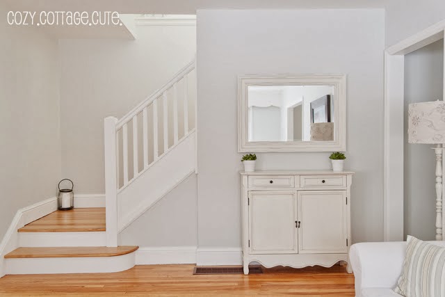
Here is a progress picture…

In this picture, you can REALLY see how much darker (and more blue) the first color of grey was.  It looks almost purple in comparison to the first coat of the new paint.
The next picture shows the final “after” of the paint… so light and bright and neutral, which is exactly what I was hoping for!

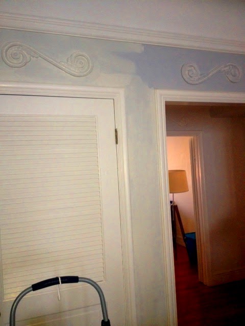
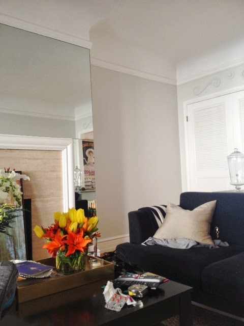
I snapped this picture really quick on my phone, in the late afternoon when this side of the house gets darker, but even in the low light, it still is so bright!  This color has changed the entire feel of the room!

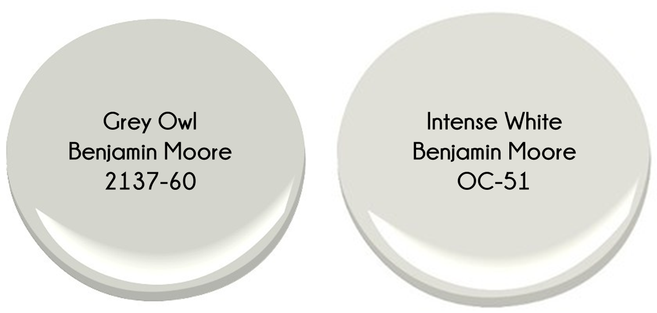
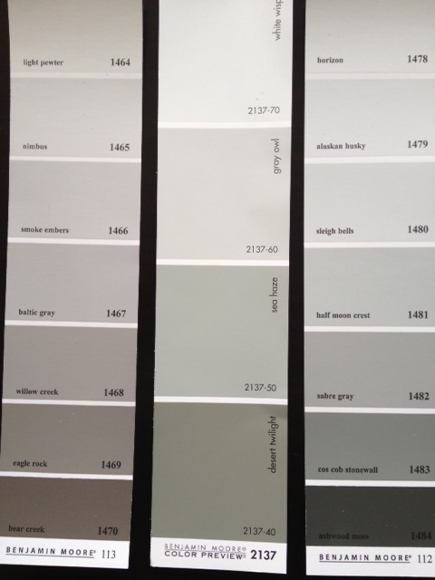
Remember this post when I had been going back and forth between two shades of grey – either Grey Owl or Intense White, both from Benjamin Moore.  Well, when I went to have the paint mixed up, I walked into the store with my mind set on getting a gallon of Grey Owl at 50% tint – this was the color I’d painted the dining room in our last house, and I figured at 50% tint, it would be even brighter and reflective.

Despite my original decision, I left the store with a gallon of Intense White.

I’m not one to usually change my mind last minute – especially after agonizing over a decision – but I chose Intense White over Grey Owl for a few reasons.

First, the guy mixing the paint said that there is no “recipe” for mixing a color at 50% tint, so the result wouldn’t necessarily be a lighter version of Grey Owl – it might end up more blue, or more beige than intended, and that all he could do was mix an approximation of the 50% tint, and record exactly what was mixed in case I wasn’t happy.

Too risky.  No thank you.

I do not want to paint our living room the wrong color for a second time, and end up needing to paint again.

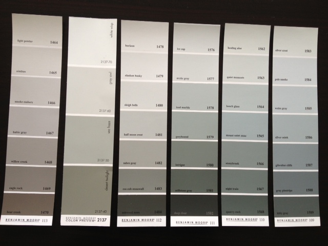
After that conversation, Intense White was the obvious choice for me – it is actually on the same paint chip as Grey Owl, but is one shade lighter.

The Benjamin Moore paint guy also taught me about the light reflection value (LRV) assigned to each Ben Moore paint color. The number indicates how much light gets reflected vs. absorbed by the paint color.  The first grey I’d painted our living room had a LRV value of ~61, meaning that ~40% of all light got absorbed by the paint color, thus making the room feel darker than it was.  Grey Owl had a value of ~64 (slightly better but not that much) and Intense White had the most light reflection of all these options with a value ~74.

This little tid-bit of info has changed my life.  The light index is a game changer!!

Anyway, I am thrilled with how it all came out, and can now focus on other living room updates I’ve been wanting to make… like on the fireplace… coffee table… side tables… and a new sofa (how long have I been talking about a freaking new sofa???)

Another sneak peak I’ll be posting about soon?

Oh yeahhhhhh!!!  Can you guess where this is?

Happy Monday!
xoxo

I’m not going to make another 50 Shades of Grey Joke…

Oops… couldn’t help myself.

Anyway, I’d posted yesterday about how I made the blunder of painting our living room the wrong color of grey.  That is not going to happen to me a second time around, so I’ve invested many hours since Saturday into researching grey paint colors.

You may remember that I already did quite a bit of legwork on the topic of grey paint last year when I painted the dining room of our last apartment – I’m almost an expert on this topic at this point.

My requisites for the perfect grey:
   1. It must be a very light grey
          *I don’t want to make our living room that gets great light feel like a dark hole.
   2. It cannot have ANY blue undertones
          *I already made that mistake – blue undertones = cold

With that list of requirements, I have narrowed it down to two options:
    – Option 1: Benjamin Moore Grey Owl 2137-60 (but with half-strength tint)
    – Option 2: Benjamin Moore Intense White OC-51

Grey Owl was actually the color that I used in our last dining room (per the recommendation of Emily Henderson), and to put things mildly, I LOVED it.  It was a very pale, true grey, and it reflected light beautifully.  Intense white is a color I recently discovered on several designers’ lists of no-fail paint colors.

Grey Owl is a definite “color” where Intense White comes from Benjamin Moore’s Off White color collection, but you can see how CLOSE they are to one another.  That said, I plan on lightening the Grey Owl (if that’s the route I go) by 50% so it will be even a bit brighter than this sample… a very close match to Intense White.
Intense white has a SLIGHT tan undertone, but it really is minimal.
Want to see some examples of each??
I knew you did.
Here are a few rooms in “Intense White”:

Intense White is a wash of color – nearly white but you can see that next to the white crown moldings in most of these photos that it’s not White.  There is contrast, and that is just exactly what I’m looking for.  Contrast, in a non-color color.
And here is a beautiful space with Grey Owl, where the tint has been cut in half:

I already know which one I’m leaning towards more, but I’m curious to hear your opinions!  Which do you prefer?

Is there another light grey color that I’m missing and should consider as well?

50 Shades of Grey… Literally

Let’s talk about paint colors… shall we?

Let me start this off by admitting that I had no idea how hard it would be to pick a shade of grey.  I mean, I thought I was going to be all clever with the title of this post, but I literally ended up evaluating just about 50 shades of grey… and that was after I had narrowed it down!!

I wanted something light and bright – no yellow undertones, but not too “cool” of a color either.  Just a perfect, clean, true grey.  To cut to the chase, I ended up with Grey Owl, by Benjamin Moore, but ending up with this decision was NOT an easy one…

Here’s where I started…


Yeah… lots of options… too many options…

Here’s where I narrowed it down to…

I decided to do a little Google image search, and found a few that I loved.  Sleigh Bells had been a front runner from the paint chip, but in the pictures it looked really steely and well… silvery.  Just. Like. A. Sligh Bell.  Duh.

Coventry Grey really appealed to me as well, but it looked a bit darker than I’d been thinking, and since the dining room doesn’t get a TON of natural light, it would have been a bit too risky…

Smoke Embers and Nimbus were a little on the “beige” side of the spectrum, and so I was really looking at White Whisp and Grey Owl.

White whisp was too white, and I really wanted the freshly painted trim to pop, so I ended up choosing Grey Owl.  As if it were fate, just before heading out for my paint, I read a blog post by Emily Henderson of Style by Emily Henderson, where she mentioned that Grey Owl is her go-to grey paint.

Sooo… I would pretty much follow Miss Henderson off a cliff (if you have not read her blog, DO – she is my hero and I love LOOVVVEEEE everything she designs), and so I took it as a sign that “Grey Owl” was the one for me.  For easy reference at Benjamin Moore, it can be found on paint chip 2137.

Here’s how it looks after two coats of fresh paint – I had them mix up primer and paint in one, and two coats covered beautifully.

It’s light enough that it doesn’t make this small room feel smaller, and it doesn’t make it feel gloomy, even on foggy days (which we’ve had an abundance of since I painted the walls).

The trim still pops, and the color doesn’t feel disjointed from the rest of the apartment (which does not have another “colored” wall in it).  I am SO HAPPY with Grey Owl – I would paint every wall in our house this color, if I had the energy in me…

This is a great before picture – I don’t have a ton of pictures of this room, just because it’s so dang small and hard to photograph.  Even though the walls have been painted, you can see that the layout was just not working (and we’ve lived with this layout for almost two years! Dah!)
The rug is WAY TOO SMALL for the room, the table blocks the pass-through from the living room to the hall… it just had to change.  But look at that paint… one step closer!!
More updates to come… stay tuned….