Kitchen Counter Makeover – Painted Grout

So our kitchen got a bit of a makeover recently!!  Actually, “a bit of a makeover” is an understatement.  The tile counter-tops got a total face-lift thanks to some industrial strength grout paint.  This whole space is feeling dramatically different than it did when we moved in and I hardly spent a dime doing the updates.
I finally got around to snapping some pictures of all the progress I’ve made on our kitchen today, and cannot wait to share the before and after’s with you!  I’m calling this “Phase I” of our kitchen’s makeover, and it’s quite a dramatic transformation.  
Here is what the kitchen looks like as of this afternoon:
Trust me when I say that this is a dramatic improvement from where we started!
It now feels bright and clean, and so much newer and modern than it did just a few weeks ago.  All I did was paint.  Paint on the walls, and paint on the grout.  Sounds weird, but grout paint is a thing.  I used a different brand for our shower a few months back, and while I was happy with those results at the time, I had no idea that there were better products out there.
After doing some research I discovered a product called Polyblend Grout Renew.  
I’m telling you, this stuff is life changing.  It has AMAZING reviews online, and two of my favorite bloggers from Young House Love, used it on the tile entryway of their new home.  Apparently its holding up to foot traffic, so I knew I had a good shot using it on our counters.  This particular brand of grout paint has a sealer built into it, so I wasn’t as worried about doing a light color on the grout as I would have been otherwise.
Ok, so before I get into the process of how to apply the paint, and revamp old, disgusting grout to your heart’s content, let’s see a few “before” pics… shall we?
So this is what the kitchen counters looked like when we started the process…
Woof.

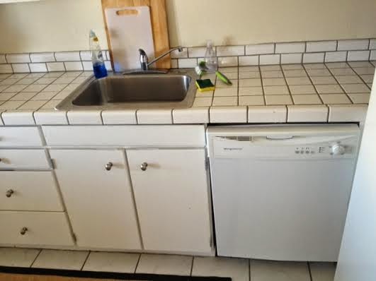
They were bad my friends.  Like so bad, these pictures don’t really do their grossness justice.

As you can see, the off-white tile had dark brown grout.  Not an attractive combination.

The walls and back-splash were all yellowed out paint that only made said grout / tile look even worse. Everything about the combination of the paint and dark grout made the kitchen feel dirty and dated – very 80’s, and not in a cute Cindy-Lauper-teased-hair-Breakfast-Club kind of way.

Before you can start painting the grout, first you have to clean it, and I’m not talking about wiping it down with a Clorox Disinfecting Wipe.  You need to get Sulfamic Acid Cleaner.  What is this, you ask? It’s a very smelly, apparently toxic, cleaning agent that will lift YEARS of grime from your grout.  I found this out first hand.

As a heads up, this is not a job you can knock out in one night – the cleaning took me several hours at least, and then you have to let the grout dry really well before painting, or the grout paint won’t adhere.

Let’s start by talking about the cleaning process… The container had good instructions on how to mix it up, but not much about what to do after, and I wasn’t able to find much online, so here’s what worked for me:

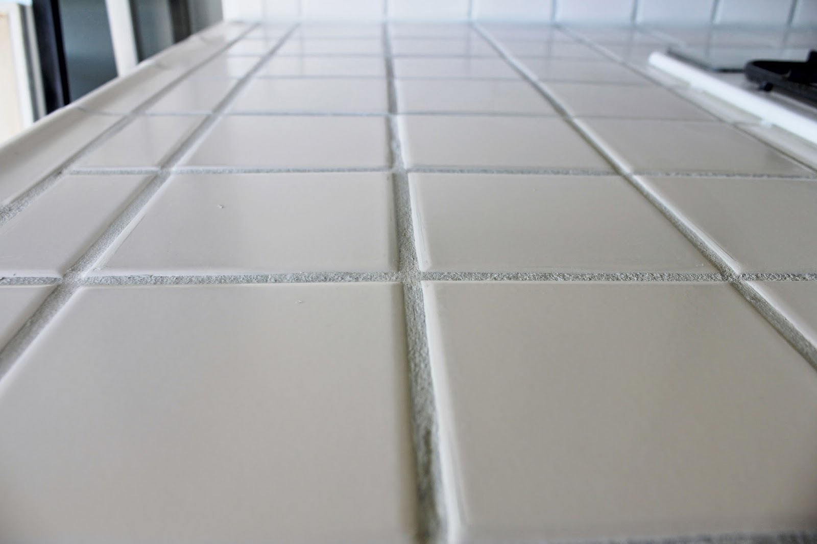
Wear gloves – don’t try to do this without them. I also wore safety goggles because this stuff seemed pretty toxic and I value my vision.  Once you’re all suited up, get your grout wet with water so it will absorb the cleaner evenly.  Then mix the Sulfamic Acid per the instructions on the container, and apply to counters with a sponge you will never use again.  After applying it to the counters, everything happens pretty quickly.  After a few minutes you’ll notice things getting a little gummy.  That’s grease.  And grime.  And unidentifable grossness that has built up over time.  This is supposed to happen. Let it.  Once it’s really gumming up, start scrubbing.  I used a plastic bristle brush and it worked beautifully.  Once the gummyness comes up, rinse with clean water.  It’s going to take a lot of water, and much more scrubbing, because the grease smears around.  It doesn’t just lift off like you think it will.  It’s all super fun (insert sarcasm here) but once its clean, you’ll notice a difference. A HUGE difference. Your grout will literally be restored to its original color.  Prepare yourself to be shocked.  I thought the grout in here was dark brown.  It was actually light brown – equally unattractive, and really really gross to think about.

Anyway, once the grout is clean, let it dry out – overnight at least – and then get to painting.  Super simple.  I used a stiff bristle toothbrush, and you just work the paint into the grout.  It will get on the tile.  You have two options – wipe it immediately, or let it dry and remove it later.

I started out doing option 1, and it was tedious.  Especially since covering brown grout with white paint required two coats for full coverage (3 coats in some places).  I found that it was easy enough to get off the tile after it was all dried.  I actually let it cure for a few days, then got the counters wet, and the paint on the tiles literally rubbed off with a finger / paper towel.  Soooo much easier than wiping as you go, but do what feels right.

Anyhoo, that’s the whole process!  I’m not going to lie, it was a bit back-breaking to lean over the counters, but I put on some good music, and spaced out.  It’s pretty mindless and easy except for the leaning over part, but it was 100% worth the outcome! Our kitchen feels brand new to me and so much fresher.  In total, it took me about 3 nights to finish – one night to clean, one night to paint, and one night to clean the paint off the tiles where it went out of bounds.
Here are some more pictures of our kitchen counters after their facelift:

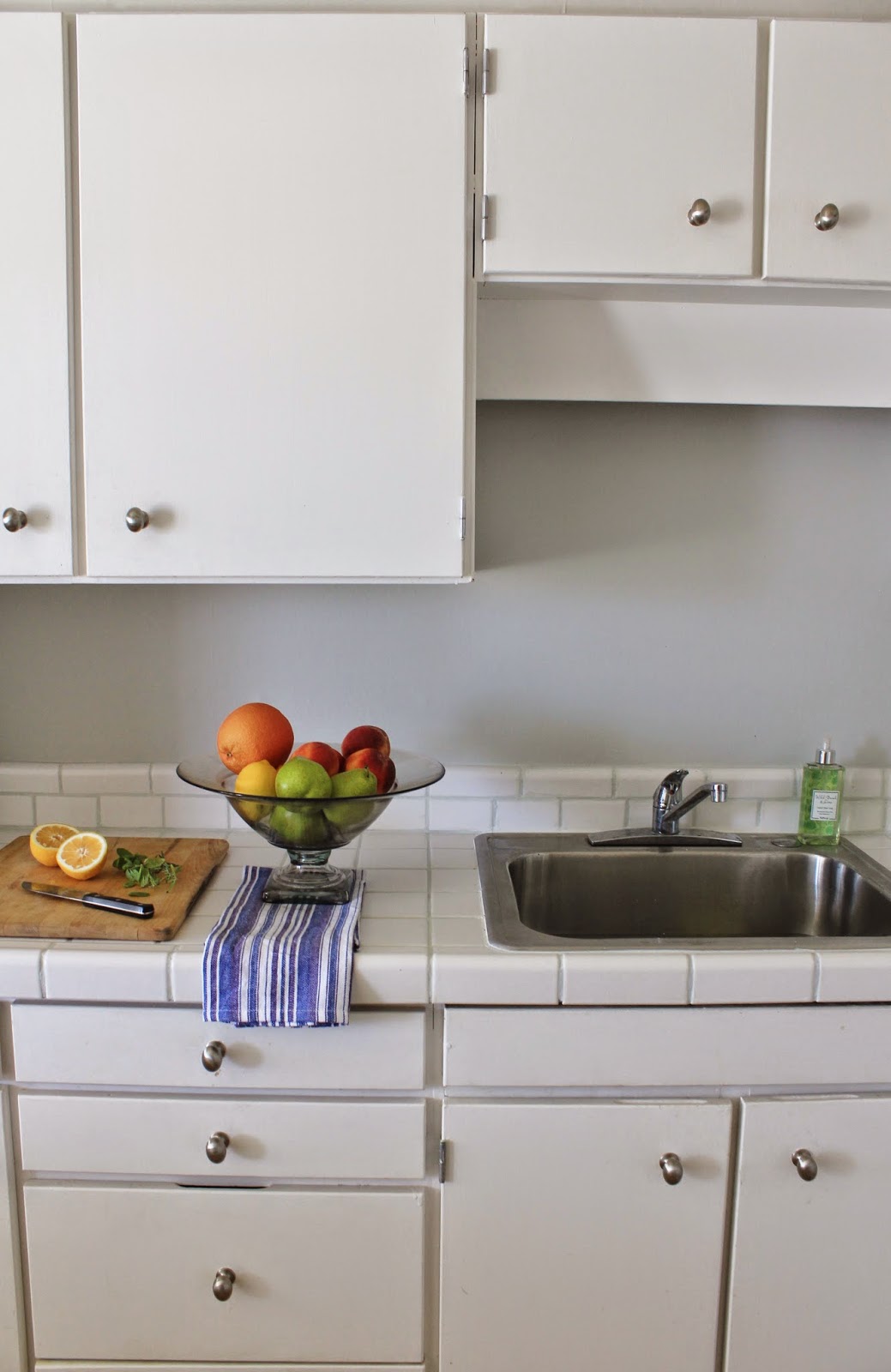
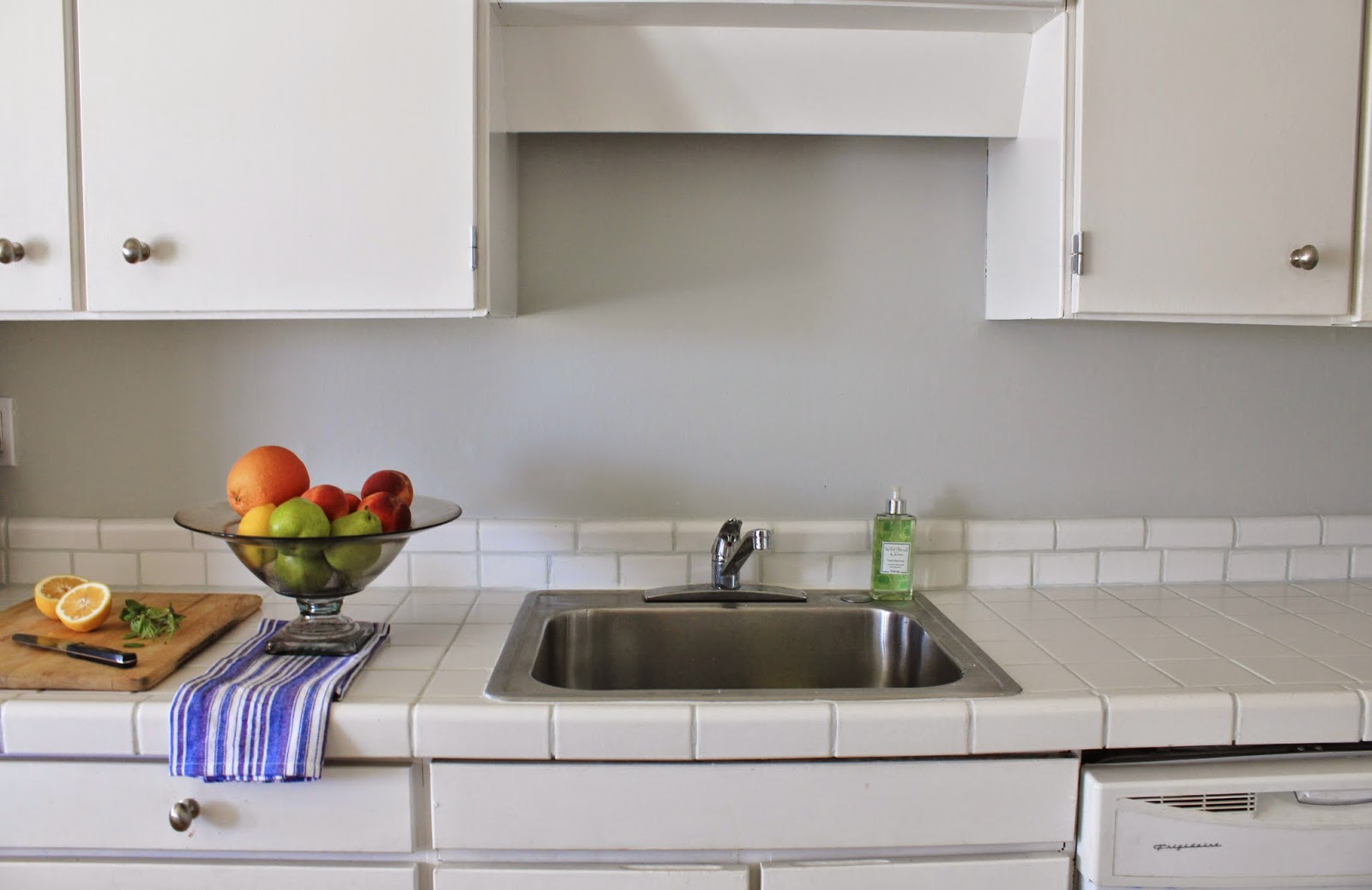
Love!!  It’s LOVE!!  After the counters were looking all clean and new, I decided the walls and back-splash needed some love too. Out came the paint, and a few hours later I was in a bright, clean grey and white haven.

The Polyblend Grout Renew Grout Paint comes in a bunch of different colors (and multiple shades of white), so I bought two and tested them out.  I brought home the Antique White and the Snow White colors, because I didnt want the end result to look too white next to our off-white tile.  The tiles started out looking really beige but it turned out that they were much more white than I originally thought.  After testing both colors of grout paint, I ended up going with the Snow White (which is the whiter one).

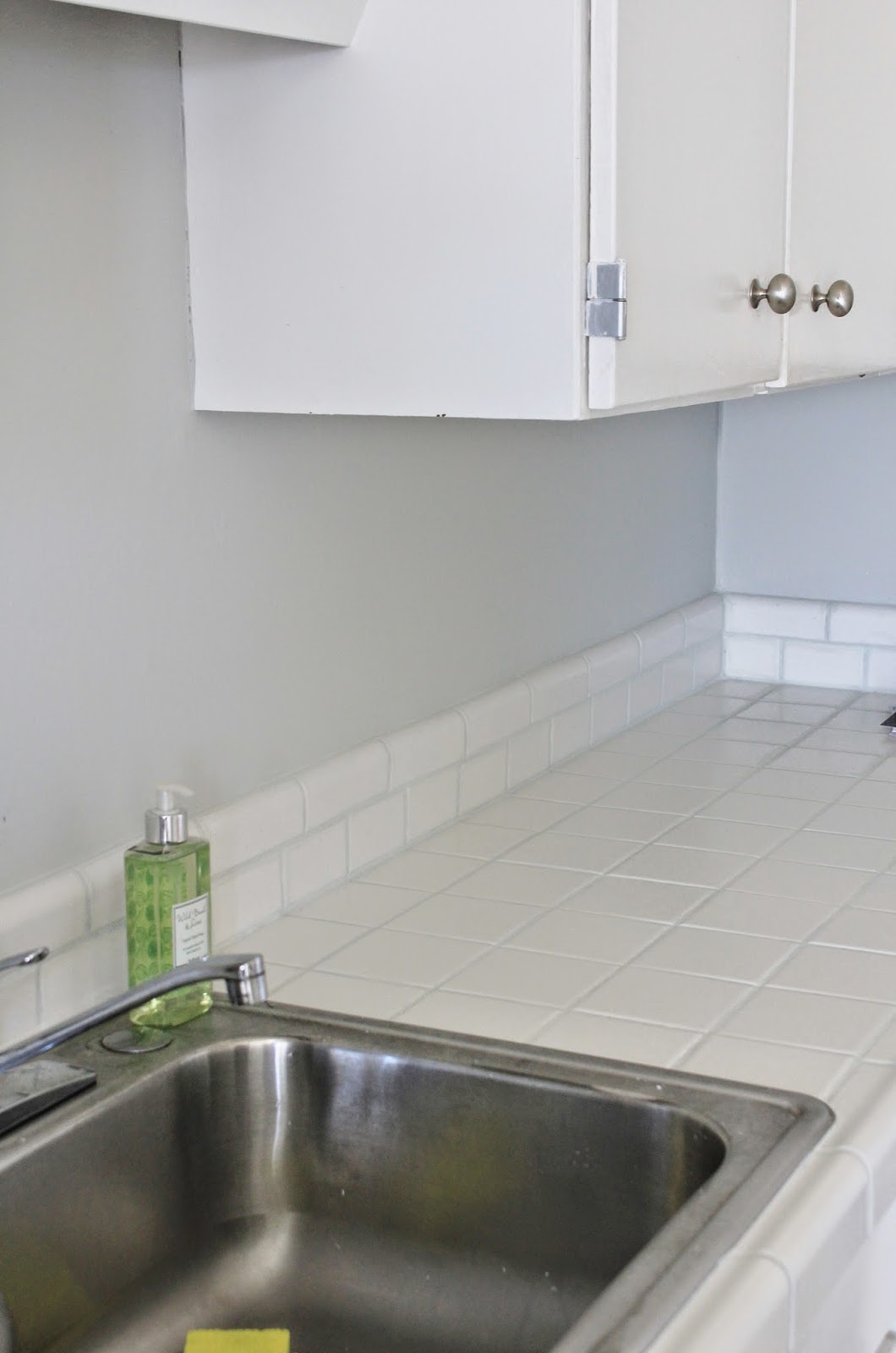
As you can see, it’s not jarring, and it looks really natural.  In the end, our tile is actually pretty white, and it was just the yellowing walls and disgusting brown grout that made them look so beige.  Who knew?!

Anyway, do you want to see a series of before and afters side by side to compare??

That’s the best part of these posts…

Here we go!

And just becuase I knew you wouldn’t be able to get enough of how fresh and lovely our kitchen is looking, I snapped a few more pics “just because”…

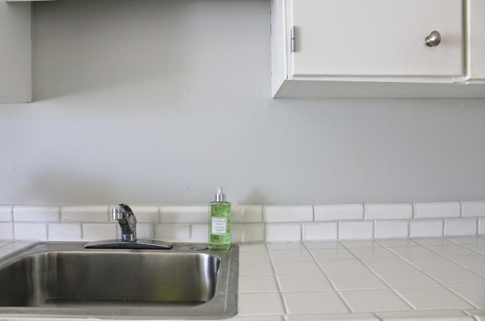
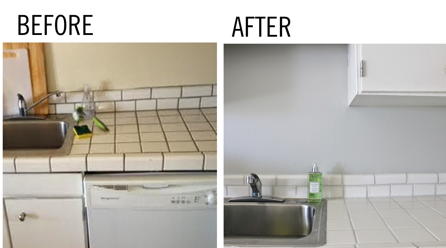
Here’s how clean and pretty our sink is looking now…

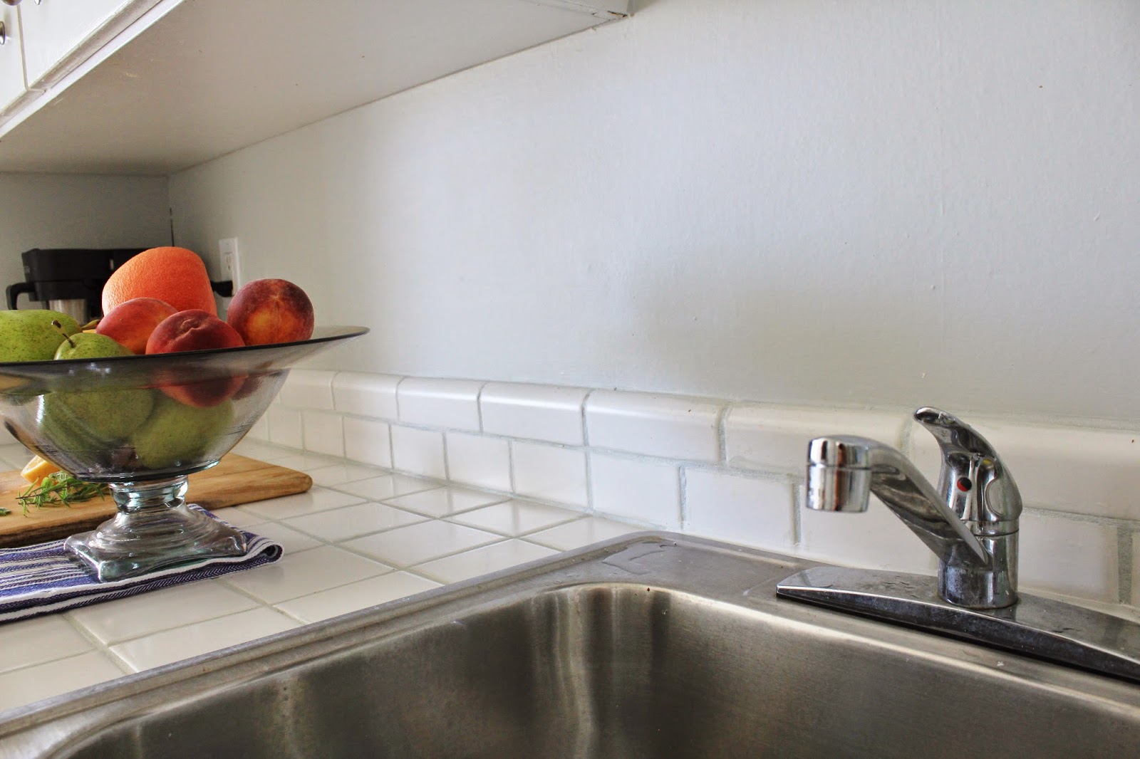
Like a breath of fresh air I tell you!!  I actually enjoy cooking in here now!!

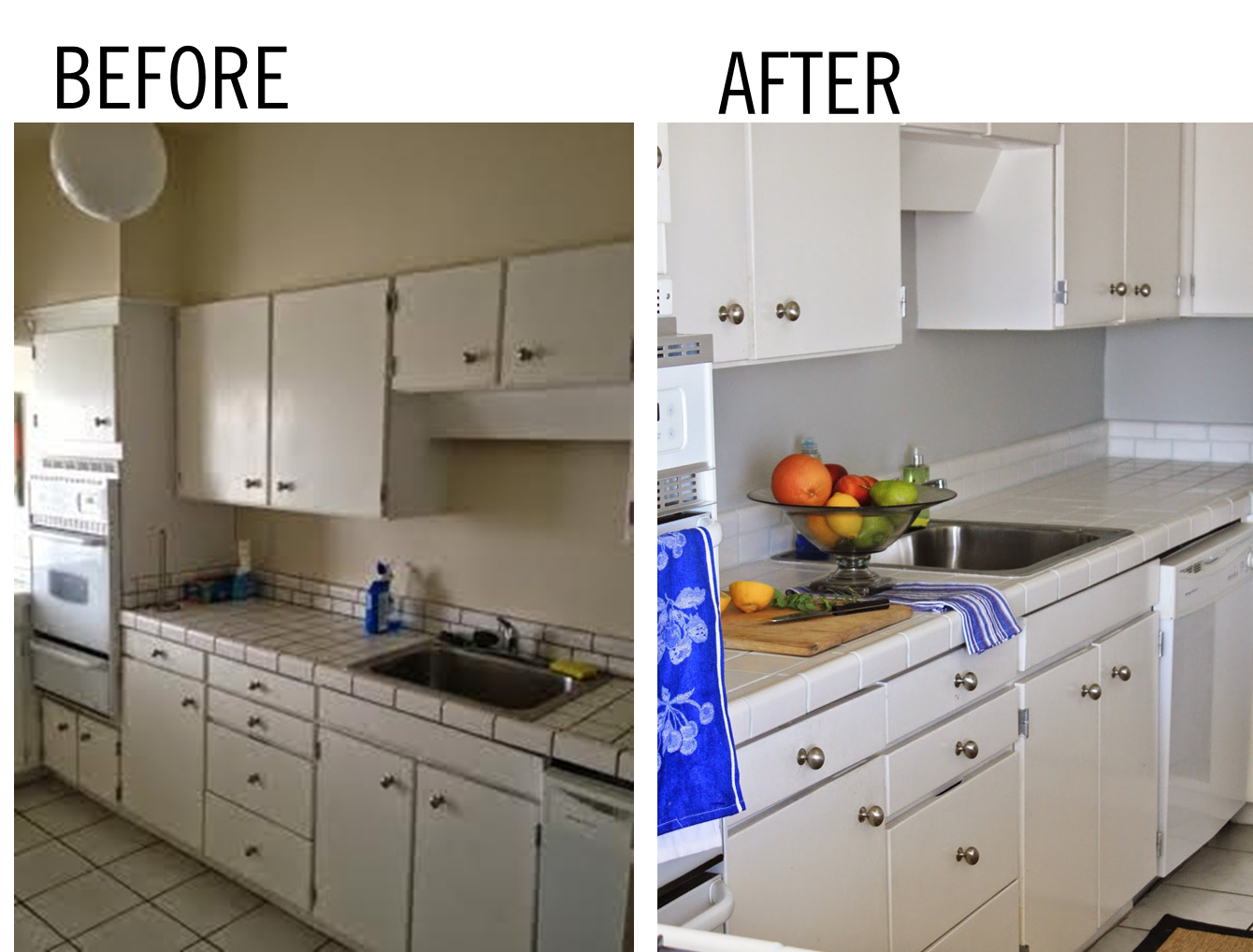
 And here we are looking back the other direction from the sink… nothing but clean countertops, all the way down!!

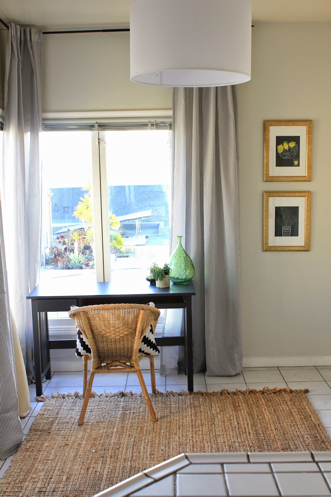
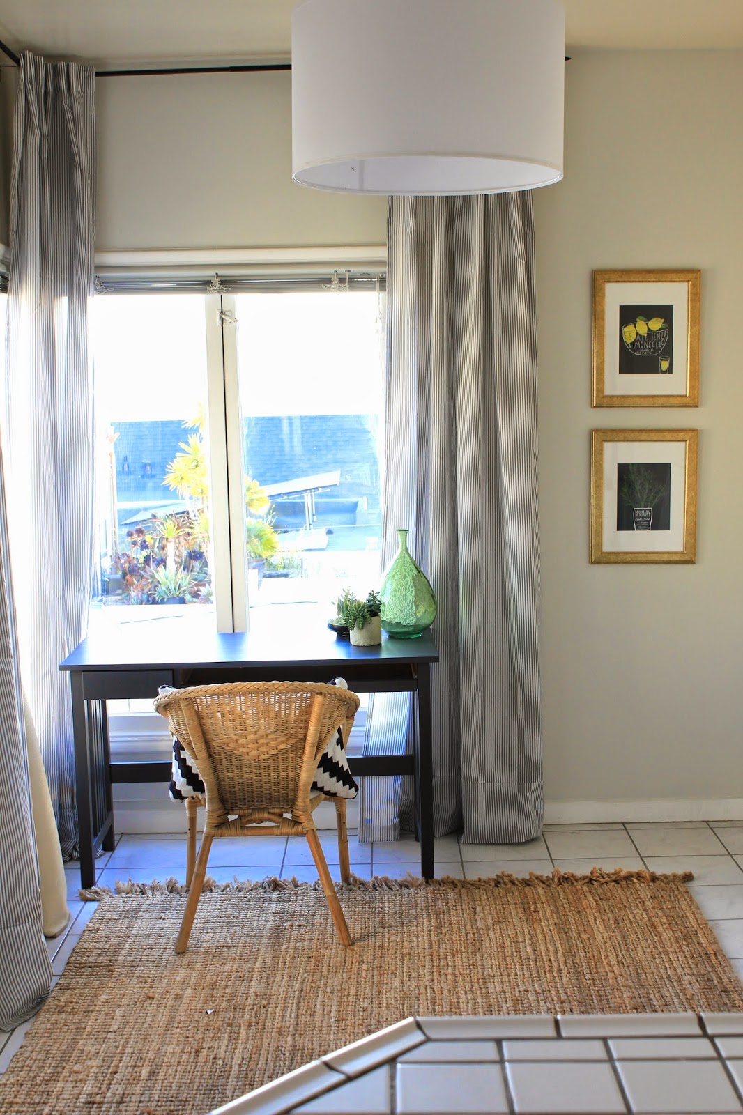
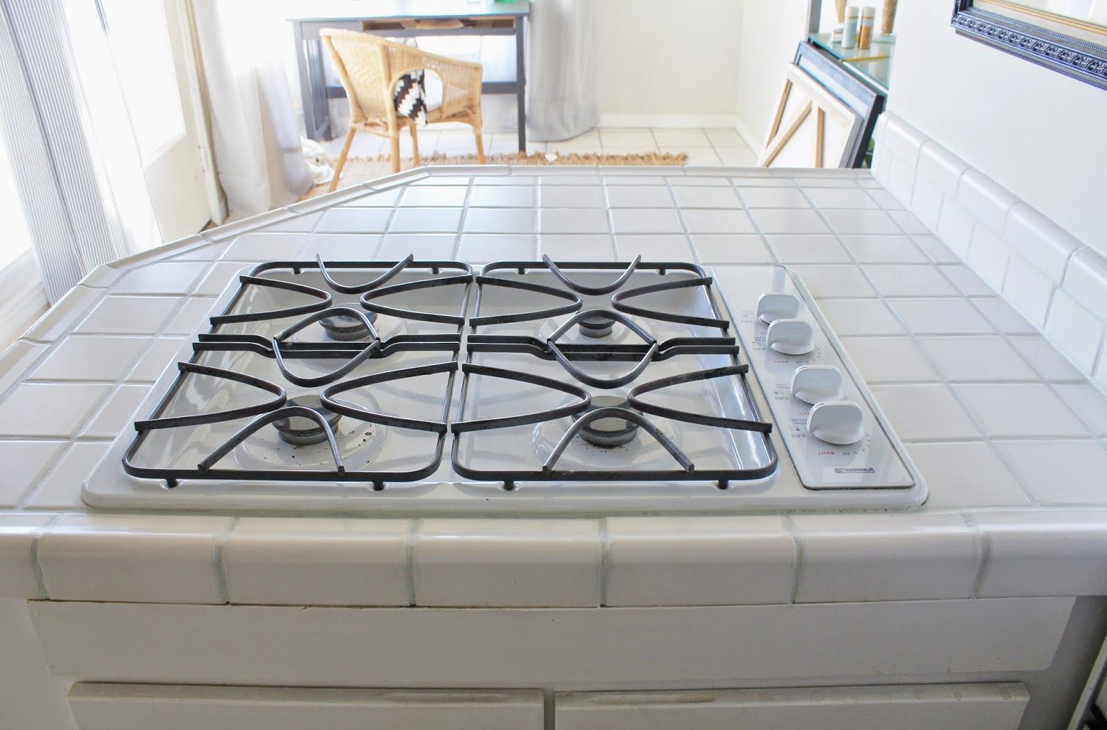
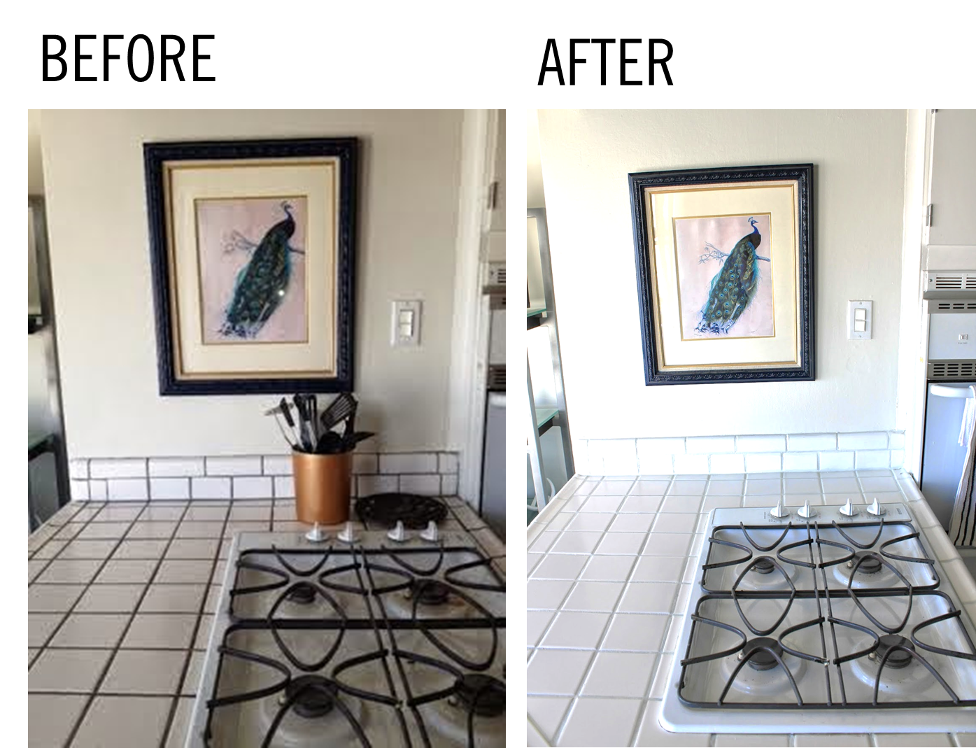
 These next two photographs were taken standing behind the stove (in my little desk / office area that I’d posted about here) looking back towards the dishwasher…

And, that’s the update!  What do you think?

It’s unfortunately not quite as dramatic in pictures as it is in person, but trust me when I say that a coat of paint on the walls, and grout paint on the counters have transformed this room from a gloomy, dated, grease-fest, to a bright, airy, food sanctuary.

It’s night and day my friends.

Dining Nook Turned Office Nook

I’d mentioned that our dining nook attached to our kitchen has recently transitioned into our office. We’re a long way from “finished” (am I ever “finished”?) but it’s HUGE progress from where we started…
Here’s what this space is looking like right now…
Here’s where it was a few days before that picture was taken…

Junk.  Everywhere.

Like EVERYWHERE.

This post should really be titled, “Junk Nook Turned Office Nook” but let’s pretend it had been used as a dining nook, ha!

The first and most major step of this transformation was with paint.  A good gallon of paint changes everything people.

I went with Benjamin Moore’s Intense White – the same color we used in our living room.  Officially my new favorite.  It’s just such a pretty, calming neutral, true grey.  Super pale and light – it reflects light beautifully, and despite it’s name it is definitely GREY – not white.  After putting one coat on the walls, this space felt so much bigger and brighter.
The sage green was a decision my best friend and I had made together a few years ago when we lived here, and it was not one of our best decisions.  It was not bad per say, but with just two walls painted, it felt like an after-thought – especially when the rest of the room was a blah off-white.  
It was just too much contrast against everything else, and it ended up absorbing all the lovely natural light this room gets from all the windows.
A few weeks prior to re-painting, I’d hung some striped curtains right up at the ceiling.  That too made a world of difference in opening the space up.  Against the grey, the thin grey and white stripe fabric is so pretty and simple, and light.
We positioned this re-purposed desk in front of the windows, and while it may eventually move against the wall, this is the perfect example of up-cycling, and working with what you’ve got.
This desk was dead.  Beyond dead.
My best friend had inherited it from her parents and used it as a makeup table for years.  It had caked on makeup, spotty and chipped paint, and it was bad.
It was destined for the dumpster after my best friend moved out, but our of sheer laziness, it stayed in the apartment.  One night… I’m not entirely sure why… I broke out the sandpaper and the same can of paint that I’d used on our wine hutch.
20 minutes later, it was looking a million times better, and it narrowly missed it’s grisly end at the dumps.  I WISH I could find a “before” picture of this desk, it was really REALLY bad.  If I can dig one up, I’ll definitely be updating this post!!
I still want to add a pull to the drawer, and paint the back of the desk (you can see exposed in this picture) so that it blends in with everything else.  I mainly want to be sure it blends in, and right now the wood back sticks out like a sore thumb to me.
What else was added to this room??  

Um… a light!

Yep, this room was not wired for any overhead lighting.  Absurd.  Ikea just started selling this drum shade, and so I got that along with a cord kit, that can be wired into the wall.  It was super simple to put everything together, and after I anchored a mount to the ceiling, I got this bad boy hung.

Let there be light!!!

As I mentioned this space is a work in progress – I’m working on some art to hang up in here, and I still need to finish painting one of the walls (on the left) that runs the length of the kitchen into the breakfast nook (now office).
More (better) pictures will be included with those updates hopefully soon, but in the meantime, here is another picture from move in day…  a real “before” if you will:
And an updated picture from this afternoon:
So excited that this has turned into a pretty, calming, usable space.  We finally have a usable room!!!
I must also add that this space has been a pretty major revamp on a serious budget.  I’ve spent about $100 transforming it – the paint for the desk I already had, along with that wicker chair (another leftover from Kira), the rug (was in the dining room of our old apartment), the frames, the art, the curtain rods, and the accessories.
Here’s what I bought: the wall paint (one gallon of BM eggshell paint) the curtains (another Ikea find) and the drum shade and light kit.  
I’m actually guessing I’ve spent closer to $80 so far… not bad, eh??

A Little Bit of this… A Little Bit of that…

Hello hello!  Hope you all had a great weekend!

I feel like the last week has been a complete whirlwind, between our trip to Mexico – which now feels like it happened about 4 months ago – my actual birthday, catching up on work, and some projects around the house.

Can I please be back here already?? This was the view from our room, and the porch was so private and lovely…

Could be a Corona ad, right??

Seriously the perfect way to ring in the big 3-0.

On a different note, our apartment is really coming along!

I need to dig out the DSLR camera from whatever box it’s still packed in to take some GOOD photos of the progress we’ve made on the house so far.

Remember how I’d painted the living room the wrong color grey?

Well I lived with it for about a month, and on Sunday couldn’t take it anymore.  I spent most of the day yesterday re-painting, and it’s now a softer, lighter, brighter color of grey, and it’s pretty much perfection.

Here is a progress picture…

In this picture, you can REALLY see how much darker (and more blue) the first color of grey was.  It looks almost purple in comparison to the first coat of the new paint.
The next picture shows the final “after” of the paint… so light and bright and neutral, which is exactly what I was hoping for!

I snapped this picture really quick on my phone, in the late afternoon when this side of the house gets darker, but even in the low light, it still is so bright!  This color has changed the entire feel of the room!

Remember this post when I had been going back and forth between two shades of grey – either Grey Owl or Intense White, both from Benjamin Moore.  Well, when I went to have the paint mixed up, I walked into the store with my mind set on getting a gallon of Grey Owl at 50% tint – this was the color I’d painted the dining room in our last house, and I figured at 50% tint, it would be even brighter and reflective.

Despite my original decision, I left the store with a gallon of Intense White.

I’m not one to usually change my mind last minute – especially after agonizing over a decision – but I chose Intense White over Grey Owl for a few reasons.

First, the guy mixing the paint said that there is no “recipe” for mixing a color at 50% tint, so the result wouldn’t necessarily be a lighter version of Grey Owl – it might end up more blue, or more beige than intended, and that all he could do was mix an approximation of the 50% tint, and record exactly what was mixed in case I wasn’t happy.

Too risky.  No thank you.

I do not want to paint our living room the wrong color for a second time, and end up needing to paint again.

After that conversation, Intense White was the obvious choice for me – it is actually on the same paint chip as Grey Owl, but is one shade lighter.

The Benjamin Moore paint guy also taught me about the light reflection value (LRV) assigned to each Ben Moore paint color. The number indicates how much light gets reflected vs. absorbed by the paint color.  The first grey I’d painted our living room had a LRV value of ~61, meaning that ~40% of all light got absorbed by the paint color, thus making the room feel darker than it was.  Grey Owl had a value of ~64 (slightly better but not that much) and Intense White had the most light reflection of all these options with a value ~74.

This little tid-bit of info has changed my life.  The light index is a game changer!!

Anyway, I am thrilled with how it all came out, and can now focus on other living room updates I’ve been wanting to make… like on the fireplace… coffee table… side tables… and a new sofa (how long have I been talking about a freaking new sofa???)

Another sneak peak I’ll be posting about soon?

Oh yeahhhhhh!!!  Can you guess where this is?

Happy Monday!
xoxo

I’m not going to make another 50 Shades of Grey Joke…

Oops… couldn’t help myself.

Anyway, I’d posted yesterday about how I made the blunder of painting our living room the wrong color of grey.  That is not going to happen to me a second time around, so I’ve invested many hours since Saturday into researching grey paint colors.

You may remember that I already did quite a bit of legwork on the topic of grey paint last year when I painted the dining room of our last apartment – I’m almost an expert on this topic at this point.

My requisites for the perfect grey:
   1. It must be a very light grey
          *I don’t want to make our living room that gets great light feel like a dark hole.
   2. It cannot have ANY blue undertones
          *I already made that mistake – blue undertones = cold

With that list of requirements, I have narrowed it down to two options:
    – Option 1: Benjamin Moore Grey Owl 2137-60 (but with half-strength tint)
    – Option 2: Benjamin Moore Intense White OC-51

Grey Owl was actually the color that I used in our last dining room (per the recommendation of Emily Henderson), and to put things mildly, I LOVED it.  It was a very pale, true grey, and it reflected light beautifully.  Intense white is a color I recently discovered on several designers’ lists of no-fail paint colors.

Grey Owl is a definite “color” where Intense White comes from Benjamin Moore’s Off White color collection, but you can see how CLOSE they are to one another.  That said, I plan on lightening the Grey Owl (if that’s the route I go) by 50% so it will be even a bit brighter than this sample… a very close match to Intense White.
Intense white has a SLIGHT tan undertone, but it really is minimal.
Want to see some examples of each??
I knew you did.
Here are a few rooms in “Intense White”:

Intense White is a wash of color – nearly white but you can see that next to the white crown moldings in most of these photos that it’s not White.  There is contrast, and that is just exactly what I’m looking for.  Contrast, in a non-color color.
And here is a beautiful space with Grey Owl, where the tint has been cut in half:

I already know which one I’m leaning towards more, but I’m curious to hear your opinions!  Which do you prefer?

Is there another light grey color that I’m missing and should consider as well?

One step forward, two steps back…

Hope you all had a fabulous long weekend! Our was spent unpacking A LOT, organizing, and purging of all the stuff we don’t need.  There is a LONG way to go still, but any progress feels good!  In between all the unpacking, and seemingly endless errands, we enjoyed some pretty sunsets off the back deck…

… we also started up season 2 of House of Cards… in bed… with coffee.  Such an indulgence!  Side note: is anyone else as obsessed with Kevin Spacey as I am??? I love evil Kevin Spacey and his saucy southern accent.

And my honey got me some absolutely GORGEOUS flowers for Valentines day…

Aside from smelling the roses, admiring pretty sunsets and watching TV in bed, I made some progress on the living room… kind of.

I painted.

It all started out great! All the holes were getting patched, cracks, chips and wall scuffs from four years of wear and tear were getting covered up, and the paint was going on as a pretty light grey.
I even had a little fun with the paint before rolling the walls out…
All fun and games right??
Wrong. 
Somewhere between belting out a Taylor Swift song, and starting in on the second coat, the paint started to dry.
That’s when things took a turn…

While I was confident at first, the paint was getting darker and darker as it dried… and more and more blue.

Nooooooooooo!

In direct light it wasn’t so bad, but the blue (lavender almost) undertones were feeling very “baby boy’s room”.  Let me tell you, after painting all day, this was NOT the look I was hoping for.

Can we say dark dungeon??  Ugh, it is not good my friends.

Granted, it was a rainy day, and this picture was taken in the late afternoon… but still.  STILL.  It’s like purple in the above picture!  Ick!

To add insult to injury, the warm lamp shades, tan sofa, and creme colored curtains I hung afterwards weren’t helping matters…  The yellow tone of them accentuated the blue even more.

In this next picture you can see how yellow the curtains looked next to the “grey” and how blue the grey looked next to the creme colored curtains.

Ignore the weird colors in this photo – I used the HDR filter on my phone since the light from the windows washed everything out, but

That night I swapped out the creme colored curtains out for white ones, which dramatically improved things, but the walls still look very blue to me.

More bad iPhone pictures, but I just wanted you to see the grey walls in daylight with the white curtains.

The color is called Silver Screen (by Behr) and while the sample on the paint chip and on the lid of the can looked like a pretty pale grey, it reads as blue/purple on the walls.  Hello Monica Geller’s apartment.

Right??

Needless to say, I’ll be repainting in the near future.  For now it’s livable, but I have grand visions for this space, and they don’t involve lavender walls.

Ok, moving on….

Ok, so what do I see changing in this room??  A lot.
So far, we’re just working with everything we had in our last apartment, but I’m pretty adamant about selling some of this stuff, and replacing it with new things – namely, a comfortable new sofa (this is non-negotiable), and a new coffee table.  Those are the big items on my checklist.
I’ve saved the below pictures to my phone for inspiration in this room.
The name of the game is light and bright… classic, clean lines, and natural fibers.  
In the below photo, I love the bright pretty linen curtains hanging in this room, and the neutral linen couch.  It’s clean, and simple, and inviting.  Everything I want in our living room.

This next photo captures the simplicity and color palette I want – the true grey on the walls paired with lots of white.  It’s clean, inviting, and easy on the eyes.

I love the white sofas, natural wood elements and lots of greenery… so pretty.

And then of course, this next photo is one I’ve posted before…

It’s obviously decked out for Christmas (and has a lot going on because of that), but the pale pale PALE grey walls are perfection, along with the natural fiber rug, white sofa, and lots of black and white sprinkled throughout.

Now that I’ve made my mistakes with the paint on the first go round, I’m going for round 2, and this time, I’m determined to get the right color of grey.

The one thing I’m thrilled about so far??

My new natural fiber rug – it’s looking very handsome with the cowhide.

Stay tuned for more updates my friends…

50 Shades of Grey… Literally

Let’s talk about paint colors… shall we?

Let me start this off by admitting that I had no idea how hard it would be to pick a shade of grey.  I mean, I thought I was going to be all clever with the title of this post, but I literally ended up evaluating just about 50 shades of grey… and that was after I had narrowed it down!!

I wanted something light and bright – no yellow undertones, but not too “cool” of a color either.  Just a perfect, clean, true grey.  To cut to the chase, I ended up with Grey Owl, by Benjamin Moore, but ending up with this decision was NOT an easy one…

Here’s where I started…


Yeah… lots of options… too many options…

Here’s where I narrowed it down to…

I decided to do a little Google image search, and found a few that I loved.  Sleigh Bells had been a front runner from the paint chip, but in the pictures it looked really steely and well… silvery.  Just. Like. A. Sligh Bell.  Duh.

Coventry Grey really appealed to me as well, but it looked a bit darker than I’d been thinking, and since the dining room doesn’t get a TON of natural light, it would have been a bit too risky…

Smoke Embers and Nimbus were a little on the “beige” side of the spectrum, and so I was really looking at White Whisp and Grey Owl.

White whisp was too white, and I really wanted the freshly painted trim to pop, so I ended up choosing Grey Owl.  As if it were fate, just before heading out for my paint, I read a blog post by Emily Henderson of Style by Emily Henderson, where she mentioned that Grey Owl is her go-to grey paint.

Sooo… I would pretty much follow Miss Henderson off a cliff (if you have not read her blog, DO – she is my hero and I love LOOVVVEEEE everything she designs), and so I took it as a sign that “Grey Owl” was the one for me.  For easy reference at Benjamin Moore, it can be found on paint chip 2137.

Here’s how it looks after two coats of fresh paint – I had them mix up primer and paint in one, and two coats covered beautifully.

It’s light enough that it doesn’t make this small room feel smaller, and it doesn’t make it feel gloomy, even on foggy days (which we’ve had an abundance of since I painted the walls).

The trim still pops, and the color doesn’t feel disjointed from the rest of the apartment (which does not have another “colored” wall in it).  I am SO HAPPY with Grey Owl – I would paint every wall in our house this color, if I had the energy in me…

This is a great before picture – I don’t have a ton of pictures of this room, just because it’s so dang small and hard to photograph.  Even though the walls have been painted, you can see that the layout was just not working (and we’ve lived with this layout for almost two years! Dah!)
The rug is WAY TOO SMALL for the room, the table blocks the pass-through from the living room to the hall… it just had to change.  But look at that paint… one step closer!!
More updates to come… stay tuned….