Holiday Fireplace and a DIY Garland

Are you guys ready for some holiday house updates?????????

Let’s dive right in!

The fireplace is the center of our living room, and an obvious focal point to decorate for the holidays.  I was so excited to be able to string up garlands, and doll it up this year since our old apartment didn’t have a central focal point in the living room.  Everything was centered around our TV which was practical, but not the most attractive option.

As stoked as I was to decorate the fireplace, I REALLLLLLYYYYYYY wish that it had a mantle.  If you look closely, you’ll notice that it’s a flat facade, surrounded by a piece of crown molding, so there’s no spot for long beautiful taper candles, leaning art, or cool decorative accents like that on top of it.

I’ve spent many hours scheming about how to create a mantle here, but with the fireplace being completely surrounded on all sides by a slab of mirror, it just won’t work… unless I dare risk 7 years bad luck by breaking it… which I’m not down for. Sometimes we just have to make do with what we’ve got…. right??  Kind of the story of my life, but let’s be honest – I’m just happy to have a fireplace to decorate this year!

When I lived here before, I always loved how we strung a pre-lighted garland across the fireplace, but after digging that garland out of storage it was looking pretty sad.  It was all smushed, and had little (if any) resemblance to real greenery.  Imagine something like this… but faded, and flattened after being stored in a box for several years….

It was time to find a new game plan for our mantle – I loved the idea of a garland, but wanted it to be super full, and really eye-catching.  And what would be more eye-catching than a bunch of gold ornaments strung together and wound up with fairy lights and greenery??  This garland DIY is super easy to pull together, so for anyone looking for a fun holiday project, this is the one for you!  In fact, the more wine you drink while working on it, the better.

May I present to you our Gold and Green(ery) Garland.  It’s two separate garlands woven together to make one massive, awesome, holiday focal point.  It’s sparkly – especially once the garland is plugged in at night – and a little over the top but I’m totally in love with it.

The ornament garland was a DIY project I worked on one afternoon while catching up on bad reality TV.  Nothing to get you in the holiday spirit than watching the Kardashian’s bicker.

I actually tested it out last year on a smaller garland that we now have hanging in the kitchen (yep, even the kitchen got a little holiday love in 2014), and making it is soooo easy.  Look back at this post for the original instructions, but there isn’t much to explain.  
Basically you need to start with a TON of ornaments – do not use glass.  They WILL shatter.  I used 4 boxes of plastic balls in assorted gold tones from Ikea… LOVE the Ikea holiday section this year.  They win the award for “best everything”.  More on them later… back to the DIY.
Start with tons of balls {insert joke here}.
Get your hands on a long strand of thick wire.  Ribbon might work but I like that the wire forms to the shape you want.
Sting balls onto wire while accidentally drinking the better part of a bottle of wine and watching trashy TV.
Here’s what you’ll end up with:
Super technical DIY project *wink wink*
Once I had all the ornaments strung on the wire, it was time to hunt down a pretty green garland to replace our sad looking one.
I wanted one that was hefty, and that looked natural (at least somewhat).  I looked into ordering a fresh garland for about two-seconds until realizing fresh garlands in SF ran about $160.  Um, no thanks.  
Off to Michael’s I went (with my coupon of course) and scored this beauty for something like $25.  I think without the 40% off coupon it was in the high $30 range.  Still, not bad for a lighted green 9′ garland with pine cones interspersed and several types of faux greens in the mix.

Once I got the green garland home, I wound the two garlands around one another, and secured them to the wood molding around the fireplace with two small nails, and more of the wire that I’d used to string the ornaments.

The nails will leave the smallest of holes, and will be easy to conceal with wood putty, and a coat of white paint.

Another new addition to our holiday fireplace, is this starburst mirror.

I love a good starburst – we have one hanging over our bed as well – but this is one of the best finds of my shopping career… EVER.

Such a score!

I consider myself to be a pretty serious bargain hunter – not on the same level as those crazy extreme couponers, but I take the sale sections seriously.  As I was at the Home Depot over the weekend, wandering the aisles in search of a ceiling medallion (another story for another day), I found myself in the aisle with decorative moldings, hollow core doors, and what else… mirrors!

Easily distracted, I ventured over to the mirrors, and there, hanging on the wall was a mirror very similar to this one that I’ve been trying to hunt down!!  It was a bit smaller than I’d wanted, but I was intrigued.  I picked up the box below the sample mirror, and guess what?  It a box for a completely different mirror.  A sunburst mirror.

A sunburst mirror that was marked down to $6.

SIX DOLLARS.

I cannot make this stuff up.

I grabbed that box so fast, and was out of there before anyone could fight me for my $6 mirror.

Not only was it SIX DOLLARS (which I still cannot wrap my mind around), but it was bigger than the octagonal mirror I was originally admiring, and it fills out this space above the fireplace so well.

Here she is close-up – isn’t she pretty??


I also love that the center of the sunburst is convex, so it sort of distorts the reflection.  Very cool.

It was a Christmas miracle actually.  I’ve been agonizing over what to hang here for a while.  The empty expanse of mirrors above and on the sides of the fireplace felt really 80’s to me.  
On the one hand, all these mirrors make the room feel larger, but with no mantle above the fireplace to lean art on, place picture frames, flowers, branches… basically anything to draw the eye up, and compliment the spot above the fireplace, it was just so empty.  It needed something.
I toyed with the idea of trying to hang a large piece of art here, but wasn’t loving that idea.  Every time I had Kris hold something up there it just felt odd.  I also toyed with the idea of hanging a mirror over here, but never found the right thing 

I am so thrilled with how this looks but I’m not completely sold on the ribbon that secures it to a nail above the mirror.  For now, with the holidays, it’s fine, but I’m not sure if the ribbon will stay – perhaps a string of clear fishing wire or something similar would be best, so it looks more like it’s mounted to the mirror, and less like it’s dangling from above.
Surprisingly enough, Kris is on board with the ribbon, so if we do keep it, I won’t have to worry about his complaints.
Also in the living room are several wrapped presents – I like to get them wrapped and under the tree as early as possible since they just add to the festive feel.  I’m liking the simple feel of this brown paper, and bold ribbon, and a sprig of douglas fir finishes it off so nicely!  And guess what… the branches were free! I may or may not have been scavenging the discard bins at the Christmas Tree Tent at Home Depot, but it’s fair game!  The guys working the saws at the tree lot confirmed that these branches that get stripped from the bottoms of the trees are headed to the chipper at the end of the day, so I see it more as rescuing them.
And how awesome is that red cardinal ribbon??  Michaels was having 60% off their ribbon over the weekend, so 25 yards of this stuff was $3.  Yes please!!  Red cardinals and festive tartan ribbon for everyone!!!

I’ve been spoiling myself this year with fresh flowers only in the house, and have found that I can make hydrangeas last for a solid month, if I take care of them JUST right.  I made this arrangement feel a bit more holiday-like with the addition of woodsy greenery, and some cool burgundy branches.
Apparently hydrangeas like HOT water, with a little bleach.  Cut the stems vertically so they can soak up as much water through their woody stem, and they are good to go. I learned this little trick from an episode of the Barefoot Contessa, and I never forgot it!  Just change the water out once a week, they tend to last and last and last.  
I think my record was 7 weeks of keeping a cut hydrangea alive. #impressive
So that’s our holiday mantle fireplace!  More festive updates coming your way soon, but the whole house got decked out – there’s a tree, an inappropriate Santa, and a really festive dining room still to share!

A Revamped Office Plan

Hola friends!!  How’s everything going for you this week??
Just wanted to check in since some ideas have been spinning around in my head.  We’re re-working our office space at home as we speak, and I’m really excited about the inexpensive changes we’re making.  

I’d been pretty happy with the mini makeover we’d given this space a few months back… the office had been functioning fine for me when I’d work from home, but as I think it goes with most projects around the house, it always starts with one little thing…. our thing was a computer monitor.

Kris has been working from home, and really needed a computer monitor to be more productive.  We talked about it, and agreed that if he needed one to be more productive when working at home, it was a good decision.  So he went ahead to choose which one he wanted and ordered it.

Fast forward a few weeks, and there was a massive box sitting in the entryway.  What was in this massive box, I thought?  Turns out, the massive box held an equally massive computer monitor… like big-screen TV massive.  Why am I not surprised…. men!

What this meant was that we now needed a new desk.  The desk we already had was WAY TOO SMALL to house his behemoth computer monitor, laptop, and various other desk stuffs, and so the hunt for a new desk, and the mission to revamp our office was born.

To refresh your memory, here’s how the room had been looking……..

All the updates we’d made in this space were really inexpensive.  I sanded and painted an old desk that was literally falling apart, painted the walls, and hung a drum shade for overhead light.  Since this photo was taken, I’ve also painted the grout white, and brought in some life in the form of an enormous, gorgeous plant.  
I swear people, plants make everything better.
All the updates we already made were extremely friendly on the wallet, and surprise surprise, we plan to keep the second phase of this room’s makeover equally inexpensive.  Since we will be replacing the above desk with one almost twice it’s size, we’ll also be changing the layout of the room.  The desk will live on the right hand wall perpendicular to where it is in the above picture.
I also want to clean up those curtains.  They are too sheer, so I’d love to line them, and they are also way too long, so they need to be hemmed.  I got lazy when I worked on them the first time, so even though they needed to be hemmed months ago, I just rolled them under and called it a day.  Shameful!  Having them hemmed with a crisp edge will make them SO much better.
We’re also going to have one big empty wall to fill up, so there will be a project there as well… maybe a nice shelf above the monitor to have some pretty frames lined up… or a gallery wall around the monitor could be nice… not sure yet!
A few more things… we need a desk chair that is as comfortable as it is beautiful, and a comfy spot to perch in the window since that space will be freed up.  Can’t you just imagine me cozied up in the sunshine on a winter afternoon??
In terms of a desk, here’s what we’re thinking…….

Kris likes modern, I like a warmer look, and this sort of combines the best for both worlds.  Kris likes the clean silhouette, and I like the warm wood top. Done!
We started out looking at desks from West Elm, World Market, Target, and everywhere in between since this was not a project we wanted to put a ton of cash into, but even options from there were adding up to several hundred dollars.  Our solution is going to cost us less than $100, and I can’t wait to share more details once it all comes together! 
More updates soon, promise!
xoxo

DIY Art – Gold Arrow Copy Cat

Hey friends!!  Happy Wednesday 🙂
Not sure if you remember, but a while back I’d posted about DIY art.  It all started with the inspiration photo above from House Tweaking.  Her post is great, but the comments… yowzers!!  Apparently people had some harsh opinions about her having painted over one UGLY piece of art that she didn’t love.  I myself could not care less – especially since I LOVED how the arrow art came out.  Clearly.
Loved it so much in fact that I recreated it for our own house!
May I present to you, my own version of the inverted arrow art…

It’s not the easiest to photograph, especially when it’s hanging on a wall in a room that is currently being used as a catch all storage area for things like empty boxes, a loveseat that we just sold, and wood.  Lots and lots of wood that will soon become a planter for our deck.

I pushed some of the junk out of the way in an attempt to stage some pretty things around the art, and it was not my best effort… for sure… but you can totally see the paintings scale here.  Its quite large.

The canvas I used was actually re-purposed – my best friend left an old black and white stretched canvas print from Ikea when she moved across the country, and it made the perfect piece for me to experiment on. No one was going to miss that print.

So I painted over it.

Two coats of white got rolled on and after it dried, I went to work taping off my arrows.  I did some vague measurements, since eyeballing the middle of a 40″ canvas is not as easy as you’d think, and taped the arrows out.

I got a mix of gold paints – including a bronze, and two different shades of gold from the Martha Stewart line. Not to diss Martha, but I was not impressed.  All the metallic shades were flat (not metallic really at all) and the gold looked mustard-y to me.

Back to Michael’s I went in search of the magical Liquid Leaf.  It’s nice and shiny, and I’ve used it on projects before so I knew it would work well.

You can see close up that I painted it on thicker in some areas for more dimension – sort of a 3-D gold effect, and it looks really pretty in different lights.

The gold leaf paint dries in minutes, so I peeled the tape off as soon as I finished, and that was that. Insta-art!

I’m certainly no artist, but it was fun to play the part one foggy afternoon a few weeks ago.  
And better yet, we now have a virtually free piece of art that is a nice focal point in our junk room office.
And even better still, we didn’t have to throw out a perfectly good canvas even though we didn’t like the art, so I like to think we’re also saving the environment… even just a little…

So easy!  Happy Wednesday friends!

Kitchen Inspiration for Phase II Updates

Hello friends!!

Thanks for all the kind words on our little kitchen facelift that I’d posted about earlier in the week!

So far, the grout paint is holding up really well!  We’ve had it for about a month now, and so far so good – we cook / clean a lot, so we’re not being gentle on these counter-tops by any means.  I’ll keep you posted though on how it wears long term.

In my last post, I’d mentioned that this was “Phase I” of the kitchen update… part of me is still debating if we need a Phase II, but here’s a little hint about what I’ve been dabbling with for a potential Phase II…

Don’t you just love???
Obviously these kitchens are all so lovely, and I would just be making superficial updates to our dated kitchen from the ’80’s (we rent!) but there is a lot we could do to doll it up a bit…
I adore the look of dark lowers and light upper cabinets – it’s like a tuxedo… but not.
The reason I’ve been toying with this is that our kitchen is feeling really “white” – this isn’t a bad thing considering before the few updates I’ve made, it was feeling really “yellow”, but with the white tile counters, the white cabinets, the white appliances and the white floor, I think dark lower cabinets would look really nice.
This is what things are looking like now:

Don’t get me wrong, I think this is a great place to be considering where we started, but don’t you think dark grey lower cabinets would look really good???
There are other things I want to work on before painting these lowers – like painting the bathroom which will be super challenging to cut in around the sink, the multiple windows and doors, and get in behind the toilet – but it’s a thought.
Another idea I’ve been dabbling with for the kitchen… more grout paint… but this time on the floor.  Same situation – white tile (it’s linoleum, but is made to look like marble) but with that hideous dark grout!  We have two large jute area rugs to mask all those gridlines (it makes you dizzy!) but I’d love for the floor grout to be white too.  If I am crazy enough to attempt this, then the kitchen really will be white on white on white, with more white, so the lowers will almost NEED to be painted.
Right??
Am I crazy to be thinking about this?  Possibly… but I somehow can’t stop thinking about it!
Ok, so this is admittedly not my finest attempt at rendering something, but what do you think…
I’m thinking… me likey….

Kitchen Counter Makeover – Painted Grout

So our kitchen got a bit of a makeover recently!!  Actually, “a bit of a makeover” is an understatement.  The tile counter-tops got a total face-lift thanks to some industrial strength grout paint.  This whole space is feeling dramatically different than it did when we moved in and I hardly spent a dime doing the updates.
I finally got around to snapping some pictures of all the progress I’ve made on our kitchen today, and cannot wait to share the before and after’s with you!  I’m calling this “Phase I” of our kitchen’s makeover, and it’s quite a dramatic transformation.  
Here is what the kitchen looks like as of this afternoon:
Trust me when I say that this is a dramatic improvement from where we started!
It now feels bright and clean, and so much newer and modern than it did just a few weeks ago.  All I did was paint.  Paint on the walls, and paint on the grout.  Sounds weird, but grout paint is a thing.  I used a different brand for our shower a few months back, and while I was happy with those results at the time, I had no idea that there were better products out there.
After doing some research I discovered a product called Polyblend Grout Renew.  
I’m telling you, this stuff is life changing.  It has AMAZING reviews online, and two of my favorite bloggers from Young House Love, used it on the tile entryway of their new home.  Apparently its holding up to foot traffic, so I knew I had a good shot using it on our counters.  This particular brand of grout paint has a sealer built into it, so I wasn’t as worried about doing a light color on the grout as I would have been otherwise.
Ok, so before I get into the process of how to apply the paint, and revamp old, disgusting grout to your heart’s content, let’s see a few “before” pics… shall we?
So this is what the kitchen counters looked like when we started the process…
Woof.

They were bad my friends.  Like so bad, these pictures don’t really do their grossness justice.

As you can see, the off-white tile had dark brown grout.  Not an attractive combination.

The walls and back-splash were all yellowed out paint that only made said grout / tile look even worse. Everything about the combination of the paint and dark grout made the kitchen feel dirty and dated – very 80’s, and not in a cute Cindy-Lauper-teased-hair-Breakfast-Club kind of way.

Before you can start painting the grout, first you have to clean it, and I’m not talking about wiping it down with a Clorox Disinfecting Wipe.  You need to get Sulfamic Acid Cleaner.  What is this, you ask? It’s a very smelly, apparently toxic, cleaning agent that will lift YEARS of grime from your grout.  I found this out first hand.

As a heads up, this is not a job you can knock out in one night – the cleaning took me several hours at least, and then you have to let the grout dry really well before painting, or the grout paint won’t adhere.

Let’s start by talking about the cleaning process… The container had good instructions on how to mix it up, but not much about what to do after, and I wasn’t able to find much online, so here’s what worked for me:

Wear gloves – don’t try to do this without them. I also wore safety goggles because this stuff seemed pretty toxic and I value my vision.  Once you’re all suited up, get your grout wet with water so it will absorb the cleaner evenly.  Then mix the Sulfamic Acid per the instructions on the container, and apply to counters with a sponge you will never use again.  After applying it to the counters, everything happens pretty quickly.  After a few minutes you’ll notice things getting a little gummy.  That’s grease.  And grime.  And unidentifable grossness that has built up over time.  This is supposed to happen. Let it.  Once it’s really gumming up, start scrubbing.  I used a plastic bristle brush and it worked beautifully.  Once the gummyness comes up, rinse with clean water.  It’s going to take a lot of water, and much more scrubbing, because the grease smears around.  It doesn’t just lift off like you think it will.  It’s all super fun (insert sarcasm here) but once its clean, you’ll notice a difference. A HUGE difference. Your grout will literally be restored to its original color.  Prepare yourself to be shocked.  I thought the grout in here was dark brown.  It was actually light brown – equally unattractive, and really really gross to think about.

Anyway, once the grout is clean, let it dry out – overnight at least – and then get to painting.  Super simple.  I used a stiff bristle toothbrush, and you just work the paint into the grout.  It will get on the tile.  You have two options – wipe it immediately, or let it dry and remove it later.

I started out doing option 1, and it was tedious.  Especially since covering brown grout with white paint required two coats for full coverage (3 coats in some places).  I found that it was easy enough to get off the tile after it was all dried.  I actually let it cure for a few days, then got the counters wet, and the paint on the tiles literally rubbed off with a finger / paper towel.  Soooo much easier than wiping as you go, but do what feels right.

Anyhoo, that’s the whole process!  I’m not going to lie, it was a bit back-breaking to lean over the counters, but I put on some good music, and spaced out.  It’s pretty mindless and easy except for the leaning over part, but it was 100% worth the outcome! Our kitchen feels brand new to me and so much fresher.  In total, it took me about 3 nights to finish – one night to clean, one night to paint, and one night to clean the paint off the tiles where it went out of bounds.
Here are some more pictures of our kitchen counters after their facelift:

Love!!  It’s LOVE!!  After the counters were looking all clean and new, I decided the walls and back-splash needed some love too. Out came the paint, and a few hours later I was in a bright, clean grey and white haven.

The Polyblend Grout Renew Grout Paint comes in a bunch of different colors (and multiple shades of white), so I bought two and tested them out.  I brought home the Antique White and the Snow White colors, because I didnt want the end result to look too white next to our off-white tile.  The tiles started out looking really beige but it turned out that they were much more white than I originally thought.  After testing both colors of grout paint, I ended up going with the Snow White (which is the whiter one).

As you can see, it’s not jarring, and it looks really natural.  In the end, our tile is actually pretty white, and it was just the yellowing walls and disgusting brown grout that made them look so beige.  Who knew?!

Anyway, do you want to see a series of before and afters side by side to compare??

That’s the best part of these posts…

Here we go!

And just becuase I knew you wouldn’t be able to get enough of how fresh and lovely our kitchen is looking, I snapped a few more pics “just because”…

Here’s how clean and pretty our sink is looking now…

Like a breath of fresh air I tell you!!  I actually enjoy cooking in here now!!

 And here we are looking back the other direction from the sink… nothing but clean countertops, all the way down!!

 These next two photographs were taken standing behind the stove (in my little desk / office area that I’d posted about here) looking back towards the dishwasher…

And, that’s the update!  What do you think?

It’s unfortunately not quite as dramatic in pictures as it is in person, but trust me when I say that a coat of paint on the walls, and grout paint on the counters have transformed this room from a gloomy, dated, grease-fest, to a bright, airy, food sanctuary.

It’s night and day my friends.

The Magic of Paint

Happy Friday Friends!!  The deck hasn’t made any major changes since my last post, but I wanted to share the small progress I’ve made so far…
Do you remember how shabby the chairs were looking out there??

Well, Kris came home a while back to find me sanding as much of that old chippy paint off as possible.

Despite the fact that the deck is still in shambles, the chairs are now looking like this…

Boom.  Amazing, right??
I used outdoor paint on these bad boys, so there was no need to prime them – thank god for that, because getting between the little slats turned out to be much more time consuming than I’d bargained for.  There will be more pictures of these lovely chairs once the deck fully comes together, but I couldn’t resist a small update here.

These photos were snapped after two coats – both chairs and the small table are needing a third and final coat for sure, but the blue is such a nice change from the blah color it had beforehand.  You can really see in these two pictures where the extra paint is needed – between the slats, and on the legs.  It just looks a bit spotty still, but regardless, a HUGE improvement.

I wish our property managers were moving at my speed – luckily I don’t have to wait too much longer… Painters are going to start getting the scaffold up next week, which means that in a few short weeks, we will be able to pull our amazing outdoor space together.!

I’m ready to get this deck whipped into shape!   Other updates on the deck… I just ordered navy and off-white striped cushions from Ballard that are on their way, along with a cedar planter for the boxwoods.  Also on my wishlist is a pretty ceramic garden stool – I’m looking for something blue and white, but don’t want to break the bank.

Keep your eyes peeled for me!!

Our Finished Shelves and a few Bookshelf Styling Tips

Big week for the blog… second post this week!  Woot woot 🙂
Earlier this week I posted about the rustic shelving DIY project that I worked on, and today I wanted to share some photos of the completed project, now that the shelves have been styled.
I am certainly no expert on styling bookshelves, but I did learn a few things as I went – especially after several failed attempts at styling them.  They were looking messy.  Cluttered.  And I was frustrated because I loved them with nothing on them, and was hating them with all our stuff.
The challenge for me, is that these shelves are not just for display.  They actually needed to be practical (ugh, I hate practical) and store things – mainly books and magazines.  It’s not like we have a ton of books since I have done most of my reading on a Kindle for the last several years, but we do have SOME, and I’m not willing to part with most of them.
All my design books, which happen to be big and beautiful and perfect for styling a bookshelf are all in the living room for easy grabbing.  I like to leaf through them on weekends or at night when we’re watching TV, so those weren’t going on the bookshelf.  
All my cookbooks that are also large and gorgeous are in the kitchen for obvious reasons.  So that left me with only a few hardcovers, and a lot of paperbacks.  Not ideal for “beautiful” styling, but that’s what needed a home, and we live in the real world… not the pages of House Beautiful… unfortunately.
Ignore the radiator… looking at these photos makes me realize how badly that needs to be sanded and re-painted…

All the shelves I loved on Pinterest and in design magazines weren’t necessarily functional… they housed gigantic seashells, and cool candlesticks… driftwood… cloches with cool weird stuff inside.  Not helpful.
So per usual, I turned to Google. 
“How to Style Shelves”.
Search.

OODLES of results came up, and I recognized a few of my favorite bloggers among the results. Little Green Notebook. Censational Girl. Emily Henderson.  Queen of bookshelf styling.  Seriously.  She wins.

After reading all the tutorials, there were a few key points that stood out. As I worked at re-styling the shelves, these tips REALLY helped me put together an arrangement that I was satisfied with in the end…
Here are the tips I found most helpful as a guide:

Start out with the largest pieces and then add the smaller.
By arranging the large pieces first, and filling in sparse space after, the end result was more balanced, although even looking at these pictures I see a few things I’d like to change.
Group like with like.
I kept photos together, books together, and small decorative items together.  In my first attempts, everything was too scattered, and there was no place to rest your eyes.  There were books on every shelf, photos on every shelf, and it ended up feeling really busy.
By grouping things together, it instantly “makes more sense” when looking at it – especially keeping the books together… which brings me to my next super helpful tip…

When organizing books, group by color.

Game.  Changer.

I started sorting books by color category and quickly realized that with the exception of maybe 4 or 5 books (that as a result aren’t on the bookshelf), everything fell into the following color palates:
   – white / neutrals
   – blue / teal
   – yellow / gold
   – black

Grouping by color is not only pretty, but also cleans up the chaos of the book spines when they’re all lined up

While on the topic of arranging books, alternate books by stacking them vertically AND arranging them in rows.

This will also help to make everything more visually appealing.  Apparently (and this was news to me)  there are seven… yes SEVEN… ways to stack books.  If you’re curious like me, you can read about them all here.

With the big objects in place, and the books stacked by color, it was time for the decorative items…

I think I may be the only person on the planet that cannot keep succulents alive.  These are fake.  BUT they look real… which is what matters (don’t judge me).

I liked the varied heights, and the varied textures of the glass, concrete, and terracotta, and I thought it all looked really pretty against the greyed out wood.

The wire basket on the top shelf just looked cool to me, and I like the rose gold color.
It’s actually a fruit basket, but it felt really sculptural, and I like it.  So it’s on the bookshelf now instead of in the kitchen.  Just thinking outside the box a little…

Another tip I read was to anchor the shelves with a collection on the top… I don’t have any collections of lovely milk glass, ginger jars, antique vases, African masks, or all the classically beautiful and cool things you see on styled shelves, but I felt that a few large frames staggered would do the trick.

They add height, and in a way sort of anchor all the shelves below.

Plus I just like them…

Finally, one of my favorite tips – use baskets as a catch-all.

We have magazines for days, and I like to save a lot of them for inspiration to come back to.  These baskets are perfect for collecting them, without having a million magazines on the coffee table.

This tip is actually a good rule of thumb in general – we have baskets all over the house – in the living room to corral blankets and throws, in the kitchen for spices, and rarely used gadgets.  They hide clutter beautifully, and bring together the best of both worlds – function and aesthetics.

I also think that having fewer visible “things” on the lower shelves serve the same purpose as having a collection (or in my case, picture frames) on the top of the shelf – it anchors everything, while letting the books organized by color, and the pretty decorative items shine.

So that’s it!

What do you think?

I do not pretend to be an expert on this topic, so if you’re curious about my favorite articles on the topic of bookshelf styling, here they are:

     Emily Henderson: Living Room Styling (there aren’t a ton of tips, but good photos)
     The Lovely Cupboard: How to Style a Bookshelf (I really liked this one too)
A few of these pictures give you a sneak peek into the progress of our dining room – and I can promise you that while it’s still a work in progress, there are more pictures coming your way soon.
Happy Wednesday!!

Rustic Wood Shelf DIY

Our dining room has new shelves!!  They are a little rustic… a little glam… and totally perfect!  I’m SO THRILLED with how they came out!

Just look at them!!  So pretty right??

I spent the better part of Saturday afternoon, with my drill, level, and measuring tape, hanging these bad boys up.

These shelves are a DIY I’d started a few months back, and then they got totally neglected out of sheer laziness.  They’d been sitting in our garage for about a month after I stained the wood, and then sitting against the wall in our dining room for another few weeks before I finally decided to do something about them.

I don’t know what came over me this weekend, but I was on a mission to finish unpacking, and with several boxes of books staring me in the face, I knew it was time to get these shelves installed.

Originally, I’d been envisioning a lovely rustic bookcase like this or this, but in the end I didn’t feel like I could commit spending that much on a bookshelf I wasn’t 100% sure I wanted, so shelves were the best option for me.  One thing I knew I wanted was for them to be made of wood – we have too much painted furniture in the house right now, and bringing in an organic material like wood or natural fibers (our Jute Rugs… the linen curtains… etc) makes such a difference!

Do you want to know how much I ended up spending on these shelves??

Next to nothing!!

Each bracket was $2 and each shelf was $15.  I bought eight white brackets, and four untreated raw pine shelves from Ikea, for a whopping $76.  Pretty sweet, right??

In all honesty, I can’t take credit for coming up with this Ikea hack on my own – I totally copied the shelves that Sarah over at Smitten Studio had DIY’d and installed.  I found her blog through an image of these shelves on Pinterest, and I was smitten.  Pun intended.

Imitation is the sincerest form of flattery… right??

While I loved the reddish color of the wood she used, I wanted something a little more weathered in our dining room – a little “Restoration Hardware” inspired since greyed out weathered wood is their thang, and I think it pairs really well with the grey linen curtains in there.  A little beachy… a little less formal.  It’s a match made in heaven.

Anyway, the DIY was super SUPER simple…

Materials you’ll need before starting:
  – Unstained wood shelves (mine were pine – same ones listed here)
  – Wood Conditioner (I used Minwax, pre-stain wood conditioner)
  – Stain (I used Minwax Classic Grey)
  – Foam Brush
  – Rag
  – Brackets (I used these)
  – Rusoleum Metallic Gold Spray Paint – it’s my favorite gold
  – Brass Screws

I had never stained wood before but it could not be simpler – when you’ve got all your supplies gathered, coat each board with the pre-stain wood conditioner.  I’d read about using wood conditioner on One House Love, and was sold.  More even application, and more uniform color?  For $7?  What do I have to lose?

I can’t speak to how much better it was than untreated wood, but it worked great for me, so I think it’s worth the extra 5 minutes it takes.

Anyway, just apply the conditioner with your foam brush, and wait for it to soak in for a minute.  By the time you finish the last board, the first is ready for stain, so there isn’t any down time.

On to the stain – feel free to use the same brush that you used to apply the wood conditioner to apply the stain, and brush it on in long, even strokes in the same direction as the wood grain.  Do NOT brush against the grain.  As long as you go with the wood grain, this process is foolproof.

Once you get one coat of stain on the wood, immediately wipe it down.  You can re-stain as many times as you like to build up color over time, but this way you’ll have more control over how much of the stain takes to the wood, so each board is uniform.

I found that even with the conditioner, the wood soaked up a lot of the stain quickly, so be ready with the rag to wipe it down.  Fearing that I’d stain them too dark, I did one coat and waited to see if it would need another the next day… thankfully they didn’t, so I stopped after one coat.

As I got started applying the stain, I was a little nervous about whether or not it would turn out – when I was first applying it, it was looking awfully purple.  The raw untreated pine has a bit of a “pink” quality to it, and the stain initially looks very purple – parts were blue, and the undertone of the wood was showing through, but fear not – as it dries, the colors meld together, and it will turn out nice and greyed out like below.

You’d never know this wasn’t an old reclaimed piece of wood now that’s dry and cured.

My father will kill me if I don’t add this bit in – once you’re finished staining the wood, DO NOT throw your rags and brushes in the trash.  The chemicals generate heat which could catch fire if not allowed to dry out – lay them flat in open air to dry completely before throwing everything away.  No one wants to start an unintentional fire.

Anyway, as the stained wood was dying, I laid out all the brackets and sprayed them gold.

Simple.

Once everything is fully dry (I’d give it a full 24 hours for the spray paint to cure) everything should be ready to be hung.

Since the wall brackets screw into the wall, I wanted the screws to be as incognito as possible.  You could spray regular screws gold, but I went the easy route and bought brass screws from the hardware store.  They are more expensive than normal screws (about $0.55 per screw) but worth the time I saved and the finished look.

The DIY was the easy part, getting them hung was the most time consuming!

When hanging shelves (or art, or anything really) measure very carefully, and mark out your holes before drilling or hammering anything.  That way you’ll end up with fewer holes in the wall.  Also, a straight edge and a level are your best friends.  There is nothing worse than crooked shelving.

Anyway, I’m thrilled with how this all came together.  Even though this project cost me next to nothing, they look really expensive, and even though all the pieces came from Ikea, they feel really unique because I was able to put my own spin on them.

I have another post coming your way later this week with these gorgeous shelves all styled up, but that’s a whole separate post.

It was a lot harder than I thought it would be!  It was also a little painful to cover up my beautiful shelves with books and pictures, because I was loving the simplicity of how they looked on their own. After a few failed attempts to style the shelves, I did a little researching around “how to properly style shelves” and while they aren’t perfect, I have a few pointers I picked up that really helped me out in the “styling” department.

Happy Monday!

Fireplace Makeover

Happy Wednesday guys!  I wanted to share a project that I worked on over the weekend…
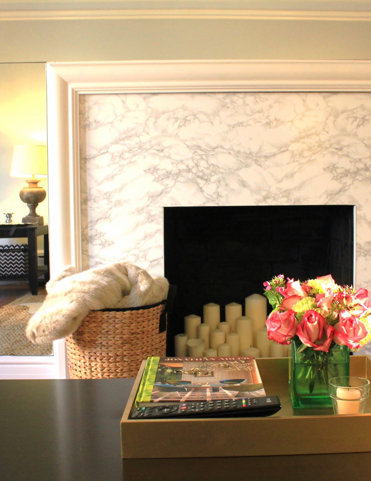
Our fireplace got a fairly substantial makeover!
We are so lucky to have a fireplace in our apartment, but as the focal point of the room, it had been looking a little sad…
Here’s the evidence:

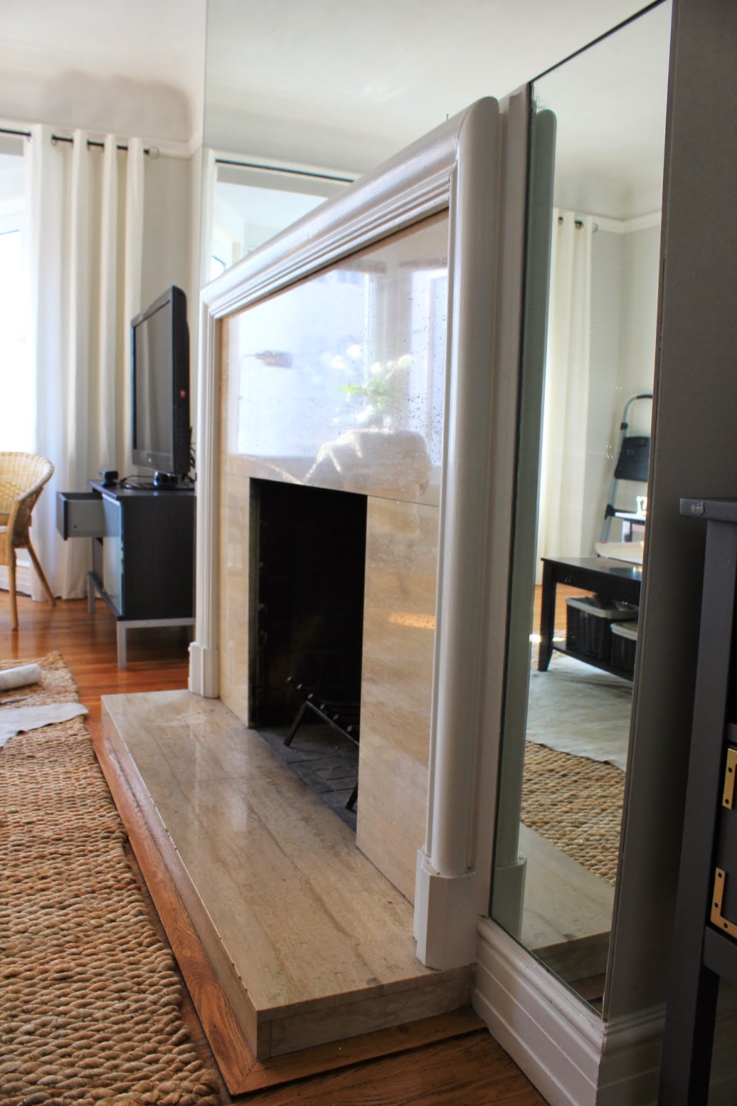
It wasn’t terrible – but it had certainly seen better days.

From far away it doesn’t look SO bad, but up close the stone was really dirty (and this is after about 45 minutes of scrubbing).  It also had several deep cracks running through it.  Nothing non-livable, but I’d been scheming about a fireplace update for a while.

See – up close you can really see the permanent grime and the cracks.

The stone was also really yellowed, and wasn’t very pretty to begin with so I was confident that I could improve upon it’s facade.  I had seen several DIY projects that got the wheels spinning.

On SMP Living they did a hack on an Ikea table that turned out amazing

On A Thoughtful Place she tackled a small countertop in a similar fashion…

And over at I Heart Organizing, their coffee table got a sweet makeover with marbled contact paper.

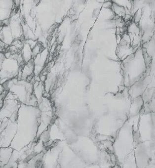
All the makeovers had turned out really well, and the contact paper looked gorgeous in the photos.  After kicking the idea around for a few days, it seemed easy enough to tackle, so I placed an order for this roll of carrera marble contact paper.

I will say, when I saw the price tag, I was a little surprised, but $65 isn’t a deal breaker – especially when the stone was in such bad shape.  I’d also looked into less expensive options on Amazon, but after reading some mediocre reviews I pulled the trigger on the more expensive product.

I later realized it ended up being the less expensive option in the end!  The other rolls of contact paper did not have enough for me to cover our entire fireplace, but with this roll, there is 50 feet of contact paper.

I win!

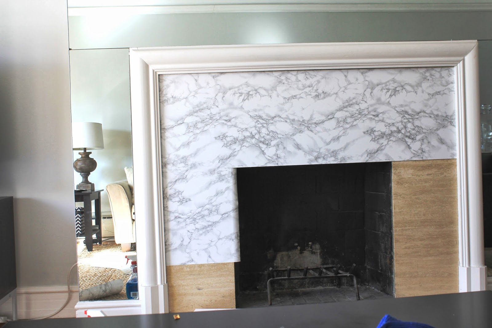
Here is the first piece of contact paper after I got it installed on the fireplace.  One long sheet covered quite a bit of the fireplace front, and so even though I wrestled to get to to lay straight and flat (no bubbles) I still had to peel it off and redo it a few times.  Regardless of the several first attempts, it went up relatively quick.

An extra pair of hands would have been helpful, but since the contact paper easily peels off without loosing it’s stickiness, it was totally fine.

I made my way row by row, and did my best to match up the marbling pattern on the seams – it doesn’t have to be perfect – no one is looking THAT close – but I didn’t want it to be super obvious.  If you’re doing a smaller space, or you don’t mind wasting a bit of the contact paper to get it to line up perfectly, you should definitely try.  I was covering a large surface, and didn’t want to run out halfway through, so I went for “close enough”.

I measured the width carefully, and then added a few extra inches than I’d actually need before cutting it out.  Once it was up, I then used an exacto knife to cut away any excess on the sides.

After this point I was feeling good… the contact paper was going up quickly, and I’d finished the majority of the front in just about an hour, but it quickly slowed down from here…

Cutting around the molding proved to be a HUGE pain in the butt, and much harder than I’d anticipated.  I wasted a few sheets of contact paper, so it was a blessing I had plenty to spare.  I found it was easiest to leave the paper backing on while tracing the molding around the contact paper as best I could, and then cutting it out roughly, adhering the paper down, and then cutting off the rest.

There are still a few spots that aren’t perfect in those tight nooks and crannies, but I’m not going to sweat it.  It’s pretty well camouflaged.

Despite my exacto knife cuts, I found that when I finished the edges looked so raw still.

Not loving it.  You could really tell on the edge that it was contact paper, and not actual marble.  Ignore the messy cuts here – I ended up re-doing this section after snapping a few pictures.

Woof.  I literally could not stand it.  The seams were jumping out at me.

Pretend that these pictures actually showcase my handiwork after it was redone.  The edge between “marble” and wood still looked raw and unfinished, but the rest was smooth, and seamless.

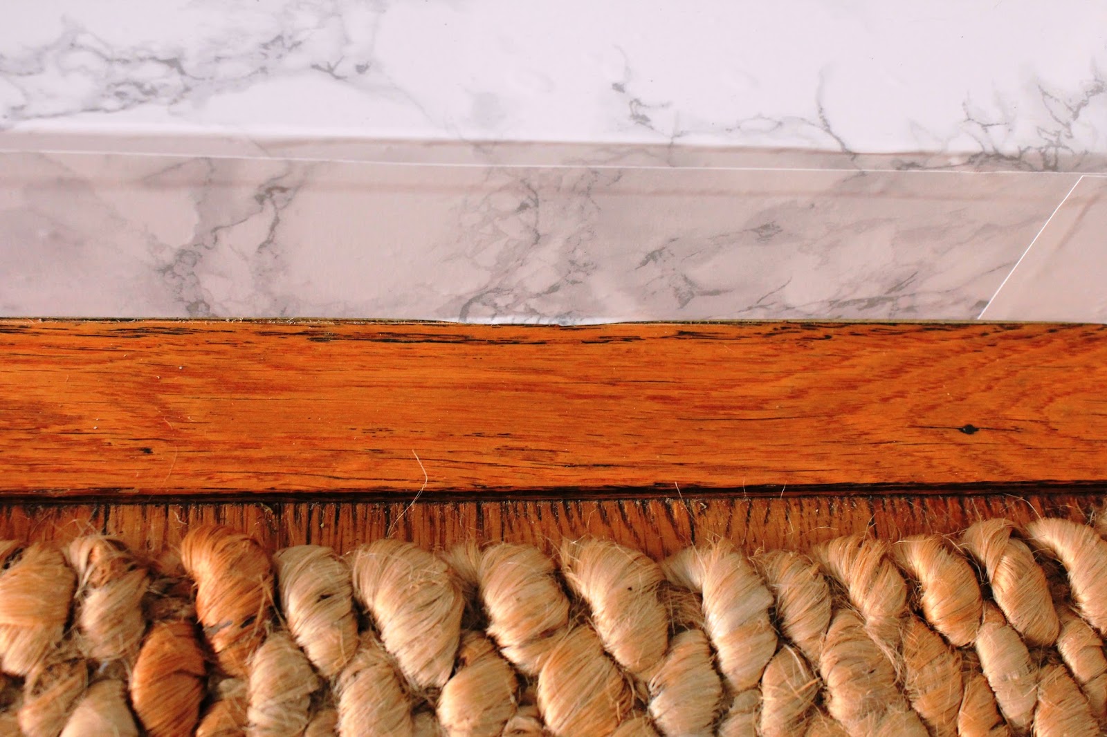
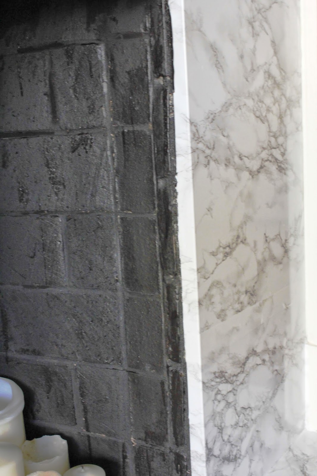
The edge where the contact paper met the brick interior, it was also pretty raw and ragged looking.  I needed a solution.

I headed to Lowes, and wandered around the store looking for the perfect thing to trim the edges with.  I originally was thinking something brass would be awesome.  The idea of trying to cut through brass was not so awesome.  I ended up buying some pre-primed and painted wood strips – the flattest I could find, and a pre-primed and painted quarter round piece of trim.

A few cuts here and there, and presto-chango… we had some very finished looking transitions between “marble” and brick, and “marble” and wood floor.

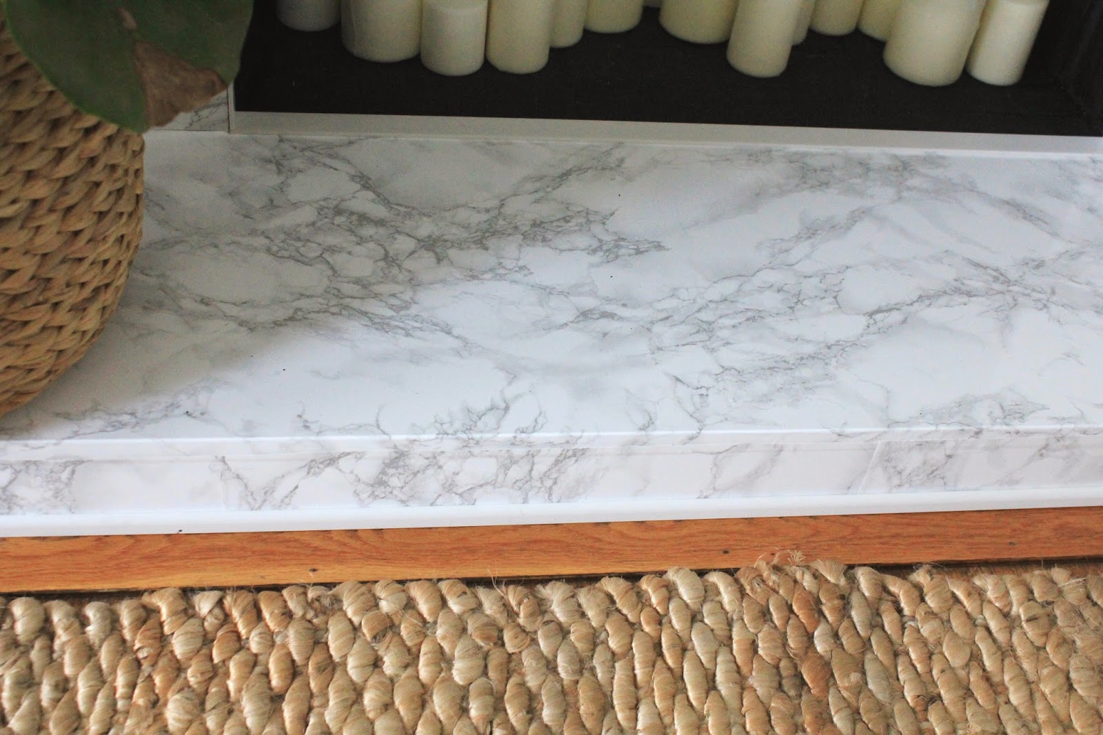
The flat ~1″ wood strips trimmed out the mouth of the fireplace between brick and contact paper, and really cleaned that up, while the quarter round finished off the area between the wood floor and the hearth.

BOOM.
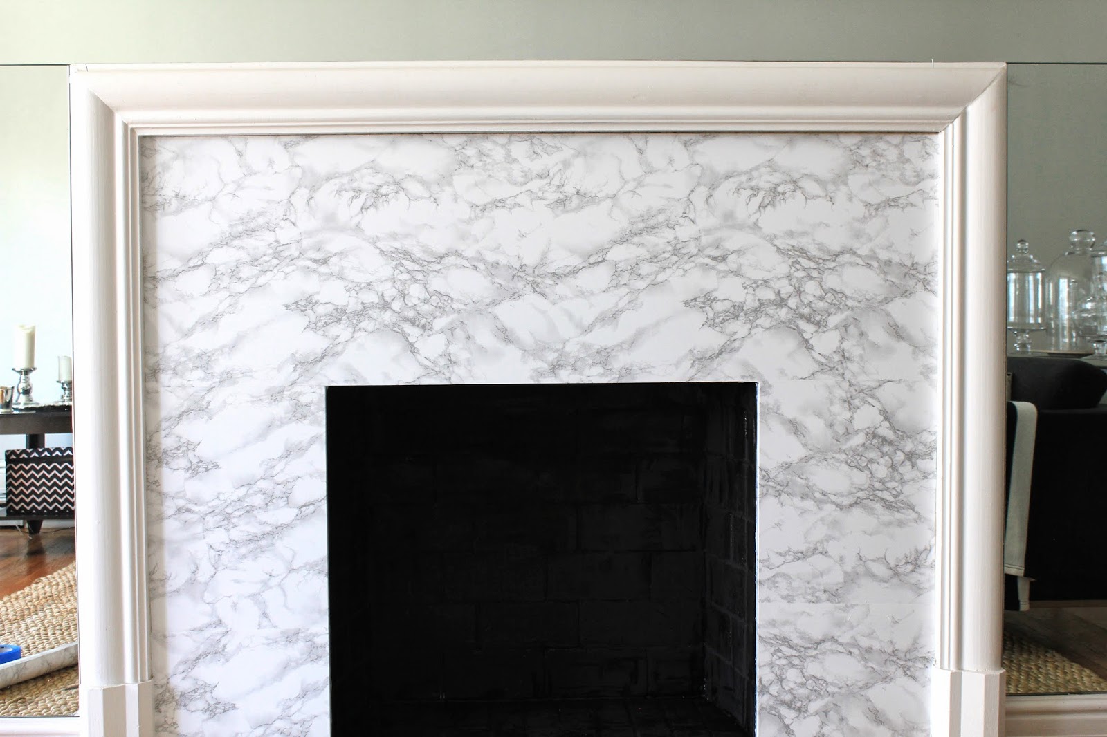
It looks pretty amazing right??  I mean the trim is so subtle that most people wouldn’t notice, but it really changes everything, and takes this fireplace from “pretty good”, to “finished off like a pro”.
A few areas still need a bit of caulk to fully seal the gap in the seam between wood and “marble” but it’s looking SO GOOD.

I also have to say, taking my time, going slow, being careful to keep my cuts straight, and being meticulous about smoothing out every air bubble really paid off.  Even when it meant peeling off the contact paper, throwing away a wasted piece and re-doing it… it made all the difference.  It looks SO REAL now that it’s finished.  You’d have to get your nose right in there to tell it’s contact paper.

Because of the cracked, pocked marked stone underneath, those imperfections show through the contact paper a bit, but I think it actually makes it look a bit more authentic.

As for the air bubbles, they really are unavoidable as you smooth the contact paper down over the surface.  Try to get as much out as you can by pressing hard and smoothing the air out to the seams before fully sealing it down, but for the small stubburn air bubbles that remain, use a pin to pop them (I just used an earring since we didn’t have a pin).  Poke a small hole in the middle of the air bubble and smooth out the contact paper around.  The air will squeeze out of the hole, the teeny tiny hole disappears, and there’s no more air bubble.  Everyone wins.

I found it was really helpful to use a towel when pressing the contact paper smooth (instead of a rubber squeegee or credit card).  The instructions on the back of the contact paper said to use a towel, it it was great.  It spared my little fingers quite a bit, although I did end up with a little blister on my thumb from all the pressing.  Totally worth it though.

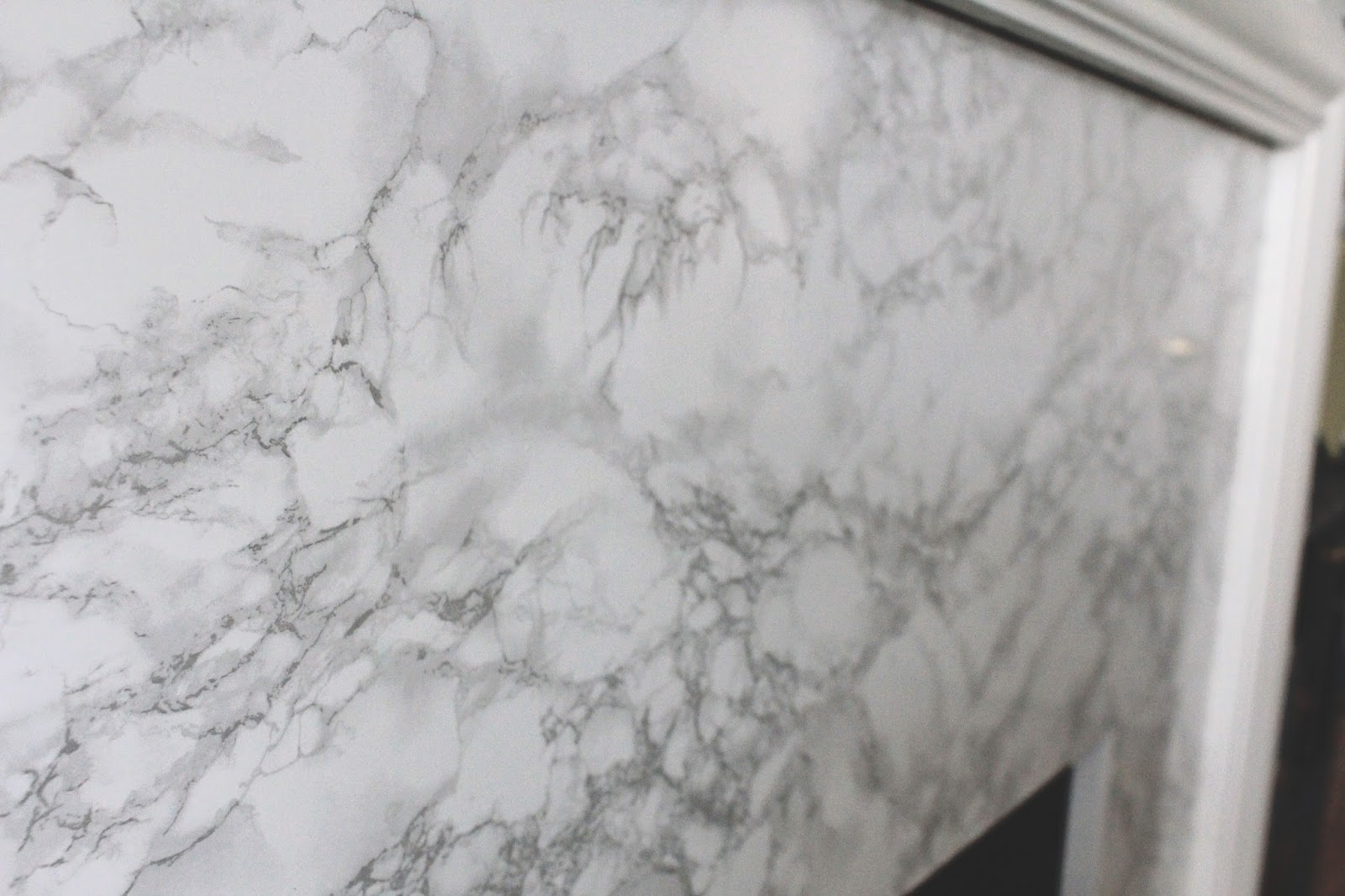
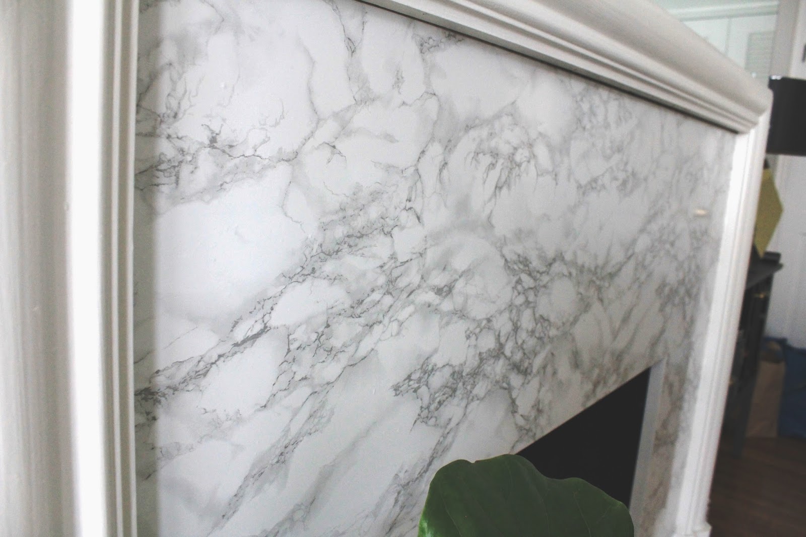
I mean, this is as close as it gets… pretty real.  The colors are really crisp, and the marbling is really pretty.

Here is a close picture of one of the seams – as you can see it doesn’t line up perfectly, but close enough, and the seam is WAY LESS noticeable than it had been with the old stone facade.

Look at the seam now from far away… it’s hardly noticeable, and certainly less noticeable than it had been with the original stone (in case you’re having a hard time finding it in the picture below, it’s perfectly lined up with the top of the fireplace opening).

For comparison’s sake, here’s a picture of the seam on the original stone – it was pretty obvious.

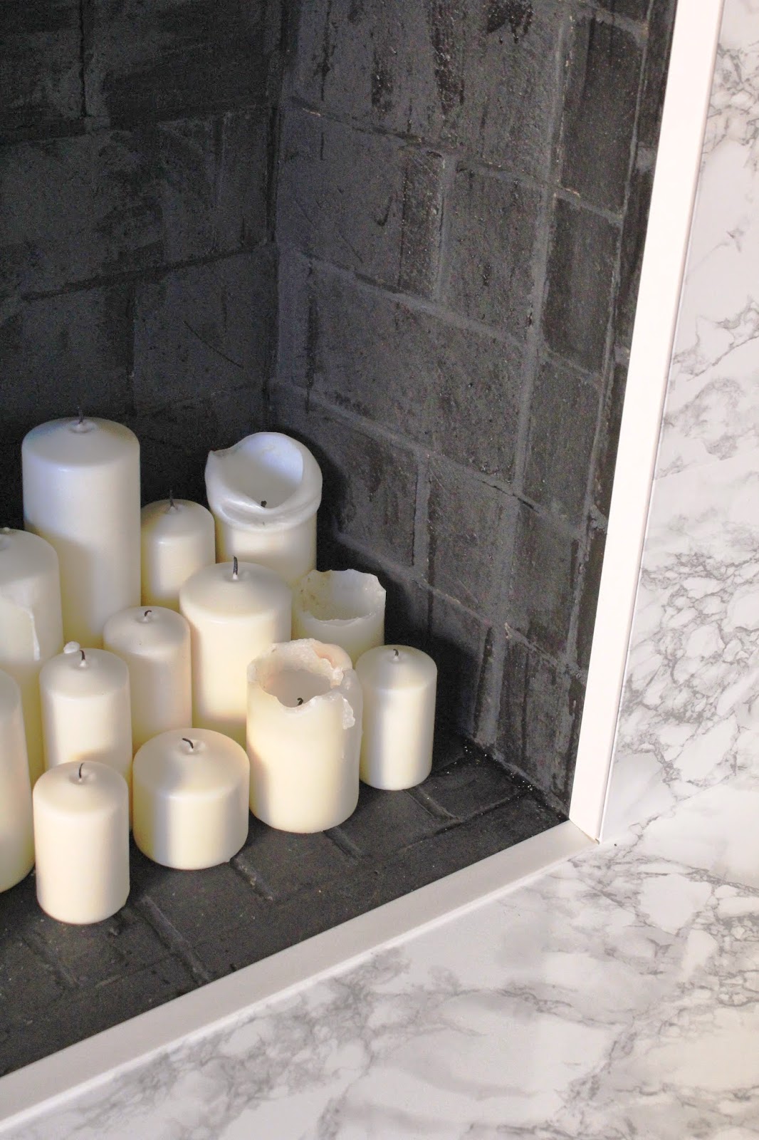
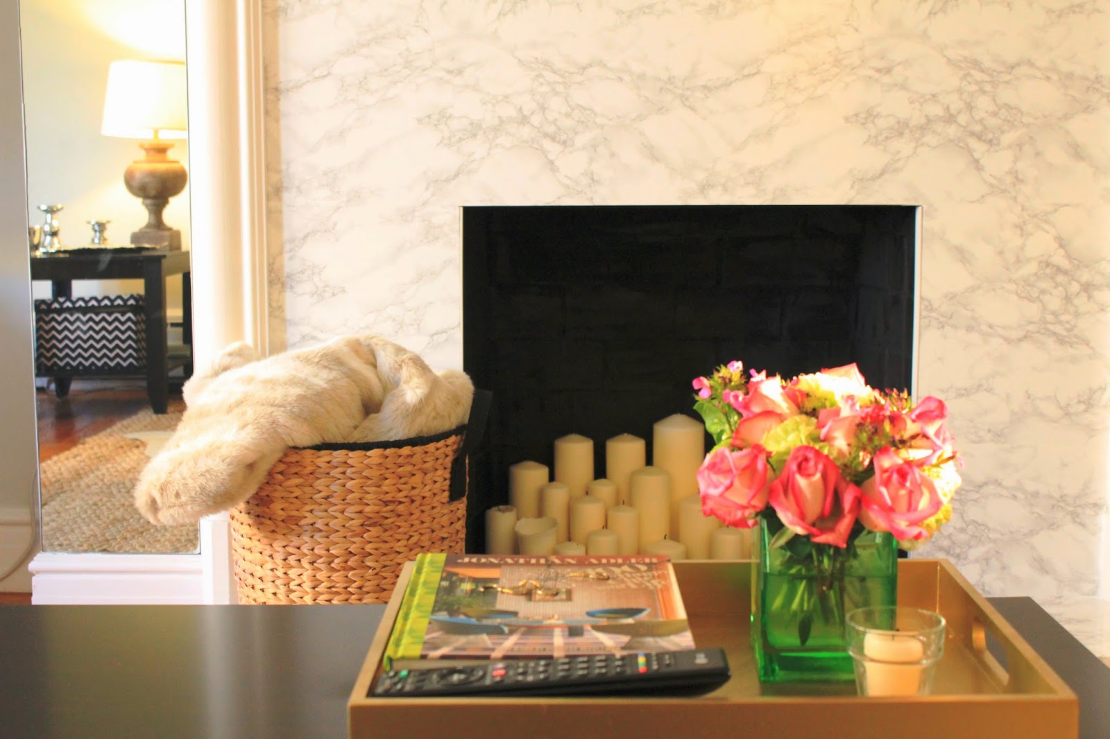
Finally, I want to talk about a second update to the fireplace that you probably didn’t notice… look inside the fireplace at all the discoloration – the black soot, and the ashy grey stone.
Ugly.
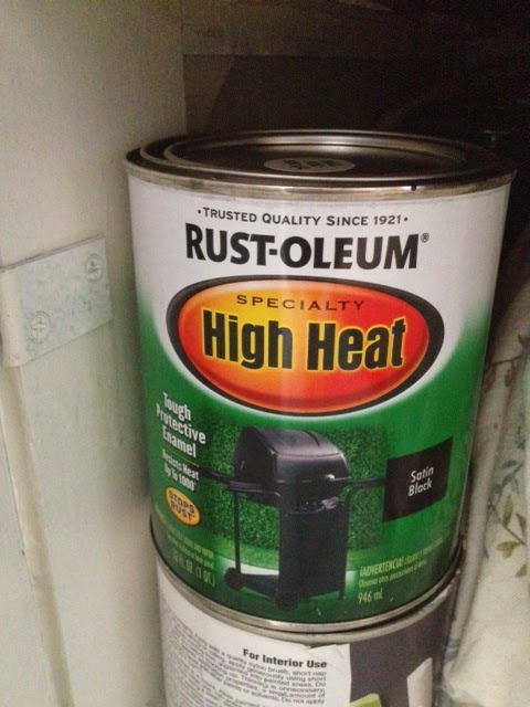
Enter a can of this high heat paint from Rustoleum.

I’m 90% certain this fireplace is non-functioning… it certainly hasn’t been used in at least the last 5 years… but functioning or not, the last thing we need is to light this building on fire.  I don’t want to test this out, so we’re not going to light any fires in here.

That said, this high-heat paint is meant for projects like this, so in case it ever does need to be used, we’re good to go.

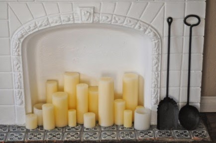
The paint was much more liquid-y than normal paint – almost like oil – and was super stinky.  Open the window when you use this!  Luckily, it went on in one coat, and dried relatively quickly. Now the inside of our fireplace is a uniform solid black, and the perfect backdrop for all our pretty candles.

I got the idea from Emily of Cupcakes and Cashmere who had a similar set-up going at her old house.

I think the white candles against the black is really dramatic and pretty, and now it’s so romantic at night.

So that’s it – a little elbow grease, creativity, and about $80, and our fireplace has a whole new face!

What do you think of my little makeover?  Was it worth the blister on my finger, and about 5 hours of work?

How to Hang a Gallery Wall

Unfortunately, 2014 is the year of neglecting this blog a bit… sorry guys!  While I sort of checked out after posting the upholstered headboard tutorial, and the grout makeover, here’s the Readers Digest version of what’s been going on in our world…
We spent the weekend down in Santa Barbara, braving the stormy weather and looking at potential wedding venues.  All I’ll say is we are REALLY excited about what we saw, and it’s all feeling so real now.  Very VERY exciting for us…
In other news, I started hanging art in our bedroom.  The beginnings of a gallery wall are starting to take shape…

I had been holding off on hanging things up, wanting to get the walls repainted first, but I’ve amended that plan.  I just don’t feel like it’s realistic to paint every room at once. It’s a HUGE time commitment (which I don’t have right now), and a lot of work, so this room won’t be getting painted in the next few months (at least!)

Regardless of new paint, I didn’t want to put off adding some character to this space.  In our last apartment, our bedroom got neglected for a long time, but with our pretty bed, and that gorgeous blue dresser I made last year, this room deserves to shine!

Luckily, the bedroom walls actually aren’t in terrible shape (compared with the dining room, living room and hallways) so these will likely be the last to get painted.  I invested in a huge package of Mr. Clean Magic Erasers… those things are certainly magical.  I was able to get almost all the black scuffs off the walls, so it’s already looking a million times better.

After a little minor scrubbing, I grabbed the boxes where I’d packed all our picture frames and art (there are about 5 boxes FULL) and just started eyeballing and hanging.

After hanging a few gallery walls in the past, I have a few helpful tips.

Do not map it out exactly – I’ve found that it’s unlikely that you’re going to stick with the original plan once frames start going up on the wall (remember this post when I attempted my first gallery wall??).  Instead, decide how high you want the art to go (how close to the ceiling, and how far our on the wall) and hold up the frames to get a feel for how much space they will take up.  Simply holding a few of the large “anchor” frames up will give you a good idea of space.

I also like to start with the largest prints first – I call these the “anchor” pieces, because they are naturally where the eye goes on a gallery wall, and their placement affects the placement of everything else.  In this case, I started with the largest “New York” frame, and built next to it.
Once the first frame is hung, decide how far apart you want the other frames to be. The larger the frame, the wider the space between frames… the smaller the frames, the smaller the space between them.  If it’s a small cluster of small frames, 1-2″ should be fine, but if its a large wall with lots of larger frames, I’d go with 3-4″ between.  You’ll see what looks right.
Another thing I’m learning as I hang these frames – since this is going to end up being a largeish gallery wall built around our TV, it’s been easier to start by hanging an “inner layer” of frames around the TV, and finish the gallery wall out with the “outer layer” so you’re building from the center.
No idea what I’m talking about?
Here’s a little diagram to help you envision what I mean…
Once you get the larger, main frames in place, finish the wall out with smaller filler frames where it feels a bit sparse
If you look at the progress I’ve made, the gallery wall is looking a bit triangular… this is because I just started the inner layer, and haven’t done any filling out.  Based on the frames I have, this is how I see the rest of the gallery wall playing out…
The dark frames in the above photo illustrate my “anchor” pieces, and the light blue are the filler that will come later.
Of course this diagram is subject to change, but it will most likely look pretty close to this based on the scale of the wall, and the size and number of frames I’m working with.
A few other tips – if you’re mixing frames (sizes, frames, colors) try to find balance there too – I’m trying to have an even mix of dark frames with gold and white.  There will probably only be two white frames, with the emphasis on gold and black.
Same rule applies for size – don’t pile up all the large frames on one side or in one area.  It will end up feeling super unbalanced.
Along the same lines, vary the frame direction as well – hang some as a portrait, and some as landscape, and I like to have a few square frames mixed in for good measure.
I also want to point out – don’t wait until every frame is filled with art you want to display – I’ve hung frames up that still had the stock photo in them, or framed prints I wasn’t in love with anymore.  Waiting to fill the frames holds the project up, and once the frames have found their home, it’s pretty easy to decide what kinds of prints, photographs, or paintings will look good next to one another – abstract next to a photograph… bright colors near a muted piece… you get the idea.  Let the frames’ size and shape and color determine where they are hung – not the actual art.  Art can be changed.
And finally… don’t be afraid to make a few holes in the wall.  Keep putty, a putty knife and a small sample pot of paint nearby if you think you’ll really mess things up, but so far, I’ve been tapping nails in, hanging the picture, standing back to see it all together, and if it doesn’t look right, moving it around a bit.  Overall, the frames will cover any holes you make, so its small tweaks here and there.  Don’t be afraid to mess up a few times.  It’s just sheet-rock!
As a bad blogger, I forgot to take a “before” picture, so the other half of the empty wall will have to do.
As you can see, its a very bare wall… tall ceilings (11-12′ tall) so the TV was very alone and awkward there.  I think the gallery wall will help fill things in, without crowding the room, and the TV won’t stick out like a sore thumb quite so much.

So that’s that – after messing up a few gallery walls, and learning the ropes, I hope these tips help you attack that big blank wall that’s staring you in the face at home!

More updates, and better photos are coming your way soon once I finish this up!  In the meantime, feel free to message me if you have more specific questions!