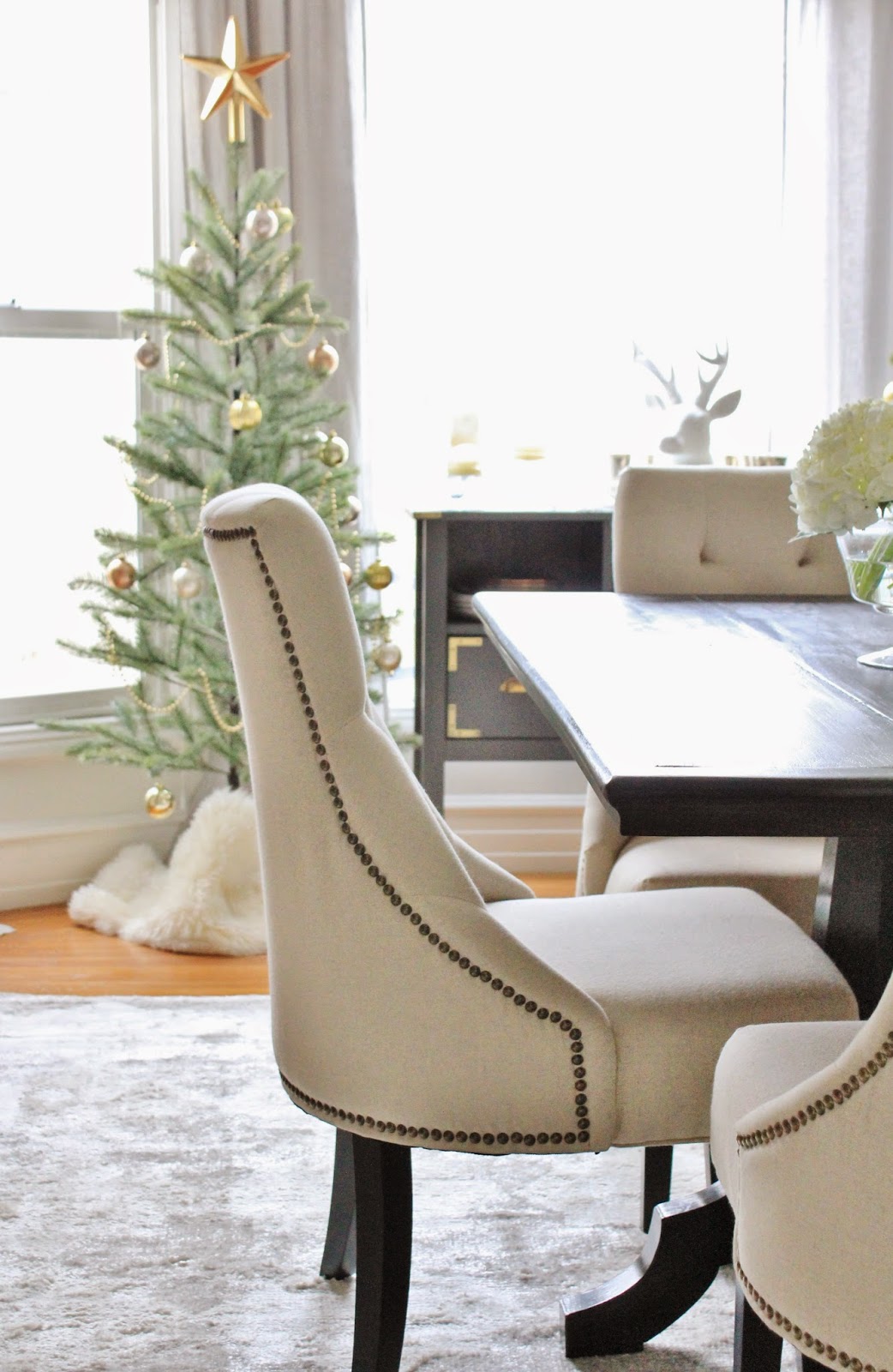
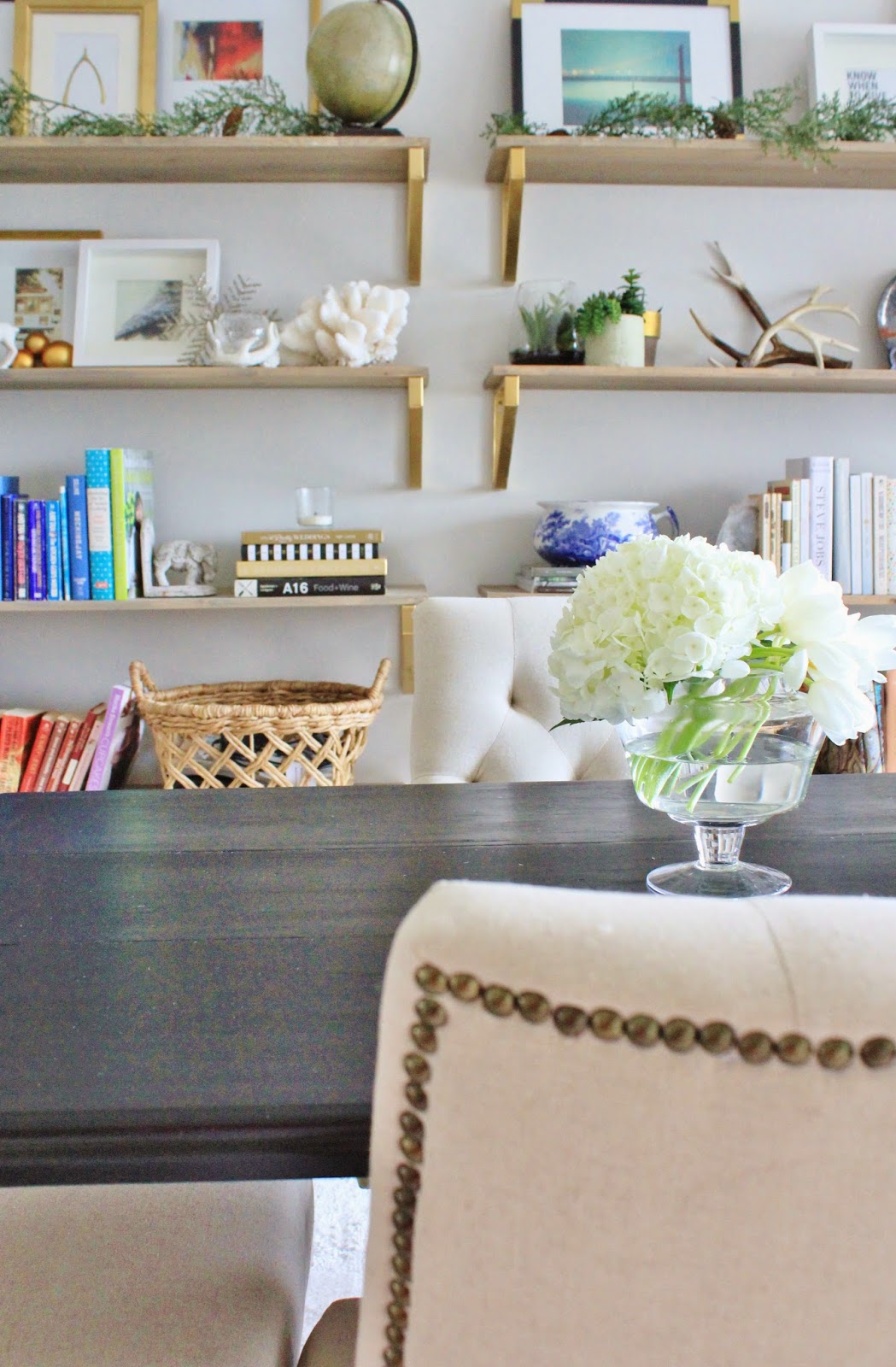
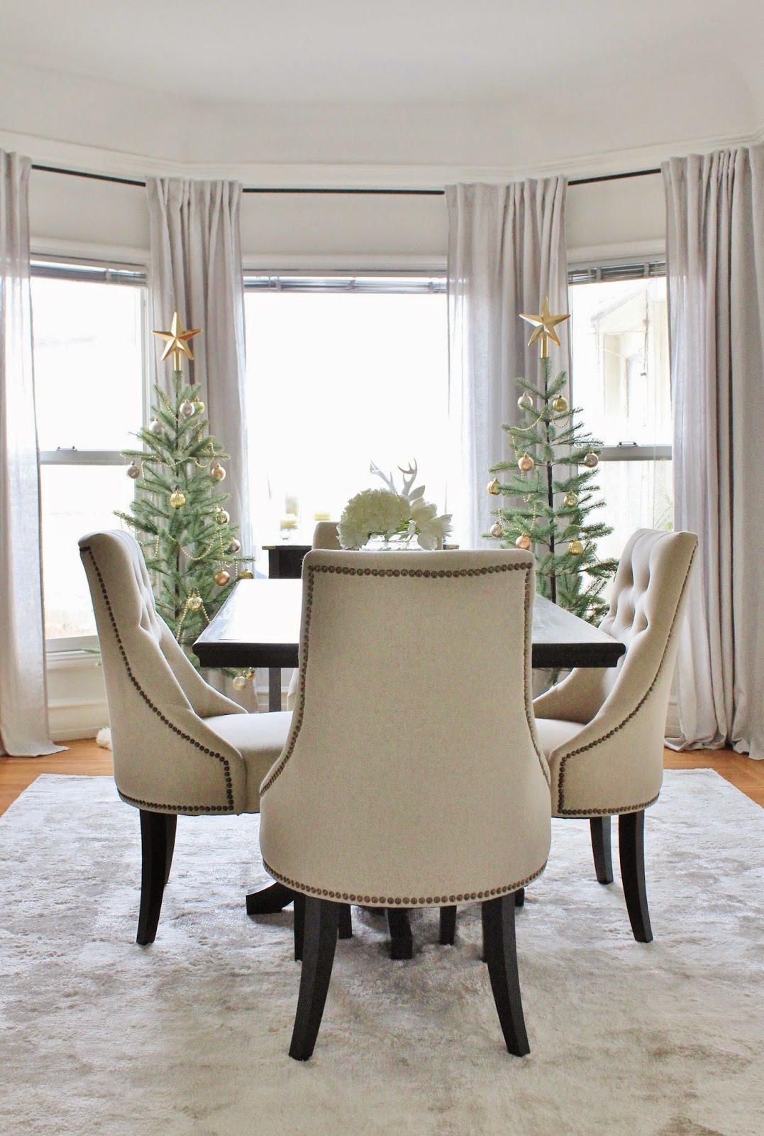
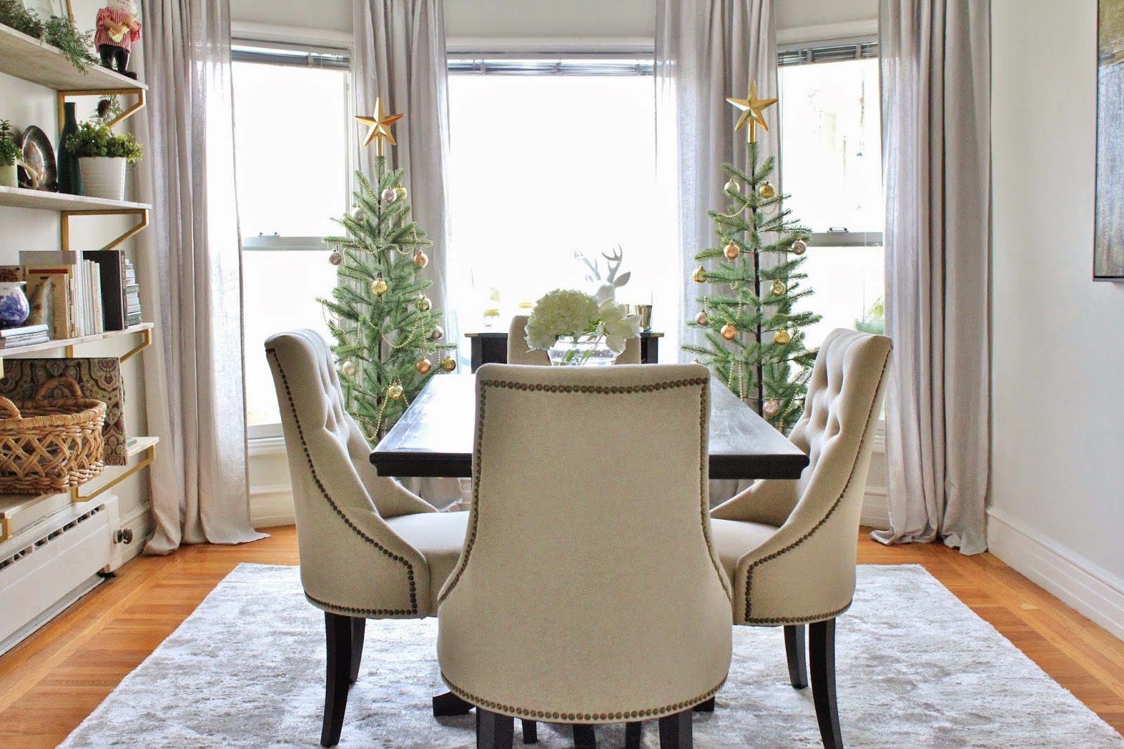
Can I just take a second to tell you how much I love our new dining room chairs??
These are the Lydia chairs from World Market and they are an absolute steal for the quality. Super plush padded seats, nice tight tufting, sturdy frame, and individually hammered nail heads trimming out each of the seat backs. There is good support, and they are really comfortable. Aside from the positive practical aspects, they are so pretty. The linen and the nailhead is such a natural marriage together, and the tufting just sort of puts them over the top for me. In a good way 🙂
I especially love that the nailhead runs around the sides and back, so that when they’re tucked into the table, you still get that great detail.
It’s love.
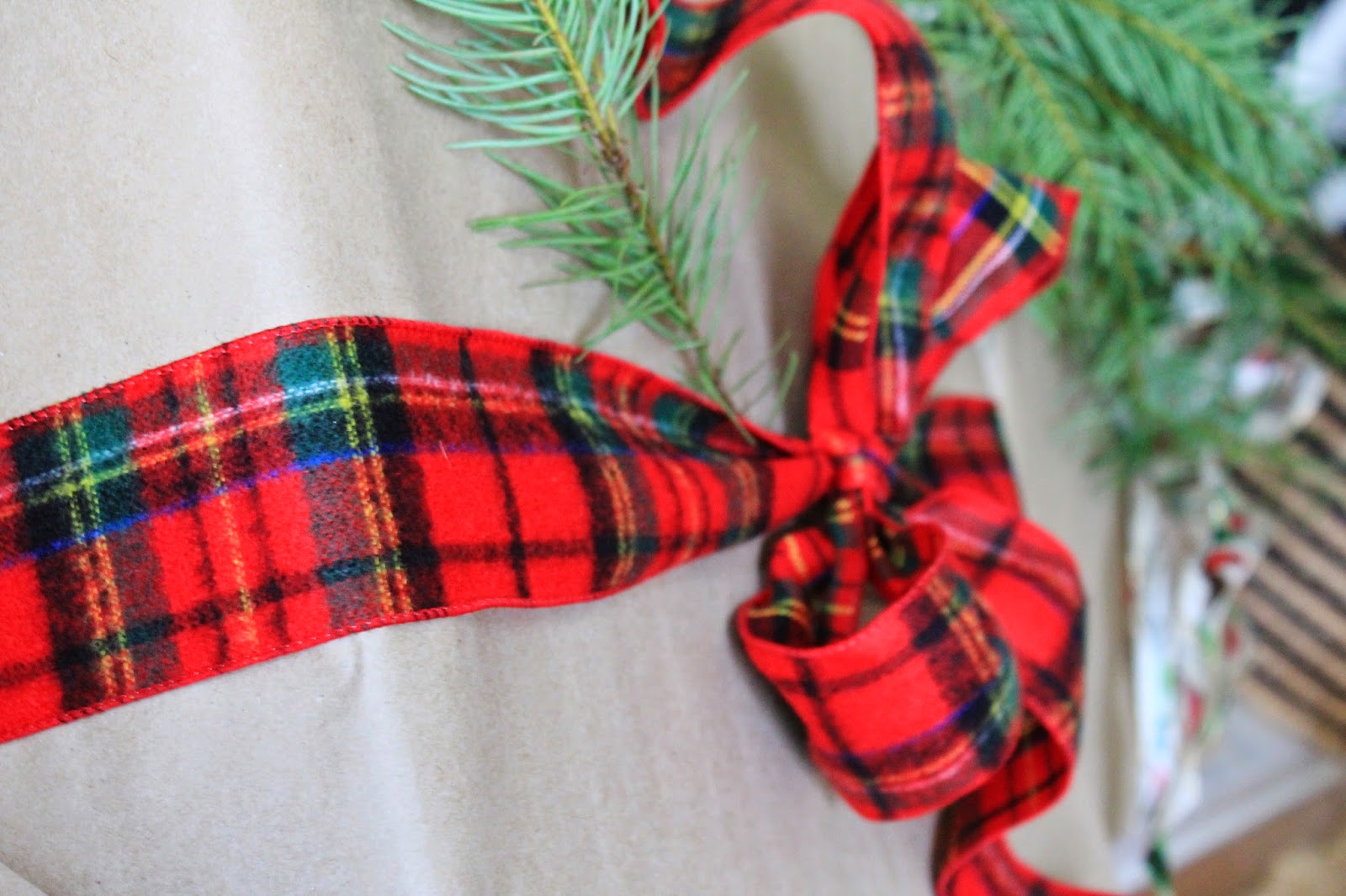
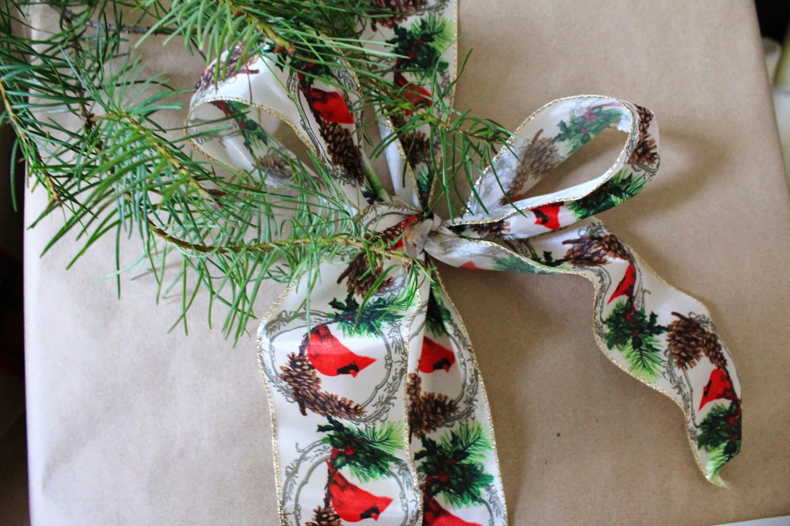
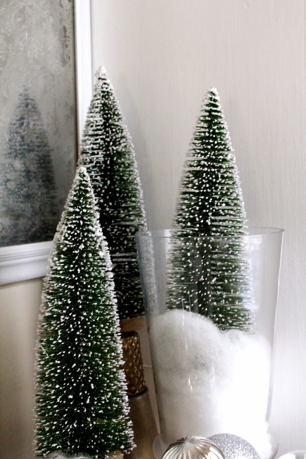
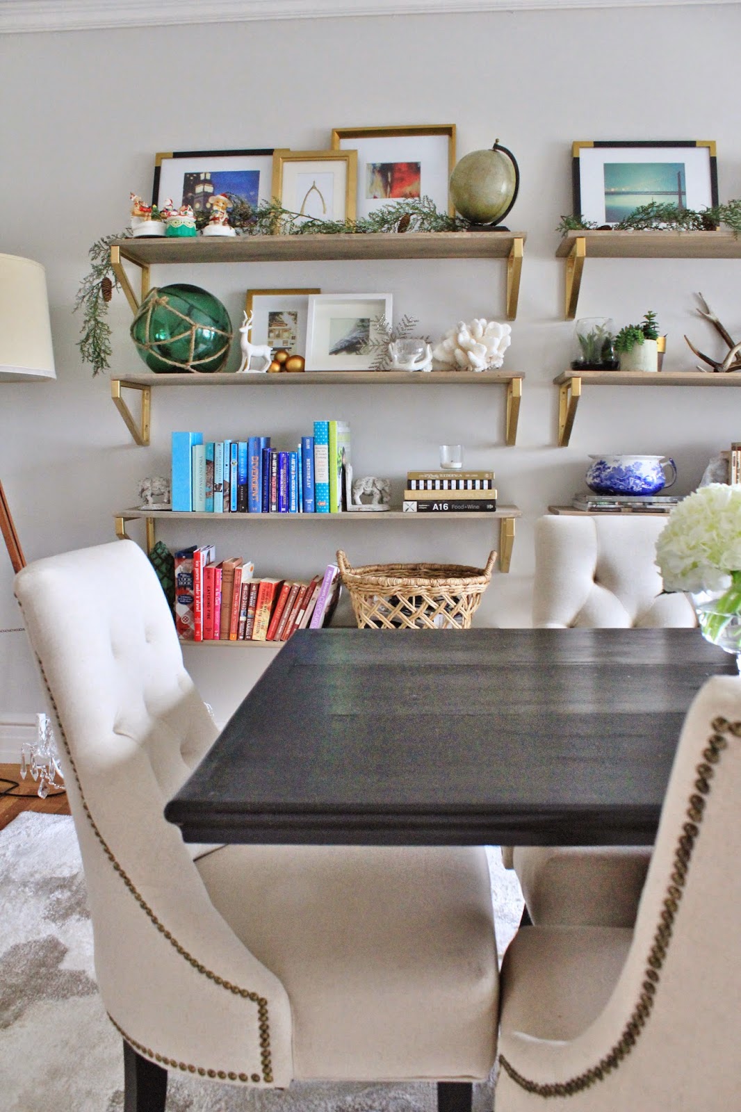
You’ll notice peeking out behind these chairs are two mini Christmas trees. Tree twins in the dining room.
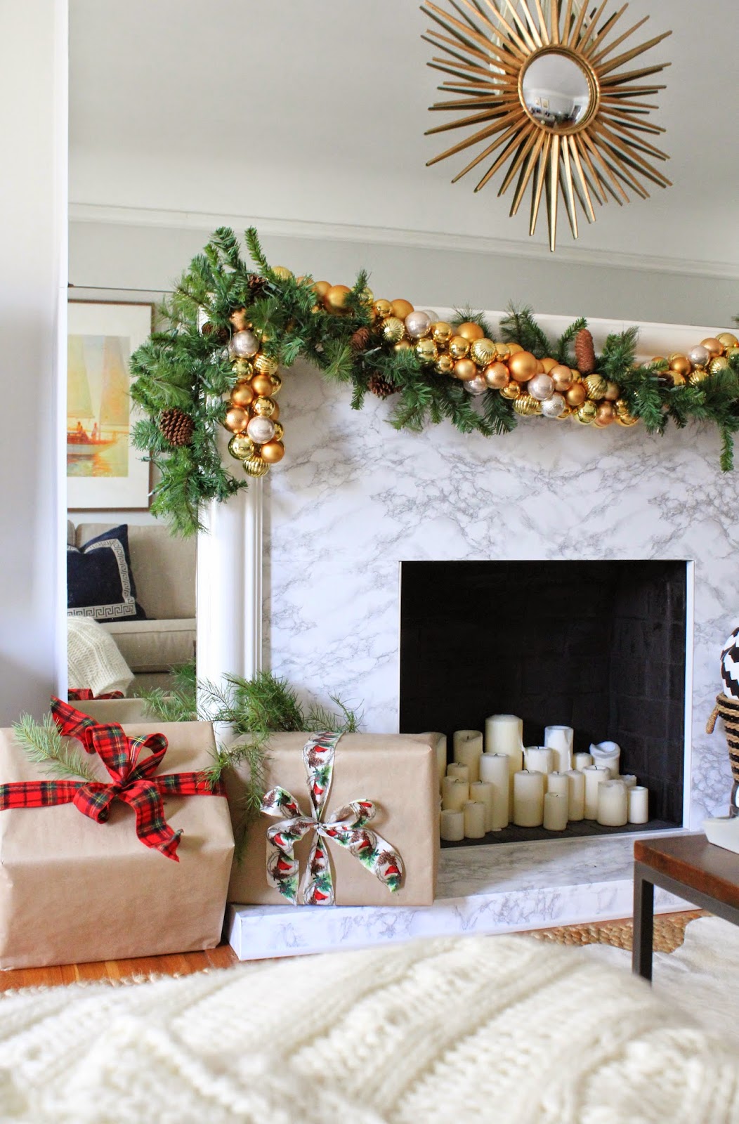
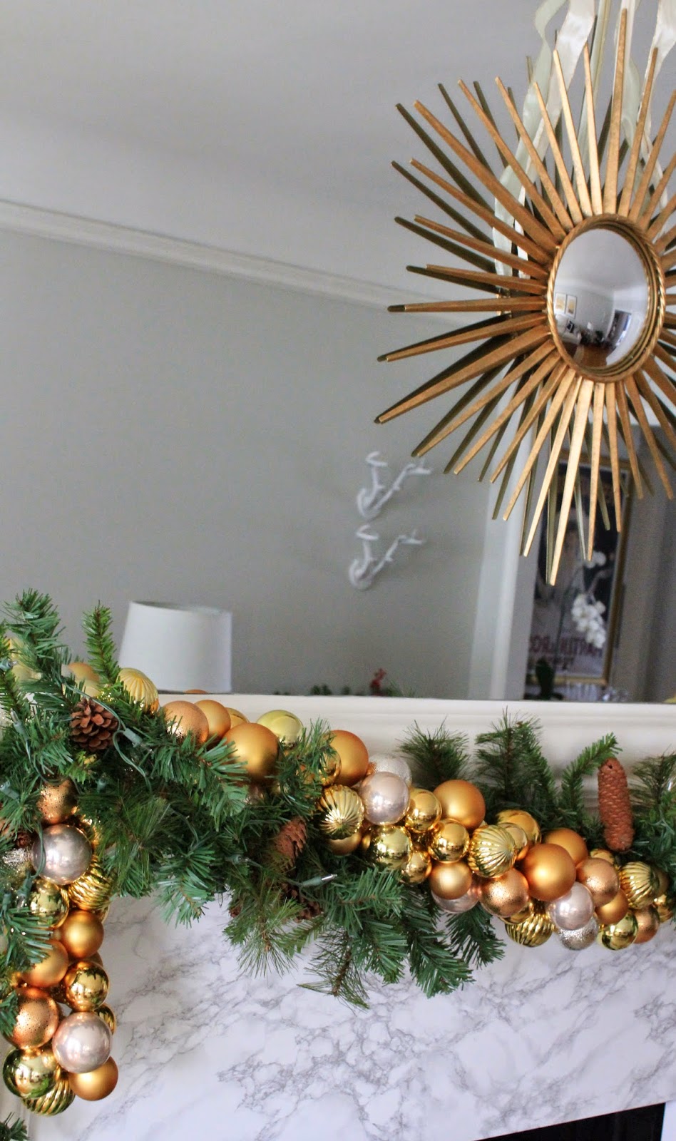
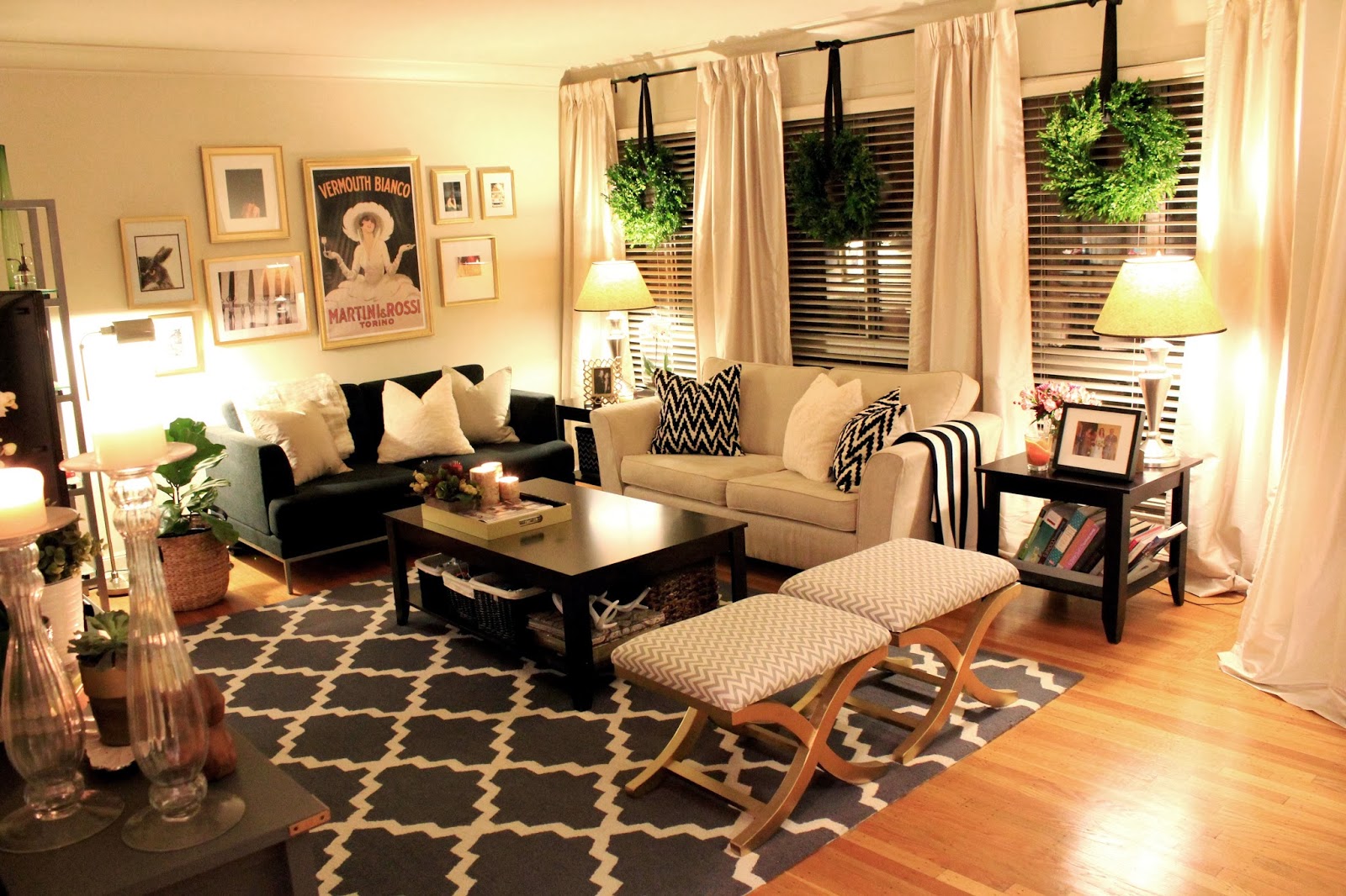
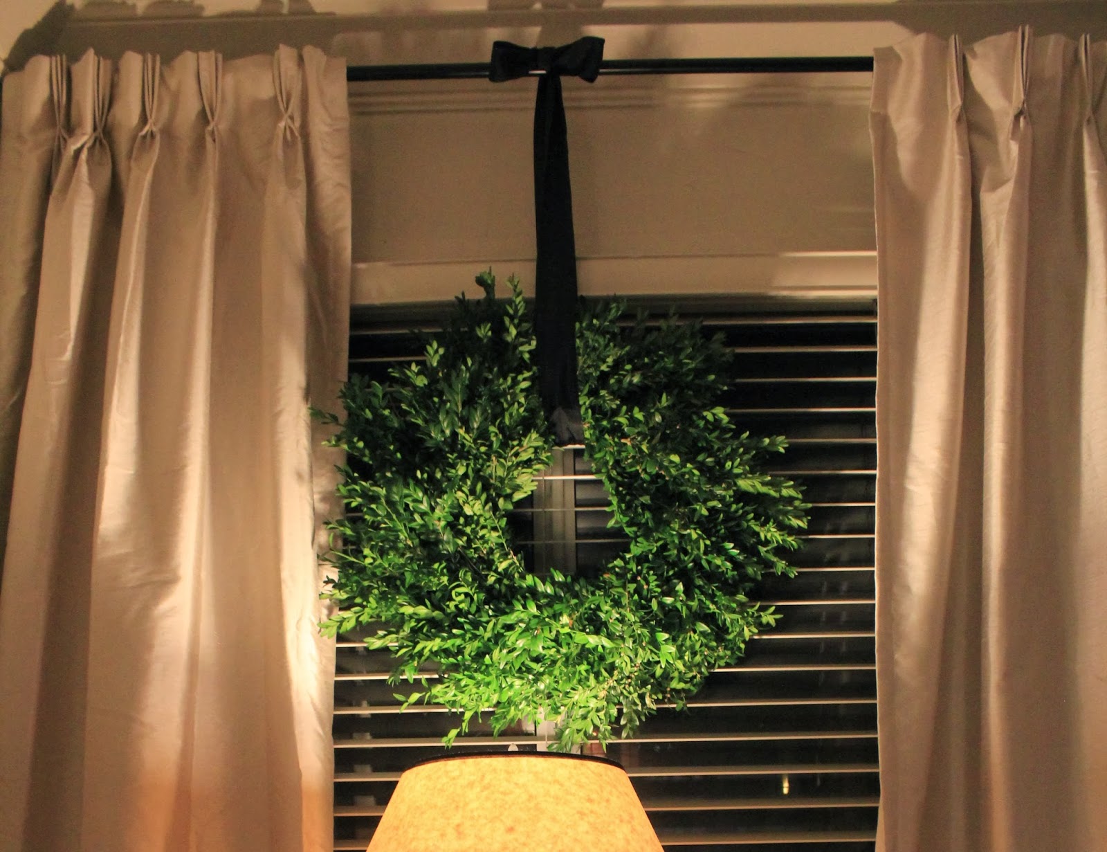
Since I work from home a lot, it’s been so nice to have the holiday decor spreading into this space as well as our living room. The trees in here, along with stars, ornaments, and garlands are all from Ikea. The ornaments in here are actually the same ones I’d used in the garland in our living room. I really like the continuity from one room to the next – especially as these spaces are open to one another.
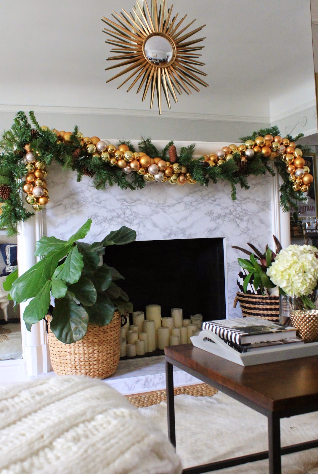
I once read in House Beautiful that one secret to making a small home feel bigger is to use the same color palate in every room. I have never forgotten that, and ever since focusing the colors in our house to grey, black, white, tan, gold, and various shades of blue, it really has made it seem bigger. Keeping the green and gold going in here from the living room makes it feel less busy, even though we have two relatively tall, fully decorated Christmas trees in a not-that-big space.

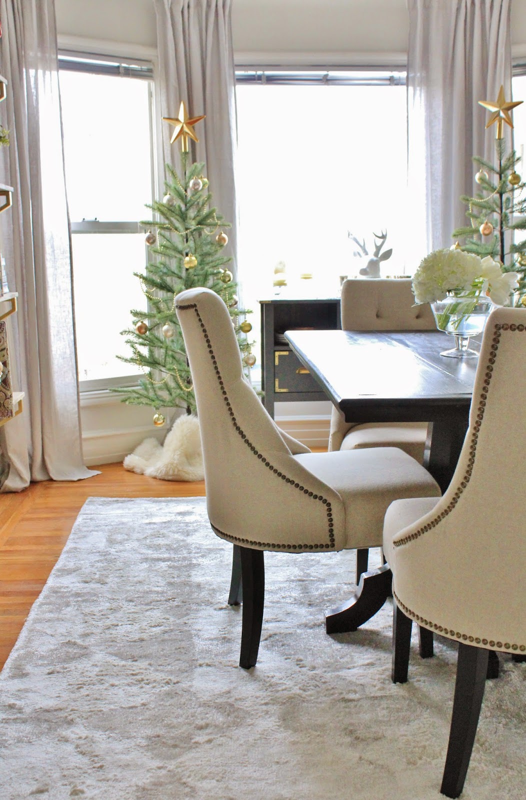
The tree’s themselves were really easy to put together, and from a glance look pretty realistic. I love that the branches are spaced out. It gives off that sort of sparse look that I’ve always admired in Nordic holiday design.
Not sure what I mean? You can see some good examples of that sparse, minimalistic type of tree here, here, and here.

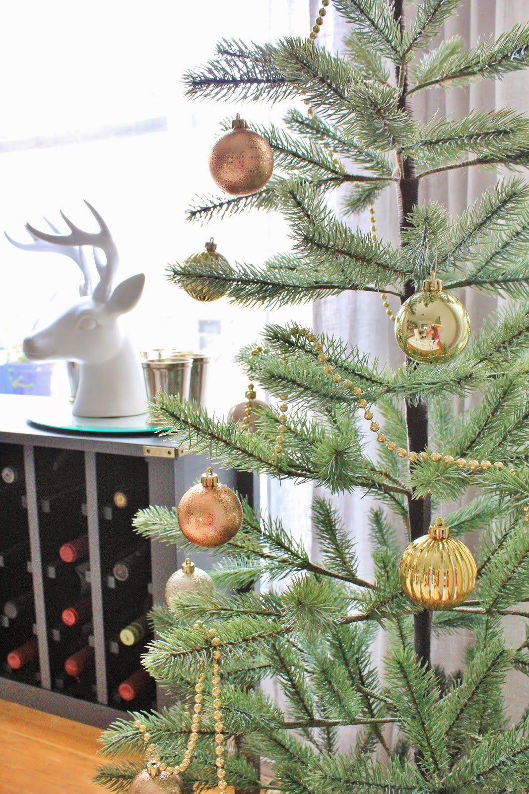
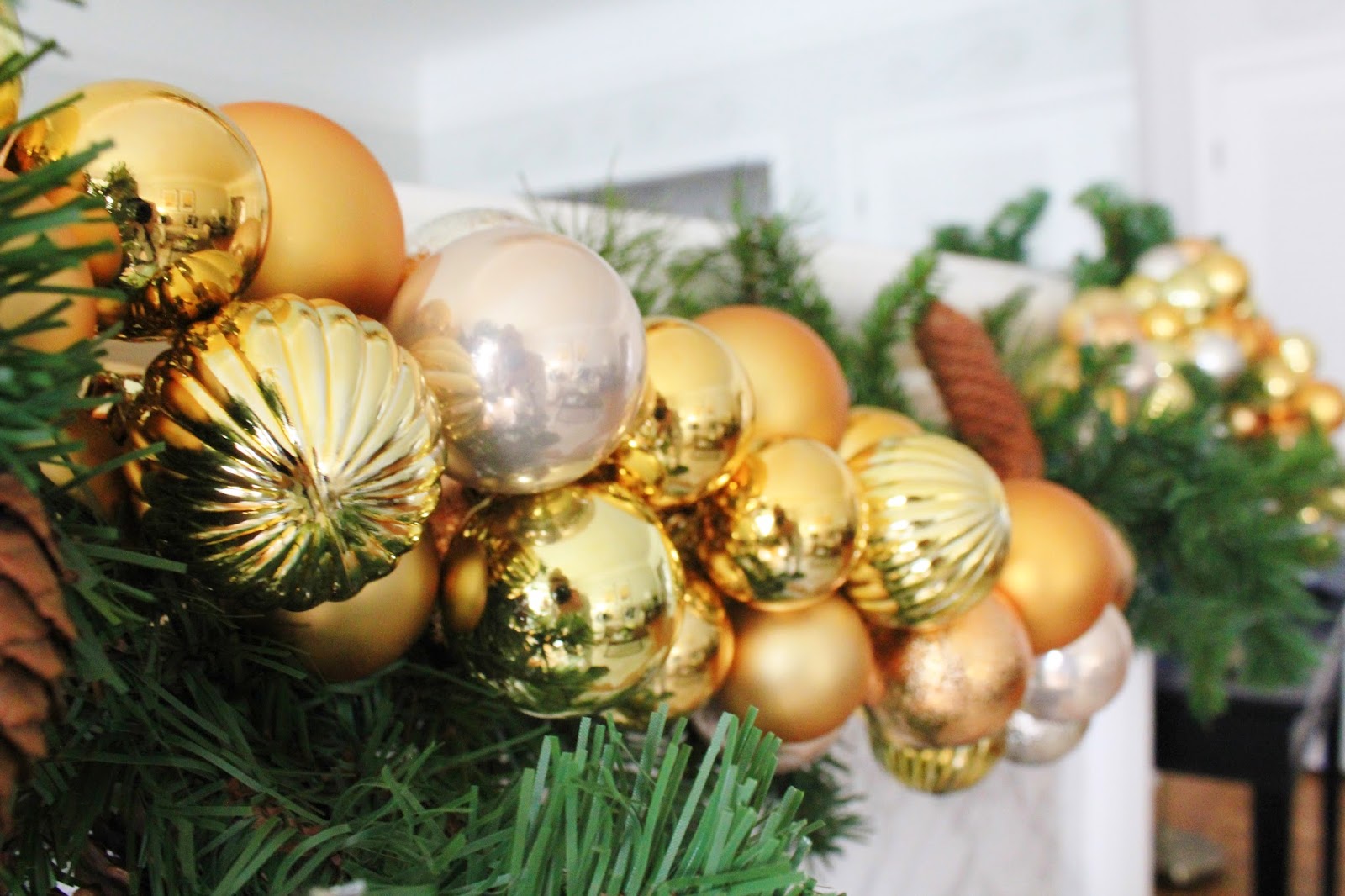
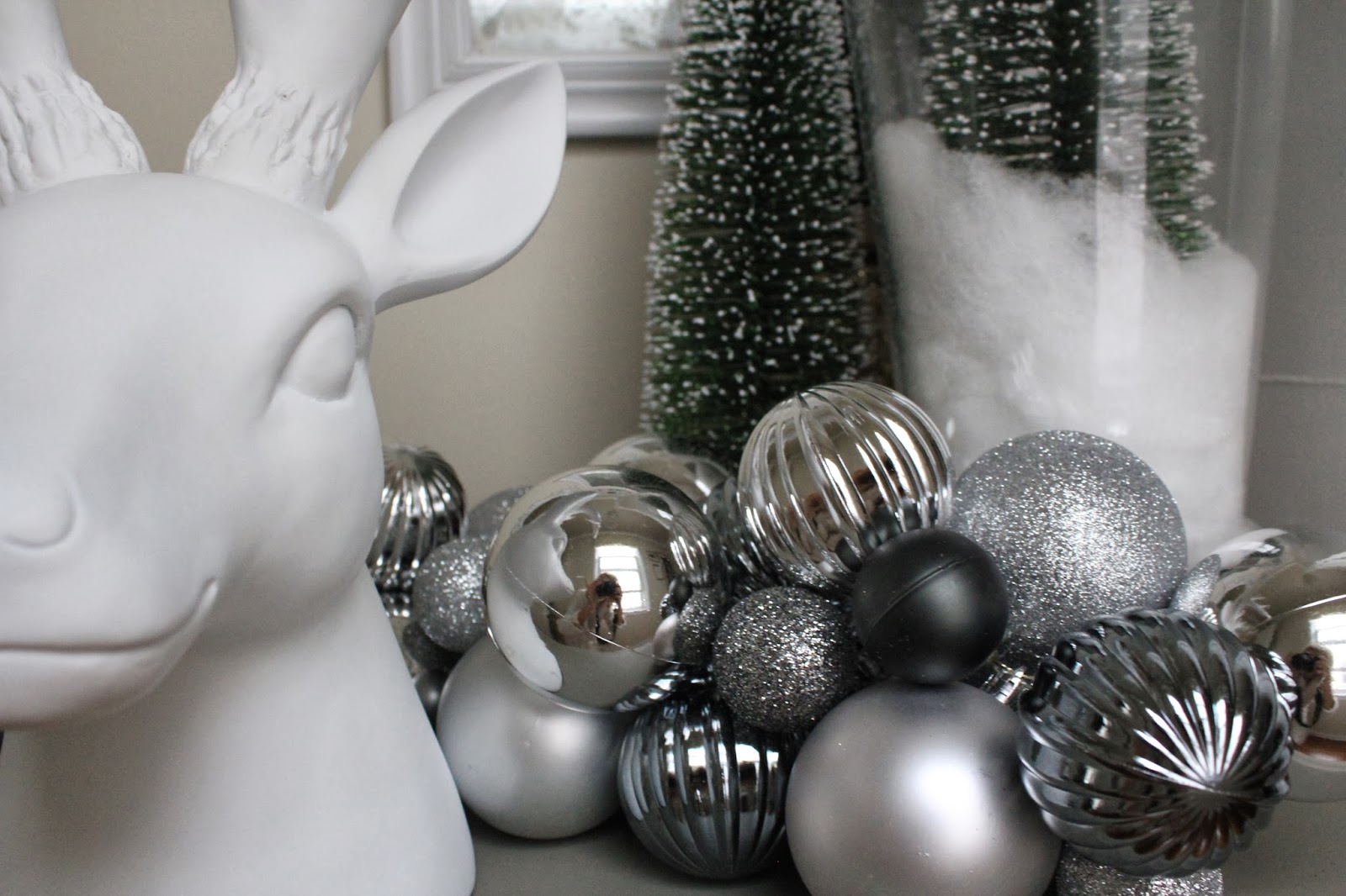
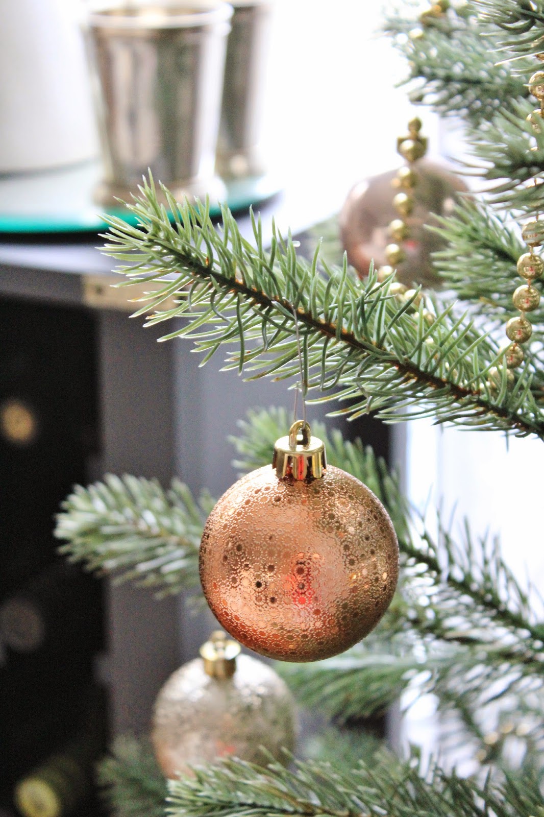
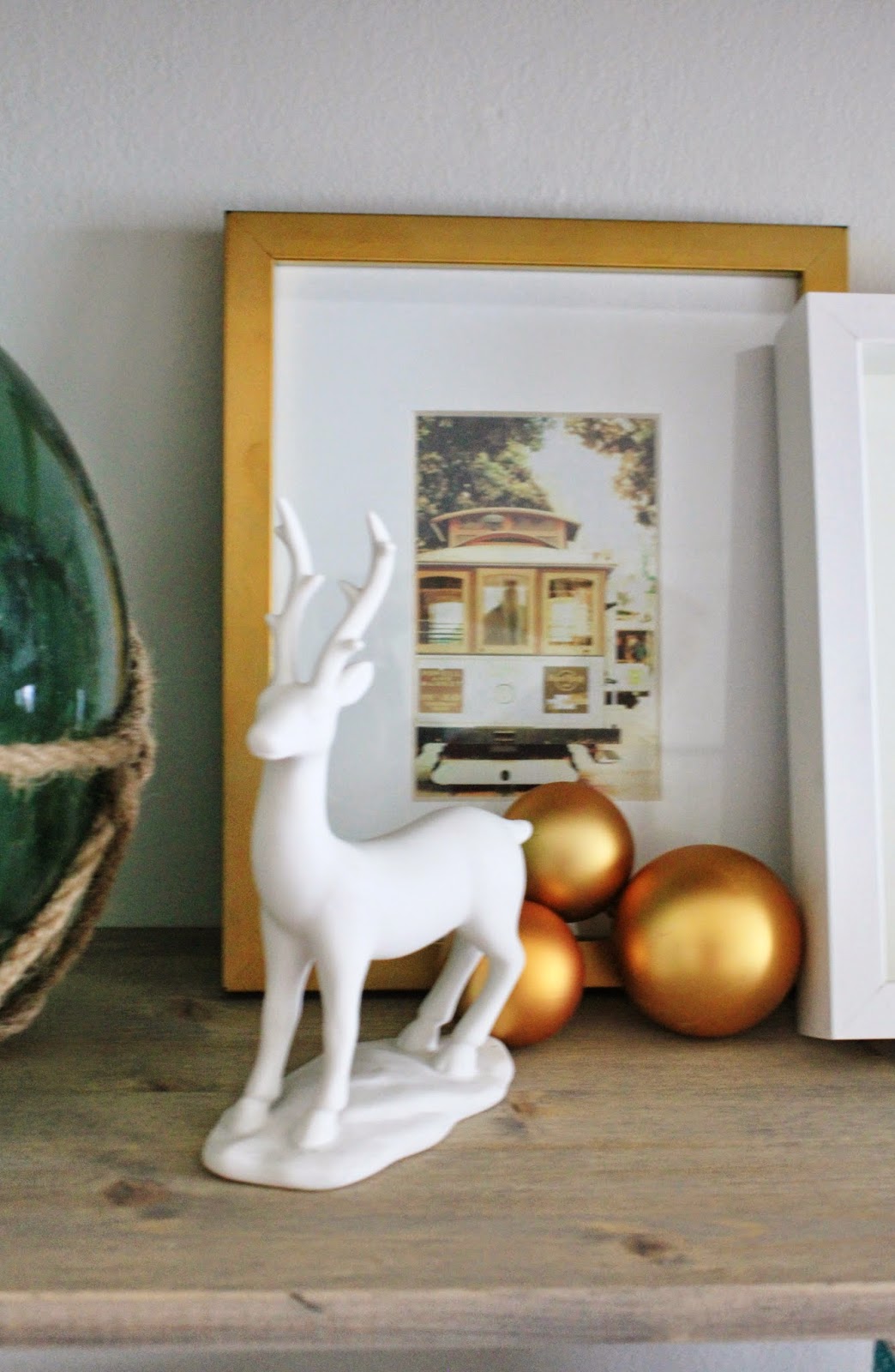
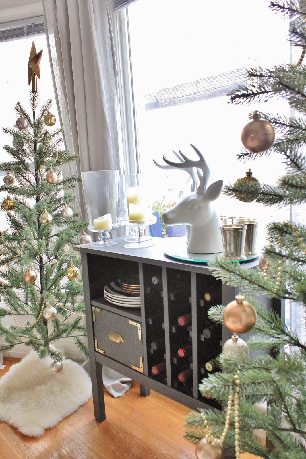
Up close, I loved that the ornaments ranged in tone from gold, to copper, to a pale frosted pink (shh don’t tell Kris). I also loved that they are made of plastic, so they were light as a feather, and didn’t weigh down the branches at all.
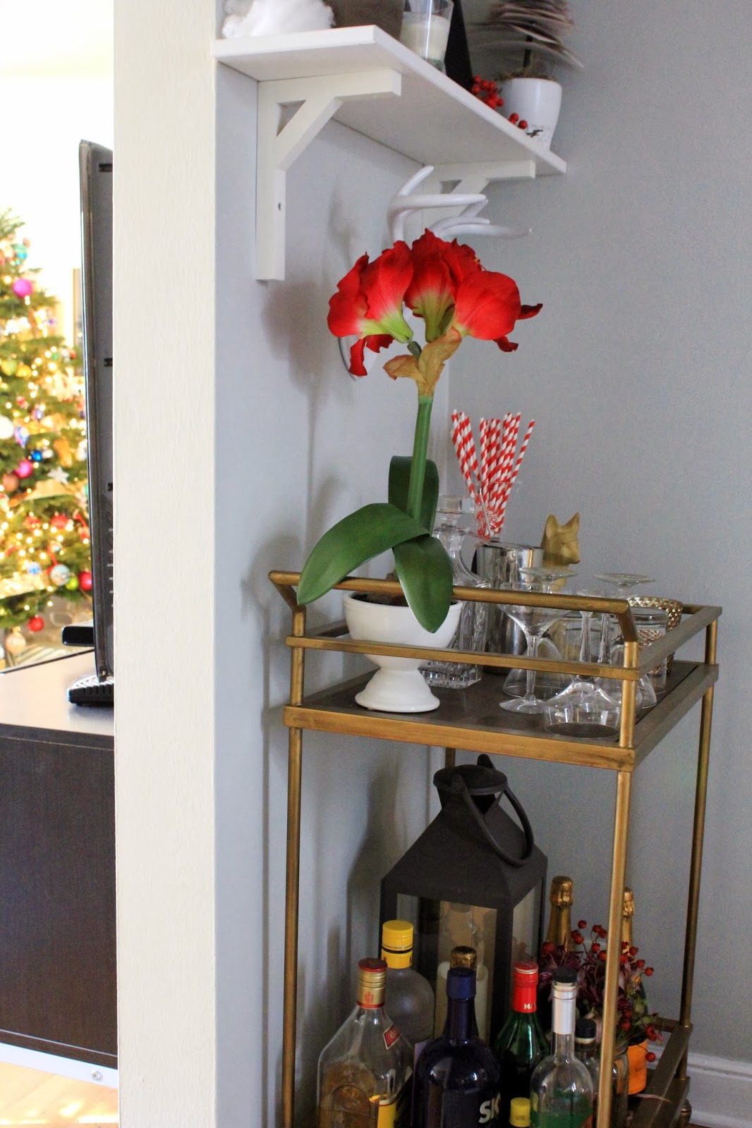
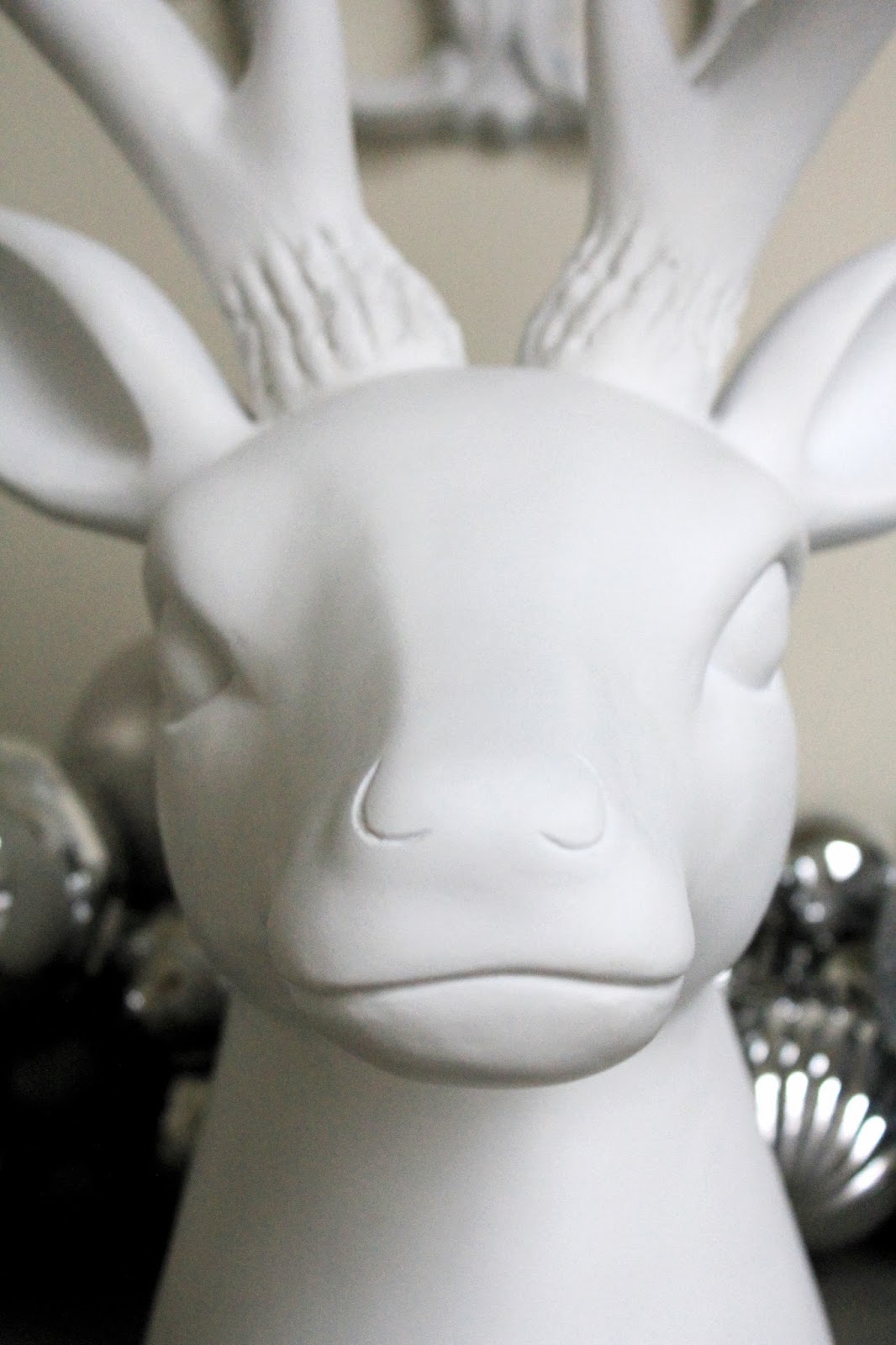
Not sure if you noticed, but there is also a fairly large white ceramic deer head on our wine rack. He made an appearance last year in our “winter wonderland” of a hallway, but this year, he looks so at home in between these trees.


Unsurprisingly, I agonized over the decision to sell our blue rug and get something else for way too long. I was never 100% happy with the blue one – it was always just a little too small for the room, and a little more “Aztec” than I’d been anticipating, which felt kind of forced in our more traditional dining room – so when RugsUSA had another huge sale over Labor Day (yes, that long ago) I decided it was time to make a change.
I thought about another natural fiber rug since we’ve had such a great experience with our other ones so far, but worried it would be too bland. I looked at rugs similar to the one we had in our old living room (it now lives in our bedroom) but didn’t want another trellis pattern that competed with the bold navy trellis runner we had in the hallway.
I ended up finding the Tanger Kambal Moroccan Trellis rug from RugsUSA, and while I liked it online, I was still waffling a bit on my decision against a natural fiber. Ultimately, I ended up ordering it since it was on sale for 75% off, but I second guessed my decision up until the day it arrived. All I can say is THANK GOD I just pulled the trigger, because I absolutely love everything about it.
It’s hard to tell from these photos, but the print is a light grey quatrefoil on a cream background. It’s a bit bigger than the old one, soft as a freshly washed golden retriever puppy, and it has a really pretty sheen. Depending on which way the nap is laying, the color changes. For instance, if I’m in the living room looking at the dining room, it kind of looks like an all white flokatti rug, but as you walk closer, you realize there’s a pattern in it. I just LOVE that.
One person complained online that the grey was more taupe in real life than the silver depicted online. She is right, however that is one of my favorite parts about it. It’s a color that can only be described as “greige”. It’s not grey, but it’s not beige. It’s somewhere in the middle which is preferable in my opinion. It means that we won’t be tied to grey or tan in whatever room it finds itself in in the future.

Anyway, back to Christmas decor…
Here’s a close up of the fake tree branch… looks pretty good, eh? Also forgot the mention before that the branches are moldable. They must have wire in them, so you can bend them a bit to look less perfect and more real.
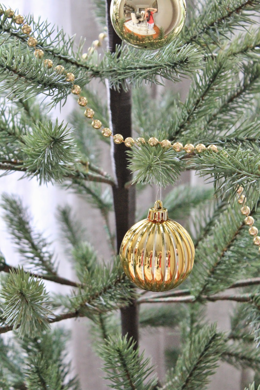
Notice how you can see me in my jammies in the reflection of that ornament? Ha! No judgement! I actually took these pictures during a power outage, when San Francisco was pretty much shut down from a major storm. What else would one be wearing other than jammies???

Here’s how this wall used to look:

And here’s a peek at the other side of the room – our pretty painting has space to breathe over there, and really shines now that it’s not crowded by other stuff.
It just feels really calm and pretty.

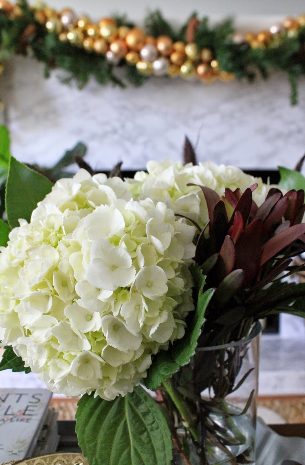
And there’s nothing like fresh flowers to make a room feel pulled together…

Not that I’m an expert in arranging flowers, but I’ve found a few little tricks that promise a knockout bouquet every time.
Stick to a single color palate (mixing colors can get tricky, so staying with one color – all red, all white, all blue and purple, guarantee that it won’t turn out looking like a hot mess will look more professional once it’s finished).
Group flowers in an arrangement by type. This is optional, but I find I like the look better, and find more success when I group flowers this way. Keep the large fluffy flowers together, fill in blank spots and edges with smaller fluffy flowers, fill in sparse edges with groups of smaller skinnier stalks. For instance right now, I’ve got two hydrangia’s grouped together taking up 1/3 of the bouquet, three extra fluffy mums together taking up another 1/3 of the arrangement, and a few stalks of snapdragons taking up the last third – all white. And it just works.
Let the flowers drape as they would in real life. Tulips want to fall over all loosey goosey. Let them. They are rarely going to stand up straight, so pick a vase that will accentuate them draping over the side. Don’t try to force a flower to do something it wouldn’t normally. These are wise words from the Barefoot Contessa.

Do you guys have any tips on arranging flowers? I would love to know!
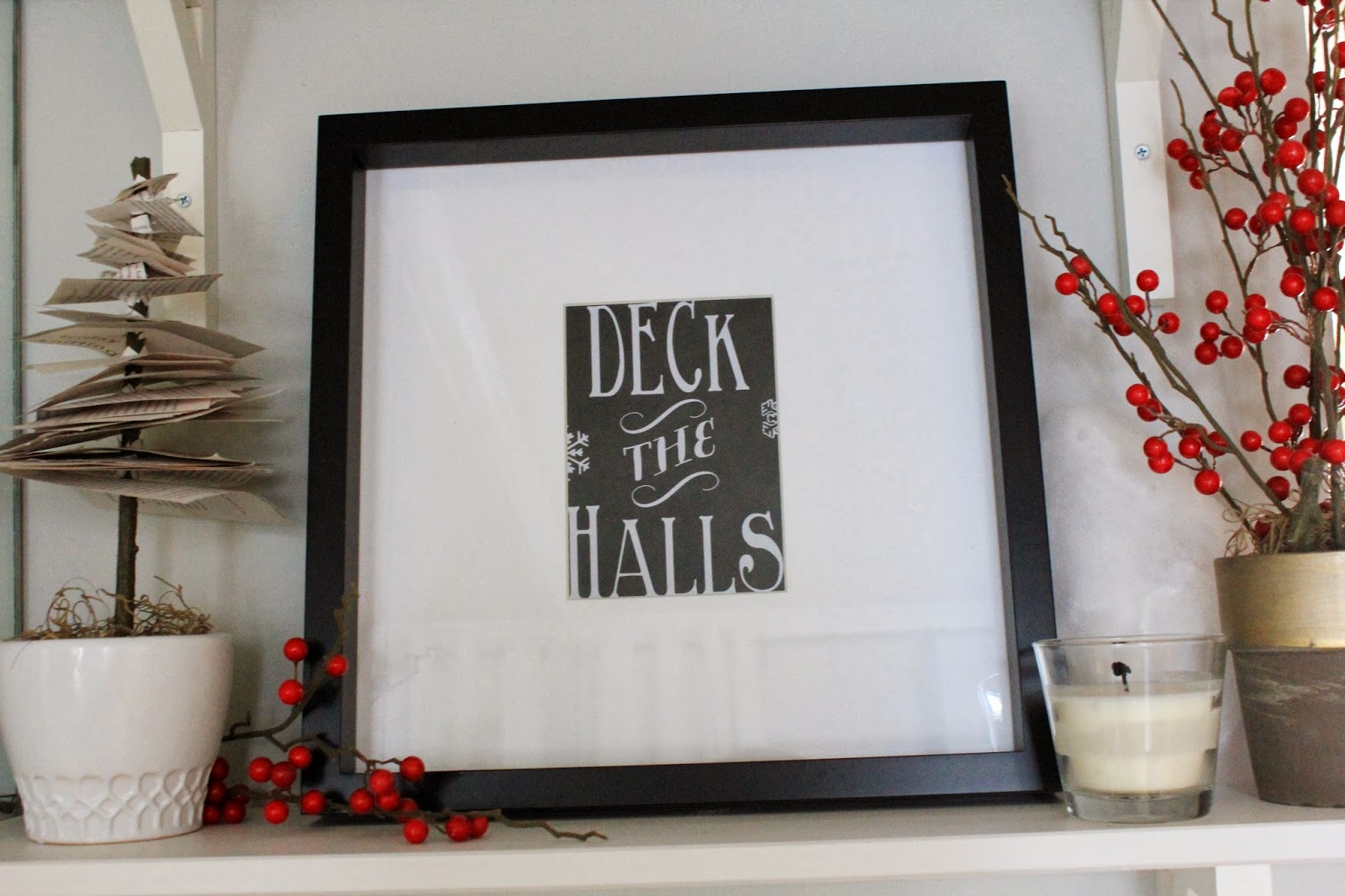
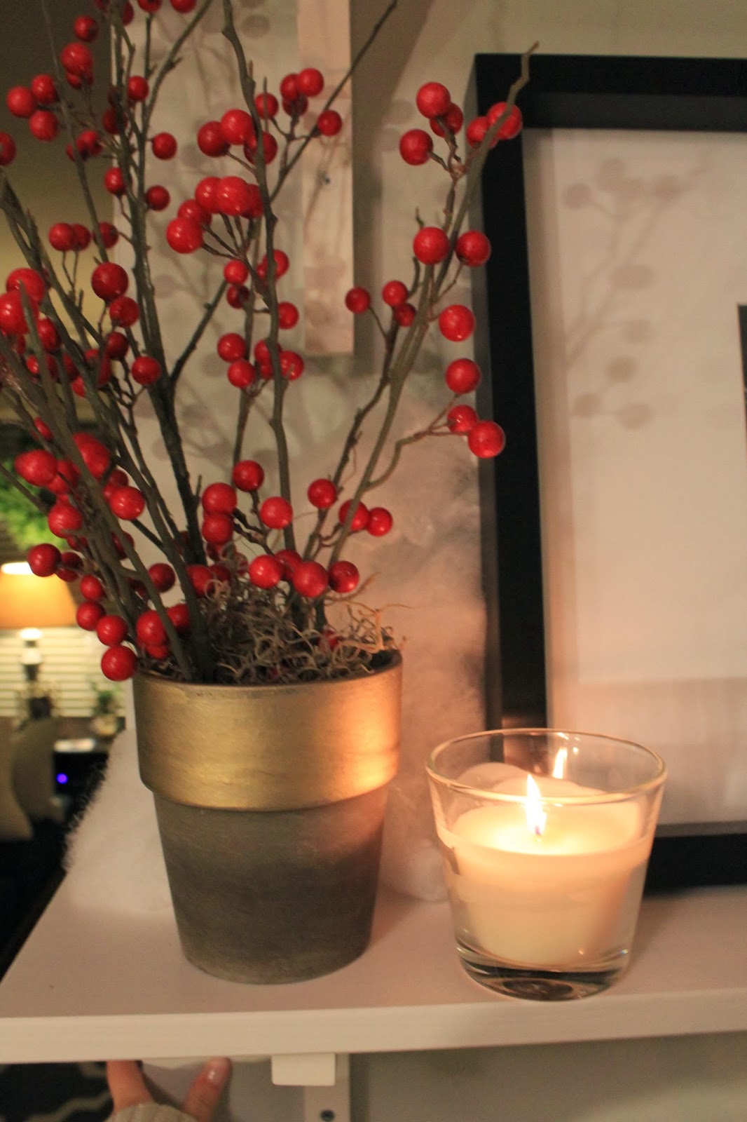
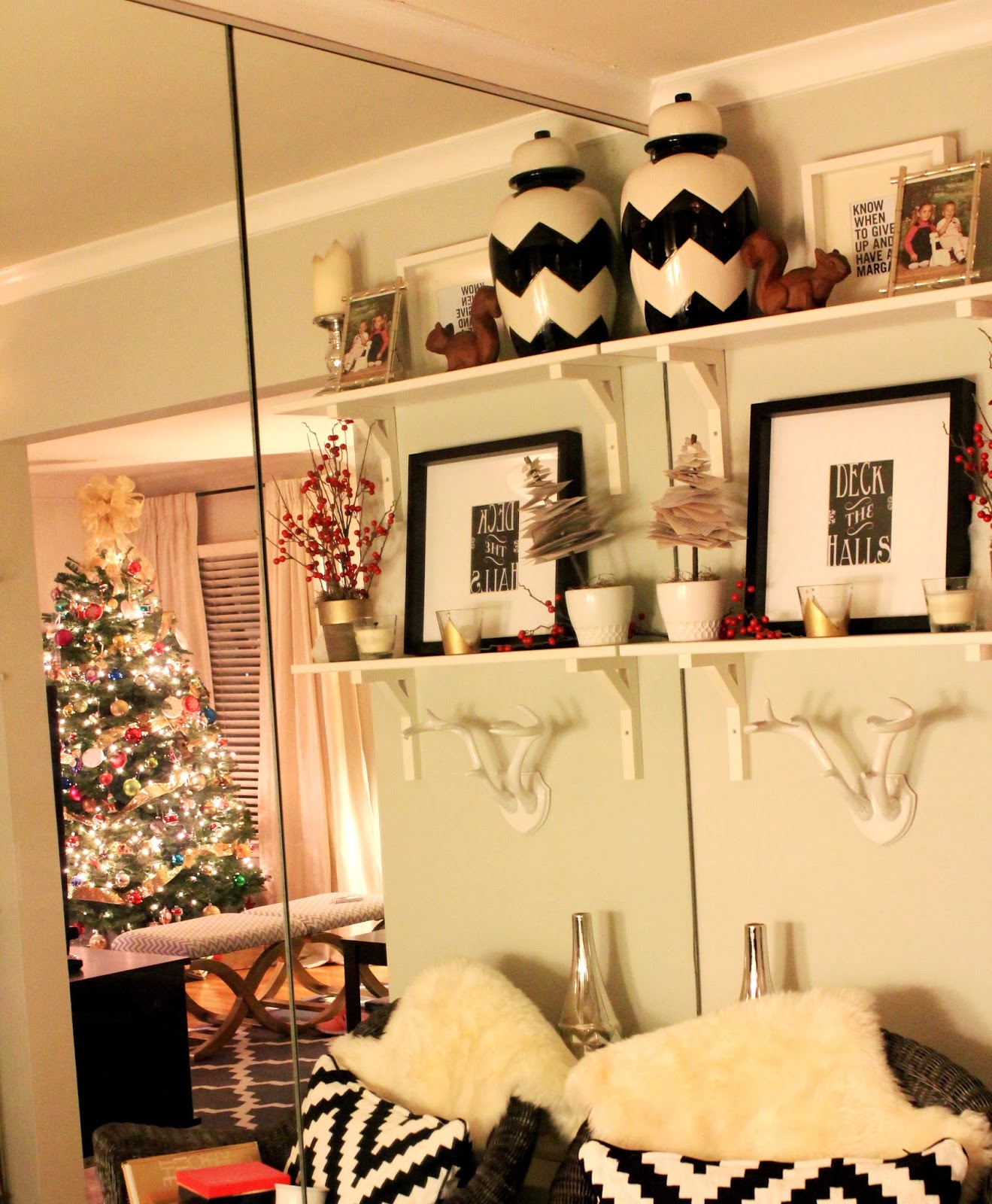
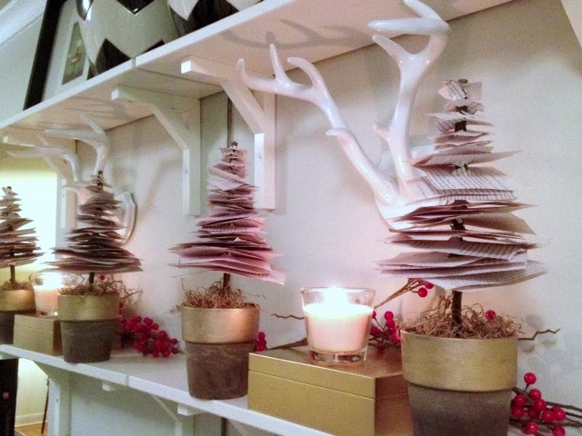
Taking a closer look at the shelves, you’ll notice that I didn’t go wild with Christmas Decor, but I did nestle in a few of my seasonal favorites… here, a few ornaments behind that handsome deer statue.
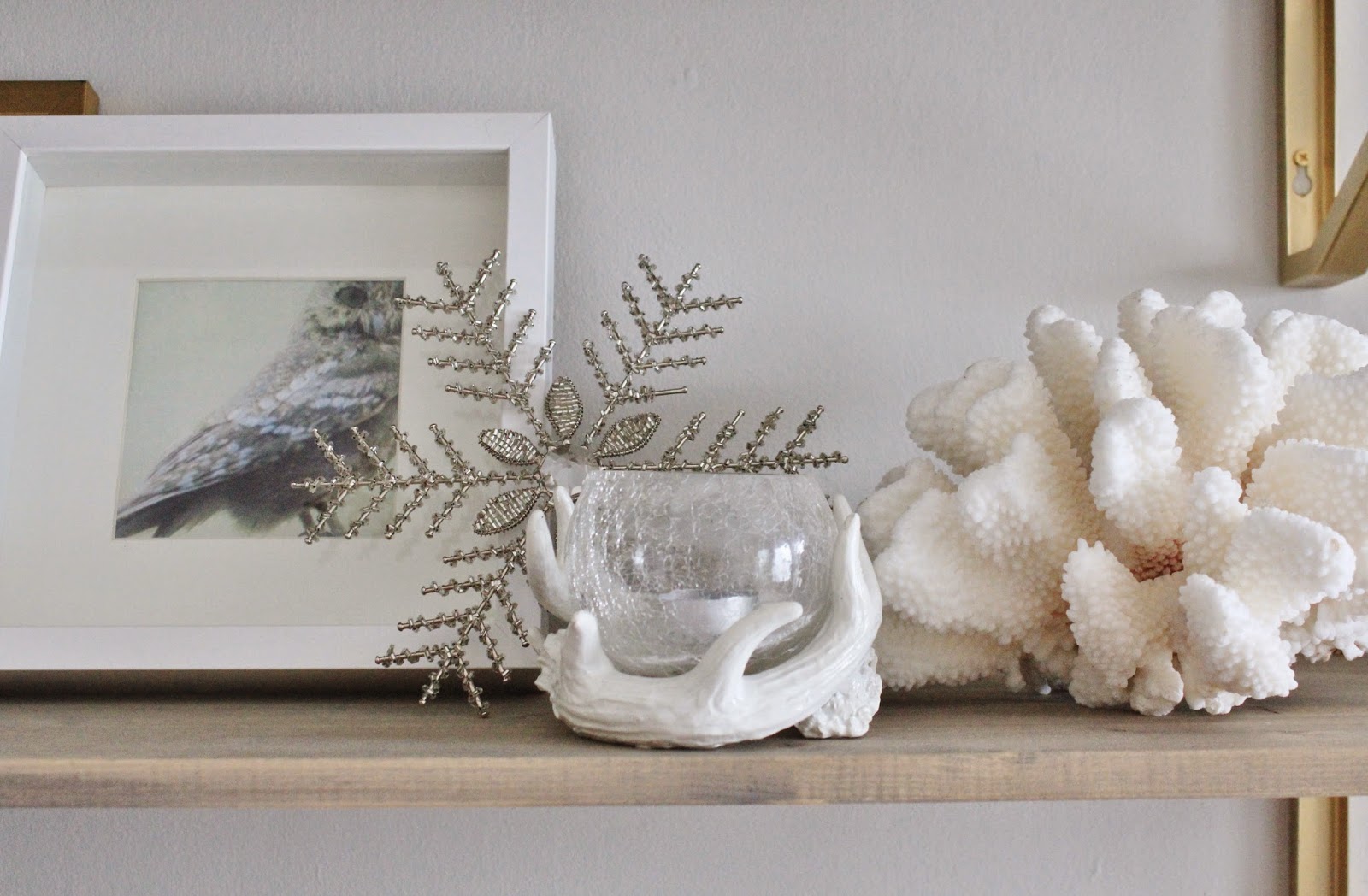
The below looks especially wintery, but actually the only addition here was the snowflake… the owl is a year round staple, as is that antler candle holder, but it does help that the coral is white to round out this little vignette.
All my old music boxes get a special place up here in December. They are fragile, but I love them so much.

These garlands were really inexpensive from Michaels, and while I’m not hugely fond of the glitter, they look really nice woven across the top of the shelves.

Oh hello, inappropriate singing Santa!
All I’ll say is that his guitar mysteriously disappeared (Kristopher! Ahem!) and his hand that was supposed to be strumming the guitar looked like it was doing something else. Oh my.
After he was scolded for hiding the guitar, Santa is back to being “G” rated.

Anyway, hope you all enjoyed! We’ve now gone through updates in the living room and the dining room. What’s next? The bedroom – it’s not all THAT exciting and different from our old bedroom, but we do have some new bedding in there that I’m excited to share with you all.
What are your thoughts on our dining room updates? Of the rug? The new chairs? The second set of shelves?
Would love to know!
xoxo