Decorating a Beige Living Room

Happy Friday, and happy 3rd of July!!  I am gearing up for a mellow weekend celebrating the 4th – BBQs, swimming, and fireworks of course – but before we get the long weekend started, I wanted to check in with you all!

As you know, my best friend just moved into a new apartment, and as she fills the new space with furniture, I’m here to help out and give advice where needed. I woke up this morning to a text from her saying that she doesn’t love the couch she ordered, and everything just looks really blah and monotone (beige sofa, beige rug, beige walls).

PERFECT timing, because I’d started this post earlier in the week.  Let’s talk about what do do when your room is all one color… beige.  I was going to title this “Decorating a Neutral Space”, but let’s call a spade a spade… everything in her apartment is beige, so it’s now “Decorating a Beige Living Room”.  This is a big problem a lot of people run into but it’s actually a really easy fix.  Sometimes it’s a case of the person being scared of color.  Sometimes it’s a case of them gravitating to the same color for everything they own.

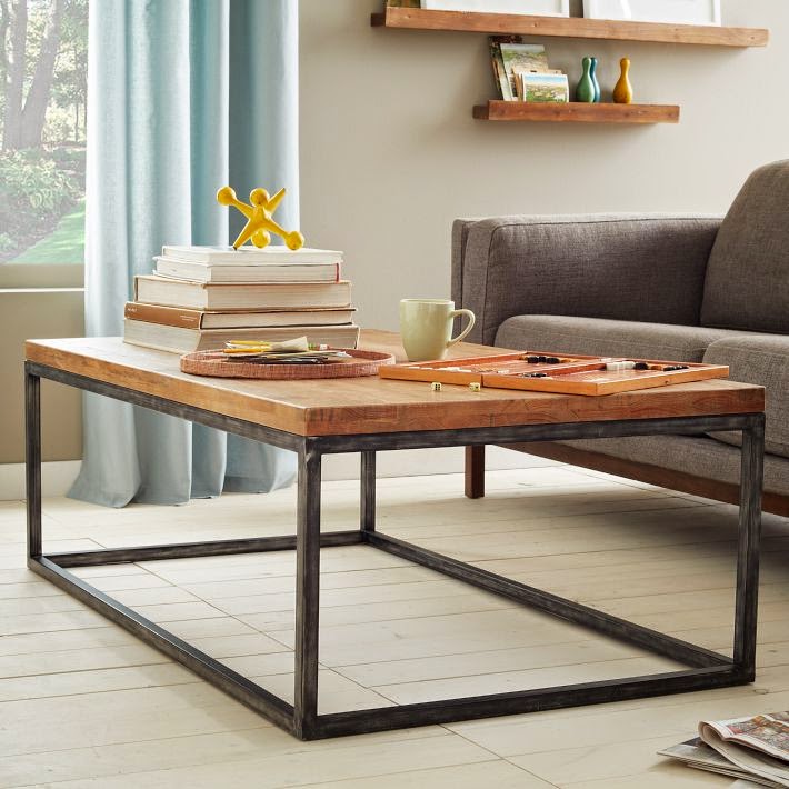
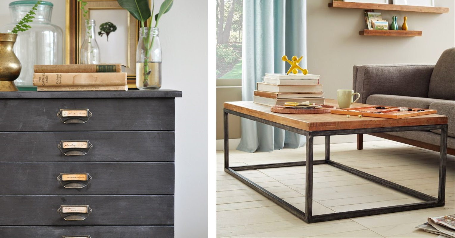
Here’s the room as it stands right now:

The good news is, the room has good bones.  Not a bad “before”… am I right?!

The light in here is awesome… it gets really good exposure!  I mean, a full wall of windows, and adjacent sliding doors to the deck.  It doesn’t get much better! And, the sofa looks SOOO good – it’s the perfect size for this room.  So excited to get started.

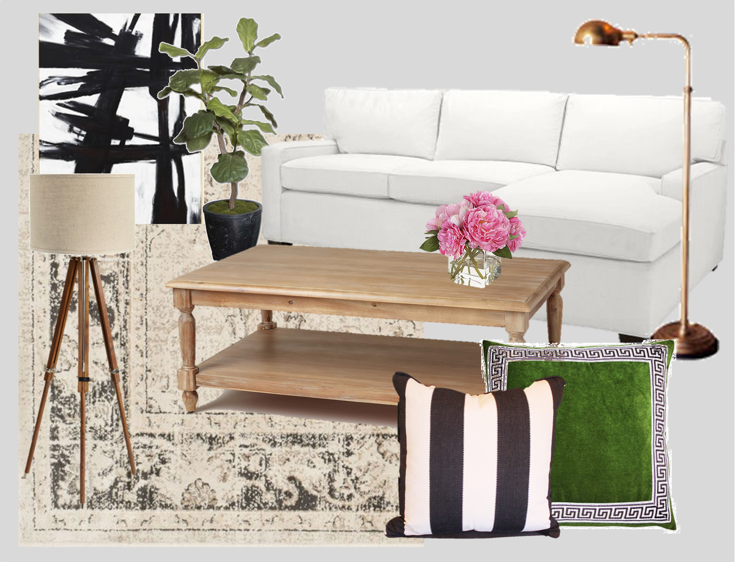
Ok so, with good light, open layout, lots of windows, and fabulous core pieces to build out from, it’s just about adding some pizazz to all the beige (the walls, the rug, the sofa the console table).  So let’s talk about creating a calm, beautiful room based around neutrals, without it ending up being bland, beige, and boring.

Step One: start with a color palette
The key is to choose a color that you love.  Look at your wardrobe – what do you wear?  Do you look good in rosy colors?  Does green make your eyes pop?  Also what makes you happy – are you your best self near the ocean? In the woods?  I happen to love blue, so that’s the color I went with for this exercise, and based on Kira’s pinned spaces (take a look at some of those here) these rooms are a mix of preppy, beachy, and rustic, and I think blue lends itself well to that aesthetic.  Once you’ve decided what colors you’re into, then move onto step two…

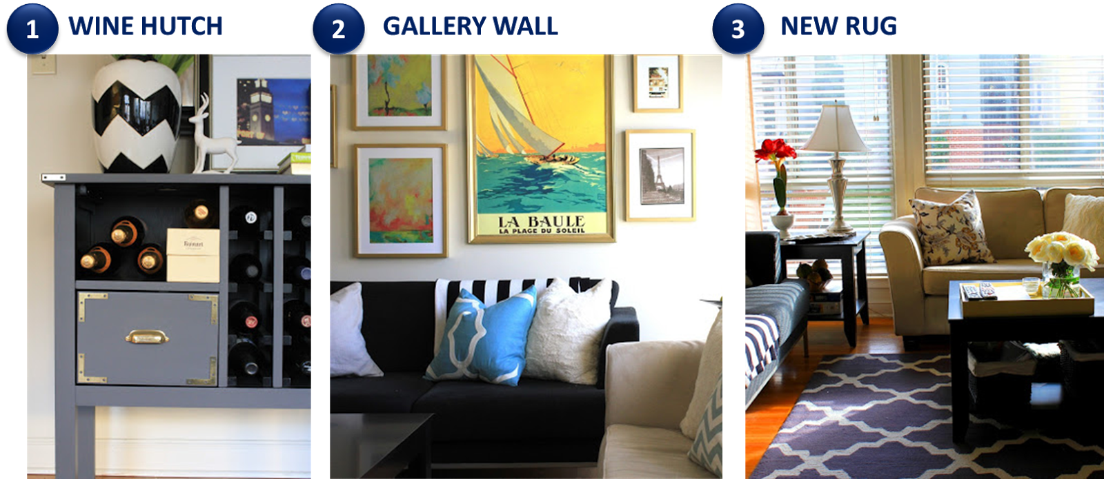
Step Two: Decide where to bring in color
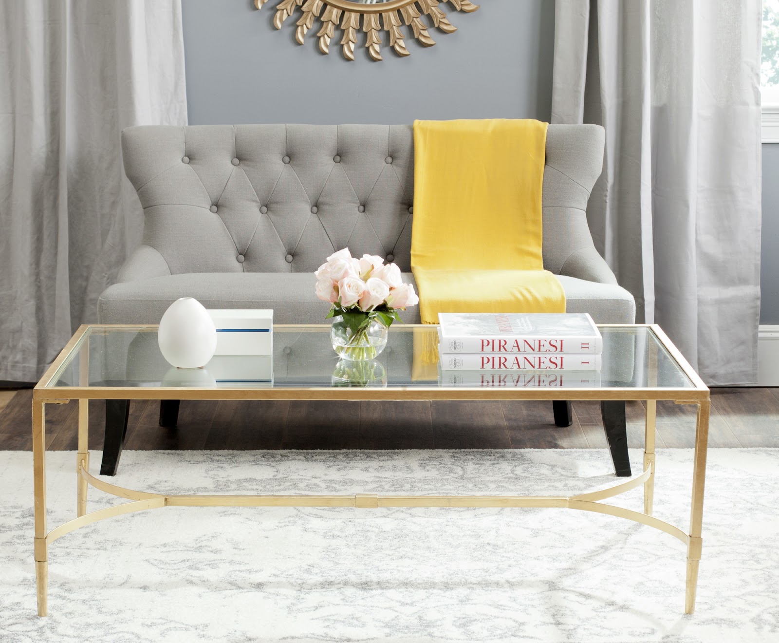
I’m a HUGE proponent of keeping the most expensive things you own neutral, so that you don’t tire of them as easily, and so you can change out the accessories when you get bored.  If you had a big green sofa, it sort of limits your color options.  But if we do colorful accessories (rug, pillows, curtains, throw blankets, art) on a neutral sofa, it’s easy, and quite a bit more cost-efficient to get new pillow covers than to replace the big ticket items).

Step Three: Bring in live plants
The emphasis here is on the word “live” – we are not talking silk flowers.  A room feels dead without anything in it that is “living”.  For a space like a living room, I’d recommend one larger green plant and one smaller plant (I like orchids – they stay alive for several months, saving you money on cut flowers every week, and they’re just so pretty, what’s not to love?!)  Trust me – a plant or two in a all beige space really brightens things up – even without changing anything else.

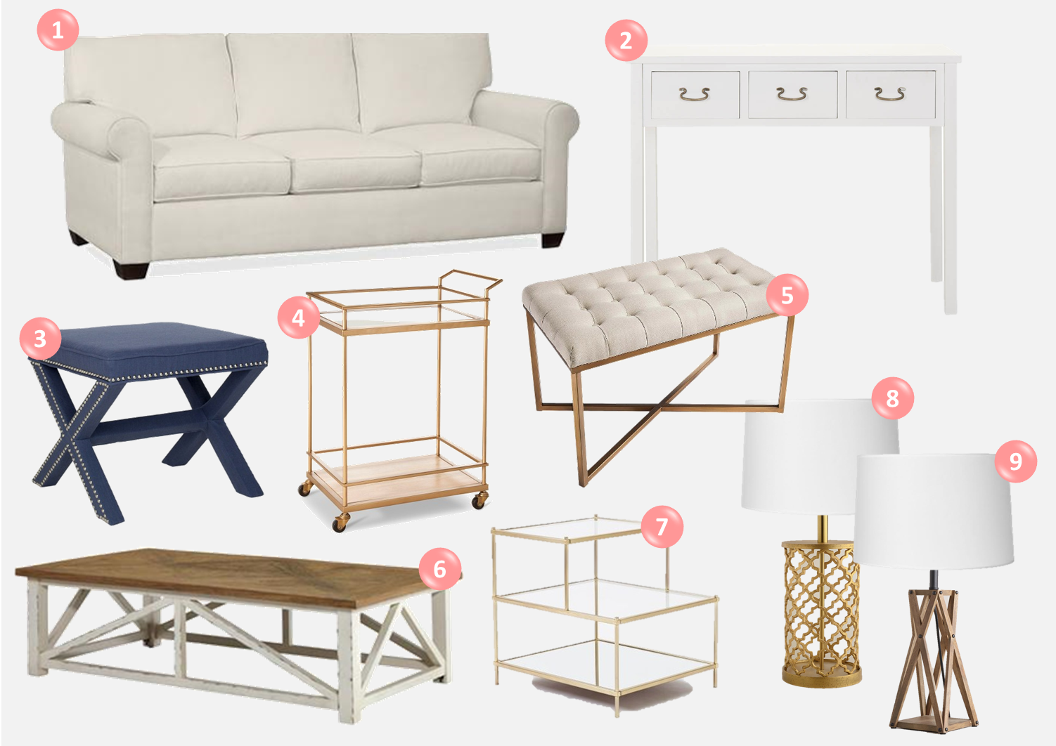
So with all that said, I put together four variations of the same room.

The things that stayed the same in each room:
     – The sofa (this is the exact sofa she bought)
     – The side table (which she already owns)
     – The art (similar to the gold leaf art she owns)
     – The wall color (a very pale grey).

Ok, let’s get to it….

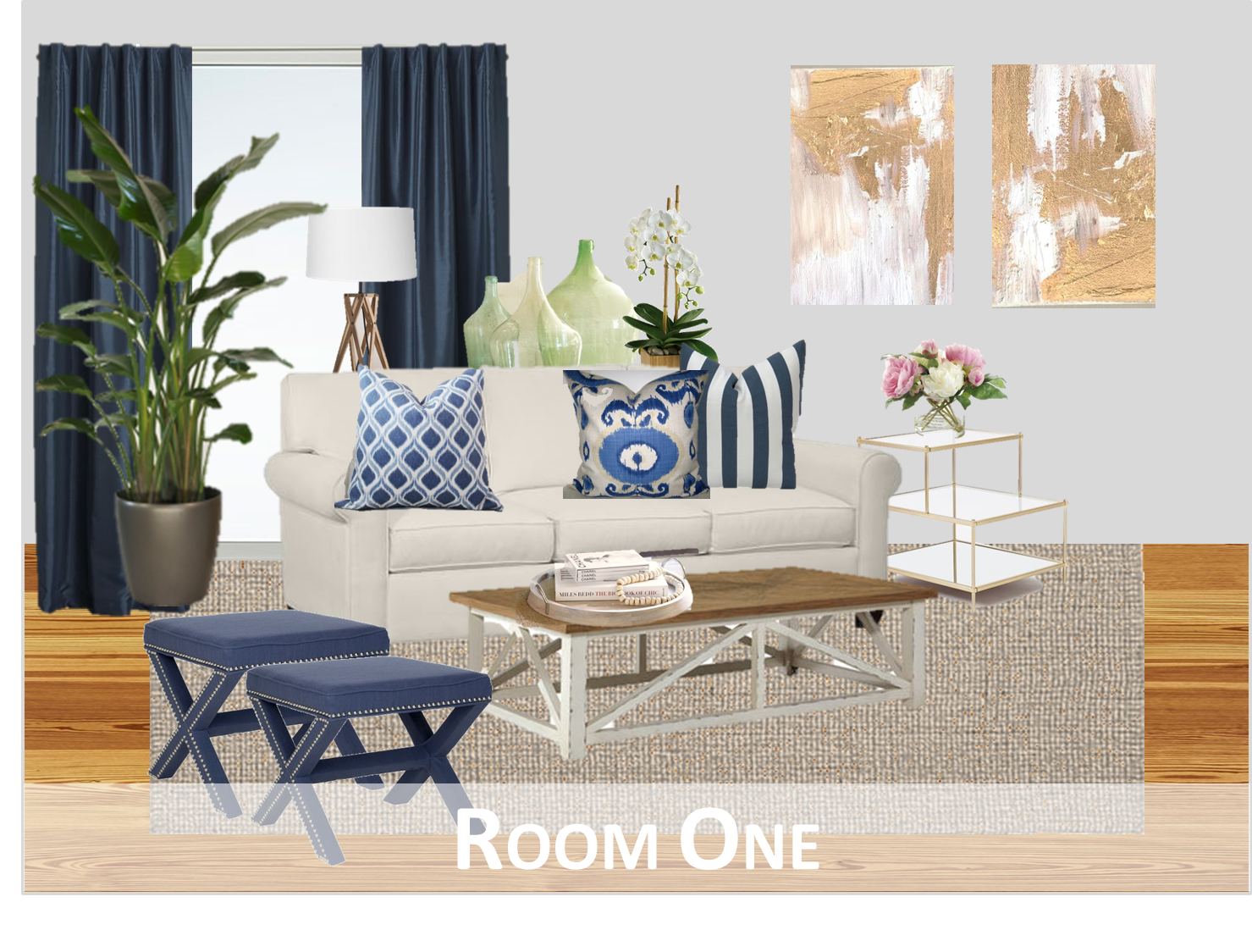
Room One: Here, we brought in color through the navy curtains, navy stools, and patterned blue and white throw pillows.  The rest of the room is very neutral, with a natural fiber rug under the oatmeal colored sofa she bought. 
The key to pairing a neutral rug next to a neutral sofa… they need to be different shades (one warmer and one cooler perhaps), and different tones (one lighter and one darker), and very different textures to ensure one doesn’t visually run into the next.
Room Two: Here I kept the blue curtains, but swapped out the natural fiber rug for one with a bold pattern and color, and exchanged the navy stools for a ivory bench.  
If I had to guess, I’d guess this would be Kira’s least favorite of all the rooms, because there more color in it than there are neutral tones, but I thought it was still important to see it.

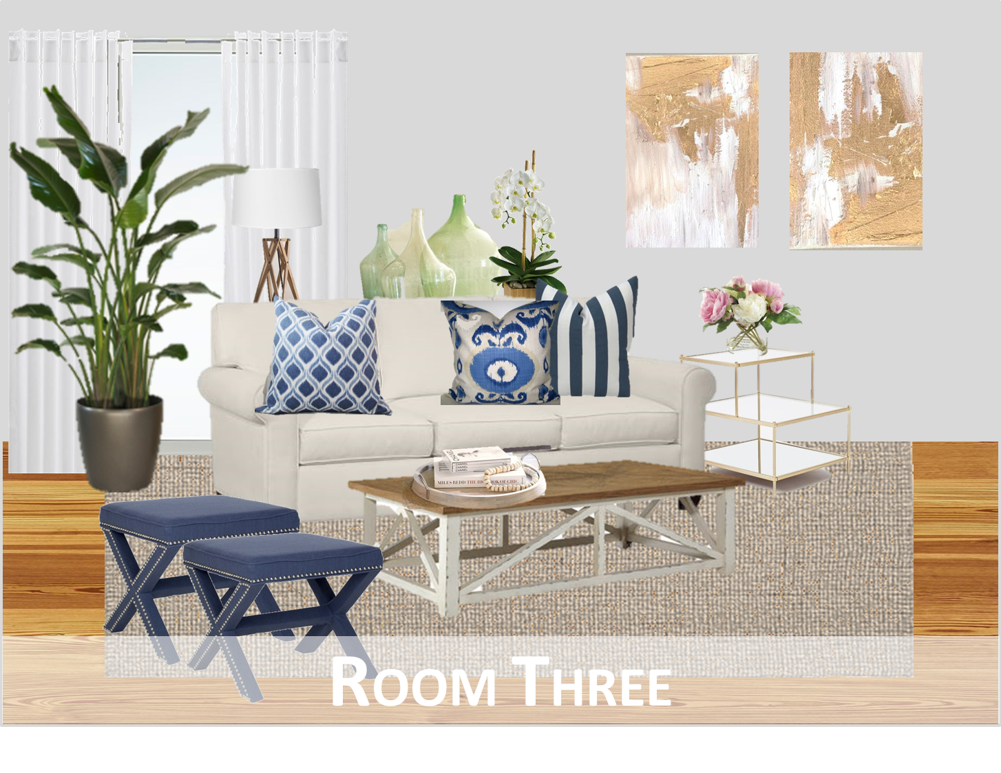
Room Three: This will be the hardest to get right in real life because it’s the most neutral of all four options.

I swapped the navy curtains for white, brought back the natural fiber rug, which means that the stools and pillows are the only source of color here.  In real life, I think I’d recommend moving the gold leaf art to another room, and bringing in art with more color because the risk is still there of ending up with a borderline drab room.

BUT, maybe not… I’d just have to see it as it came together……..

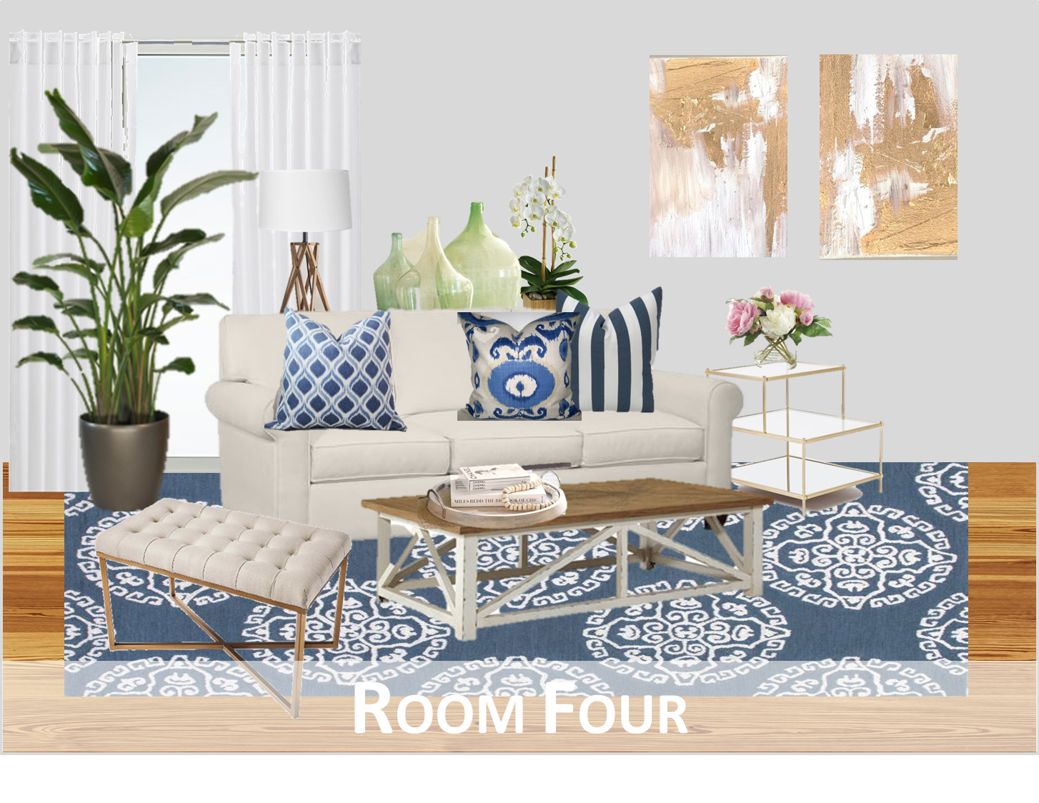
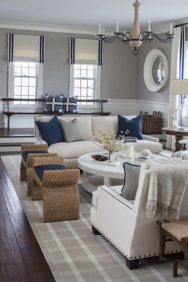
Room number four – this is really a combination of rooms two and three.  Here, I kept the white curtains, and brought back the blue rug.

I like this one, but something about it seems a bit off – like it’s bottom heavy. Having everything at eye level so neutral, and then the dark rug, I think the walls need something with substance as well. Maybe even having art in a black frame, or a really large wall mirror propped up against the wall behind the sofa with a big black frame.  Just something to anchor the upper half of the room a bit more.

So anyway, this is really just a jumping off point to get the ideas started.

Ultimately, I really like all these rooms for very different reasons.  I like number one the best because it feels really balanced, but I suspect Kira will want to go with lighter curtains, and with all the light that comes into her apartment, I wouldn’t want a dark curtain panel blocking any of that out.

Because of that, I think we need to think carefully about what colors to bring in, what patterns to incorporate, and how to ensure its not only balanced, but that she loves it.

Next up, I want to talk about hanging curtains in a tricky spot………..

Chicago Apartment: Coffee Tables

Adding onto yesterday’s post, I wanted to pull together some (affordable) coffee table options that fit within the living room aesthetic.  
Some are more rustic, some more refined.  Some have storage (hello hidden remote controls) while some offer no clutter concealment.  Some have glass tops, some are solid wood.  Some are more beachy, which some are more elegant.  They really run the gamut – hopefully there are some contenders in there for the Chicago apartment.
Which are your favorites?

Chicago Apartment: Living Room Inspiration

Now that we’ve got the layout sort of figured out, it’s time to start pulling together inspiration.  
These images came straight from Kira’s Pinterest board, and it’s pretty clear to see the common themes in what she likes:

Clean lines.

Traditional core pieces.

A little preppy.

A little nautical.

Light colors.

Gold accents.

Soft upholstered furniture.

Warm wood tones.

A few rustic pieces.

Based on things she has, and things she plans to buy along with her Pinterest pages, I pulled in a few benches, a coffee table, and a few table lamps that go with the look and feel of what she likes.

She already has the white console table, gold bar cart, and gold side table, (numbers 2, 4, and 7) and plans to buy this sofa from Pottery Barn (number 1).

What I like (and what I think she will like) about the other things I’ve pulled in (the coffee table, the lamps, and the benches), is that they are all within the neutral palate that she likes, and will serve as a canvas to bring in more color through additional accessories (pillows, curtains, art, table accessories, books, and perhaps the rug).

A few things to be very careful of based on the above pieces…

1. Too much gold.
Yes, there is such a thing.  With the gold side table, the gold bar cart, and a series of gold leaf abstract paintings she has, she already has quite a bit of gold going on.  The gold lamp will only work if she doesn’t do the gold ottoman, and if it’s placed on the console table at the far end away from the gold side table.  If she does the gold ottoman, it cannot be placed next to the gold side table, and the room will feel more balanced with the wooden table lamp on the console table behind the sofa.

2. Needs color
As I said, these pieces serve as a neutral canvas for color (and the ability to switch accessories out with the seasons for a different look and feel between warmer and cooler months).  If the curtains are neutral, the walls are neutral, the rug is neutral, and the pillows are neutral with all this neutral furniture already going on, this is going to look BORING.  At least two of the three (rug, curtains, pillows) need to have color and pattern going on to bring in interest – my recommendation would be either the rug and pillows, or the pillows and curtains, if she doesn’t want to do all three.

So this is the jumping off point… time to source a few more pieces to choose from (coffee table, lamps, and chair / bench options) and then the fun stuff… the accessories and color that will bring life to the living space.

Our Hamptons Inspired Living Room…Coming to Life

Hey guys!!  Just wanted to check in with you – we’ve been making some real progress on the house which I swear I’m working on photographing and posting.  The deck is well on it’s way, the dining room is in a good place (for now) and our kitchen nook has officially become Kris’ office (and my little DIY spot for sanding, painting, building, and re-vamping).  It’s been a huge mess for the most part over the last few weeks, but I have a few photos in a cleaned up state.  I hope to share with you later this week!

In the meantime I wanted to check in with you all on our living room.  Last time I posted about it, I’d talked about the new sofa we bought, along with the new coffee table.  Neither have arrived – actually the coffee table was supposed to be here this week but the delivery date has been pushed back.  SO FRUSTRATING.

Anyway, in anticipation of these two key pieces arriving, I put together a final inspiration board for how I see this room coming together.

It looks something like this…

I’ve been putting in A LOT of thought to how I want it to look, and feel.  I’ve posted some inspiration photos that I keep close to me at all times.  I’m still feeling really drawn to a more organic, preppy, “Hamptons” look.  Woven rugs, pretty wood in the coffee table, lamps, and picture frames, and LOTS of white and blue.

It just feels so fresh and calm to me.

Most of the details in this inspiration board are already ordered or purchased, but the finishing details are still in flux.

What still needs a decision??

The pillows – I’m planning to enlist the talent of my lovely mother to help me make larger 24″ pillows for our now much larger sofa.  Right now we have 20×20″ pillows, which are nice, but since the new sofa will have a back close to 10″ taller than our current love seats, we are going to need something beefier on the sofa, so they don’t look dwarfed.  I noticed that Pottery Barn was using 24″ squares on their sofas, and loved how it filled the couch out.

In terms of fabric, I’ve been toying with many different patterns but one thing is for sure – a small scale blue and white stripe is happening.  I’m leaning towards the Covington Darlington pattern in the Mariner colorway.

I found it at Joann’s in person, but can’t seem to find it online now!  Grr!  It actually does not look quite so vibrant in person – its just really pretty and nautical.  Love.

Having this small scale stripe will read as almost a solid and will allow me to experiment with a larger pattern on the other pillows.  I learn slow, but I learn well people!

I definitely want some sort of Ikat or “enthnic” type pattern.  Not sure if that’s the right word.  Tribal?? Worldly?  Who knows… not that concerned with labeling it to be honest.  A few patterns I still looovvvveeeee??

Duralee Kalah Blue.

I’ve posted about this one before, here and here… and I’m still totally in love with it.  So much.  It’s just such a classic, and the blue is so rich and pretty.

Also, loving the Robert Allen Khandar Indigo.

I loved that the blues in this one were more light, and the background was a crisp white fabric.  But is it as classic as the Kalah blue??  Will I love it long term?? So confused.

And the final option that keeps coming back to me is the one I used in the mock up… the Duralee Woodblock Print in Indigo

Just love.  Almost as much as Kalah blue – it’s more imperfect and handmade looking, whereas Kalah blue is more refined and “fancy” feeling.  Do you agree?

Still not sure which fabric to order, so if you have an opinion, I’m open to hear it!!

Other “up in the air” details – the art.  I have the frames, but no art.  I’ve been agonizing over this a bit because I haven’t found anything I am obsessed over.  I like the sailing prints I used in the mock up, but I was really hoping to find something with more blue in it.  We have quite a few “warm” colors going on in the sofa, the natural fiber rug, the baskets, the wood table… I don’t want to make it TOO warm. Does that sound weird?

I haven’t ordered the prints yet, but I do like them.  Very calming colors, and they make me think of my dad (who loves to sail), and I really love that.  I definitely want to make a decision soon though so that the walls don’t stay empty for long after the sofa arrives.  Since we’re getting rid of both love seats, and the new coffee table is a smaller scale than our current one, the room is going to feel a bit empty at first… especially because we don’t have anything to replace the second love seat with yet.

We are thinking of putting a chair in it’s place (like the inspiration mock-up), and that’s the last “big” piece we will be purchasing for this room.

I want something comfortable.  Something you want to sink into, but also something tailored.  I found this one at Ballard – it’s the Manchester Chair:

Definitely want to check out a few other sources like Macys, since they are always having amazing sales, but I love that you can pick your fabric on this one…

Kris keeps pushing for a recliner – woof.  In his defense, we saw one at Room and Board that was a caramel leather, and really sleek – no clue it was a recliner, but it still wasn’t really my taste.  We will see – if we can find one that is a compromise of comfort and style, then maybe I’ll eat my words, but when I think of a recliner, I think of something like this, and that makes my stomach turn.

Anyway, that’s where things stand as of now!  Hopefully, next time I’m talking about the living room, it’s to post pictures of our fabulous new sofa!!!  Yay!

Fingers crossed that it doesn’t get delayed like the coffee table!

xo

Plans for the Living Room

Soooo… there hasn’t been much news on here about what’s going on in the living room… and that’s because not a ton has been going on in there since our fireplace update.
I need to take some “before” photos, even though they’re more “during” photos – while the rug from the living room of our last apartment has made itself a new home in our bedroom, the furniture currently in there is the same as before for the most part.  Here’s a little refresher from before we moved:
Two love seats… lots of dark fake wood furniture…  I did the best that I could with what we each brought to the apartment together, and we made it work for two years.  I actually kind of liked it once I distracted from all the things I wasn’t loving (black man couch… super duper modern everything…)
Well, things are about to change… and SOON!
We just bought THIS sofa from Pottery Barn a few weeks ago. It looks a bit dwarfed in this photo, but it’s big.  Really big.  And sooooo comfortable! I can’t even put it into words.

We opted for the upholstered version and it’s being made for us in this fabric:

It’s got a subtle texture like linen, and little nubby bits here and there, and it’s perfect.  PERFECT.

I originally wanted white, but everyone talked me out of it.

I mean I get it – it’s just not practical.

I already know how anal I’m going to be once we get our new sofa.  People will have a glass of red wine and I’ll be holding my breath the entire time.  And with a white sofa… I can’t even imagine the sticky baby fingers of the adorable blonde babies we’ll eventually have near this thing.  This sofa is an investment for us… something we see having for the next 10 years (at least), so I figure a textured fabric with a little grey and a little tan will help mask spills, and dirt over time.

We saw this fabric on a sofa in the store (photo below), and absolutely loved it – Kris was actually the one who noticed it.  The below picture is a really accurate representation of how it looks in real life. Much lighter than the above swatch, and I’m hoping I love it as much when this thing arrives in another month…

I’m also thrilled that we’ll be getting rid of our current coffee table in the very near future.  After buying the new couch, we also bought the Box Frame Coffee Table from West Elm.  God I love that store.

Anyway, scroll back up to the picture of our old apartment for a reminder about what our current coffee table looks like.  I HATE the storage on the bottom.  It was practical for our apartment that literally had NO storage… but it always looked so cluttered.  Under the coffee table was where half of our Christmas decor lived for 11 out of 12 months of the year.  I only wish I were kidding.  Awful.

It was cluttered, and really detracted from everything else.  Plus the enormous dark coffee table was so huge, and manly.  Just this huge dark blob taking up an un-godly amount of room.  I can’t wait for it to go away.

Already in our new place, we have a new rug – it’s a nubby natural fiber jute rug (same one as the below picture), and it just makes things feel so light and bright.

With it I’ve layered our white cow hide that I adore.  I don’t know that I’ve really ever photographed it for the blog but it’s great… there’s a picture of it in this post.  With the new coffee table, you’ll actually be able to see it!  Hooray!

In the meantime, I’d been waffling between getting new side tables or trying to revamp what we’ve got. In the end, I’m going with the “revamp” option since there are other high ticket items on my list ahead of “new side tables”.

What to do with them??

They currently look something like this (except the top is solid “wood”) – you can see them peeking out in the first photo of this post if you need a real reminder.

They are fine – simple enough lines, functional.  I don’t HATE them the same way I really hate our coffee table, but the fake wood veneer kills me.

I just haven’t really known what to do with them to change them into something that I’ll like, and it has been plaguing me… ok that’s admittedly a bit dramatic, but it has been on my mind.

Anyway, a few weeks back, I saw this little makeover on the below chest of drawers, and knew instantly what I wanted to do…

Chalkboard paint.

No priming needed.  They look sort of like zinc which has the coolest finish, and I think that they’ll fit right in with the more earthy palette we’ve got going on.

I mean how great does the finish on those (faux) drawers look??  Answer: amazing.

I also think that that finish will tie in really nicely with the finish on the frame of the coffee table:

I mean… right?????

So good.

Other things to think about for the living room..

Art.  That’s been on my mind quite a bit lately…. some updates for you there (hopefully) soon.

Throw pillows – I want to stick with more classic patterns, and I’ve really been drawn to a white and cobalt color-way.  I’m also open to other shades of blue too…

Side chair – now that we’re getting rid of both love seats (hooray) and replacing them with one sofa, we’ll need a chair to go where one of the love seats currently is.  Should we do a solid neutral?  Too boring? What about a subtle pattern? Solid color? Something bold?

I don’t know people.  There is still lots to think about, but soon it will be coming together, and I cannot wait.  Seriously… CANNOT.  WAIT.

More updates coming soon… I hope!

Splurge or Save: Glass Coffee Tables

It’s time for another installment of one of my favorite games… splurge or save. This week, we’re talking coffee tables.  What is it about this week??  The theme here seems to be “living room inspiration”… I just can’t get enough!  Well I’m going with it, to let’s talk about glass topped coffee tables, shall we?

I love a good glass top coffee table – super elegant, and simultaneously modern and traditional.  Clean lines, but a bit feminine at the same time…

Can you guess which is the splurge and which is the save??

I think these are perfect if you have an amazing rug you don’t want to hide, or a smaller space that you want to visually open up… since you can see straight through them, they sort of fade away and let other elements in your living space shine…
They are also really easy to clean which is a bonus (Windex and a paper towel), but not ideal for a house of kids (cracked head anyone?) or for a pack rat.  You’ve got to be able to keep it clean and orderly for it to work in your space so if you’re looking to store 3 years of Pottery Barn catalogs on the lower shelf, go for something with concealed storage.

Are you ready for the reveal?

Admittedly, if you are looking to really save, a glass topped coffee table isn’t going to be the least expensive option out there, but cut glass never is… if you’re willing to put a little elbow grease into a DIY project though, there is an amazing tutorial by Kristen of The Hunted Interior.

She recreated a VERY similar coffee table, using gold leaf, and an Ikea coffee table. Who doesn’t love a good Ikea hack too?!

Gorgeous, right??

Happy Wednesday my friends!
xo

Grey and White… and a worn rug

Ok people – the tree is down, the holidays are over, and I’m back from my short hiatus – ready for some fresh design inspiration for 2014.  
Let’s start with this living space…
I love, loovveee, LOOOVVEEEE this space. Everything about it is perfection.  The wall color, the mirrors, the white tufted sofa, the rug… oh that rug.
Traditional but worn.  Quiet, neutral colors so it tones in with the wood floors and wall color.  It’s a soft background of pattern, and isn’t the focal point of the room.
Right??
Amanda Carol also used this same rug in her dining room… I’m just totally obsessed with it…

This rug ended up being discontinued, but I found it’s evil twin online, and want to pull the trigger on it SO BADLY.
The bad news?  Kris isn’t sold.  He thinks it looks old, worn, and is not a fan in general, but I’m determined to change his mind…
I mean look how pretty it is?!

And it looks SO GOOD in so many different kinds of spaces…
This contemporary, lightly industrial dining room…

This rustic living space with the pretty wood beams…
This amazing master bath with that claw foot tub I’d scratch someone’s eyes out for…

This uber traditional – but sleek – monochromatic bedroom…

This inviting dining room / breakfast nook…

Again… it looks so great with raw, light wood, and an open weave linen…
Over the last several years, I’ve started to hone my style, and while I’ve really embraced some more modern textures and lines in furniture, I still like a bit of tradition in my space.
To keep this rug from looking old, I think the key is to be sure that the overall feel is polished, use lots of white, a dose of bold color, and some modern elements (like stripes, abstract art).
I see this rug playing a neutral role in the background of our living room… working well with rustic wood pieces (possibly a worn wood coffee table), a big overstuffed white sofa, a brass floor lamp, black and white pieces here and there (art, pillows, throws) and some color like a vibrant green in a luxe fabric like velvet to cozy things up.
Something like this…

What do you think?
Do you think this rug is too worn looking, or perfectly shabby chic?

Living Room Envy and Tartan

I am crazy in love with Erin Gates of Elements of Style.  She has great style – what I wouldn’t do for 5 minutes to paw through her closet – but her home is what I’m most obsessed with.  They bought this home roughly a year ago, and have been renovating pretty much ever since.

While we’ve had a few small glimpses into the new spaces (the kitchen for instance, and her fabulous stairs), she just posted a few first images into her newly remodeled (and styled) living room – it’s A-MA-ZING.  It’s been all done up for the holidays and it’s TOO GOOD not to re-post!!

Right?!?!?!

The neutrals, those custom draperies (with the taupe greek key trim)… and that brass rod??  So SOOO good.  The layered rugs (if you look closely you can see a sneak peek of a zebra print cow hide), the hammered brass and glass coffee table, the pops of green… oh my gosh, the antique buffet is so beautiful, and of course, that chair.  That chair is (in the words of Rachel Zoe) “everything”.  It is absolutely the crown jewel of this room (aside from her sweet little puppy).

Let’s have a closer look at it, shall we??

I mean…. stop it.  That chair is SOOOO GOOD.
But you know what subtle little accent I loved??  The tartan throw, draped over the arm of this awesome chair.
My sister and I had these adorable tartan holiday dresses when we were little girls, and I’ve always loved the classic look of this pattern.  
While it might be a little much to dress up in an adult sized tartan dress for the holidays, I love the idea of cozying up a formal feeling living room with a tartan throw.  You still get to wrap yourself up in the classic pattern, and its 100% acceptable…
I’ve gone ahead and rounded up a few of my favorites – some more affordable than others *cough* Williams Sonoma *cough* and all have distinctly different patterns.
Love!!
Doesn’t the camel version kind of look a bit “Burberry”??  There were a few other color-ways, but these were my favorites from Sierra Trading Post.

Williams Sonoma is WAY overpriced for their throw – double the price of any other option here, but it is an easy one-stop-shop, so if you’re running around for a last minute gift, it might be worth the premium…

Always a classic – and they come with a cute leather strap for toting this around on picnics… so cute.  Do I even need to say more??
This is actually a kid’s blanket, but who cares????!  You could totally make it work for a grown up’s living room, and it’s the least expensive version on this list.  It’s a win-win!
What is your take on Tartan??
Love it?  Hate it??  Is it something you’re planning to incorporate for the holidays??

Inspiration to Reality: Classic, White Living Space

I haven’t done a design board in a while and it’s time to get those creative juices flowing again!

This living room (from Houzz) is pretty much the stuff my dreams are made of…

Open concept.  Neutral Furniture. Classic details. Contemporary lighting and accessories. Worn natural woods.  It’s love.

I put together an inspiration board to get the look (for likely A LOT less than this room cost)… take a peek:

That sofa is actually one of the ones we’d been considering from Pottery Barn – the Carlisle Couch with it’s deep feather stuffed  seat cushions and pretty turned legs.  It’s not cheap, but it’s the core of the room!

To balance out the cost of the sofa, everything else is a bargain find – that rug from RugsUSA is just $1000 right now (with the 60% off discount) for an 8×10′ – great price.

I love the look of the grain sack throw pillows, and the carved wood candlesticks.  The Hicks Pendants are a bit pricey, but they are a classic, and they bring a cool industrial feel to an otherwise classic, clean space.

Juxtaposed against the more natural elements, the mercury glass lamp glams things up, and the dark wood side tables and coffee table really pop against the white walls and white furniture.

Sources:
SofaCandlesticks, Lamp Base, Flour Sack Pillow Covers, End Table, RugPendants,

Living Room Re-design

Do you ever have those moments when you turn around and completely hate everything in your space?? This happens to me most mornings when I try to get dressed – tons of clothes in the closet but nothing to wear…

Well, it’s started happening with decor now too – eek!

Our living room got a few updates earlier this year with a new rug, a gallery wall, and a dolled up wine hutch, but since then it has been at a complete standstill for many months.

I can’t stand the lack of change, so the time has come to switch things up.

I made a laundry list of the things I want to change, and came up with an inspiration board for how I want this space to feel – lighter colors, more natural wood elements, and overall a more organic feel…

Living Room Wishlist:
  – New sofa
  – “New” Area Rug
  – Cowhide rug (for layering)
  – Lighter colored side tables
  – Weathered wood coffee table
  – Additional Seating

I’m desperate for a new sofa (it’s about time!) and while I’ve been talking about getting rid of all the dark furniture (coffee table and side tables), it’s time!

The area rug is an easy fix – this creme colored trellis rug is the exact area rug that we have in our bedroom, and I think the rug currently in our living room would look fabulous in our bedroom with all the white bedding, and navy chevron curtains… so the easy solution is to swap rugs.  Bedroom rug moves to the living room, and living room rug moves to the bedroom.  The annoying part of this??  Moving the mattress, boxsprings, frame and headboard out of the way first…

Ok let’s not think about that… let’s talk about my plans for a cowhide rug… RugsUSA has a fab 75% off sale running over the 4th of July, making this cowhide rug just $245! I think I need to have it…..

Obviously, I can’t afford don’t plan to splurge on a new rug, new side tables, a new coffee table, a new chair (or pair of chairs) and a new sofa all at once, I’m thinking of making some temporary tweaks to what we already have in order to feel happier with this space overall… how will I do this??

PAINT.

Yep – that coffee table and side tables are getting a mini makeover in the meantime before I replace them.  They have no idea what is coming their way! I’m thinking a clean creamy white, or even a pretty light blue like the side table in the inspiration photo… although notice the card catalog drawers??? That side table is high up on my wish list….

I’m also contemplating changing up the layout of the room, but I’ll cross that bridge after making some of the initial changes to color palette…. stay tuned for more………..