Chicago Apartment: Living Room Inspiration

Now that we’ve got the layout sort of figured out, it’s time to start pulling together inspiration.  
These images came straight from Kira’s Pinterest board, and it’s pretty clear to see the common themes in what she likes:

Clean lines.

Traditional core pieces.

A little preppy.

A little nautical.

Light colors.

Gold accents.

Soft upholstered furniture.

Warm wood tones.

A few rustic pieces.

Based on things she has, and things she plans to buy along with her Pinterest pages, I pulled in a few benches, a coffee table, and a few table lamps that go with the look and feel of what she likes.

She already has the white console table, gold bar cart, and gold side table, (numbers 2, 4, and 7) and plans to buy this sofa from Pottery Barn (number 1).

What I like (and what I think she will like) about the other things I’ve pulled in (the coffee table, the lamps, and the benches), is that they are all within the neutral palate that she likes, and will serve as a canvas to bring in more color through additional accessories (pillows, curtains, art, table accessories, books, and perhaps the rug).

A few things to be very careful of based on the above pieces…

1. Too much gold.
Yes, there is such a thing.  With the gold side table, the gold bar cart, and a series of gold leaf abstract paintings she has, she already has quite a bit of gold going on.  The gold lamp will only work if she doesn’t do the gold ottoman, and if it’s placed on the console table at the far end away from the gold side table.  If she does the gold ottoman, it cannot be placed next to the gold side table, and the room will feel more balanced with the wooden table lamp on the console table behind the sofa.

2. Needs color
As I said, these pieces serve as a neutral canvas for color (and the ability to switch accessories out with the seasons for a different look and feel between warmer and cooler months).  If the curtains are neutral, the walls are neutral, the rug is neutral, and the pillows are neutral with all this neutral furniture already going on, this is going to look BORING.  At least two of the three (rug, curtains, pillows) need to have color and pattern going on to bring in interest – my recommendation would be either the rug and pillows, or the pillows and curtains, if she doesn’t want to do all three.

So this is the jumping off point… time to source a few more pieces to choose from (coffee table, lamps, and chair / bench options) and then the fun stuff… the accessories and color that will bring life to the living space.

Designing a room around Dark Furniture: Part I

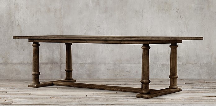
One of my good friends and her husband just bought the most AMAZING dining room table from Restoration Hardware.  It’s actually this one (or very very similar to this one), and it’s absolutely stunning.

Now that it’s been delivered, they are in the process of making room for it in their apartment, and have very cleverly decided to split their huge living room, so that half is for the dining area, and half is for the living room.

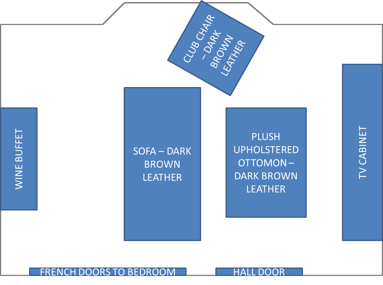
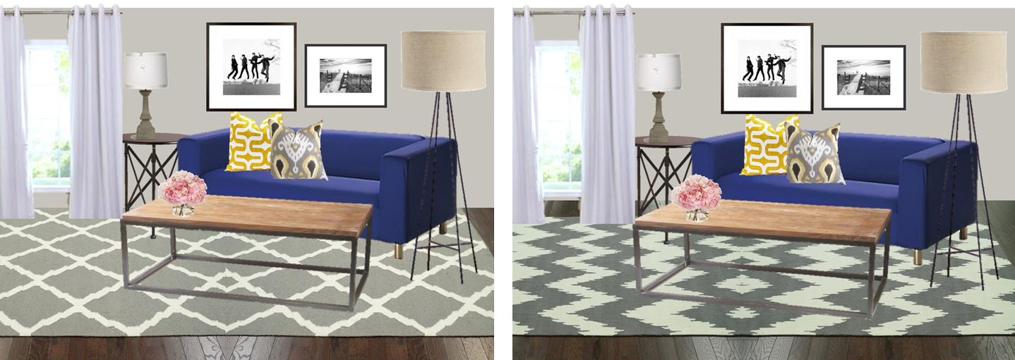
The old floor-plan looked something like this:

I only know the general details of how the room is being split up, but I imagine the new floor-plan will look similar to this:

Genius, right?

By flip-flopping the room, you now walk into the “dining room” from the hallway, and in general have a good flow for entertaining.

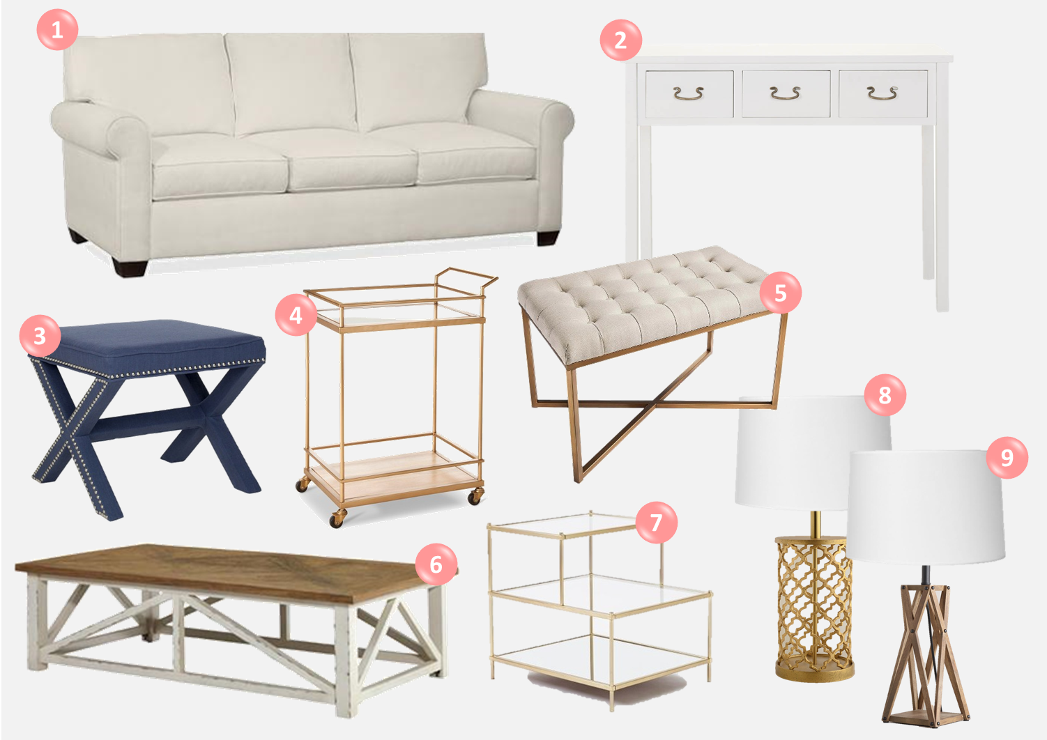
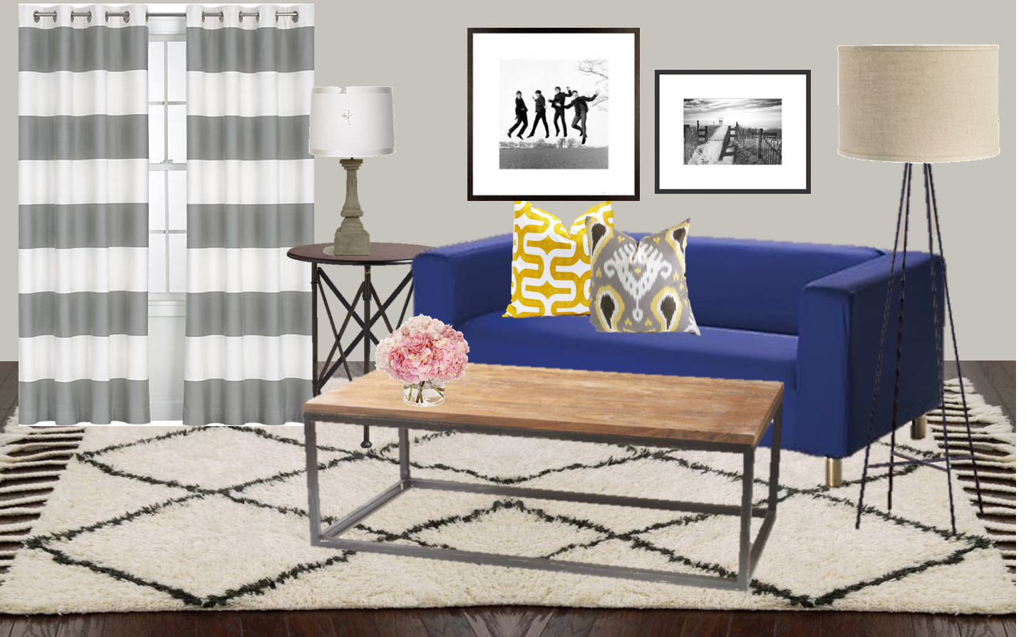
What else is changing from the old layout?  Well the ottoman is going to be way too big to transfer over to the other side of the room, so that needs to be replaced.  By replacing it with a smaller coffee table, and eventually downsizing the TV stand, they will have room for living and dining spaces in the same room.  I LOVE this. City living at its best.

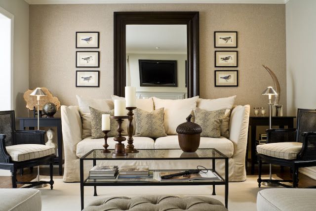
The challenge?  Designing the rest of the room around dark furniture (ding ding ding, the title of this post!)

The new dining room table is made of reclaimed oak – which is so incredibly gorgeous but the stain on it is a dark brown.  Their existing sofa and club chair that will live on the other half of the room are both made of dark brown leather, which means there is a lot of dark brown happening in this space.

The walls of the room are a very light taupe color, the crown molding is white, and a beautiful bay window that lets in tons of natural light. Oh, and the space still has original hardwood floors.  It doesn’t get better than that! The room has good bones, so it will be an easy task to use what they already have, and turn it into a complete and cohesive space.

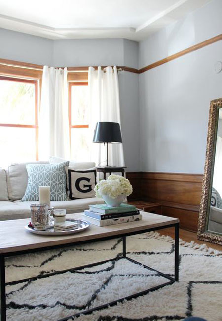
Here’s where the room stood last week after the table was delivered.  Excuse the iPhone picture – it’s a little grainy here:

The knee-jerk reaction to having lots of dark furniture is to compensate with lots of light colors everywhere else.  On one hand, yes, bringing in light colors around the dark pieces (ie: light pillows on a dark sofa) do help to lighten the space, but the real magic needs to happen in the space at and above eye level when you walk in a room.  Think about it for a second… dark furniture sits below eye level when you walk into a room, so if you have light walls, and light curtains, and light art (or worse, no art), your eye goes straight down, and visually the space just feels smaller.  Adding interest through color and pattern at and above eye level, creates a feeling of balance, and so the “challenge” of dark furniture, sort of isn’t a “challenge” anymore.

Trust me, it will make more sense as you see it come together.

Ok, moving on… so what’s the plan in here?  Since the above picture was taken, my friend already ordered a natural fiber rug to go under the dining room table.  Good call girl.

The rug is going to define the dining space, and separate it from the living room.  Also, massive area rugs are SUPER expensive, so to even think of getting a rug to cover this entire room, we’re talking serious money.  No thanks.

Why else was it a good idea to go sisal?  It’s neutral, it’s easy to clean (it’s going under a dining table after all) and it’s mainly covered  up with the table anyway, so the focus of the room will be elsewhere.  Any pattern would go mainly unseen here with a huge table on top of it.
My friend also said that the curtains need to be replaced because they can’t find the same ones anymore, but she likes the blue so isn’t opposed to something similar.  
Sweet.  Perfect place to jump right in…
Here’s what I think needs to happen on this side of the room:
Minimal changes my friends.  
First, they need chairs.  They obviously know this.
Then, I think that filling that back wall out is priority #2, so that your eye doesn’t stop at the table. 
Oversize art will help… like OVERSIZE.  I always find that it’s hard to find large scale art… it seems so big when you buy it, but once you get it on an empty wall like this one, it’s like an island in the middle of an ocean.  My point?  We need to find massive, beautiful, and not ridiculously expensive art.  
What else?  A bigger lamp that takes up more visual real estate will help.  And plants.  I LOVE bringing in larger house plants to wake up an empty corner.
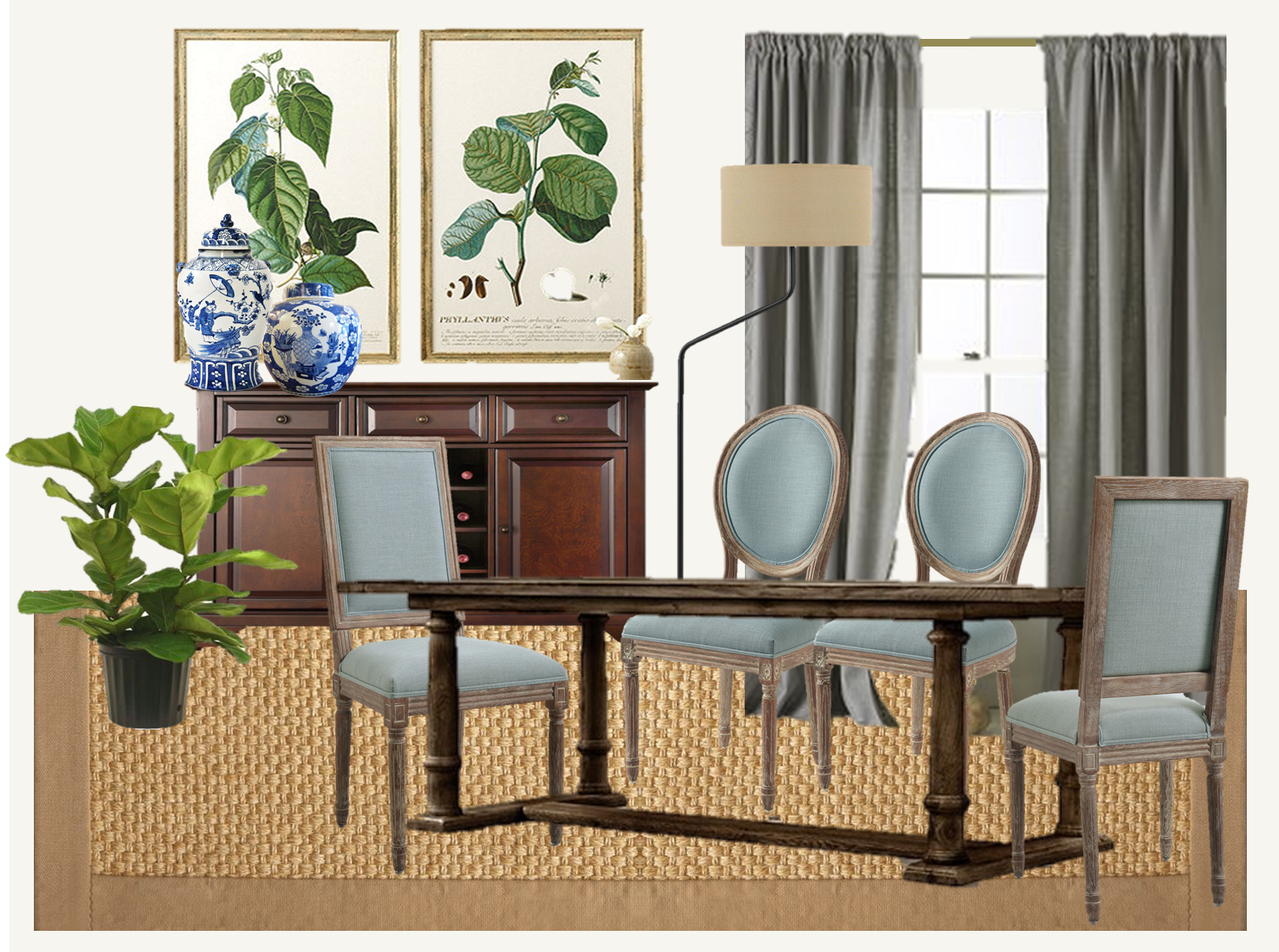
I started playing around to test out different looks, and at first, I went more “traditional”.  I think the table is so amazing – it’s a little rustic…. a little french-y feeling……… I loved the idea of adding Louis XIV chairs with it.  
Here’s the first look I came up with:
I love love LOVE these chairs – that dusty blue linen is so pretty, and I was thrilled to see it on two complimentary sets of Louis XIV chairs.  The blue fabric and lighter wood on the chairs surrounding the table will immediately bring life into the space.
LOVE.  
I also thought it was nice to have the taller rectangular chairs at the head of the table, and mix in the round backs in the middle, but again if you like the look of one over the other, you could certainly stick with one type of chair.
I should also take the time now to call out the fact that the wood on the chairs is NOT the same color (or even same type) as the wood on the table. 
That’s on purpose my friends.  
Some people are weird about mixing woods, but it doesn’t bother me!  I like the look of different woods in a space, because it looks “collected” instead of “we bought the set”.  If it will drive you nuts, the good thing about wood is that you can stain it, but I like the different wood tones.
Moving onto the art, I am SO into botanical art right now – you literally see it everywhere, from shelter magazines to the blog world.  These oversize prints from Ballard are SO GOOD.  They are massive – each one is 42″ high, by 27″ wide.  With prints this large, the frames should get pretty close to meeting the picture molding that runs around the walls, which will naturally draw the eye up, while taking up almost 5′ across that wall. Mission accomplished – these would meet the goal of filling the blank space out, without making it feel super busy (the way that a gallery wall can sometimes do).
The floor lamp has a bent bronze neck (shaft? stem? base? what IS that called??) and I like that this also helps fill out the space on that wall.  I also like that having the bent shaft makes it different than a standard floor lamp.  If the wall was still feeling empty once all of this was in the room, my recommendation would be to have two identical floor lamps similar to this flanking either side of the buffet.  I also can’t remember the overhead lighting situation in here, so they might actually need the extra light.  Boom. Kill two birds with one stone.
The fiddle leaf fig stands on the other side of the buffet in this mock up, but really any sizeable green houseplant would do in the corner.
And finally, the curtains… I thought that with the blue linen chairs, blue curtains might be a bit much, so I mocked this up with grey linen.  I think I like it.  The lightweight fabric will feel visually light (as opposed to a heavy fabric like velvet), while the grey still has enough of a color presence to draw the eye up to the ceiling.
Overall I like how this all came together, but I didn’t stop there… I swapped a few things out and came up with another version of this room:
What changed?  Well the chairs are a slight variation of those first ones, this time in a sandy linen.  With the sisal rug and all the wood, it feels like a lot of brown on brown, and so the accessories need to change.  I did a dark blue (almost navy) curtain, and swapped out the art, for a symmetrical gallery wall of… wait… what is that… more botanical prints!  Holla!
I told you I’m crazy for botanical prints right now.

These ones have a super saturated inky blue background with that green… I love it.  I think with the navy curtains, it looks awesome.  I’m still half and half on the chairs though… is it too much brown or are they ok with the art and curtains?  I think I need to see the color of the linen in person to tell if its more brown than cream.

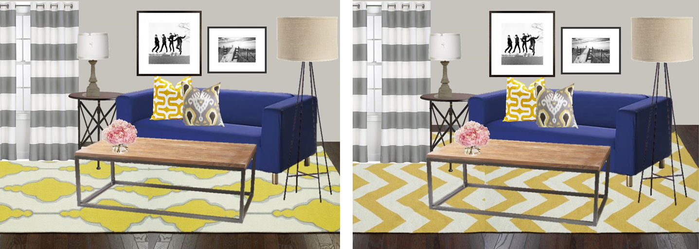
My friend mentioned that they do like the vibe of West Elm, so I wen on to put together a third, less traditional, more modern version of this space…
…so another mock-up was born:
The starting point for me in here was the curtains.  I think these are so cool, and the pattern will definitely succeed in drawing the eye up, and bringing some color to the room.  The floor lamp also got switched up for an aged bronze pharmacy lamp.  I like alternative floor lamps, and these just look cool, although take up less visual real estate than the floor lamp with the drum shade.
I’m loving the color that these chairs bring to the space – I also love the detail of the individually hammered nail heads around the edges.  It just makes it a little more special.
Some of you might be thinking… If you’re trying to lighten up the space, why are you putting dark blue chairs with already dark furniture??  And I totally hear you… but the point I’m trying to drive home is the need for balance.  
The challenge is not how to bring as much light colored “stuff” as possible around the dark furniture, but rather in balancing the darkness with other rich colors at or above eye level.  So while these chairs are upholstered in a darker peacock colored fabric, the shock of color paired with similar colors in the art, and yet another variation of the color echoed in the curtains balances things out.
Even if none of these ideas make it off the cutting room floor and into real life, this is a good starting point for visualizing this half of the room…
Next up, I’ll be tackling some ideas for the other side of the room… the living room side.  Working on integrating accessories that accent their dark leather sofa, club chair, and some ideas on how to style a cohesive space to pair with their new dining room…

Our Hamptons Inspired Living Room…Coming to Life

Hey guys!!  Just wanted to check in with you – we’ve been making some real progress on the house which I swear I’m working on photographing and posting.  The deck is well on it’s way, the dining room is in a good place (for now) and our kitchen nook has officially become Kris’ office (and my little DIY spot for sanding, painting, building, and re-vamping).  It’s been a huge mess for the most part over the last few weeks, but I have a few photos in a cleaned up state.  I hope to share with you later this week!

In the meantime I wanted to check in with you all on our living room.  Last time I posted about it, I’d talked about the new sofa we bought, along with the new coffee table.  Neither have arrived – actually the coffee table was supposed to be here this week but the delivery date has been pushed back.  SO FRUSTRATING.

Anyway, in anticipation of these two key pieces arriving, I put together a final inspiration board for how I see this room coming together.

It looks something like this…

I’ve been putting in A LOT of thought to how I want it to look, and feel.  I’ve posted some inspiration photos that I keep close to me at all times.  I’m still feeling really drawn to a more organic, preppy, “Hamptons” look.  Woven rugs, pretty wood in the coffee table, lamps, and picture frames, and LOTS of white and blue.

It just feels so fresh and calm to me.

Most of the details in this inspiration board are already ordered or purchased, but the finishing details are still in flux.

What still needs a decision??

The pillows – I’m planning to enlist the talent of my lovely mother to help me make larger 24″ pillows for our now much larger sofa.  Right now we have 20×20″ pillows, which are nice, but since the new sofa will have a back close to 10″ taller than our current love seats, we are going to need something beefier on the sofa, so they don’t look dwarfed.  I noticed that Pottery Barn was using 24″ squares on their sofas, and loved how it filled the couch out.

In terms of fabric, I’ve been toying with many different patterns but one thing is for sure – a small scale blue and white stripe is happening.  I’m leaning towards the Covington Darlington pattern in the Mariner colorway.

I found it at Joann’s in person, but can’t seem to find it online now!  Grr!  It actually does not look quite so vibrant in person – its just really pretty and nautical.  Love.

Having this small scale stripe will read as almost a solid and will allow me to experiment with a larger pattern on the other pillows.  I learn slow, but I learn well people!

I definitely want some sort of Ikat or “enthnic” type pattern.  Not sure if that’s the right word.  Tribal?? Worldly?  Who knows… not that concerned with labeling it to be honest.  A few patterns I still looovvvveeeee??

Duralee Kalah Blue.

I’ve posted about this one before, here and here… and I’m still totally in love with it.  So much.  It’s just such a classic, and the blue is so rich and pretty.

Also, loving the Robert Allen Khandar Indigo.

I loved that the blues in this one were more light, and the background was a crisp white fabric.  But is it as classic as the Kalah blue??  Will I love it long term?? So confused.

And the final option that keeps coming back to me is the one I used in the mock up… the Duralee Woodblock Print in Indigo

Just love.  Almost as much as Kalah blue – it’s more imperfect and handmade looking, whereas Kalah blue is more refined and “fancy” feeling.  Do you agree?

Still not sure which fabric to order, so if you have an opinion, I’m open to hear it!!

Other “up in the air” details – the art.  I have the frames, but no art.  I’ve been agonizing over this a bit because I haven’t found anything I am obsessed over.  I like the sailing prints I used in the mock up, but I was really hoping to find something with more blue in it.  We have quite a few “warm” colors going on in the sofa, the natural fiber rug, the baskets, the wood table… I don’t want to make it TOO warm. Does that sound weird?

I haven’t ordered the prints yet, but I do like them.  Very calming colors, and they make me think of my dad (who loves to sail), and I really love that.  I definitely want to make a decision soon though so that the walls don’t stay empty for long after the sofa arrives.  Since we’re getting rid of both love seats, and the new coffee table is a smaller scale than our current one, the room is going to feel a bit empty at first… especially because we don’t have anything to replace the second love seat with yet.

We are thinking of putting a chair in it’s place (like the inspiration mock-up), and that’s the last “big” piece we will be purchasing for this room.

I want something comfortable.  Something you want to sink into, but also something tailored.  I found this one at Ballard – it’s the Manchester Chair:

Definitely want to check out a few other sources like Macys, since they are always having amazing sales, but I love that you can pick your fabric on this one…

Kris keeps pushing for a recliner – woof.  In his defense, we saw one at Room and Board that was a caramel leather, and really sleek – no clue it was a recliner, but it still wasn’t really my taste.  We will see – if we can find one that is a compromise of comfort and style, then maybe I’ll eat my words, but when I think of a recliner, I think of something like this, and that makes my stomach turn.

Anyway, that’s where things stand as of now!  Hopefully, next time I’m talking about the living room, it’s to post pictures of our fabulous new sofa!!!  Yay!

Fingers crossed that it doesn’t get delayed like the coffee table!

xo

Living Room Design Board – a House Tweaking Knock-off

That’s “House TWEAKING”… not twerking… no matter if that’s how it reads in my weird twisted mind…  and it’s a blog I’ve recently become completely obsessed with.  
I forget how I discovered House Tweaking to begin with but it doesn’t really matter… it’s a new instant favorite for me.  Trust me when I say that her taste is SO GOOD. The kind of good where when you look at the clock you realize that you’ve spent 2 hours blog-stalking her. I feel that if we met in real life, we’d be the best of friends.  We both share a love of finding a good deal, Sherdog, and restrained color palettes. Oh and interior design.  That too.
This is her living room.

Hello lovely.

Plush rug…  Check.

Pretty light greys…  Check.

Chevron…  Check check!

Tripod lamp.  It’s love.

You know who else would approve?  Emily Henderson.

They are like style kindred spirits.  That explains so much about why I’m obsessed with this room.  She has the “effortless” look nailed.

I felt inspired… and so to the drawing board I went to recreate a similar room on a budget.

Obviously, it’s a little different, but I think that this inspiration board comes pretty close to achieving the same look and feel.

I’ve also included links to purchase if you are so inclined to recreate this on your own.

WHERE TO BUY:
RugBamboo Roman ShadeGrey Curtain PanelsTripod LampSlatted Bench / Coffee TableSofaGrey Arm ChairYellow Chevron Throw Pillow (pair)Woven Native American PillowCream Colored “Lacey” PillowCream Colored Knit Pillow

Happy Monday!!

Bedroom Design Board – an Emily Henderson Knock-off

Emily Henderson is a design goddess.  
She just posted this bedroom yesterday morning, and of the people I follow on Pinterest, I saw this room pinned, and re-pinned by about 10 different friends (and when I say friends, I mean for the most part random Pinterest “friends”).
Anyway, this room is SO SIMPLE, but so lovely, so I just had to come up with an affordable version for the rest of us to mercilessly copy.

I love that everything in the room is light and bright, letting the headboard take center stage.  SO GOOD.

The chandelier MAKES this room, and so I kept the original chandelier in my inspiration.  It’s actually quite affordable from Shades of Light – if you’re ever in the market for a chandelier you’ll see that they can run up the cost quickly.

With the bedding, the headboard, the lamps, the nightstands, and decorative pillow, we’re talking about an entire room makeover for well under $1000.

Here’s my own version…

Where to Buy:
   1. Navy Tufted Headboard
   2. Washed Linen Bedding
   3. Rast Nightstand (for Campaign Makeover)
   4. Geometric Lamp
   5. Jonathan Adler Chandelier (minus the shades)
   6. Yellow Woven Throw Pillow

Pretty close to the original, rigghhhtttt???

You can actually get the headboard she used from Target, which is also REALLY affordable, but this option from Wayfair, was ~$300.  Even less costly than the Target version!

You’ll notice that the nightstands will require a little DIY, but it’s really minimal.

To make these into a pair of cute, and SUPER affordable nightstands, go pick up two Rast 3-drawer chests from Ikea ($30 each).  Pick up some brass hardware – 6 pulls per dresser, and a few brass brackets from the hardware store – and paint these dressers in a nice medium grey.  I like Benjamin Moore’s Stonington Grey.

I’m so in love with this space – makes me want to recreate it in real life!

Inspiration to Reality: Classic, White Living Space

I haven’t done a design board in a while and it’s time to get those creative juices flowing again!

This living room (from Houzz) is pretty much the stuff my dreams are made of…

Open concept.  Neutral Furniture. Classic details. Contemporary lighting and accessories. Worn natural woods.  It’s love.

I put together an inspiration board to get the look (for likely A LOT less than this room cost)… take a peek:

That sofa is actually one of the ones we’d been considering from Pottery Barn – the Carlisle Couch with it’s deep feather stuffed  seat cushions and pretty turned legs.  It’s not cheap, but it’s the core of the room!

To balance out the cost of the sofa, everything else is a bargain find – that rug from RugsUSA is just $1000 right now (with the 60% off discount) for an 8×10′ – great price.

I love the look of the grain sack throw pillows, and the carved wood candlesticks.  The Hicks Pendants are a bit pricey, but they are a classic, and they bring a cool industrial feel to an otherwise classic, clean space.

Juxtaposed against the more natural elements, the mercury glass lamp glams things up, and the dark wood side tables and coffee table really pop against the white walls and white furniture.

Sources:
SofaCandlesticks, Lamp Base, Flour Sack Pillow Covers, End Table, RugPendants,

Dorm Room Rewind…

It’s September, and this time of year always gets me nostalgic for back to school.  The excitement over first day of school clothes, the smell of new pencils, new notebooks, new teachers…
College…  Oh man… if I had to do it over (which I would in a heartbeat) I’d go for a totally different dorm room look.  I remember agonizing over the perfect color of periwinkle for the down comforter we were ordering, and also being really proud of the oversized cork-board covered in pictures, and a hot pink lucite lamp with matching pink shade covered in sequins.  #whatwasithinking??!!
To go back and design my dorm room, I’d go for graphic prints with a girly, youthful twist… something only an 18 year old fun loving, beach cruiser riding, UCSB co-ed could get away with…
First up… the black and white and green inspiration:

I WISH they made these storage benches when I was in college.  Not only would it have been stylish to stash our snacks, or books, or whatever it was we kept in our room, but it could have been pushed under the beds, and pulled out for seating when neighbors came by to “chill”.  I love the stripes – a little Beetlejuice, but I LOVE that about it.  And the fun lime green is so youthful, and would inject some much needed life into the drab dorm room decor.

Nothing about berber carpet says, “what a comfortable, cozy living environment” – this fun rug solves that problem quickly (and cheaply!)

Next up… the girly, graphic, mint and pink combo…

Nothing says “a girl lives here” like mint and pink.  I mean, Kris would DIE if I did our bedroom up in mint bedding with some pink and zebra throw pillows.  I’d have a pretty unhappy camper on my hands.  College should be carefree, and it’s the time to decorate your room the way you want… so pink and mint it is! Again, I just have to say… this storage bench is GENIUS. Oh if only we could rewind 10+ years and tell Target to make these back then…

And finally, the ultimate in girly… floral bedding!  Yes please!

I think this room is my favorite.  The floral bedding is bright and happy and fun, and the mix of patterns, and graphic is very kate spade meets a country garden.  You’ll notice, I kept the accessories the same in each room – drum table (just $60 right now), and the little brass elephant from Fab is quirky and shiny, and would instantaneously make you the cool girl with great taste.  
I’m actually dying to get one of these chrome floor lamps from Ikea – a GREAT price, and aside from providing great task lighting for those late nights cramming for finals, it’s ultra cool looking.  Looks REALLY pricey in person… but it’s Ikea!  $70!
Done!

Creating (a stylish) Living Space in a Studio

My old coworker (and fabulous friend) Margot just moved into a Studio (after living in a truly awful situation with roommates for a few years).  One of the BEST things about living alone is being able to make decisions on your own about what YOU want in your space.  You don’t need to take other’s tastes into consideration, and most importantly, you don’t have to worry about your sloppy roommates ruining your new pretty things.
Amen to that!
Well, Margot already has a few things in place, but I was able to help her out a bit, by creating a few mood boards for how I see her studio coming together.  She has white bedding, neutral walls, and this fabulous, bold, cobalt sofa from Ikea.  With that in mind, I pulled together a few fun accessories, to create several ideas of how I see this space coming together.
This first inspiration board was a fan favorite.  This rug (at the time, 75% off from RugsUSA) is the spitting image of the Souk wool rug from West Elm that retails for ~$6x the cost of the Marrakesh Shag rug we found at RugsUSA
So… you could have this one for $899 (8×10)…
Or… you could pay $187 for it’s long lost twin (8×10)…
No brainer right??
Margot really liked the idea of yellow being the accent color in the room as well, so I added in a few cool ikat throw pillows that incorporated a burst of sunshine-y yellow… but then we saw a few yellow and white rugs on sale as well, and it got us thinking…

There was a creme colored rug with an Indian inspired yellow and grey pattern, and then the yellow and white chevron piqued her interest too…

We also tested out a few grey and white options as well…

But we just kept coming back to this beauty…

We figured that the neutral colors would translate into any space – so if she moves, or wants to switch up the accessories, she won’t forever be trying to coordinate with a yellow rug, and the shaggy texture is just enough “boho” to be cool, without being sloppy.

We both agreed that in a small space where there is bold color in the sofa, it was important to keep the rug a neutral color with a bold pattern to keep your eyes from feeling “confused” when trying to make sense of the space.

These rugs have been getting lots of attention – just look how fabulous they look in these spaces…

Of course, West Elm’s blog has fabulous photos of this rug…

But it’s also a favorite of designer (and personal idol) Emily Henderson… she used it in her friend’s living room re-design, with lots of pops of color (god, I hate myself for using that phrase)

And clearly, she loved it enough to use it again in her own home… this space is so light and bright, and colorful, and pretty, and crazy all at once, but I adore it.

Amazing right???

Ok… fine… a few more glamour shots from Emily’s place… seriously, it makes me drool…

THOSE CHAIRS!!  What I would do for them to be mine…

So are you sold?  I WISH I had a need for this rug… Kris would probably kill me if I brought ANOTHER new rug home… but it makes me happy to know that Margot’s space is coming along!

The rug should be arriving any day now…

Living Room Re-design

Do you ever have those moments when you turn around and completely hate everything in your space?? This happens to me most mornings when I try to get dressed – tons of clothes in the closet but nothing to wear…

Well, it’s started happening with decor now too – eek!

Our living room got a few updates earlier this year with a new rug, a gallery wall, and a dolled up wine hutch, but since then it has been at a complete standstill for many months.

I can’t stand the lack of change, so the time has come to switch things up.

I made a laundry list of the things I want to change, and came up with an inspiration board for how I want this space to feel – lighter colors, more natural wood elements, and overall a more organic feel…

Living Room Wishlist:
  – New sofa
  – “New” Area Rug
  – Cowhide rug (for layering)
  – Lighter colored side tables
  – Weathered wood coffee table
  – Additional Seating

I’m desperate for a new sofa (it’s about time!) and while I’ve been talking about getting rid of all the dark furniture (coffee table and side tables), it’s time!

The area rug is an easy fix – this creme colored trellis rug is the exact area rug that we have in our bedroom, and I think the rug currently in our living room would look fabulous in our bedroom with all the white bedding, and navy chevron curtains… so the easy solution is to swap rugs.  Bedroom rug moves to the living room, and living room rug moves to the bedroom.  The annoying part of this??  Moving the mattress, boxsprings, frame and headboard out of the way first…

Ok let’s not think about that… let’s talk about my plans for a cowhide rug… RugsUSA has a fab 75% off sale running over the 4th of July, making this cowhide rug just $245! I think I need to have it…..

Obviously, I can’t afford don’t plan to splurge on a new rug, new side tables, a new coffee table, a new chair (or pair of chairs) and a new sofa all at once, I’m thinking of making some temporary tweaks to what we already have in order to feel happier with this space overall… how will I do this??

PAINT.

Yep – that coffee table and side tables are getting a mini makeover in the meantime before I replace them.  They have no idea what is coming their way! I’m thinking a clean creamy white, or even a pretty light blue like the side table in the inspiration photo… although notice the card catalog drawers??? That side table is high up on my wish list….

I’m also contemplating changing up the layout of the room, but I’ll cross that bridge after making some of the initial changes to color palette…. stay tuned for more………..

Grey and White Palette

My best friend has decided – OFFICIALLY – to move to Chicago, and while I need to come to terms with it… I think I’ll stay in denial for a while longer…
Possibly the only good thing that will come out of her moving half-way across the country from me, is that I get to help her decorate her new place.  
She recently mentioned that she’s been loving two things – chevron, and a grey and white palate – so I put together a few inspiration boards of how I envision her future Chicago living space…  It’s been a good long while since I’ve put together an inspiration board, and it feels good to be back in the game – creative juices flowing, and all!
She has the white Ektorp sofa from Ikea already, so I built everything based on the fact that she’ll likely be moving this with her.  She has always been fond of the shabby chic look and feel, but has been coming around to more contemporary styles (my personal favorite).  
Keeping the feminine feel of the shabby chic with a light color palate, I’d say this inspiration board is contemporary meets feminine… You know I love a good graphic trellis pattern, and this rug is perfection.  This rug is on sale right now too!! $222 on sale at RugsUSA (50% off)… go get it!
The bold striped curtains are really fun, and could be easily swapped out for a solid white during the summer.  Even though both the curtains and the rug make a statement, the soft grey doesn’t distract, and the fun pillows and art bring in color.  
I’ve been wanting a ginger jar lamp for the longest time, and these pale blue beauties seemed fitting to balance the pops of pink…
My second inspiration board takes girly to the extreme.  I kept details from the first inspiration, but incorporated more bold sweeps of blush (those curtains are not “pink”).  This is an apartment that CLEARLY belongs to a girly girl, but I think it’s still sophisticated, and adult.  Nothing about this says “little girls room”.
To balance out all the pink, I swapped in a bolder rug in dark grey chevron, and kept the lighting a little more quirky with a masculine brass reading lamp, and a fun ceramic owl lamp.
I LOVED the mint linen pillow, and the peach ikat is just fun.  During the winter months, it would be so easy to swap out the art for something black and white and moody, do switch out the peach pillows for faux fur.  Bring in some dark red (or snow white flowers), and do a cool Lucite tray on the table, and this room goes from summer to winter in a snap.
See what I mean??
So as fun as that was… I still think she should stay.  Chicago is sounding VERY far all of a sudden…