Dark Moody Rooms

Good morning friends!!  The last several posts I’ve had are mainly about progress on our own apartment, but I’ve been thinking a lot about dark moody rooms.

 Maybe it’s because all the fall clothes have hit the stores and I’m waiting for the perfect opportunity to bust out my new faux fur vest.  Maybe it’s because it’s been foggy and cold in San Francisco, and the drippy, dreary days have me ready to hibernate and think about pumpkin spiced lattes, and cozy nights, and big glasses of red wine while the wind howls outside. Or maybe, these rooms are just so beautiful and I can’t resist.

Don’t get me wrong, I’m still craving warm weather and summer nights, but mentally I’m in the fall mindset.  Don’t you think there is something so inviting about a dark moody room?  It is an invitation for dim light, candles and ambiance.

It’s probably (definitely) not something I’ll be trying out in our current apartment, mainly because our place is not super large, and because all the rooms are pretty open to one another, but I’m really into this look – dark walls, dark furniture.  IF (and that’s a big IF) I were to test this in our current place, it would probably be in our bedroom since it’s the most separate from the rest of the house, and because the dark walls, and dark furniture would feel really calm, cozy, and sleep inducing.

Normally, you’ll find rooms with dark walls and lighter furniture, or lighter walls and dark furniture, but I’m loving the combination of dark with dark.

I’m also finding that the rooms I love best with this dark on dark use rather monochromatic hues – the first picture (and one of my favorite spaces in general) has the ink curtains next to the ink sofa, next to the dark grey window frames, and everything is on top of the inky purple rug.
In the photo above, everything is painted in the same dark taupe.  And below the walls, and rug are nearly the same shade of grey.
This next photo, the walls, columns and ceiling are the same shade of grey, and only the sofa and flowers bring color to the space.
What I find really interesting too about all of these spaces, is that they seem to work best with more traditional details.  The moldings, and more ornate mirrors.  Classically tailored sofas, chairs and ottomans, panel curtains, and a good dose of brass.  
I think that these traditional elements keep these spaces from feeling cold, even through there is so much dark, and drama going on.  They still feel inviting.  They say, come bring your cup of tea and tattered copy of Pride and Prejudice in here for the afternoon.

What do you think?
Would you ever experiment with a dark and moody room in your own home?

Inspiration to Reality: Classic, White Living Space

I haven’t done a design board in a while and it’s time to get those creative juices flowing again!

This living room (from Houzz) is pretty much the stuff my dreams are made of…

Open concept.  Neutral Furniture. Classic details. Contemporary lighting and accessories. Worn natural woods.  It’s love.

I put together an inspiration board to get the look (for likely A LOT less than this room cost)… take a peek:

That sofa is actually one of the ones we’d been considering from Pottery Barn – the Carlisle Couch with it’s deep feather stuffed  seat cushions and pretty turned legs.  It’s not cheap, but it’s the core of the room!

To balance out the cost of the sofa, everything else is a bargain find – that rug from RugsUSA is just $1000 right now (with the 60% off discount) for an 8×10′ – great price.

I love the look of the grain sack throw pillows, and the carved wood candlesticks.  The Hicks Pendants are a bit pricey, but they are a classic, and they bring a cool industrial feel to an otherwise classic, clean space.

Juxtaposed against the more natural elements, the mercury glass lamp glams things up, and the dark wood side tables and coffee table really pop against the white walls and white furniture.

Sources:
SofaCandlesticks, Lamp Base, Flour Sack Pillow Covers, End Table, RugPendants,

Small Space Living

You all know that I’ve been struggling with the tiny entry way in our apartment.  I’ve made the executive decision – those black stripes are going – but now I’m left with the question… what do I do now?!

Houzz is such a source of inspiration for me, and I’ve been scouring their archives for helpful decor hints. Luckily for me, their archives are FILLED with amazing tidbits to help me solve this problem…

First up: decorating with intention, to maximize a small space.  If this article wasn’t written for me, I don’t know what is!!
var hzw_id=1628249;function hzwshow(id,v,delay){var showDiv=document.getElementById(‘hzexpand’+id);if(v){ position=function(element){ var p={x: element.offsetLeft || 0,y:element.offsetTop || 0};while(element=element.offsetParent){ p.x += element.offsetLeft;p.y += element.offsetTop;} return p;};var ref=document.getElementById(‘hzfooter’+id);var p=position(ref);var scrollX=(window.pageXOffset||(document.body.scrollLeft-10)||document.documentElement.scrollLeft);var x=Math.min(Math.max(p.x -(300-ref.offsetWidth)/2 ,scrollX),(window.innerWidth || document.body.clientWidth) + scrollX -300);var root=document.body;root.insertBefore(showDiv,root.firstChild);showDiv.style.top=(p.y + ref.offsetHeight + 3) + ‘px’;showDiv.style.left=x + ‘px’;} var timeout=window[‘hzwtimeout’+id];if(timeout) clearInterval(timeout);if(delay && !v){ window[‘hzwtimeout’+id]=setTimeout(‘hzwshow(‘+id+’,false,false)’,400);} else{ showDiv.style.display=v?’block’:’none’;} } #hzroot1628249 div {width:100%;}#hzfooter1628249 {line-height:normal;} #hzfooter1628249 a {text-decoration:none;} #hzfooter1628249 a:hover {text-decoration:underline;} #hzexpand1628249 {display:none;width:290px !important;position:absolute;background-color:#222;border:1px solid #888;padding:4px;padding-top:8px;padding-bottom:8px;text-align:left;font-family: arial,sans-serif;font-size:11px;line-height:130%;z-index:100;} #hzexpand1628249 div {color:#eee !important;text-align:left;font-family: arial,sans-serif;font-size:11px;line-height:130%;} #hzexpand1628249 a {color:#ccc !important;text-decoration:none;} #hzexpand1628249 a:hover {text-decoration:underline;} #hzsection1628249 {margin-top:8px;}

Another super helpful article I found was this tutorial around decorating tricky spaces.  Unfortunately, I WISH one of my problems was having too high ceilings, but there were a few tips in there that got me thinking…
var hzw_id=7473075;function hzwshow(id,v,delay){var showDiv=document.getElementById(‘hzexpand’+id);if(v){ position=function(element){ var p={x: element.offsetLeft || 0,y:element.offsetTop || 0};while(element=element.offsetParent){ p.x += element.offsetLeft;p.y += element.offsetTop;} return p;};var ref=document.getElementById(‘hzfooter’+id);var p=position(ref);var scrollX=(window.pageXOffset||(document.body.scrollLeft-10)||document.documentElement.scrollLeft);var x=Math.min(Math.max(p.x -(300-ref.offsetWidth)/2 ,scrollX),(window.innerWidth || document.body.clientWidth) + scrollX -300);var root=document.body;root.insertBefore(showDiv,root.firstChild);showDiv.style.top=(p.y + ref.offsetHeight + 3) + ‘px’;showDiv.style.left=x + ‘px’;} var timeout=window[‘hzwtimeout’+id];if(timeout) clearInterval(timeout);if(delay && !v){ window[‘hzwtimeout’+id]=setTimeout(‘hzwshow(‘+id+’,false,false)’,400);} else{ showDiv.style.display=v?’block’:’none’;} } #hzroot7473075 div {width:100%;}#hzfooter7473075 {line-height:normal;} #hzfooter7473075 a {text-decoration:none;} #hzfooter7473075 a:hover {text-decoration:underline;} #hzexpand7473075 {display:none;width:290px !important;position:absolute;background-color:#222;border:1px solid #888;padding:4px;padding-top:8px;padding-bottom:8px;text-align:left;font-family: arial,sans-serif;font-size:11px;line-height:130%;z-index:100;} #hzexpand7473075 div {color:#eee !important;text-align:left;font-family: arial,sans-serif;font-size:11px;line-height:130%;} #hzexpand7473075 a {color:#ccc !important;text-decoration:none;} #hzexpand7473075 a:hover {text-decoration:underline;} #hzsection7473075 {margin-top:8px;}

And another… tricks for stashing your stuff in an apartment.  How convenient! Kris and I were JUST talking about looking into an external storage facility… maybe all I need to do is clean out our linen closet, and get some hollow ottomans with lids…
var hzw_id=6026378;function hzwshow(id,v,delay){var showDiv=document.getElementById(‘hzexpand’+id);if(v){ position=function(element){ var p={x: element.offsetLeft || 0,y:element.offsetTop || 0};while(element=element.offsetParent){ p.x += element.offsetLeft;p.y += element.offsetTop;} return p;};var ref=document.getElementById(‘hzfooter’+id);var p=position(ref);var scrollX=(window.pageXOffset||(document.body.scrollLeft-10)||document.documentElement.scrollLeft);var x=Math.min(Math.max(p.x -(300-ref.offsetWidth)/2 ,scrollX),(window.innerWidth || document.body.clientWidth) + scrollX -300);var root=document.body;root.insertBefore(showDiv,root.firstChild);showDiv.style.top=(p.y + ref.offsetHeight + 3) + ‘px’;showDiv.style.left=x + ‘px’;} var timeout=window[‘hzwtimeout’+id];if(timeout) clearInterval(timeout);if(delay && !v){ window[‘hzwtimeout’+id]=setTimeout(‘hzwshow(‘+id+’,false,false)’,400);} else{ showDiv.style.display=v?’block’:’none’;} } #hzroot6026378 div {width:100%;}#hzfooter6026378 {line-height:normal;} #hzfooter6026378 a {text-decoration:none;} #hzfooter6026378 a:hover {text-decoration:underline;} #hzexpand6026378 {display:none;width:290px !important;position:absolute;background-color:#222;border:1px solid #888;padding:4px;padding-top:8px;padding-bottom:8px;text-align:left;font-family: arial,sans-serif;font-size:11px;line-height:130%;z-index:100;} #hzexpand6026378 div {color:#eee !important;text-align:left;font-family: arial,sans-serif;font-size:11px;line-height:130%;} #hzexpand6026378 a {color:#ccc !important;text-decoration:none;} #hzexpand6026378 a:hover {text-decoration:underline;} #hzsection6026378 {margin-top:8px;}

Design Icon: Kishani Perera

Kishani Perera is a total design maven – her work has been shown all over the internet – from design blogs, to Pinterest (which is actually where I originally fell in love with her) and she’s been consistantly featured in BH&G, House Beautiful… the list goes on.
One of my favorite Bloggers, Amanda Eck featured her recently, and since I am totally in love with her work, decided to create a design board for one of my favorite rooms.

This space is girly… funky… and Kris would totally die if he walked into our house decked out in hot pink. My favorite thing about her, is that she takes risks, and creates rooms that are as livable as they are beautiful.  Simultaneously ‘relaxed and elegant’ if you will, and somehow it all works.

While I’m sure this room didn’t come cheap, that’s not how we roll in my household, so the design I put together below focuses on getting the same look, while staying on budget (dang that budget… I could throw it out the window!)

Enjoy the “where to buy” below for this affordable reconstruction!

Where to Buy:
Zebra RugGrey SectionalPink PillowsLucite Coffee TableFloor LampBookshelfChandelierMercury Glass VasesAbstract PaintingSilk Panels

Dorothy Draper DIY

I’ve been casually looking to replace our existing TV stand that we have in our bedroom.  The stand is relatively low to the ground, which makes it really hard to see the TV unless I sit upright.  These are real problems people!!

Because of the dilemma of needing a taller TV stand, I’ve been scouring the internet for inspiration.  Segue to… the Dorothy Draper chest.  Ta-da!!

Dorothy Draper dresser

It’s beautiful, with classic lines and awesome ring pulls.  I love the gold detailing you’ll find on most of them, and best of all, Kris approves!  It’s retro but timeless, and while it sounds like the perfect solution, there is a hitch.  They are REALLY expensive.  Trust me when I say, they are hard to come by – even on Craigslist, I am seeing Dorothy Draper pieces in the $500-$900 range (which is definitely more than I want to pay for the TV stand that goes in our bedroom).  A fully restored piece from an antique dealer could run well into the thousands, and so you can imagine my joy when I stumbled upon this Ikea Hack.

Everyone loves a good Ikea hack (I know I do), and while this one has already reverberated across the web, it’s new to me, so I am beyond excited!!  Does that nightstand below not look pretty much identical to the piece above??  Could have fooled me!

To make your own Dorothy Draper chest, you start out with a Rast Dresser from Ikea – this will run a whopping $30.

Not the most beautiful piece of furniture, but I’ve seen this bad boy transform before, so you know what it’s capable of – its the little dresser that could!

Assemble the dresser first and once it’s together, move on to the sanding phase.  The grain of the wood is pretty rough (I’ve seen it in stores), so don’t skip the sanding step.  Once it’s nice and smooth, wipe it clean with a tack cloth, and then move onto the priming phase.  Once the primer is dry, you can go the old fashioned route and paint the piece with a brush (or roller) or you can go Marcus’ route and use spray paint  (using the spray attachment for even coverage).

Marcus got crafty, and made a stencil based on several Draper pieces he’d seen online.  I’m not the free hand type, so I’d definitely go the stencil route.  If you don’t feel like making the stencil and cutting it out with an exacto knife like Marcus, you can go the easy route and get an overlay from O’verlays (I blogged about them here, and you can get their stuff here.)  A word of caution, the O’verlays will look nice, but they don’t offer the classic Draper shape below… you’ll end up with the look, but not exactly.  If you want the beveled outline, do the stencil.

Moving along, with the stencil’s cut, he used gold paint to transcribe the shape to the drawers, and with round ring pulls from here, the project was complete!  I made it sound way easier than it probably was, but that’s pretty much all there is to it.

Fabulous, no??  I’ll have to do two, and push them together for this to accommodate our enormous TV (it’s a pet peeve of mine when the TV hangs over the edges of it’s stand, I I’d like our new Dorothy Draper inspired chest(s) to be at least two inches longer than the TV on each side).

Anyway, the classic color combo is the black with gold – if you Google Dorothy Draper, you’ll find it’s pretty much all black and gold out there, but we have so much black furniture in our bedroom already… should I deviate from the classic Draper look and go for something lighter?

I saw this one online, and its nice.  I’m not loving it as much as the black ones I’ve seen, but it could work – plus with all the gold detail (at least twelve “drawers” with twelve ring pulls) maybe the black would be overkill??

So much to think about!!

Sophisticated Entryway: Design Inspiration

Clean traditional.  Like the smokey mirror + animal print done right
Houzz

This room (or should I say hallway) is sexy… to me, it’s a slinky dress, dirty martini, smudged red lipstick kind of sexy.

Am I right, or am I RIGHT?!

Between the dim lighting, smoky mirrors, and animal print, I’m all about it.  It’s really pulled together and tailored, but very masculine at the same time.  From the cubist modern framed prints, to the dark wood chest of drawers, to the angled lamp and tribal accents… it says “manly” to me.  While there are aspects of this that I really love, I don’t know if I’m brave enough to have a space like this in my own house. Unfortunately, the original room was featured on Houzz.com and I can’t find the original page now, so all the details are lost!

Anyway, enjoy an inspiration board I pulled together for this room.  I’m sure there are so many more (and better) furniture and accessory options if you dug around in thrift shops, antique stores, and flea markets, but working with the instant gratification of online, here is what I came up with…

Zebra Chairs: Wayfair
Apothicary Chest: V&M Curators
Angled Lamp: World Market
Antiqued Mirror: Bronson Design
Driftwood Charger: World Market
Vase: World Market
White Stone Sculpture: Etsy
Wall Sconce; Lamps Plus
Jute Rug: Rugs USA

What originally drew me to this room are those fabulous chairs!  I’m sure they are quite costly (even custom), and as I discovered, pretty much impossible to find online.  Above, I found a pair from WayFair for around $700 for both.  Not shabby since accent chairs can run up the bill quickly.
Aside from those chairs, a staple in this space is a sturdy dark wood chest of drawers, that really reminded me of an apothecary chest.  As a side note, while I was searching for the perfect apothecary chest online, I could not stop thinking about that one episode of friends, where Rachel gets an apothecary table from Pottery Barn… anyways… if you haven’t seen it, please do yourselves a favor and watch this clip.
Back to the inspiration – several of the table accessories came directly from Cost Plus World Market – they are great for the worldly, tribal, or eastern influenced accessories, and unless you are looking for an original piece, they are pretty cool.  Speaking of, I just saw some really cool globes there, and I’m seriously thinking of picking one up.  Where it will go in our apartment is beyond me, but I just loved spinning it around in the store.  Etsy is also probably a goldmine here – support the small business owner!
Moving onto the art – it’s totally subjective.  In the original room, they went for cubist art (a la Pablo Picasso) but you could go for black and white photographs, old maps, whatever.  The floor looks like it’s possibly inlaid wood, but I also included a jute rug for a bit of texture – an old faded tapestry esque floor covering would also look pretty amazing in a space like this.
Finally, the lighting should be ambient – I wouldn’t try this space in a really bright area of your home.  It’s all about moody lighting, so go for low wattage bulbs to bring the warm tones in the paint to life, and create a bit of mystery.

I have a crush…

It’s true!  I have a total crush on a new interior designer (well new to me) – Emily Clark.  In terms of taste, I think we are kind of soulmates.  I’m not even 100% sure how I stumbled up on her blog, but I swear I can’t get anything done around here!  Her home is amazing, and I am totally captivated because her taste and choices are what I aspire to achieve.

Emily A. Clark: Better Homes and Garden's Living Room

I have a real appreciation for designers who take some chances with color and pattern.  I love the contrast of the dusty navy wall against the white curtains and fireplace, and I love how it compliments the rug, and ties the whole room together.  It has been several months since we got our new dark grey trellis rug, and I’ve struggled to find accessories to go with it.  Do the throw pillows compliment or take away from the pattern on the rug?  Is it too much pattern?  Too much grey??  Too geometric?  These questions and doubts about decisions I’ve made keep me wondering why I’m not totally satisfied with the look of the room.

The conclusion?? The color and pattern of the rug is very strong, and it needs an equally strong counterpart in the room – a complimentary wall of color perhaps – to bring it all together.

Since we may end up moving towards the end of this year / early next year (the story of my adult life is packing up once a year on average), I don’t want to put in the time and energy to paint the living room now…  I think… but after seeing her living room (which by the way was featured in Better Homes and Gardens) I had an aha moment, and think I’ve figured out what we need to do in our next home to bring the room and rug together.

Chiang Mai Dragon print throw pillow: mocha

Can we talk about these pillows??  I am a heartbeat away from immediately placing an order for the Chaing Mai Dragon Print fabric (in mocha) to make some throw pillows for the living room.  It. Is. Love.

Apparently, (and this is news to me) this fabric has made it’s way around the design blogosphere, and is very “trendy” (translation: overdone) but since it’s the first I’ve seen of it, I’m pretty sure my less design-y friends won’t know or care that I totally jumped on that bandwagon.

**An update here: a single throw pillow cover in this print is looking to be in the $200 range… must find out if I can order this fabric on my own…..

Beautiful home office - love the built in bookshelves with charcoal backing, and the lantern chandelier

IMG_9881

Ok… in my future house, I need this office.  That wall of books is making me want to stop downloading books onto my Nook – just so I can start collecting!  I LOVE the contrast of the dark backing with the white shelving and the colorful books.  Also, that lamp was a $70 thrift store find – originally shiny brass – that she spray painted black.  I am green with envy!

And that table – the old, dinged up, antique table with turned legs??  Craigslist.  I’ve never seen anything that awesome on Craigslist!!  I’d love to hate her for her fabulous taste, and luck in tracking down amazing second hand finds, but I just love her.

The breakfast room in her old house – love the painted wall, the lantern light, and the chartreuse patterned curtains that you get a slight peek of.  Is it totally creepy that I know that this is in her old house?

And at last, the formal living room in her old house (I believe possibly also featured in Better Homes and Gardens).

It’s funny – I see things in other people’s homes that I never knew I wanted, and suddenly I have to have them – the magic of the internet I suppose.  But those birdcages are awesome, and that zebra pillow is something I must find.  This room has a lot going on, but feels clean and simple at the same time.  I need to learn that, because sometimes I find our home feeling cluttered even if it’s not.

Can I Live Here??

dream. home.

But seriously… can I really live here?

From the oversize chandelier, to the exposed brick wall, to the high vaulted cieling, to the black and white contemporary furniture, and tons of light and windows…  I have some serious jealousy looking at this!  Don’t get me wrong, I love our little apartment, but sites like Lonny and Pinterest make me green with envy over other people’s homes that boast fabulous architectural details.

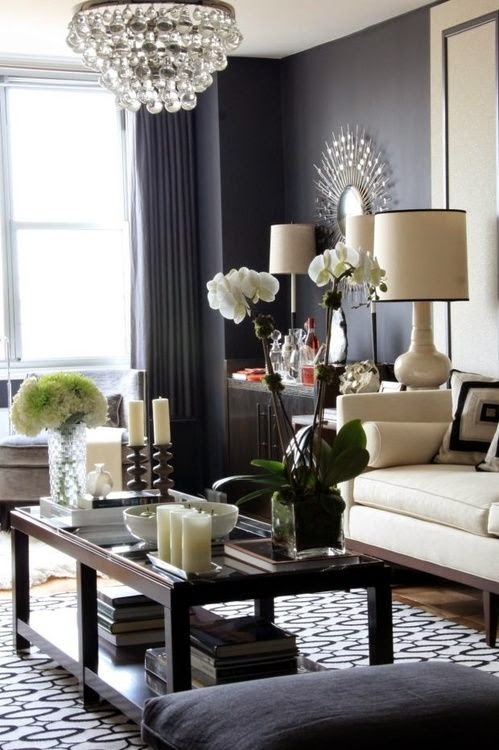
Normally, my taste is a bit more traditional, and I like to use more color in our home, but the black and white (and shades of grey) in this room are so clean, and bright, and pretty… I can’t help myself!  This room takes the staples that I love (clean classic lines on the “core” furniture – sofa, chair, side table) and couples it with some masculine feeling contemporary pieces (the coffee table, graphic pillows, and brick wall).

I’ve gone out of my comfort zone for this inspiration board, to put together a room that “feels” the same as this inspiration, but is much more in line with the budgets normal people (aka me) would be working with…

Inspiration: Black and White Opulence:

The goal here is to create the same look and feel of this lofty, architecturally stunning room, when the details may not already exist.  Kris and I live in an art deco apartment from the 1930’s.  It does not have exposed brick anywhere, no vaulted ceilings, and no arched windows overlooking a courtyard.

Tom Hagga makes some really awesome wallpaper’s, and the one I used in the inspiration board has the look of exposed brick.  I’d be really careful when deciding where to roll this paper on the walls.  Keep in mind that from a distance, it looks like brick, but up-close there is zero dimension.  I’d be sparing, using cool paper like this on a small wall, or on a wall with large windows, so that this paper peeks out from the architectural details – as opposed to dominating an entire wall.

For rooms without large expansive windows, Ballard Designs has a huge assortment of floor to ceiling height mirrors that have the look and feel of windows (pretty clever, eh?).  The Amiel Arch Mirror has a lovely dark maple arched frame, and antiqued mirrors that reflect light.  This would be an awesome solution to open up a smaller room.

Aidan Gray Kason side table is pretty much perfection.  I am a sucker for a pretty pedestal, and the weathered wood on this perfection.  For a tenth of the cost, the West Elm.com Turned Pedestal Side Table (made of mango wood) has the same dimensions and would do the trick just as well.

The finishing touches bring the room to life, and add a bit of glamour – with the mercury glass lamp, the pretty chandelier, and the graphic black and white throw pillows.  One note with a chandelier – do not try to hang in the center of a living space if the cieling isn’t vaulted.  Opt for a corner over a chair for reading, or over a desk on the room’s perimeter.

For some greenery, a fiddle leaf fig always looks well groomed, orchids mean minimal maintenance, and the little black stallion figurine is as sassy as it is inexpensive (I went with black here, but gold would look awesome too).  I took a queue from one of my favorite bloggers who spray paints inexpensive children’s toys to display as art – yep, $2 plastic toys become decor.  It’s pretty much genius if you ask me.  Check out Cassie’s DIY Brass Figurines to see the before, the after, and trust me when I say it looks amazing.


Tom Hagga Exposed Brick Wallpaper (price upon inquiry)

Target White Slipper Chair $199
ZGallerie White Graham Slip-covered Sofa $899

Crate and Barrel Frame Medium Coffee Table $499
Aidan Grey’s Kason Wooden Side Table $1200 (West Elm’s Turned Pedestal Side table is VERY similar at $199)
Home Depot Chandelier $99
RugsUSA Dark Grey Rug $300 for the 8×10
Ballard Designs Amiel Arch Mirror $699 (each)
Homegoods Mercury Glass Lamp and Shade $40
Horse “Sculpture” DIY (idea from the fabulous Cassie of HiSugerplum)
Black and White Graphic Throw Pillows: Etsy ($30-50 each)
Fiddle Leaf Fig Plant + White Orchid

Mirror Love & a Bedroom Makeover

I love a good mirror, and I’m a firm believer that there should be one in every room.  Not only is it nice to not have to trek to the bathroom to check your hair or outfit before leaving the house, but mirrors reflect light, open up a room, and make everything feel bigger and brighter than normal.  Whether it’s a big picture frame mirror, a delicate scrolled mirror, a sunburst mirror, or a convex mirror… I love them all!

Is anyone else LOVING those porthole mirrors like I am?  Look at a few more close-ups… So cool!!
I am pretty sure this room is going to be the inspiration for our bedroom re-design.  The chandelier is perfection, silk drapes are always my number one choice, and that upholstered nail-head trim headboard?!  I am dying a little inside…

I absolutely love the look of the convex mirrors lined up above the bed.  We have the trio of quatrefoil mirrors above our bed in the meantime (remember how hard I looked for those??)  Well, despite all the work it took to hunt those bad boys down, I am thinking of  something smaller to go above the bed when we get our new bed and headboard! (no, Kris does not yet know about the new headboard, hee hee hee…)  

Not to worry, the quatrefoil mirrors will find a home elsewhere in the apartment, but I am looking forward to updating the bedroom – you have no idea!  Don’t you love this bedding?  I saw a few similar rooms and just love the smoky paisley.  Take a look at this similar and equally awesome smoky paisley print bed… sooo pretty!  I also love the zebra paired with it!  Are you as in love with this look as I am right now?

We could also do a grand starburst mirror like this one… with the beveled edges, it brings a lot of glamour to the look.  Unfortunately, I’ll just have to admire that detailed crown molding from afar – we’ve got crown molding, but nothing like that!

Here is another in a dining room – the more I see them, the more I love them!


So much to think about…

Live Beautifully

I am officially in love with Maria Beck’s blog, Live Beautifully, and I am not ashamed to admit that I want her life.  She is a prominent Texan interior designer, who owns her own company.  Her taste is flawless, and her renovations are absolutely stunning – we are talking serious transformations on some of these – tearing down walls, gutting entire floors of homes, etc.  After discovering her site, several hours disappeared a little too quickly as I scrolled through page after page of beautiful design.

What I especially love is how she aims to preserve the integrity of the homes she revamps, and stays true to the era of the home.


This is her most recent kitchen renovation where she made a much smaller kitchen an open functional space for a large family who entertains.

The before and after is really shocking.  She opened up a wall to open the kitchen to the living space, knocked down a wall to expand the kitchen into previously un-used square footage, expanded the island, and extended the cabinets up to the ceiling (one of her favorite tricks, and I have to say, one of the biggest impact changes to every kitchen remodel she does!)


This is one of my favorite dining room transformations – the room is small (compared to some of the expansive Texan homes she works on) but feels grand at the same time.  You wouldn’t know to look at it now, but the room had painted cement tile floors before the transformation (woof).  Thankfully these were replaced with french herringbone wood floors – so pretty (see below)

Her rooms are peppered with all my favorite styles – neutral colored core pieces, lots of dark wood, nail-head trim on everything, high mounted curtains, classic subway tiles (in kitchens and in bathrooms), animal print, lots (I mean LOTS) of white, natural fiber fabrics, grand chandeliers, deep tufting… oh my!  The list goes on!  These rooms look livable, but elegant.  I would not hesitate to sink into the deep fluffy furniture or cook in these kitchens.

Enjoy some of my favorite transformations from her blog, and be sure to check out Live Beautifully – you will fall in love!