Industrial Shelving

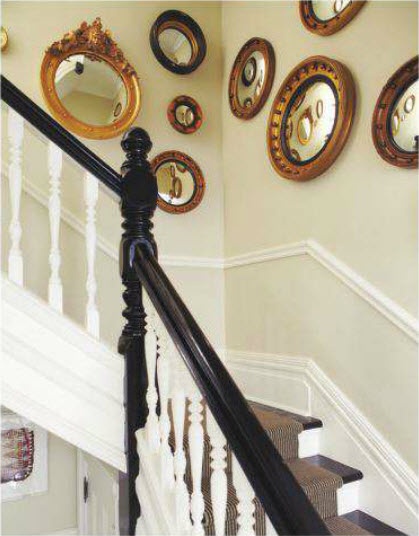
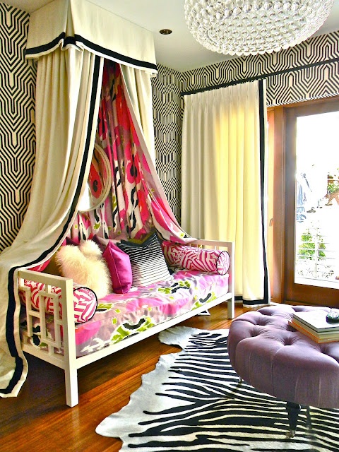
Industrial… rustic… found… restored… upcycled… these are all SUPER common words thrown around in design magazines, shows, and blogs… and a spreading trend supported by hugely popular retailers like West Elm and Restoration Hardware. I’m not a fan of everything “industrial”, but used with restraint, these pieces add a lot of character, and help balance out a room, keeping it from looking to perfect and shiny.

As I think about our pending move, and as we get rid of our “early twenties single furniture” and fill our house with things that reflect BOTH of our tastes and personalities, I’d love to find a few ways to incorporate some pieces with a bit more of an industrial feeling to them.  These photos provide ample inspiration for the look I’m going for… clean and classic, with a bit of industrial chic…

As trends come and go, I think I’d most want to test this trend through a piece that isn’t a staple to our house.  Some sort of shelving unit seems like a safe bet, because it will be large enough to make a statement, but we won’t feel TOO tied to it the same way we would with an “investment piece” like a bed or dining room table.

I did a little digging to see what I could find online, and it turns out that there are a TON of cool shelving units that are very reasonable.  My best sources??  Home Depot, Lowes, and Ikea.  These aren’t even all the shelving units I found either – just my favorites…

1  , 2
 3  ,  4
5  ,  6

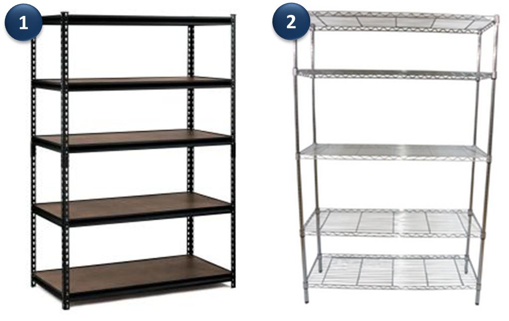
These shelving units, range in price from $15 (yes… $15!!!!) to $130.

The most expensive was the wooden Ivar Unit (#4) from Ikea at $128 (luckily for me, this is my least favorite of the bunch), and the least expensive shelf was $6 from Ikea… and it cost just $15.

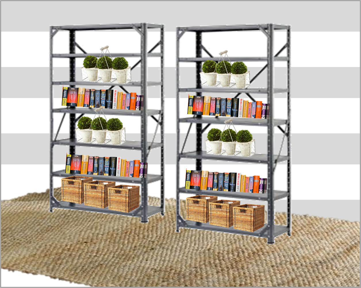
I literally cannot get over it!  I am dying to see what it looks like in person – is it rickity?  Does it look cheap or totally awesome?? It’s only 10″ deep, so it wouldn’t stick out too far into a room, and I think it would look kind of cool to line up four of them along a wall for open storage.  I also like that there is A LOT of space between each shelf – nearly 20″ if I’m doing my math correct, so things wouldn’t feel cramped.

I mocked it up really quick… kind of awesome, right??

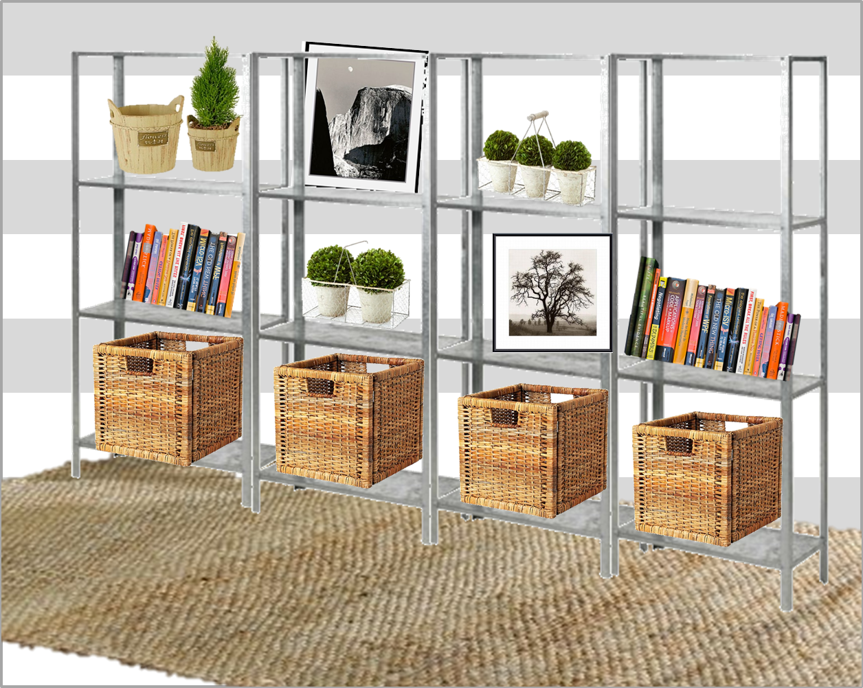
… and it would only be $60 for 4 of these shelving units!  I also like #3 a lot, and those are just $30 each from Home Depot!

Another mock up… more cramped, but also a lot more storage??  Also… it looks a more sturdy with the X’s on the back for support… no?

#2 would look cool in a kitchen, holding colorful mixing bowls, pretty new pots, and cook books… along with large glass jars of flower, sugar, oatmeal, and other bulk foods.

#1 is also at the top of my favorites… and while the frame looks really sturdy, I think the black might be too dark considering I’m trying to stay away from too much more black in our house…

On the “less industrial end” I am IN LOVE with #5 – the Vittsjo shelving unit, and with a quick coat of gold spray paint, it could soon be just like one of these…

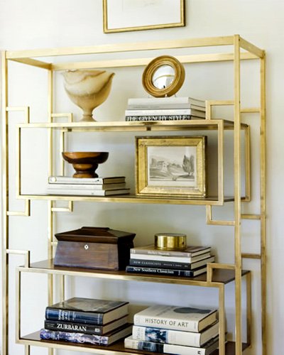
Not at all industrial, but still a shelving look that I’m obsessed with… ALTHOUGH I’m not hating the black at all… it might also look amazing with a rubbed bronze finish??

After tracking down some great industrial shelving options, and seeing how inexpensive they all are, the little wheels in my head have started turning…

Perhaps you’ll be seeing more on this topic soon…

White Vanity – Inspiration to Reality

Perhaps it’s the warm weather we’ve been having, or the fact that it stays light out until almost 9pm now (longest day of the year is this Friday!) but I have been finding myself drawn to light, bright, spaces that don’t use much color.
Don’t get me wrong, I’m a big fan of color – wearing it… decorating with it… but this vanity space is so pretty, I couldn’t resist trying to find pieces to re-create it.
Places like Target, Overstock, and Ikea are great for simple pieces like these – I love that Ikea has come up with their own take on the Lucite chair (I also wrote about it here)… zGallerie is fabulous for large funky accessories, and RugsUSA is always a favorite source of mine.  This Jute rug is 65% off right now, and is just $79 for the 5’x8′ size.  Can you seriously beat that price??
Actually this entire setup could be re-created for less than $500 – all together, this look costs $450, and the mirror alone is $200.  If you shopped HomeGoods, you could probably find a mirror of this size for ~$50, taking this look down to$350 or so…
Happy shopping!

Federal Style and a History Lesson

It started with this picture from Blue Label Bungalow

This room is a bit more traditional and masculine then I would choose for my own home, but there is one piece in particular that caught my eye in this space… can you guess what it is??  (No not the lamps, although I DO love those too…)

Maybe these other pictures will give you a hint…

Still don’t know??  Here’s a few more hints…
No Source
Yeah, I know it’s totally obvious… I was just totally indulging my obsession with the ornate, old time-y Federal Mirrors that I seem to keep noticing EVERYWHERE. In college I double majored in Sociology and History… BUT… I am a complete novice when it comes to spotting and identifying period pieces.  All I know is that these mirrors are cool, and I want to know more about them…
I dug up a little info on their origin – The Dumbarton House talks about where these mirrors originated:
Our nation’s early years, when the Federalist Party led the American government between 1790 and 1828, generally defines the Federal period. During this time, a strong sense of nationalism was born and many government leaders, like Thomas Jefferson, looked to the classical past of Greece and Italy for inspiration in forging the identity of the new American democratic Republic.

Thanks Thomas Jefferson… and I guess Greece… because these mirrors are FAB!!  What makes these mirrors “Federal” style are the concave mirror (which is cool on it’s own), the eagle embellishment (so “Americana”) and a brass frame (with an awesome antique patina).

What I do NOT love about these mirrors are the price tag on them… for a legitimate Federal mirror, you’ll be paying in the thousands… easily.  Dang it!
However Google saves the day again, and after a few random searches, I learned that these were all the rage in the 1950’s, and a company called Syroco became famous for their molding technique where they were able to churn out exact replicas of these “eagle mirrors”.  I’ve also learned that they can be called “Bullseye Mirrors” as well… which helps when searching eBay and Etsy for replicas.
Seems like all the mirrors in the larger size I want will run between $60 and $150 which compared with thousands, is a steal!
I’m imagining this over our bed (like the first photo here) or even in an entry way – although a convex  mirror is not ideal for the last minute hair fixing before running out the door…
What do you think about these beauties?? Are you as into them as I am?

Leopard Print Flats

You guys!  I’m SO sad!  My beloved leopard print flats that I pretty much wear every. single. day. are on their last legs.  You can’t really tell from this picture, but after two years of constant wear, they are literally ripping at the seams!  So sad!

These are the Sam Edelman “Beatrix” flat in “Nude Leopard”.  I love the black cap toe with the jagged burrs… they make them now with a gold toe, but I am NOT a fan of how the gold looks… bring back the black!!!

I’ve searched high and low – Nordstroms, Bloomingdales, Amazon, eBay,  Zappos… even random sites (there was one called “Shoe Bunnies”… no I’m not kidding)… and I literally cannot find the same ones!  It’s very upsetting!

I’ve finally resigned myself to the fact that I will not be able to find the exact same shoes as a replacement for my current leopard beauties, so I’ll have to look at some alternatives.  I rounded up a list of potentials here, and plan to do a little more hunting before fully committing.  In my opinion, leopard ballet flats are THE MOST versatile shoe. I wear them like a neutral, so they get worn with everything!  EVERYTHING.

What do you think about these options??

Leopard Print Flats

STELLA McCARTNEY leopard flat / Pretty Ballerinas leopard flat / Giambattista Valli canvas espadrille / Pointed toe flat / Minnetonka flat shoes / H&M ballet flat, $23

Of course I like the most expensive version (Stella McCartney) best… why oh why?!

Card Catalog – Ikea Hack

Just last week I was talking about incorporating vintage card catalogs into your home, and just this morning I stumbled across this awesome Ikea Hack to make your own card file drawers!

This Post at The Painted Hive gives you the details on making the very inexpensive (and cheap looking) Moppe Drawers from Ikea into this lovely, antique-y looking card catalog for your desk.

Use a little stain, get some cute brass label holders, flip the drawers backwards, and voila!  I may have missed a step in there, but it’s all very easy – pretty much a 20 minute project.

I also think these would be awesome outside of an office environment. Wouldn’t these be great to hold recipes in a kitchen, or hold makeup, or q-tips, or other bathroom supplies?

Seemed like the other trick to making them appear authentic was to sand the corners down a bit so they looked worn, and using Danish oil for a slight sheen… who knew?!

After a quick search online, I’m seeing these drawers available only on the UK Ikea site, however they may have a different name here.

I’ll report back on what I find!

Zebra Cowhide Done Right

Hello Friends… I’m back!  Well technically I’ve been back for a week (how has a week passed by since sipping my margarita on the beach?!)  In the last week, I’ve been catching up on work, trying to catch up on sleep, and traveling like a mad woman for work, but I’m back in my schedule once more, and ready to talk zebra rugs.

Normally, when I hear “animal print” the words “overdone” “over-the-top” and “tacky” come to mind, but somehow zebra on a cowhide rug is classic in these spaces…

Here are a few guidelines for incorporating a zebra cowhide into your space in a classic way:

Mix textures:
The space below does a great job of it.  It has brass on the side table, an overstuffed and worn leather chair that looks like it was from grandpa’s study, and light weathered wood. This keeps the space feeling collected. In a word… Classic.

Keep a Neutral, Light Color Palette:
If you know what you’re doing, (or if you are going for a really over the top Moulin Rouge type vibe), feel free to bust out other bright colors and patterns in the same space, but if you are dabbling with zebra for the first time, neutral colors are a safer bet.  Black and white always looks chic, but shades of brown, taupe, tan, grey, and creme are also safe bets for mixing in.

This space is super chic with the all white furniture, glass top table (this really keeps the emphasis on the rug), and the complete absence of all other color – even the art is black, white, and grey!

Keep a Neutral, DARK Color Palette:
Yep… while the last rule was to keep a light color palette, the same rules apply to a dark color palette AS LONG AS you stay neutral.  Dark grey, chocolate, or black walls still maintain an uncomplicated look, and allow the rug to be center stage.  If you go this route, ensure the space is well lit – a big window offers plenty of natural light to keep it from feeling cave-like.  I can think of nothing worse than an animal skin rug in a cave-like setting.  #NOTclassic

Another important factor in making a zebra cowhide rug work with dark walls… accessories should be upscale and glam here.  Pretty gold frames, mirrored console / side tables, lucite lamps, etc.  The entryway below is a great example of how to keep the space feeling upscale.

Pair with Elegant Antique Pieces:
The ornate sconces and embellished chairs are also statement pieces (not to mention the silk curtain panels) but they are all within the same time period – very Louis XVI.  Among fancy-feeling antiques, the rug provides the graphic, modern punch that makes this space feel current.

Source

Bring in natural elements:
Whether it’s placing the zebra cowhide rug in a sunroom surrounded by big trees in the yard, or simply bringing in fresh flowers or a leafy plant to the space, natural elements make the rug seem earthy and natural.

Bring in a Professional:
Ok, so let’s say you want to bring in lots of color, lots of pattern, complicated, cool accessories, AND a zebra print cow-hide rug… I’d advise you to hire a professional.  This little girls’ room is perfection, but could easily end up looking like a cluttered, visually confusing mess if done improperly.
So what about you??  Would you ever attempt a zebra print cow-hide rug??

Making an Old Apartment New

It’s pretty much official that my best friend, Kira, is moving to Chicago, which means that Kris and I will be most likely packing up our little apartment, and moving back into the apartment I shared with Kira.  It’s bigger, and packs a lot of character, so it’s pretty much a no brainer.  Putting aside the fact that I’ll miss her so much, I really am looking forward to living there again.  
It gets great light all day with a east/west exposure (our current apartment is north/south facing), has tall ceilings  an a open layout.  We’ll have space for an office AND dining room (separately), a deck for grilling, a backyard, and a much larger kitchen.
View of the bay from Pac Heights, San Francisco: Source
Obviously it has it’s downsides – a terrible shower, a teeny tiny oven that doesn’t fit a standard cookie sheet, and a leaky roof – but these are all things we can work around.  Before Kris and I moved in together, I lived with Kira there for just over two years, which means this place has been inhabited without updates for nearly 4 years.  While it’s in good shape, things start looking a little sad over time, so we’ll definitely need to make some improvements.
While I don’t want to put any serious money into renovations (all appliances will stay as is) I don’t mind spending a little money (and a lot of elbow grease) to spruce things up.  
One of the rooms that needs some serious love is the kitchen.  I’ve been keeping a running mental list of what I’d like to update, and while there is a multitude of sins that paint can cover up, I’m looking forward to getting a little creative.  I also want to be extremely conscious of the fact that whatever we do has to be seen by the landlord as an “improvement” so no jarring changes that they wouldn’t want to keep for a future tenant.
The kitchen cabinets are nothing to write home about, and they could use some serious love – I’m thinking they’d benefit a great deal from being sanded down, and re-painted a soft grey…
Here are a few photo’s I’m using for inspiration…
I love the look of the brass pulls in most of these photos, but right now, the cabinets and drawers have cheap silver pulls.  Hardware adds up really fast, and with possibly 15-20 pulls, new cabinet hardware could get really pricey.  I may just leave them as is, but there is also the option of using spray paint on them, and even replacing a few pulls on a few of the drawers / cabinets are are most focal.
Just some food for thought…
Connected to the kitchen is a large breakfast room – I think we’ll use this as an office, but as it’s essentially part of the kitchen, I want it to have a cohesive look and feel.  We painted two of the walls a muted sage green a few years back, but I’m thinking it’s time for that to go, and switch back to something lighter and brighter since this room has tons of windows.
I’ve actually been loving the look of a striped focal wall, and something like this could be kind of cool…
 
Since the cabinets don’t meet the ceiling, and I’m thinking of a medium grey on the cabinets, perhaps a very pale grey would look nice bringing the cabinets to the ceiling… or should we do the stripes on the wall the same color as the cabinets…
More food for thought…
I also really love the casual, fun vibe of a chalkboard wall.  On the wall opposite the sink, stove, and cabinets, I’d love to paint a large chalkboard directly on the wall, and possibly frame it like one of these…

Do they make magnetic chalkboard paint?  It could be kind of fun if it were, so we could use this as a sort of command center.
Anyways, that was sort of rambling post, but sometimes it helps to get ideas down on paper.
Opinions?  Any other simple, but cool things you’ve seen in kitchens lately I should be thinking about??

Re-purposing a Card Catalog

The public library is no longer the only place for the card catalog as is evidenced by the many MANY stylish spaces that use these pieces.

I feel that the apothecary table (made popular by Pottery Barn, and then made REALLY popular by that episode of Friends) was the beginning of making these types of pieces with many little drawers popular for home decor.  If you don’t get my reference to Friends, you HAVE to watch this clip

While the card catalog isn’t super functional for someone looking for serious storage (let’s be honest, you aren’t going to store linens, plates, or anything much larger than an index card in these bad boys) they bring a lot of character to a space, and for smaller things (art supplies, kitchen utensils, crafting materials, etc) they could prove as functional as they are lovely!

They look great in a hallway… as is evidenced by this photo…
And here, the card catalog brings a “cool factor” to this otherwise traditional kitchen…
Here, a smaller natural wood finished card catalog serves as small buffet tucked into a corner of this simple dining room…
And it fits in quite well with a rustic / urban living room – aren’t all those brass handles fabulous??
And while it clearly works well in urban spaces, it works equally as well in a country-chic bedroom…
A quick Craigslist search just now proved that these are not easy to come by.  Not a single listing matched what I was looking for…

Wouldn’t it be kind of cool to try to mimic the look of one of these cool card catalogs on a double-doored cabinet, using small drawer front facades, and loads of brass pulls?

Ooh, I’m having some good ideas!!!

Hot Pink Lipstick

I’m a total creature of habit, and always steer towards the same look – big doe eyes with neutral / brown shadow, big black lashes, and pale lips –  but recently, I’ve been getting a little more experimental with my makeup routine.

I’d been doing red lips all winter, and was absolutely loving it, and while I was at the drugstore last week, picked up a tube of shocking pink lipstick.

The color is called rose hips, although to me it’s a much brighter pink than any flower I’ve ever seen.  Depending on the application, it ranges from magenta (lighter application), to almost neon (two thick coats, blotted).

With lips verging on day-glo, keep the eye make-up light – neutral shadow, and mascara only!

Here’s a close up of my lips from Saturday night… is that a shocking pink, or what?!

Let me just say, there is nothing more awkward then trying to get a close-up of your mouth… who knew how weird my nostrils looked up-close!

Nostrils aside, the hot pink is a fun, more summery variation from red, and I’m loving it!  What do you think?  Would you ever dare to wear hot pink lipstick?

Cabo Packing List: Inspiration to Reality

Yesterday I posted the inspiration behind my Cabo packing list, and here is a little glimpse of how that inspiration is translating…
Lots of bright colors and fun jewelry… aye-aye-ayeeeee!!

One more day and I’ll be beachside… HOWEVER, I’ve got a few fun posts lined up for the rest of the week!

I’ll be back on Monday, relaxed, refreshed, and hopefully not burned like a lobster!

Adios!
xoxo