Seeing Spots

Polka dots are a classic, but I’ve been obsessed with irregular spotted prints most recently.  Patterns that are animal-esque.  Almost dalmation-esque.  Cruella DeVille would approve.

Spotted patterns are showing up everywhere, and while Kris thinks I’m on the verge of losing it (what else is new), I feel our house is NEEDING a splash of spots.  
Case in point… this bench?!?!?!
Jenny Comenda got the memo long ago when she reupholstered this awesome bench…  looks great in every space she puts it.  LOVE.
What about that pillow?!?!?!
This awesome pillow from Furbish – an amazing source for home decor… bedding, pillows, furniture, art, entertaining… the online shop is amazing.  Highly encourage you to check it out.
And this chair?!?!?!
This chair is an Ikea hack if you can believe it or not.  Originally featured on Little Green Notebook, and later picked up by DecorPad, this stylish number cost next to nothing, and it’s a pretty close replica to the ultra pricey Brunschwig and Fils Snowleopard fabric.
Creativity at it’s best!
Holy spotted rug….
How fab is that?  And it’s a free-form cow hide.  I feel like I don’t even need to say any more!
And the grand finale… my favorite wallpaper of all time…
It’s a personal favorite of mine that I’ve blogged about before… the Thibaut Tanzania Animal print – comes in wallpaper and fabric, but I sort of favor the wallpaper.  It’s SO amazing.  And becuase I love it so SOOO much… here is my ALL TIME FAVORITE space that uses it.  It’s like wallpaper porn for me…

Tiffany Richey’s office?!?!  OMG.


So what do you think??  Have I totally changed your mind about what I lovingly refer to as the “dalmation trend”?
After bringing these images together, I’m THISCLOSE to pulling the trigger on the pillow from furbish…

Bedding Decisions

As you know, the bedroom has been on my list for a little revamping for a looonnnggggg time.  And I’ve been saying for months that it’s “next on the list”, but I swear to you, this time, improvements are on the way.
And I mean, SOON.
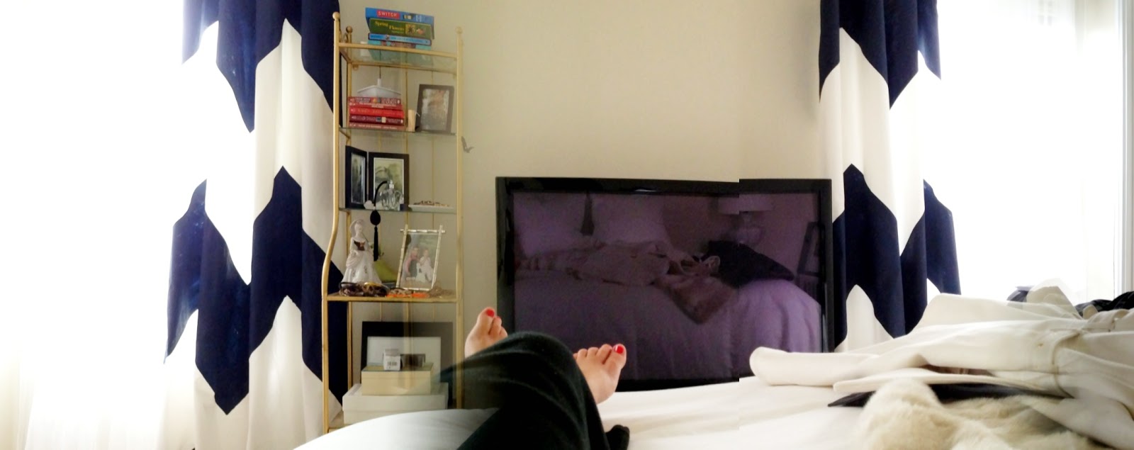
We’ve got the new bed, some new curtains, and the new rug, so I’m going to get motivated to start finishing the room out.  Here’s a shoddy picture little reminder of how the curtains are looking now with their crisp navy and white wide chevron stripes:
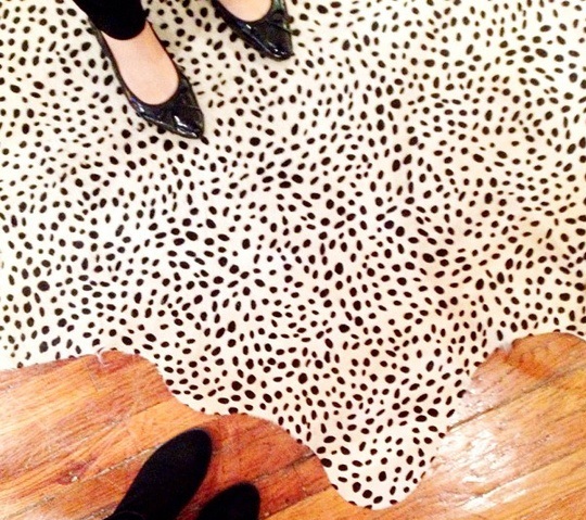
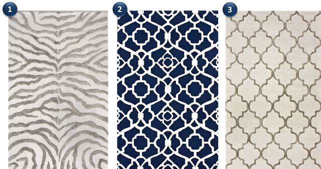
If you recall, we got a new rug which arrived several months ago, but I’ve never photographed or posted.  Of the three options I was going between in this post, I went with option #3:
It was the “safe” choice since the pattern wasn’t too crazy and the colors were the most neutral, but it’s been a decision that I’ve been very happy about – here are a few pictures from the day we rolled it out… just before our bed was delivered!

I am SO thrilled with the quality.  It’s really plush and soft – you can really see the quality in this up-close and personal shot below:

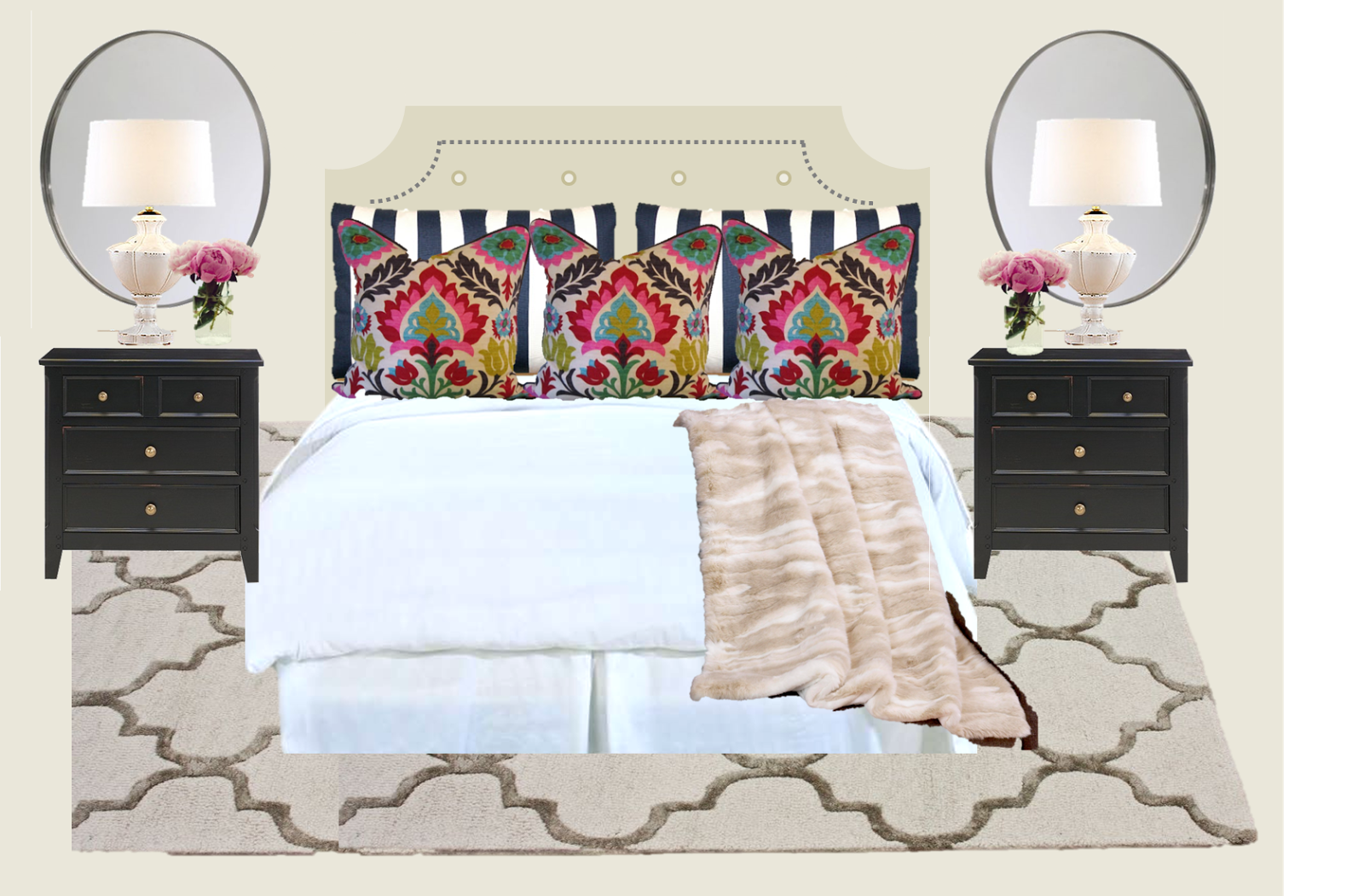
So now with the neutral rug, the new curtains, the new bed, and white bedding, I feel that we need to add some more color and pattern into the mix.  I definitely want to incorporate the navy from the curtains into the bedding, and here are a few options I’ve come up with:
Bring in some BRIGHT Colors:

I really love the Santa Maria Fabric from Lewis and Sheron fabrics – it’s bright and fun, without being juvenile.  The pattern has a good dose of navy, and I love that using this fabric on the Euro Shams would bring some life to the otherwise neutral space, while tying in with the striped pattern for the shams and curtains.

Santa Maria

Kris isn’t 100% sold on the bright colors – I think it’s because of the pink – but a punch of color would really wake things up – don’t you think?

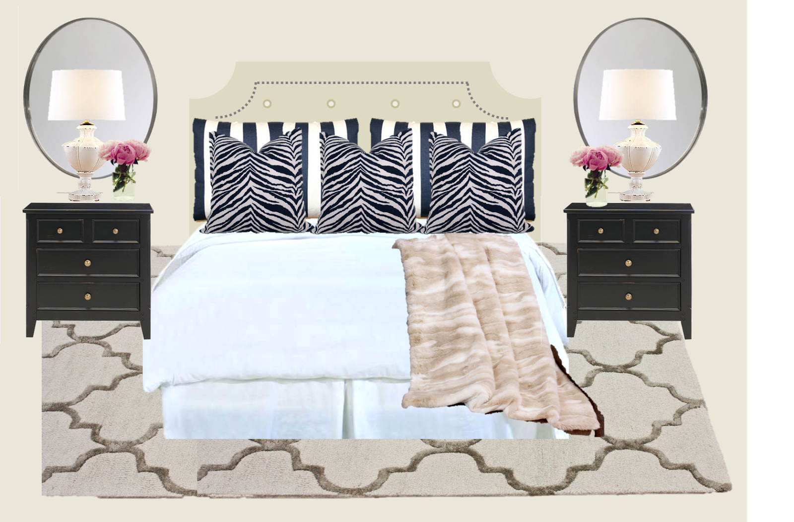
Stick with Navy and White all the way:

Staying with a navy and white palate will allow me to bring a more wild (literally) print into the mix. There is something about a little kick of navy zebra that I am absolutely LOVING.  It’s just enough animal print without being “safari” and I think it could be really fun.

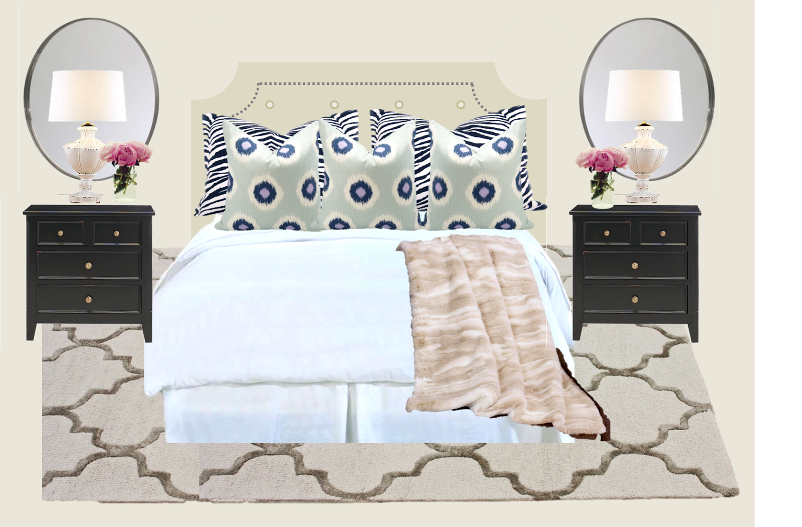
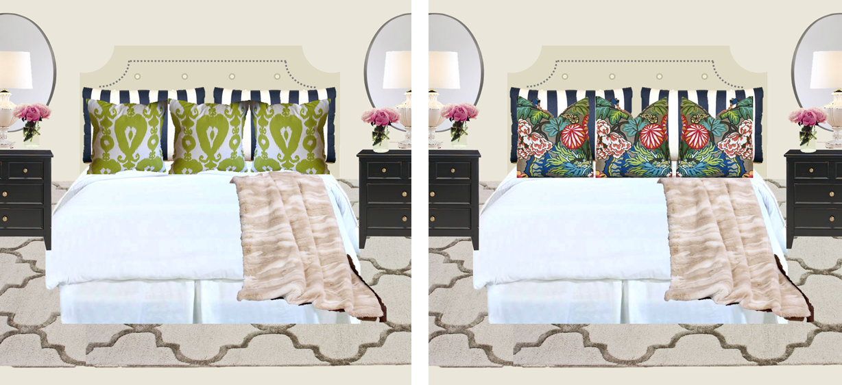
Mix in A LITTLE color and fun patterns:

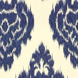
I love Ikat, but I’m afraid that the Kalah Blue pattern I’m so in love with is too creamy colored to work with the pure white bedding (swatch below).

The “polka dot” ikat fabric with the pale grey background makes the fabric choice more deliberate, and while the Kalah Blue fabric won’t work on the bed, I have other plans to make it work in our house elsewhere.

So those are the three options I came up with first… but then I started second guessing (shocking, right?) and started thinking that maybe a combination of these three might be what I need…

I could take the preppy striped fabric from the first mock, and the “polka dot ikat” from the third mock and pair those together…

Could this be the winning combo??

Or do you feel like I haven’t hit the jackpot yet with ANY these combinations? Should I look for other options???

What about Lime Green?

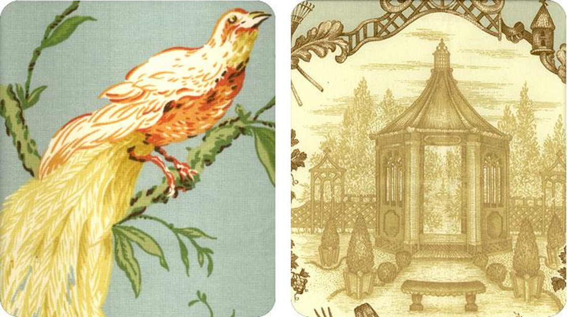
Or what if I used some of the Chaing Mai Dragon fabric from Shumacher??

DAH!  I swear I will make some decisions!

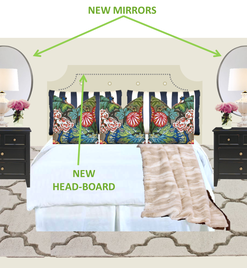
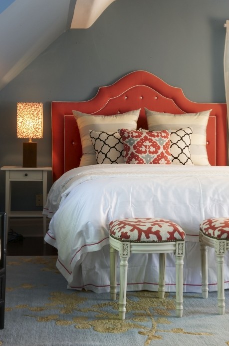
Apart from my indecisiveness, you may have noticed a few other changes to the bedroom set up in these mocked up photos.  I want to get some large mirrors – either oval or rectangular, to mount behind each nightstand, and take the place of windows.  I also want to add a headboard, to anchor the bed, and create a visual point of focus for the room.

As of the day our new bed arrived, this is how the bed pretty much still stands today:

Excuse the washed out photo – this was taken at night with all the lights on.  Since this photo was taken, the poly fill Euro shams have been replaced with down Euro Shams – a HUGE improvement (and you know how I love to chop my pillows).  We’ve also gotten a white duvet for the down comforter, and it looks just like a hotel bed – no more freshly-taken-out-of-the-bag-super-wrinkly-down-comforter.

Here’s the official list of to-do’s for the bedroom:
  – New King Shams
  – New Euro Shams
  – New Bedskirt (this is SO necessary to hide all the crap under the bed)
  – Mirrors behind nightstands
  – Headboard
  – New TV Stand
  – Get rid of gold shelving unit
  – Art behind the TV
  – Find a new home for the quatrefoil mirrors
  – Additional Lighting

That list looks longer than it sounds in my head…

I’ll keep you posted on progress (and decisions!)

White Bedding Inspiration

Decisions, decisions…
In my last bedroom post, I was admittedly overwhelmed by the choices for bedding.  Honestly, I still am, but  I’ve made at least one decision that should keep the ball rolling…
I’m going white.  
It was actually this photo that really sealed the deal for me.
I just really loved how clean it looked, and it really appealed to me that I could swap out the pillow covers without commitment.  We could do lighter fabrics, florals, and punches of coral and aqua during the warmer months, and heavier fabrics, faux fur, and darker colors in the winter.  For a girl who can’t make up her mind, this is definitely the way to go… no?
Last week, my mama and I set out on a mission to find “the perfect” down comforter.  She probably was at her wits end with me continually asking… Is this one fluffy enough?? but alas, we found one, and so I’m on the road to getting the bedroom moving along.
After getting the comforter, I spent a lot of time trolling Pinterest to find white beds that inspired me, and these pictures together should give a good idea for the look I’m going for (and keep me focused in the process)…

Source
I especially loved this one, with the thick black border and the eclectic mix of black and white.  We DEFINITELY need to get some color going in our room with all the creme and white going on, so black isn’t going to work for us, but the pattern is what got to me. The euro sham here is almost an animal print, but isn’t, and I love that.  If only I could find that in navy…

Source
The color combo here struck a chord with me.  All that navy, and the mix of patterns and textures.  I also love the pops of poppy and orange.  Even just a vase of flowers does the trick.  As a side note, if anyone knows where I can find that fabric covering the lumbar pillow, please contact me.  I spent a solid hour searching without luck.  I love that its part ikat, part polka dot.  To me, it’s playful and it just makes me happy.

Source
Another great fabric here – is it chevron or zebra?  Who really cares – it’s fabulous!  I also love the white lamps against the navy wall, but obviously I’m not going to be painting the walls navy in an apartment we may not be in too much longer…

Source
Rustic meats sophistication.  I LOVE this… but again, we’ll need more color in the pillows.

Source
Finally, a subtle stripe, with a trellis pattern, and some fun scroll designs – not to mention the coral printed stools.  This is definitely more coral than we are going for, but I love it all the same.

Notice a trend though in these beds?  I am really leaning towards blue and white – crisp and clean.  I’m going between navy and cobalt blue – perhaps a blend of the two??  Either way the navy will being more character than plain black, while still allowing us to mix in other colors over time.

A few of my favorite patterns:
Diamond ikat - indigo and white
Diamond Ikat by Lucy Patterson

Casablanca Wht/Fla
Casablanca Blue Ikat by Lewis and Sheron

Duralee Blue Ikat Decorative Pillow Cover, Accent Pillow, Throw Pillow, Pillow Cover
Duralee Kalah Blue
I love this one, but perhaps the background is too off-white to be paired with crisp white bedding??

Anyways… just some food for thought.  I am giving my wallet a rest after the holidays, New Years, and rent, so I have plenty of time to stew on these ideas…

Epiphany: Fabric as Art!

So yesterday, while browsing fabrics, I kept seeing so many that I loved.  Unfortunately for me, so many of them would have been visual overload in our small apartment, but I kept coming back to this one again and again (isn’t he cute??)

Finally it came to me – while this bird was never meant to be on the curtains I was making, he was still meant to be in my house.  As what, you ask?  As a pretty piece of art, singing on the wall!
I did a little investigation, and discovered that others also had this brilliant idea already, turning textiles into art.  I am apparently late to this party…  I love this example from Elle Decor, where this Ikat print breathed life into what could have been a rather ho hum office.
Here, another office, posted on Apartment Therapy, where they used the same fabric in four different colors, with a matte behind the desk.  I love that these give the feel of screened windows, and tone down the very green walls.
This room has different patterns and different colors simply matted in black frames – easy, inexpensive, and impactful.  I love it.

Finally, framed fabric featured in a hallway.  Pretty pretty – I don’t think I’ll be framing anything this large in our small space, but I’m encouraged seeing how awesome it can look in other spaces.

I’ve revamped my original design board, to include a few changes – including my mocked up birdie.
While the original inspiration board (featured here) was fine, it lacked energy and interest (I’m the first to admit it).  The white roman shades were blah, and the room was boring.  It was was all blue, white, and brown – so one dimensional.  I think the citron printed fabric (the Secret Gate pattern is the winner for me) will make a lively addition as a roman shade in this space, and my dear little mockingbird (or is it a nightingale?) will tie everything together in a big bird-like bow.
I am starting to think that my mockingbird/nightingale might need a partner in crime up there on the wall, so I’ve started looking at other fabrics that he might pair well.  With the trellis rug and the citron patterned shades, I think we’ve got enough graphic patterns going on, so I’m thinking something more “picture-like.”  Here are the options I’m debating…
OPTION I: Bird with the Working girls
That description came out all wrong…   These girls are working… not as hookers!  Get your minds out of the gutter!  I’m even thinking that with a grey print, a light wash of color from some watercolor paints might be neat.  Am I being optimistic with my artistic capabilities?? Perhaps… I may just go ahead and try it…
OPTION II: Bird with the Turbaned Turks

I swear I can’t make this stuff up!  This fabric is actually called Turkish Toile!  I love it, but is this too much yellow?  Is the yellow here too different from the citron color in the shades?  I do like that the guys in ths print are sitting around drinking and probably gossiping about their mistresses.  I’m going to keep this one in the running…

OPTION III: Bird with the Garden Toile
I think this print is really pretty, but my biggest concern here is the border.  I love the blue border because it ties in really well with my sweet bird, but what if the toile print is so big that the border is cut off by the frame!  There is nothing that gets my goat more than something non-symmetrical, so if it can’t be perfectly centered, I don’t want it at all.  I think this one, as sweet as it is, has to go.  It’s not worth the $20 per yard to test it out.

OPTION IV: Bird with the Turbaned Turks (part II)
I just keep coming back to these Turkish dudes, right??  This one is different though I swear!  Difference #1: This print is black and white – no yellow anywhere to be found.  Difference #2: These Turks are at the same little hut, but in a different climate.  Take a close look – they’ve got palm trees here, so they must be somewhere tropical.  In the other print, it’s pine trees encircling them… so they are likely in the mountains somewhere.  Gosh, the more I think about it, the more I like these Turks.  I’m feeling like we are already becoming closer friends than I am with the mockingbird.

Ok, enough crazy talk… must make some decisions!!

Fabulous Find: Fun, Funky Fabric (like the alliteration?)

There is a good thing going on at Lewis and Sheron Textiles with tons – and I mean TONS – of amazing interior fabrics to choose from.  They have a promotion right now for 20% off all fabrics when you use the code LSFABRICS FIRST.  I’m thinking that since I’m doing a little freshening up at our house, it could be a great chance to get a few designer patterns at a discount!
I’m loving the citron colors in these patterns:
Clockwise from top left: Secret GateCoral SplendorAzzuro, Kalita
I’m also really loving this bird print, and dabbling with the idea of ordering a bit of it since it’s just so pretty!  What I will do with it, I’m not sure yet, but I have a few ideas in mind…
Roberta 21003
This set of indigo prints are so pretty – this is one color that I love, but it doesn’t exist anywhere in our house.  I’m thinking that this might be really soothing and pretty for the bedding in our bedroom.  The rest of the room is pretty much a neutral palate with light taupe walls, bright white trim, and creme colored silk curtains.  With white fluffy bedding, and an upholstered headboard with nail head trim… a few pillows in these prints could really wake things up.
Clockwise from top left: Cross SectionCasablanca WhtflaJoy (very aptly named I might add… this linking print in a blue bell color just makes me happy), Bloom Stripe
Finally, I just LOVE this water colored floral print – it’s pretty enough to frame!  I’d love to order it, but I don’t really have a great spot for it at the moment… 
Fleur