DIY Embellished Picture Frames

I got my inspiration for this easy DIY from Courtney over at A Thoughtful Place, but she got her inspiration for this project from House Beautiful… it all trickles down folks!
I have jumped wholeheartedly on the “gold” bandwagon, but realize that it’s best used in moderation… it takes serious self restraint from taking a can of gold spray paint, gold leaf, and gold leaf pen (yes, they make a pen my friends) to everything in sight.  I’m in the process of revamping our currently gold framed gallery wall to something a bit more simple (I think)… but I digress…
Back to my little gold edged frames…

Our entryway has had an empty wall ever since I moved out the ornate Ikea mirror into our hallway… I’d been looking for a larger federal mirror, but having put myself back on a budget after a few shopping sprees, and a splurge on new bedding and the dresser DIY for our bedroom, I’ve decided to hold off on a pretty federal mirror for now.

The question of what to hang in this spot plagued me for a while, and then I spotted these frames in Courtney’s living room, and decided to give it a go…

Super cute right??

Courtney ended up spraying tape, cutting it down to size, and then CAREFULLY wrapping it around the corners of each frame.

I took the lazy approach and taped off the corners of the frame, eyeballing about an inch and a half on each side (nope, didn’t even measure), and then with a craft brush and a small pot of Martha Stewart’s gold leaf paint, just dabbed each corner until it was completely covered with gorgeous texture.

Voila!!

I took the tape off the frame after the second coat went on, and the paint was still wet – it just helped get clean lines on the frame.

So… this DIY is actually just a glorified painted frame!  It was so easy – I literally finished both of these in about 10 minutes, and the paint dries fast – maybe 5 minutes until it’s fully dry?

There are a few small mistakes where the paint bled under the tape, but it’s fine – really from a distance, you don’t notice it at all.

The entryway is really simple, but in such a small space, we figure simple is better than overdone.

Look at that crisp edge… I absolutely LOVE them!

The pretty photographs were from one of my all time favorite Etsy shops, Eye Poetry Photography.  The photographs are really dreamy and pretty, and they have a San Francisco series that I absolutely adore!

I’m not normally a HUGE fan of photographs of city landmarks (the Golden Gate Bridge or Eiffel Tower is SO overdone) but the Ferry Building is so classic, and less photographed, and I just loved the photo of the bridge at dusk – it’s not the in-your-face red towers we’re so used to seeing…

So that’s it – the entry way got a small face-lift this week, these old frames got re-purposed, and everyone wins!
Happy Thursday!!

Belize Honeymoon – Fashion Inspiration

I’d mentioned that I spent the long weekend down in Orange County for a best friend’s wedding, and it was incredible!  The wedding was absolutely gorgeous – from the venue to the flowers, to all the little details – it was like being in a real live Pinterest page – no joke.  My beautiful friend, Lindsay, was absolutely stunning – gorgeous, and glowing and happy.

Of course, everyone at the wedding has had to return to real life, while Lindsay and her new HUSBAND (so weird and awesome to say) are on their honeymoon in Belize. I’ve been daydreaming about a hot tropical vacation, and with Belize on the brain, I put together a wishlist for what I’d pack on a romantic trip down there…

I’m not known for packing light (I had a carry on AND a checked bag for 3 nights in southern California for goodness sake) but I’d do my best to limit myself to pieces that could easily transition from day to night… I’d definitely go after bright colors, and LIGHT fabrics, because it is hot and humid down there…

Here’s my packing check-list…

Belize

Matthew Williamson floral dress / 120% Lino floral dress / Miss Selfridge chiffon dress / Accessorize sun dress / Jane Norman summer dress, $78 / Pull&Bear red dress, $62 / Paprika floral dress, $7.79 / Cutie summer top / One piece swimsuit / Halter top / Vix bikini / Wal G jumpsuits romper, $51 / Forever 21 romper / Charlotte Russe fringe bathing suit / Steve Madden shoes / Nine West flat sandals / MICHAEL Michael Kors tote bag / Irene Neuwirth gold jewelry / Luis Morais gold bracelet / IaM by Ileana Makri sterling silver charm / Michael Kors jewelry / Stella & Dot cuff bracelet / Blu Bijoux gold jewelry

White swimwear – you’re a bride!!  And white makes you look oh so tan!  A sexy one-piece and a fringed bikini are must haves.

I’m also loving the versatility of the romper – light and easy to throw on for the beach, or for dinner with gold cuffs and cute gold sandals.  If you’re feeling a bit more dressy, a pretty floaty maxi is just the thing, but it’s Belize – one pair of wedges MIGHT make an appearance for a dressy night out.  With everyone else in flip-flops, it’s hard to muster up the energy or desire to squeeze heels on.

A big bright tote is perfect for throwing everything into before hopping on a boat, or heading to the pool, and a selection of bright floral sundresses are essential for any beach vacation…

Dorm Room Rewind…

It’s September, and this time of year always gets me nostalgic for back to school.  The excitement over first day of school clothes, the smell of new pencils, new notebooks, new teachers…
College…  Oh man… if I had to do it over (which I would in a heartbeat) I’d go for a totally different dorm room look.  I remember agonizing over the perfect color of periwinkle for the down comforter we were ordering, and also being really proud of the oversized cork-board covered in pictures, and a hot pink lucite lamp with matching pink shade covered in sequins.  #whatwasithinking??!!
To go back and design my dorm room, I’d go for graphic prints with a girly, youthful twist… something only an 18 year old fun loving, beach cruiser riding, UCSB co-ed could get away with…
First up… the black and white and green inspiration:

I WISH they made these storage benches when I was in college.  Not only would it have been stylish to stash our snacks, or books, or whatever it was we kept in our room, but it could have been pushed under the beds, and pulled out for seating when neighbors came by to “chill”.  I love the stripes – a little Beetlejuice, but I LOVE that about it.  And the fun lime green is so youthful, and would inject some much needed life into the drab dorm room decor.

Nothing about berber carpet says, “what a comfortable, cozy living environment” – this fun rug solves that problem quickly (and cheaply!)

Next up… the girly, graphic, mint and pink combo…

Nothing says “a girl lives here” like mint and pink.  I mean, Kris would DIE if I did our bedroom up in mint bedding with some pink and zebra throw pillows.  I’d have a pretty unhappy camper on my hands.  College should be carefree, and it’s the time to decorate your room the way you want… so pink and mint it is! Again, I just have to say… this storage bench is GENIUS. Oh if only we could rewind 10+ years and tell Target to make these back then…

And finally, the ultimate in girly… floral bedding!  Yes please!

I think this room is my favorite.  The floral bedding is bright and happy and fun, and the mix of patterns, and graphic is very kate spade meets a country garden.  You’ll notice, I kept the accessories the same in each room – drum table (just $60 right now), and the little brass elephant from Fab is quirky and shiny, and would instantaneously make you the cool girl with great taste.  
I’m actually dying to get one of these chrome floor lamps from Ikea – a GREAT price, and aside from providing great task lighting for those late nights cramming for finals, it’s ultra cool looking.  Looks REALLY pricey in person… but it’s Ikea!  $70!
Done!

A Little Red Rug

Red is a color I stay away from in our own home…

Perhaps it’s from seeing a few too many homes in the 1990’s look like this:

Upstairs color for the blue and green walls.

Woof.

There’s a lot of red, and a lot of brown… and all together it equals… just a lot.  Too much.  I call this look “faux elegance”.

That said, I have a real appreciation for this loud color when used in the RIGHT way.  For me, that would be in accessories.  More specifically, I could really see myself incorporating this color through a Persian rug… but not an uber traditional rug – one with more of a tribal print.  I swear I’m not trying to be vague!!  If you’re not entirely sure what I’m talking about, check out Jenny’s (of the Little Green Notebook):

She had this great little rug: from in her New York kitchen.  See what I mean?  With a less traditional pattern, that is more graphic and “chunky” it really makes this space come alive!

Here are some other good examples of using red Persian rugs without going overboard…

This hallway had me at hello… white adobe walls, substantial wooden beams.  It’s classic Spanish style meets the middle east, and the punch of red on this flat woven rug is absolute perfection…

Again… here we have a nice neutral kitchen, and the red runner just wakes things up a bit (plus, whatever gets spilled on this rug will disappear instantaneously with all the dark colors and pattern)

I love this pair of rugs in the library.  With a full wall of books, it’s hard to go wrong here, but they just add a global element, and having a more simple, large diamond pattern in the area rug isn’t too busy against all the book spines.

This rug isn’t Persian – it’s more southwestern, but I love it.  Again, who would think to put a large rug like this in a kitchen??  Not that many people, but with so many spills, it’s genius!  Just don’t put an heirloom in there…

So what is my conclusion about red?

When done in small doses, it’s amazing!

I’d go for red rugs with a global feel (Persian or Southwestern seem the safest).  More graphic patterns are also easier and at all costs, stay away from any red rug that looks “faux Tuscan villa”, or “old European” in any way shape or form.

Home Decor Discovery

I’ve always been a huge fan of Polyvore.  Always.  Amazing solution to aggregate fashion online, and hands down my favorite source for discovery.  If I had a specific item in mind (gold strappy high-heels for example) I’d type it in, filter by price, and voila, there were options at my fingertips!

Well, amazing AMAZING news!!  I just discovered that in addition to fashion, they also have a home decor filter.  Yes… I know…. HUGE!

Let’s say I’m looking for a rustic side table (or coffee table)… chose “tables” from the main category, filter with the keyword “rustic” and there you have it!  Could it be simpler???

After discovering this, I felt inspired, and pulled together some collections of things I’ve been browsing myself…
First up: the rustic occasional table… to replace our dark faux wood coffee and side tables that are currently in our living room.  I’m really drawn to the lighter natural wood finishes, metal details, x-bar reinforcements, and tiered storage…

Rustic Occasional Tables

I also went a step further to browse art, since I’ve been toying with the idea of revamping the gallery wall in our living room… for fall, I am really liking the more muted color palates, nature inspired pieces, and quirky photographs with an aged “instagram like” quality.  The elephant is absolutely AMAZING, and I think Kris would like the old surf photo.

Art

And, while we are not necessarily IN NEED of gorgeous chandeliers, or lamps right now, I’ve been toying with the idea of swapping out the brushed metal lamps in the living room, for something a little more mid-century… just for a while!  These lamps have served me well – six years, and four apartments!!

Lamps

This is in no way sponsored by the way – I just happen to love Polyvore, and think that this is so cool!  Fashion, AND home decor??? Such a cool tool when you’re looking for something specific!

The Comeback of the One Piece

Summer is coming to a close in most parts of the country, which means that it’s back to school time for most families.  That’s why September is one of my favorite times to vacation – all the kiddos are back in school, so the resorts and beaches have fewer tantrum throwing toddlers.  AMEN to that!! With vacation on the brain, let’s talk about swimsuits, shall we?

While I still love a good bikini, I know I’m not the only one who has been on a vacation, chowing down on tacos and margaritas, and wishing for a little more… “coverage” in the tummy area.  Am I right??  I’ve spotted A LOT of really amazing options out there with retro cuts, figure flattering shapes, and deep plunging necklines…

I pulled together a few of my favorites:

One Pieces

Mink Pink one piece swimsuit, $115 / ASOS one piece swimsuit, $54 / La Blanca one piece swimsuit / ASOS one piece swimsuit, $44 / Zimmermann one piece swimsuit / Topshop one piece swimsuit / Lisa Marie Fernandez one piece swimsuit / Miraclesuit one piece swimsuit, $220 / Caffé Swimwear one piece swimsuit / Topshop one piece swimsuit / CHROMAT one piece swimsuit / Roksanda Ilincic one piece swimsuit / Melissa Odabash one piece swimsuit

I have so many favorites in this bunch, it’s hard to narrow it down!!

I mean, the red and hot pink number is A-MA-ZING, and the color-blocked waist will visually shrink your middle.    The retro shapes are also so awesome – the strapless styles, that have a corseted look and feel are so “South Pacific”.  The black with the white piping and the tropical top with the navy bottom is also adorable.

I actually ordered the navy plunge one-piece from ASOS, and hope it fits!  (never know with European sizing…)

So what do you think?? Would you rock a one-piece on your next vacation, or stick with the bikini??

Black and White

I have a little love affair going with graphic black and white patterns right now…

It’s apparent from the black and white pattern mix going on in our dining room right now with the wicker chair makeover, and I’m finding myself picking up fun black and white accessories here and there.  Our living room has been saturated with color for months now, and while I’m not one of those people who can live in a home devoid of color for too long, there is something so appealing about this simple color palatte.

This clean white room is a favorite of mine – it’s simple, but not boring, with the graphic punch coming from the pillows and striped rug.

If this were our bathroom, I could die a happy girl.  The wallpaper is fabulous in all it’s psychedelic glory, but the clean white shower curtain gives the eye something to rest on amid the busy patterned walls.

While I’m sure this rug isn’t from Ikea (my guess is that it’s the Madeline Weinrib version… quite pricey), but it’s so fun.  Nate Berkus uses a similar version in many of his designs as well…

Striped curtains – everything else in here is pretty simple, but these curtains make this room something to stop and look at!

And again, more fab black and white wallpaper.  We’re still renting, but one day a sweet little powder bath is going to get one heck of a makeover in our house with something fabulous like this…..

Not willing to commit to a pricey rug, or anything so permanant as wallpaper?  Ikea has recently produced some AMAZING pieces (and this is not a sponsored post – I am really just that impressed with them right now) so I pulled together 6 of my favorite pieces they’re selling right now…

1. Staggered Stripe Rug
2. Woven Aztec Lumbar Pillow
3. Diamond pattern Area Rug
4. Striped Dinner Plate
5. Striped Knit Throw Blanket
6. Houndstooth Throw Pillow

I actually bought several of the lumbar pillows (they are thick, and look really expensive in person) and the striped throw has been a staple in our living room for the last year.  I also couldn’t help myself, and bought four of the large striped dinner plates last week too!  They really are amazing, and would look so great with all white dishes, and a simple table setting.

What do you think? Are you loving black and white as much as I am??

Have you found other fabulous black and white finds recently??

Wicker Chair Makeover

Hey guys!!  I was at a conference for work all week, and have missed my little blog!  It feels good to be back at home, and I am SO excited to share a little project I finished late last night…
I haven’t shared many pictures of our dining room so far because it’s not “finished” but I’m tired of waiting around!!  Remember this lonely little corner?  I was on the hunt for a comfy overstuffed armchair to wedge in here…
As it turns out, comfy, overstuffed chairs come with a hefty price tag, and since we’re about to spend quite a bit on a sofa, I decided to look for alternatives.  This room is now functioning more as an office than as a dining room (side note: I really need to stop referring to it as a dining room) so we just have one chair at the table now.  Since painting the walls, I had put one of the dining room chairs in the corner, but aside from attracting clutter, it was completely non-functional.  So I moved it down to the garage, and turned to plan b…
The wicker chair that used to be in our living room, but has been sitting in our garage all sad and lonely since I haven’t been able to sell for months. 
I couldn’t even give it away, but since I’ve had it since I was a child, I just didn’t have it in my heart to leave it on our street corner.  I wanted it to find a good home, so it just sat in the garage collecting dust…
Remember it from the living room??
It was white, wicker, and oh so perfect for a little girls room… Not so perfect for a city apartment shared by two adults…
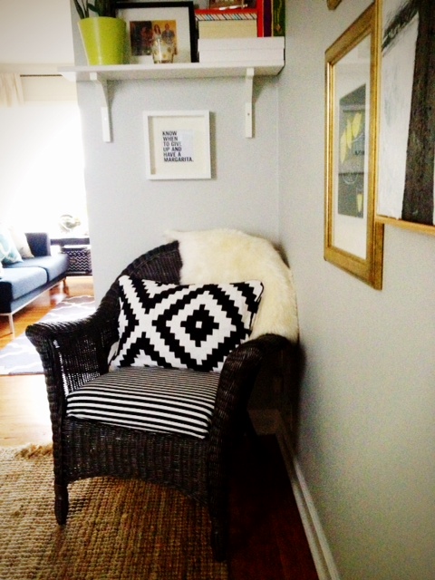
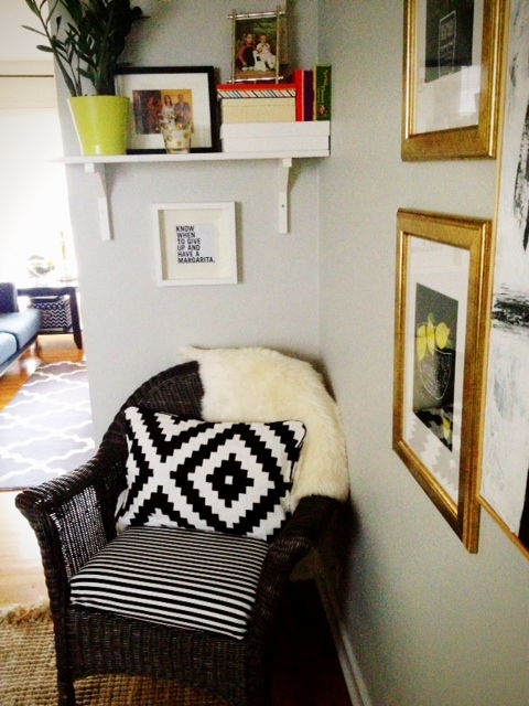
Well, it’s nothing that two cans of Rustoleum Bronze spray paint can’t fix! Here is the chair sitting all sassy and happy in the corner of our dining room as of this morning…
              
HUGE CHANGE right??  
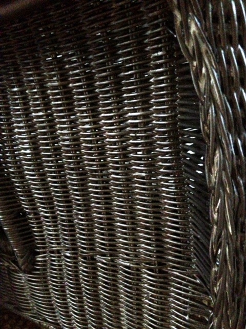
The chair is hardly recognizable now that it’s been sprayed a dark brown.  The paint color is “bronze” but it’s not metallic at all – I promise. It’s a nice dark brown when all is said and done.  Here’s a close up:
                     
This is actually a better, more accurate depiction of it’s color:

Chocolate-y.  I kind of love it.

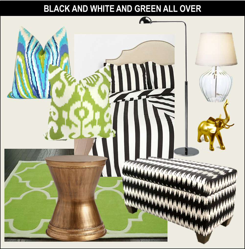
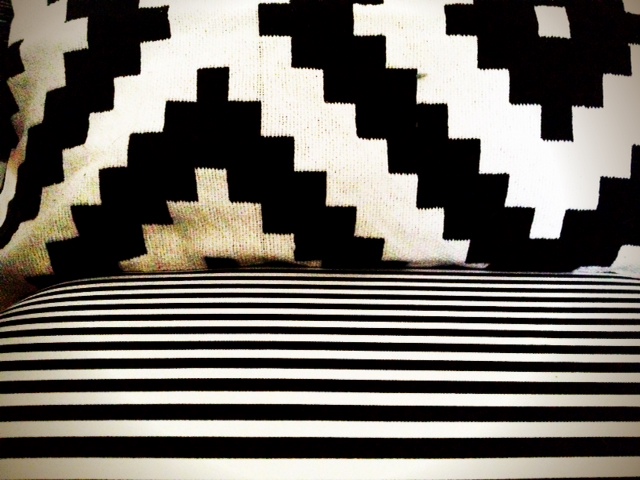
Ok, let’s talk about the new seat cushion and accessories, shall we?  I have a little crush going on with black and white right now, and while I still think our living room could live without SO MUCH black furniture, this space needed to be grounded with some black since everything else was white, and grey.

Both pillow case, and fabric for the seat cushion are from Ikea.  The pillow cover is one of my all time favorite Ikea finds actually.  It’s thick, and woven, and has amazing texture in person.  And that graphic pattern is like mod-meets-aztec.  AND (it gets better)… it was ONLY $10!!!!  I know – run, don’t walk to Ikea – it took all my strength to limit myself to just two.

The striped fabric was $7.99 a yard.  Pretty good as well.

I’d ordered some striped fabric online, and when it arrived, it was sheer.  Clearly not going to work for any sort of upholstery job.  This is thick and durable – perfect for throw pillows, or projects like this.

Well, I’m sure you don’t remember the seat cushion on the chair when it was white, but my mom (who by-the-way is as talented as Martha Stewart, but unlike Martha hasn’t served prison time) had made a custom fitted cover for it when I was in high-school.  It was cute – a tan color with french quotes scattered on it. Again, perfect for a teenage girl.  We needed an updated cushion cover.

I am no seamstress, but I do own a staple gun, and so I improvised…

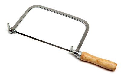
I went to the Home Depot and got a piece of MDF – super cheap.  It was $5 or something.  I also got a little hand saw that the guy at Home Depot recommended.  It looked like this:

I have no idea what it’s called and I tossed the packaging as soon as I got it home.  Sorry!
Anyway, I traced the cushion onto the MDF, and cut(sawed?) the shape out.  I should have gotten batting to wrap around everything, but I got lazy, so I just stapled the fabric onto the MDF – directly over the existing cushion.  I’m sure my mother is cringing at the idea of this.
Turns out, MDF doesn’t really like staples.  Many of them bounced back.  But some stuck (like REALLY stuck… they aren’t going ANYWHERE).
So about 200 staples later, we had this:

LOVE it!

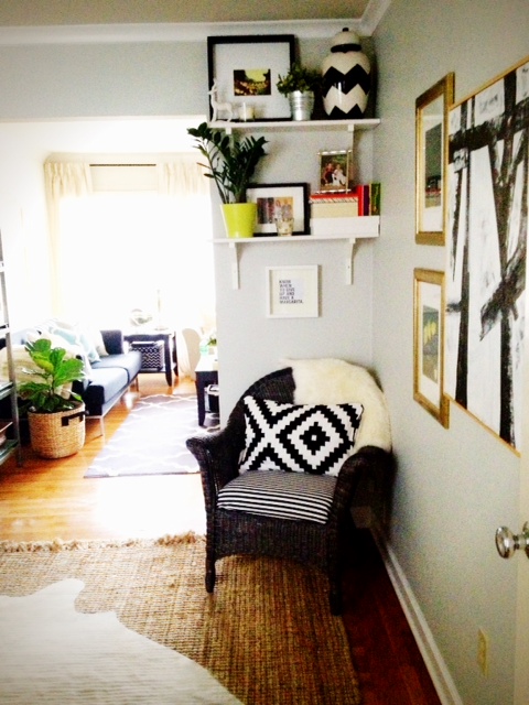
On a whim, I also quickly tapped in a nail to the wall to hang up my new mantra below the final shelf…

Can’t see what it says??????  Here’s a close up:
AMEN TO THAT!
I’m not sure that the size of the frame is quite right, and since I didn’t even bother measuring anything before tapping in the nail, it’s totally not centered, but it’s fine for now.  Maybe a slightly larger frame would do well here…
Moving on…  Since this is a far cry from an overstuffed chair, I wanted there to be a “cozy factor” and picked up one of the sheep skin throws from Ikea (just $30, and it’s oh-so-soft). Wicker is not the most comfortable to lounge against, so the fluffy throw is the perfect solution.
Cheap.  Cozy.  Textural.  I love it.
As a side note, they do have faux sheepskin throws, but they were not as soft, and looked kind of raggedy… 

You may also notice the art on the wall… also a few new additions.  I’d been obsessing over the abstract black and white brush stroke art FOREVER, and had debated trying to make some myself, but then saw that West Elm was clearing it out.  I snagged it for $60, and it’s BIG.

It’s really hard to see, but you can see it most clearly in the below photo (I’ll take more later – promise)

I’m working to figure out how to take the pesky door down to add one more large photo to this wall, and open things up (you can see the knob peeking out in the photo above) but the hinges have been painted over probably… oh…. a thousand times in the last 90 years… so the screws are not going anywhere for now.  I’m looking into different options… paint stripper?  Dissolver?  I don’t really know… but it’s like cement.  It’s one secure door.

Stay tuned for updates on that one…

But anyway, this little corner is MUCH happier now, and I am SO THANKFUL I didn’t end up getting rid of the wicker chair!  I am really liking how it looks here, after a little TLC.
In total, it cost me around $60 (fabric, throw pillow, sheepskin, + spray paint)… most of the cost comes from the sheepskin throw.  Pretty good though, right?!
We’re making progress!!!

A Newer New Logo

I recently debuted a new logo, and while I liked it, I didn’t love it…

I spent some time thinking about what it needed… here’s the list of what I wanted to change…
  – Less “stuff”
  – More Color
  – Custom Font

Here was where the logo stood:

And here’s the updated version:
I’m testing out this new logo (very similar to the last) to see if it sticks…

Thoughts??