Chalkboards at Home

It’s not a secret that chalkboard paint has made a huge resurgence recently, and it keeps popping up all over the internet.  It’s making offices functional, giving kitchens a fun place for children to play, and it’s dull finish looks uber chic when painted on furniture.

Is anyone surprised that Martha Stewart jumped on this bandwagon??  Not only did she feature an entire chalkboard wall, but also featured various shades of chalkboard grey that make up a perfect calendar grid – ingenious!  Bravo Martha… bravo!

Martha Stewart

This next wall – a feature in the dining room – actually has magnetic chalkboard paint – a double whammy 🙂 If the room were busy, it would all be way too much, but with simple furnishings, clean lines, and natural materials, it looks amazing – even once it’s covered in doodles.

Source

Ok, try to tell me that this isn’t the most clever idea yet!!  Using chalkboard paint to create a whimsical headboard in a child’s room.  If our bedroom weren’t so dark, I’d be seriously considering this for our headboard!!

Decoist

Kate from Centsational Girl recently madeover an computer armoire, taking a once dingy dark desk, and making it bright and functional – I love that the inside doors are used to keep track of schedules, but that it can all be closed up at the end of the day.

Centsational Girl

And finally – chalkboard paint in a super formal dining room.  All that wood paneling is giving me a bit of anxiety to be honest, but I do love the creativity of creating a fun chalkboard border.  This room needs a can of white paint on that paneling, stat, along with a non-brown rug, but that’s beside the point.  Bravo to these homeowners to stepping outside the box a bit!

Apartment Therpay

Black and White Weddings

I am normally drawn to weddings where light colors and rustic details take center stage, but I have to say that the graphic contrast of black and white is a breath of fresh air from all the summertime weddings that take place in a garden, barn, or vineyard.


Doesn’t this bouquet of white anemones make a bold statement without being too “loud”?  I also love the black sash that break’s up the sweetness of this romantic dress.

I’ve always been a fan of having bridesmaids wear different dresses, and this line-up above is still cohesive, while letting the girls wear something that is a) flattering to their figure, and b) shows off their personality.  Aside from that, the blush and black is a little more fresh and unique than the standard creme, and more flattering than nude.  So pretty!

This picture strikes me as the perfect look for a Halloween wedding.  Without being costume-y about it, the black lilies in the bouquets add drama, while the strappy black shoes are adventurous, and give a nod to the spooky… almost witch-like.


I love these invitations wrapped in black and white string, and how fun are those checkerboard socks and black and white wingtips?!  Adorable!

Maybe it’s just me, but I think the chiffon softens the all black dresses above.  The vibe is romantic all the way despite the dark color.


Ok, who can say that these sheer lace Valentino’s are anything short of FABULOUS.  With the big bows, sexy peep toe, and sky high heel, these shoes are sexy meets sweet.  Weddings aside, I want these for my own closet!


Feather’s aren’t really my thing, but it makes for a dramatic detail on a white lapel, and don’t even get me started on that necklace.  I love the antique brooch that serves as a clasp, along with the oversize pearls – so pretty.

These invites are modern all the way.  I love the graphic “LOVE”, the black background with white font, and the simple lay-out.

The more I look at it, the more I love the idea of a black and white wedding… what do you think?

Hunting at HomeGoods

Oh HomeGoods – this place is such a wealth of treasures… it also houses a lot of “non-treasures”, so whenever I make the trek 45 minutes outside of the city to go there, I give myself at LEAST a few hours to dig through everything.

I went there over the weekend, bound and determined to find some fun fall decor, and as I was walking through the store, saw some really great things.

Mirrors:
We need a replacement mirror (or even piece of art) for the hallway, where we currently have our dwarfed sunburst mirror.  These two immediately caught my attention –

The first one with the leaf motif was $50, and the second one was $100.  I actually hate the “marbled” frame on the second one, but that can easily be fixed with some paint, or some gold or silver leaf.  This picture actually doesn’t capture the scale of this mirror – it was really large at roughly 3 feet in diameter, and it reminded me quite a bit of this one, originally posted in a bedroom makeover from A Well Dressed Home (seen below):

I also saw this candle holder – kind of tacky, but also kind of cool.  One of my favorite homes belongs to a woman in Southern California, who would prefer to keep her family’s blog personal.  Her style is clean, and simple, taking shabby chic, and mixing it with classic lines, and minimal colors.  You’d be shocked to know that there are three wild girls running around her all white house.  ANYWAY, in her living room is a really pretty candleabra, and this candlestick reminds me so much of it!

HomeGoods beaded candlestick:

Antique Candleabra:
I know, I know… the finish leaves something to be desired.  That’s why it stayed at the store instead of coming home with me, but with a little creativity, it might work…

After accessories, came the chairs.  There were SO MANY really cute ones, but my favorites were these Ikat print sliipper chairs ($350 for the pair), along with these oatmeal linen dining room chairs with the nailhead detail ($199 each).

Near the chairs were the larger pieces of furniture.  I LOVED this mirrored console table, although I’m not sure how Kris would feel about that….

It reminded me so much of the ZGallerie borghese collection… right??

I came home with a lot of little things – a new vase, some autumnal preserved leaves, a new bath mat that feels like heaven on our feet, a few holiday throw pillows to be stored until December, and some picture frames, waiting for pictures.  Nothing ground breaking but it was fun to come through everything!

Hope you all had a great weekend!

Happy Weekend!!

How’s this little rear-end to get your weekend started off right??  Puppy butt!  Ahh, love.
This weekend I’m looking forward to doing a whole lot of NOTHING.  I’ve got a hair appointment, and will return to my “natural” blonde hair color I was born to have.  It’s also supposed to warm up here, for our “Indian Summer” – sunny and 80 degrees is what I am talking about!!
Happy Weekend!

It’s 5:00 Somewhere… In a Classy way (of course)

I’ve found myself fantasizing about a vintage bar cart recently, and it has moved from the “want to have” list to the “need to have” list.  Kris just loves that 🙂
Not only are they so pretty with their glass tops and metal side details, but they are also “visually light”.  They don’t visually take up a lot of space, since the glass and metal frame are open.

Ballard Designs

I have even found the perfect spot for one (under a large mirror, next to our TV).

Bear with me, but this lovely picture of ooey gooey breakfast treats is the the only picture I could find that demonstrates where this bar cart would go… mmm, now I want chocolate crescent rolls!

Unfortunately, I’ve also found that these bad boys run up a pretty decent price tag…
I did a quick search on Google, along with Craigslist and Ebay – on the low end of the spectrum, I found the Jill Bar Cart at Ballard Designs for $349, but some of the actual vintage pieces on Craislist ran well into the thousands – yes THOUSANDS.  Holy macaroni!  I think I’ll go for a vintage knockoff, thankyouverymuch.
I absolutely love the bar carts with curved lines.  This one here with the handles and shiny chrome is amazing against the dark wallpaper, and who can resist the imperial trellis print?!  I know I cant!

                      Veranda

This brass cart is pretty much a spitting image of the chrome one above… must be why I’m really into it too.  The cut crystal decanters are so pretty on top.  So pretty!

And another oval cart – this one in a brushed bronze is a little more industrial which is cool, but I’m not loving the clear acrylic wheels…

habituallychic
Any good suggestions on finding a vintage (looking) bar cart for a steal?!

Fleur de Sel Caramel’s

I’ve recently become totally and utterly hooked on salted caramel.  The Fleur de Sel caramel candies from Trader Joes… the salted caramel ice cream from BiRite (if you ever come to San Francisco, a stop at BiRite in the Mission is MUST – life changing I tell you).  This girl can’t get enough!

Then, I came upon a recipe for homemade Fleur de Sel Caramels – from the Barefoot Contessa no less (god I love her) – and I am DYING to try these on my own…

Fleur de Sel Caramels (Makes 16 Caramels)

Ingredients:
Vegetable oil
1½ cups sugar
¼ cup light corn syrup
1 cup heavy cream         
5 tablespoons unsalted butter
1 teaspoon fine fleur de sel, plus extra for sprinkling
½ teaspoon pure vanilla extract
Instructions:
Line an 8-inch square baking pan with parchment paper, then brush the paper lightly with oil, allowing the paper to drape over 2 sides.
In a deep saucepan (6 inches wide x 4½ inches deep), combine ¼ cup water, the sugar and corn syrup and bring them to a boil over medium-high heat. Boil until the mixture is a warm golden brown. Don’t stir – just swirl the pan to mix. Watch carefully, as it will burn quickly at the end!
In the meantime, in a small pan, bring the cream, butter, and 1 teaspoon of fleur de sel to a simmer over medium heat. Turn off the heat and set aside.
When the sugar mixture is a warm golden color, turn off the heat and slowly add the cream mixture to the sugar mixture. Be careful – it will bubble up violently. Stir in the vanilla with a wooden spoon and cook over medium-low heat for about 10 minutes, until the mixture reaches 248 degrees (firm ball) on a candy thermometer. Very carefully (it’s hot!) pour the caramel into the prepared pan and refrigerate for a few hours, until firm.
When the caramels are cold, pry the sheet from the pan onto a cutting board. Cut the sheet in half. Starting with a long side, roll one piece of the caramel up tightly into an 8-inch-long log. Repeat with the second piece. Sprinkle both logs with fleur de sel, trim the ends, and cut each log in 8 pieces. Cut glassine or parchment papers into 4 x 5-inch pieces and wrap each caramel individually, twisting the ends. Store in the refrigerator and serve the caramels chilled.

Dorothy Draper on the Brain

I had posted about my love of Dorothy Draper furniture a few weeks ago, and I’ve still got it on the brain.  Not to over-obsess, but these bad boy’s made it into the Vogue offices in the Sex and the City movie… so you know it’s legit.

Anyway, I’d mentioned that we need a taller piece for our TV in the bedroom – right now the TV is on a lower TV stand, which is a problem because you can’t see the TV when you are laying back in bed.  We literally have to be sitting straight up in bed to see the screen, which really defeats the whole purpose of watching TV in bed – right?!

Anyway, I am in the process of working out the exact specs I want the dresser to have in our bedroom, but I absolutely love the longer look of the cabinets here.

I saw a similar Ikea hack to the one I posted earlier this month.   Naomi, of Design Manifest, actually turned two Rast nightstands into a TV console.  You can see in this picture, that she added an extra shelf on top to house the cable box, and create a completely flat surface for the TV above.  Awesome right??  My hesitation is that I’m crafty enough to build an additional shelving unit, and I worry that I’d end up after this project with an unstable surface that we’d have to balance the TV on…


See in this second picture how the sides are not completely flush with the top?? I do like the idea of having a space for the cable box, but it’s starting to sound like too much work for me.  The other work-around to making both pieces flush would be to sand everything down… Am I way overthinking this??
rast

Maybe I should keep looking on Craigslist….

The Little Hallway that Could

Ok – no judging allowed, but just wanted to share some updates on our hallway.  I swear I’ve been doing work on it, and not just having fun – this means coming home at 10pm, and working until bedtime.  It’s getting old my friends… real old.

That said, I’ve made some serious progress!  You all remember these sad “before” pictures right…

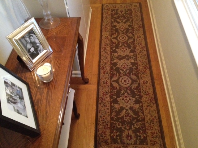
Brown on brown on brown… GROSS.  I mean, it was just depressing!

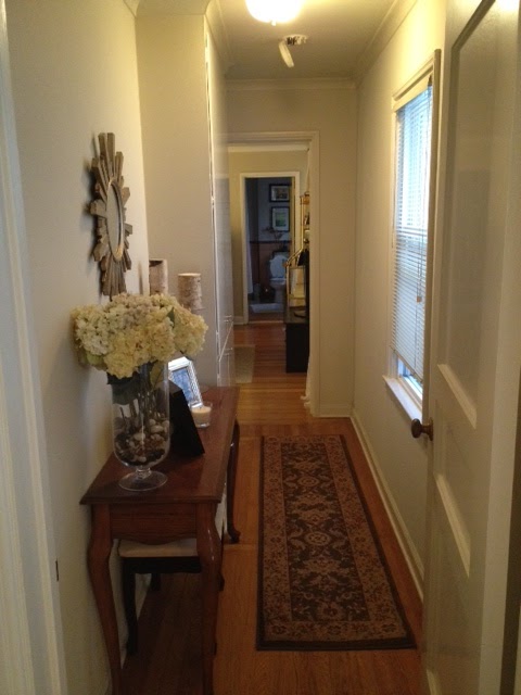
There is still work to be done, but here is some preliminary “afters”:

Actually, let’s call this a “during” since we are still working on it…
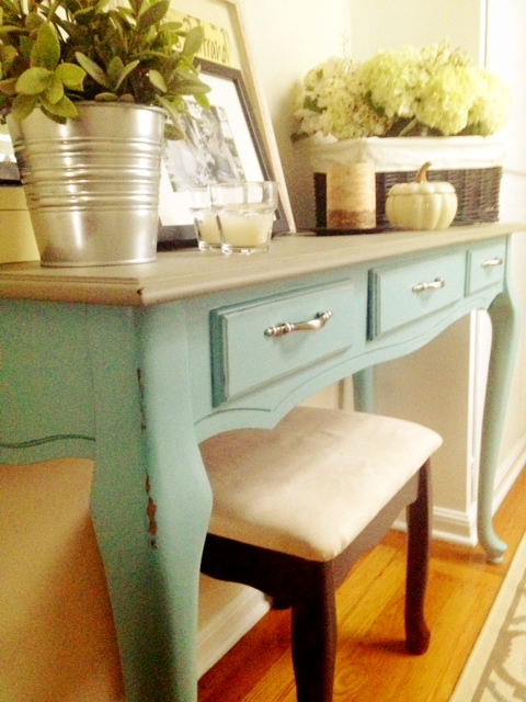
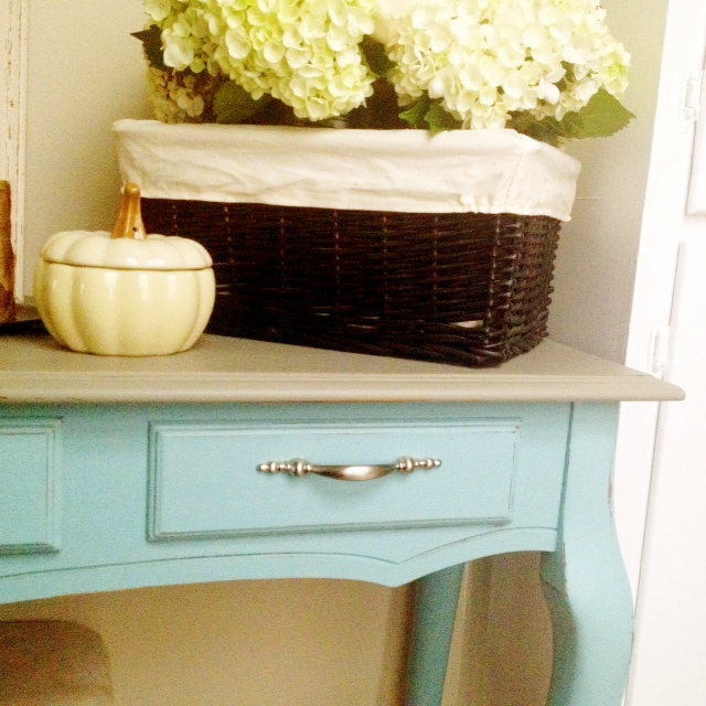
The updates??  Most obviously removing all that was hideous and brown – repainting the console, and bringing in my new rug.  Love looveeee that rug.

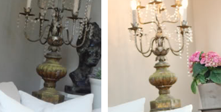
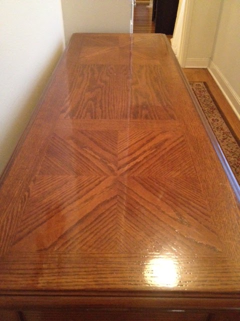
It’s a little hard to see clearly in some of these (sorry, iPhone pics in early morning light before work = grainy snapshots), but after painting the console, I roughed up the edges with some trusty sandpaper.  Focusing on the areas that would get the most natural wear, it made some of the details pop back out, and gave it a nice antique feeling.  You’ll also notice that I decided to paint the top (instead of keeping the super shiny faux inlay), but before painting, I took a hammer to it, and really banged it up (aka took some aggression out on it).  Aside from being extremely fun and therapeutic, I think I succeeded in making it look genuinely old antique.  Kris said so himself, so it must be true 🙂

I’m still going back and forth on spray painting the hardware a brushed bronze… the silver looks much better than I thought it would, so I think I’m going to hold off making any decisions on that for a few weeks – see if I change my mind.  Besides, my can of Rustoleum isn’t going anywhere…

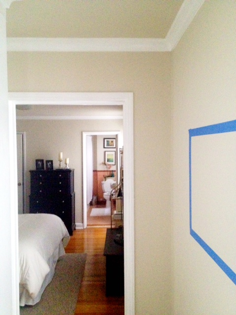
In addition to my freshly painted console (the least labor intensive part of this whole deal), the door, the built in linen closet, and the crown molding got a little makeover with some “Decorators White” from Benjamin Moore.  Trust me when I say, adding white paint to the dingy hallway, and defining the trim have made the largest impact of anything I could possibly do in here.  It creates some much needed architectural interest, and a point of reference for the ceiling – it feels taller!

The linen closet still has zero character, so painting it fresh white is probably the best I can do with it.  Some battles I’m willing to let go of… we are renters after all.

Let’s do a side by side comparison for fun… shall we?

The light in this “before” photo isn’t great, but you can see what I’m getting at – you couldn’t even see the trim before! It totally blended in with the walls.  Woof.  Now the clean white is bright, and it just makes me happy…

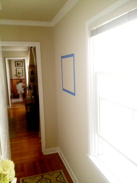
The window is waiting on a new fancy treatment… another DIY on it’s way with my new pretty fabric  (hopefully not an epic failure)!

Also, you can see that I’m now trying to decide where to hang things on the wall (thus, the lonely square of painters tape).  Last night when I was measuring out the tape, I felt that the 20″x16″ filled out the space, and anything more would be too much, but now, looking at this from a distance in this photo, I’m wondering if it would benefit from a few more smaller frames on the side.

Also, I think this sunburst mirror is too small for the wall, and we need something larger to fill the space – especially next to the built in that goes up to the ceiling.  There is just a lot of wall, with a cluster of “stuff” down near the table, and in the small space, I want to draw the eye up as much as possible.

*Side note: this photo is really washed out from the direct light… 
the walls and linen closet are distinctly different colors

Right??  Lots of wall… that mirror will find a home elsewhere – not to worry 🙂  Also… just realized that the rug needs to come closer to the entryway… easy changes…

I’m a "Photographer" now that I know the word "Aperture"

You may have noticed that the quality of the photos I’ve been posting have been pretty lack luster… it’s because I’ve been using my iPhone for everything since our vacation (not to hate on the iPhone camera… it’s actually not bad).  On our trip to Cabo, Kris dropped our DSLR camera at the airport, and while the actual camera is fine (thank god) we found the lens in a million little pieces when we took the lens cap off.  Sad!!

Since then, I’ve been on the hunt for a new one, but as many people with these kinds of cameras know, the lens is the most expensive part!  A good lens will run well into the thousands of dollars, but for what I’m looking for, that won’t be necessary.

Basically, I want a lens that takes great shots up close.  So I can document my projects, our life, and take wonderful photos of family and friends.  I was so sad not to be able to bring the camera to my mom’s birthday!

I’m determined to find a good replacement that is a moderate upgrade from our original lens, so I’ve been reading a lot of reviews online.  If anyone else has ever tried to research technical gadgets online (phones, TVs, cameras, lenses) you know how confusing it can be.  There are a lot of resources – some better than others – but even the best end up throwing around super technical terms that are intimidating and unhelpful for us non-savvy photo takers, but one of my favorite bloggers Emily Clark, featured a guest post on lenses recently, and it was SO helpful!

For me, being able to read simple advice from a trusted source (a professional photographer, on a blog I read daily) means more than any CNET editor’s review, so obviously I paid attention!

The recommendation was to go with the Cannon EF 50mm f1.8 ii lens.  Gibberish people!  I have no clue what this lens is!! Luckily, Google has all the answers a girl could ever want, so from there I was able to solidify my decision.  I checked out the Google Images for this lens, and of course came across a ton of pictures that people had taken with it!  Boom.

Great pictures right?!  I realize now how creepy it is to have posted pictures of two random guys – one taking a smoke outside, and the other picking his nose (what are people using this lens for?!), but I think these portraits capture the “aperture” (wow, look at me using my new-found photographer lingo)… for those not in the know, aperture just means how blurry the background becomes when focusing in on a subject… apparently, this lens has a “low aperture” (aka extra fuzzy background).

What else do I love about this lens?? It’s cheap inexpensive – well… inexpensive as far as lenses go.  It’s $104 on Amazon right now, so in comparison to several thousand (or even several hundred) it feels like an absolute steal!

Now that I’ve found the portraiture lens I want, it’s time to start researching wider angle lenses – any recommendations??