Wall Stenciling

You know how sometimes you just see something completely inspiring, and you have to tell everyone and their brother??  Well that’s what happened to me since stumbling upon Tiffany’s fabulous entryway on her blog, Living Savvy.

I mean… it’s just draw dropping in all it’s dramatic glory.

AAAHHHHHH!  It’s SO GOOD!!  That green???  Stop it.

And that mirror??  SOOOO jealous!

Everything about this is SOOOOO good.
She has a really detailed tutorial of how she attacked this entryway (Part I and Part II), and after reading through, I’m dying to try it out on my own.  I love the scale of this print – I’ve seen some stenciled walls that are quite lovely, but strike me as being too busy when the pattern is on a smaller scale… unless it’s a powder bath – then all rules go out the window.
Now that I’m completely obsessed with this idea, I googled the pattern she used – it’s the Royal Design Studio Contempo Trellis wall stencil (say that 10 times fast), and good ole Google came up with more inspiring spaces that used the same pattern.

This two toned entry way was quite stunning – and it looks like the paint was actually metallic.  Fancy!!

It’s amazing to see that just by changing up the paint colors how different this stencil can look!!
I was also totally loving this black and white version…
So cool right??  
When we end up moving, I really want to test this out – I think it works great in these entry spaces, but would also be so cool in a dining room, or office space.  To read through the tutorial is a little daunting, but I think that it could be a project spread out over several sessions…
I could also totally imagine this done in lighter colors – medium grey on light grey – or in varying paint finishes – glossy navy on matte navy.  Wouldn’t that be super cool too??  Something sort of like this…
See the sheen from the paint??  Even though it’s the same color, the pattern totally pops.  I feel like this method would really give the look of wallpaper… I wonder though how hard it would be to paint over later…
What do you think of the look??  Would you try it on your own?
Any other professional words of advice from those of you who have tried it out before?

Full Dresser Reveal – Ikea Tarva Hack

So last week I’d jumped the gun with excitement and posted a few blurry pictures of the newly painted dresser that is in our room functioning for storage and as a TV stand…
This has been a long time in the making… remember LAST FEBRUARY when I first started talking about this???  Well, it’s only taken me eight months to finish this project 😉  With the hardware attached, I can OFFICIALLY check this project off the list!
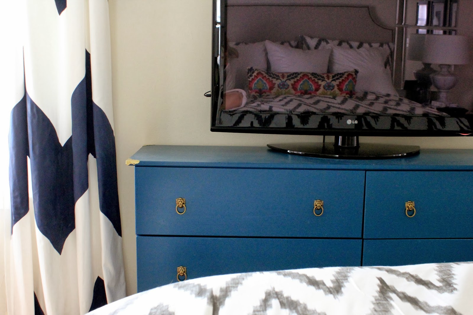
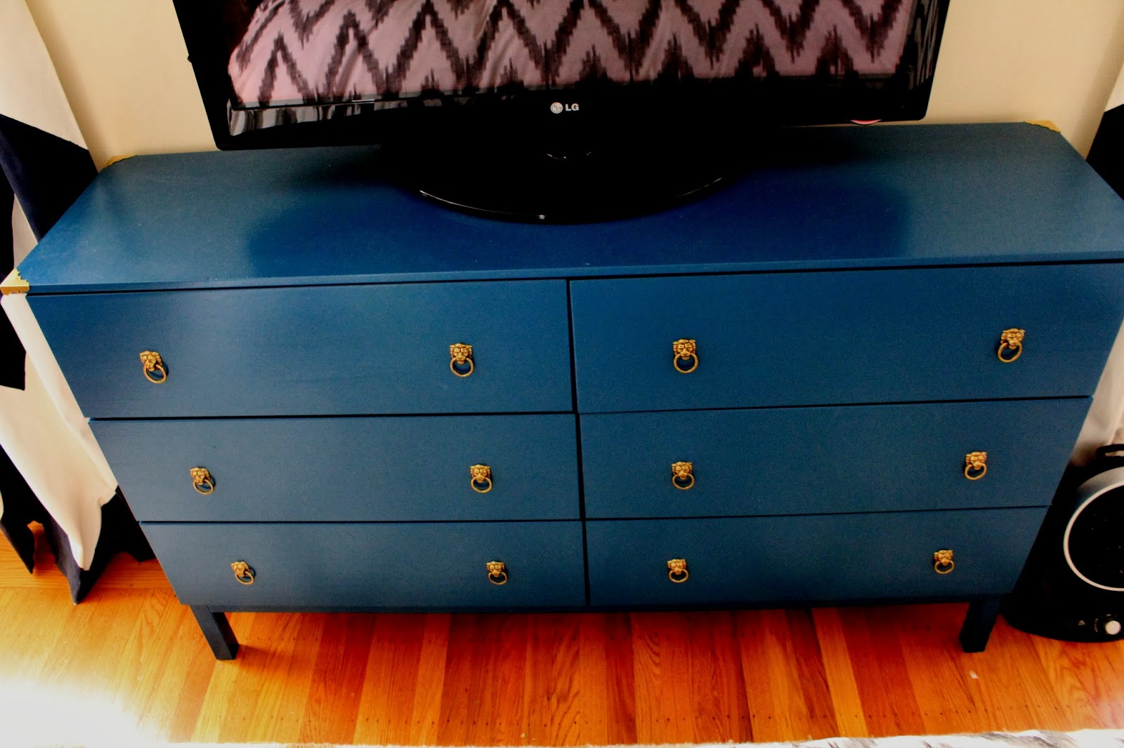
Yep, that’s my reflection in the TV!!

I can’t even begin to explain how good that feels to be able to say it’s DONE.  Phew!

I am so pleased with how it turned out – the ultra-marine blue paint color brings such LIFE to our bedroom without being overwhelming, or too in your face.

I am in love with how it all turned out, but it was a LONG road to get here… let’s start at the beginning…

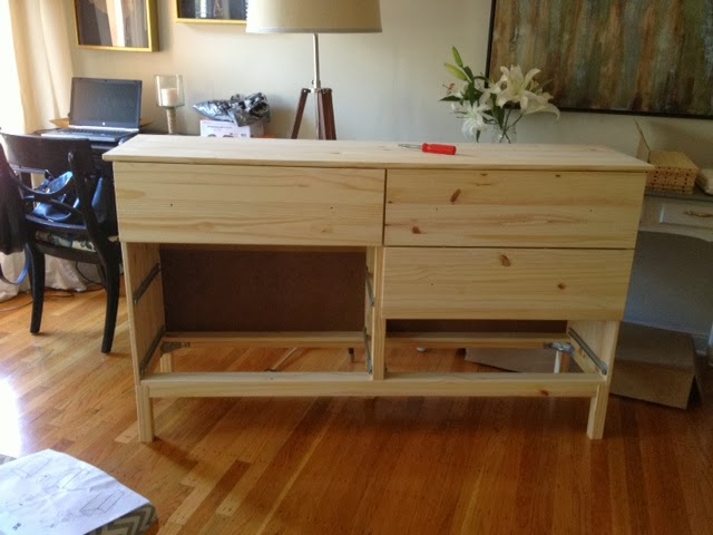
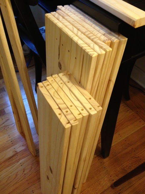
Ikea… on a Saturday… NIGHTMARE.  I got in, I got out, and a glass of wine later, I was ready to get the party started get this dresser built.

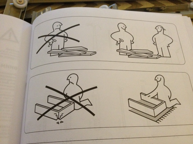
Step one: organize nuts, bolts, and assorted other random pieces Ikea packages up.

All I’ll say is… be VERY CAREFUL to be sure that you are using the right little screw thingy for each step of the process… you do not want to have to go back and take apart the dresser halfway through because you used the short screw and not the long one – TRUST ME on that one.
You may also want to enlist a buddy to help read the instructions… they use pictures, not words, and some of the little drawings I STILL can’t figure out…. bottom left picture… what do you think that says?? “Don’t break the furniture you’re building?”  Is that what it means?  Thanks Ikea… wise words…
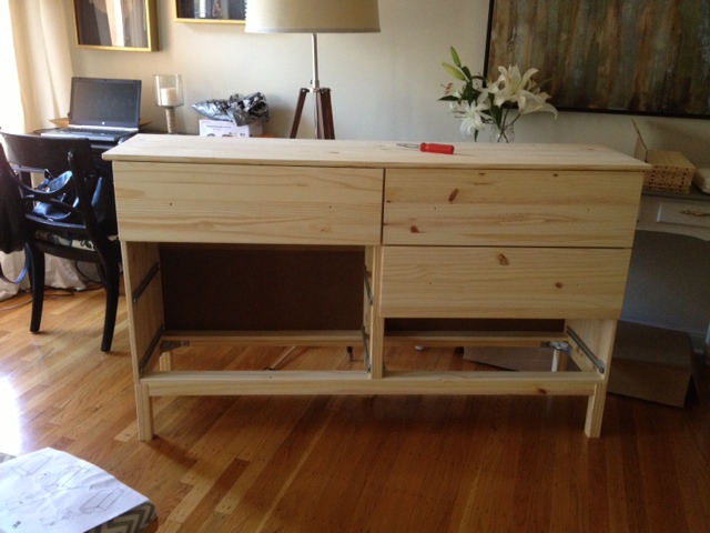
I’ll spare you the boring details, but our living room was a disaster zone for two nights, as it went from this…
To this… an almost completed dresser! 
WITH FUNCTIONING DRAWERS.  
Holla! 
Look at those drawers… that open and close smoothly.  A work of art I tell you!  I’ve never experienced a more satisfying moment.  
Well, except for that time when I was home from college, and went to Costco with my mom, and saw that the girl that bullied me all through high-school was working the front door…  that was also an EXTREMELY satisfying moment… Deanna!  Is that you??  Going places in life I see… 
Another story for another day… 
Anyway, it felt REAL good to get the drawers working…
Moving on… the wood is pine, which means that it secretes oil from the knots in the wood for years… YEARS PEOPLE… so to be sure that the knots stayed hidden, and that my lovely paint job stayed intact without any bleeding from the wood, I used a super-duper primer.
Kilz primer got the best reviews online for sealing in wood oils on pine furniture, and so far so good.
I read that having the primer tinted made things MUCH easier to paint over when using a dark paint color.  I am SO THANKFUL I did this – I probably saved myself an extra coat of paint (or seven), and many frustrating hours in the long run.

The tinted primer won’t be as dark as your paint color, but it helps SO much.  It went on a light blue (pictured above) – I did 4 thin coats with a roller (to be sure none of that oil from the wood came through over time), let it dry, sanded it, wiped it down really well.

Then it was time to paint.

I just did regular water based paint (for easy clean up) in a semi-gloss – three coats with a roller later, and these bad boys were drying in the living room…

The most interesting thing to me about this paint color is that it photographs so differently in different lights, and that’s actually how it is in real life.  In bright direct sunlight, it’s a rich peacock blue, but in the afternoon it’s definitely a darker moodier version of itself… sometimes it almost looks like a dark green.
Like a mood ring – it’s totally fascinating to see!
Remember my inspiration for this color?? It was this Peacock Blue Dresser from Dimples and Tangles that got the creative juices flowing – I still love how her’s has the lacquered look.  
It’s AMAZING.
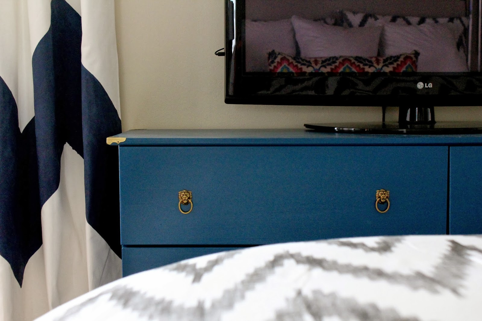
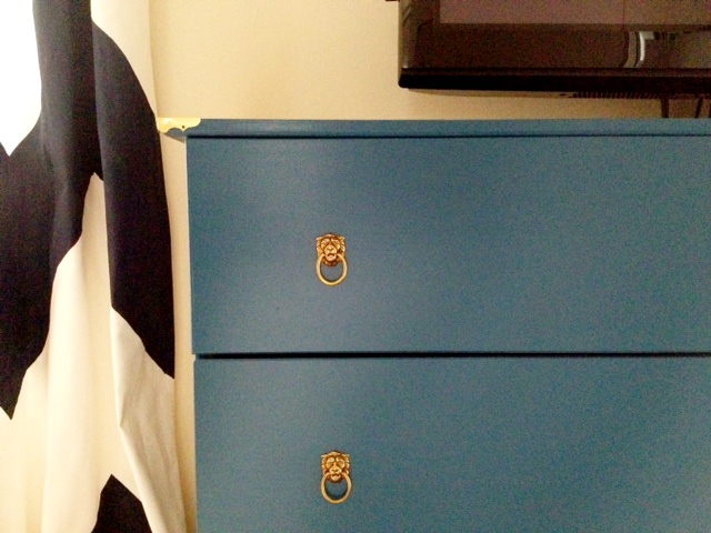
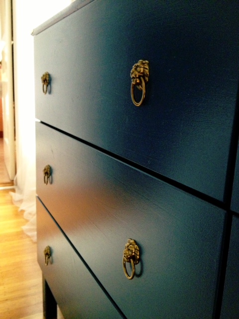
Anyway, you all know about my love of the brass hardware – it was quite a hunt to find!  My first order was cancelled because they ran out of lion head pulls!  WTF… I had to hunt it down elsewhere, which added a few extra weeks onto this project.

The dresser was in our room, just waiting for those pulls, and when they came, I was even more excited with how cute these guys were!  Quite sassy if you ask me.

RAWRRRRR.
And so, that’s the story my friends…  are you ready for the massive photo dump??  Here we go!
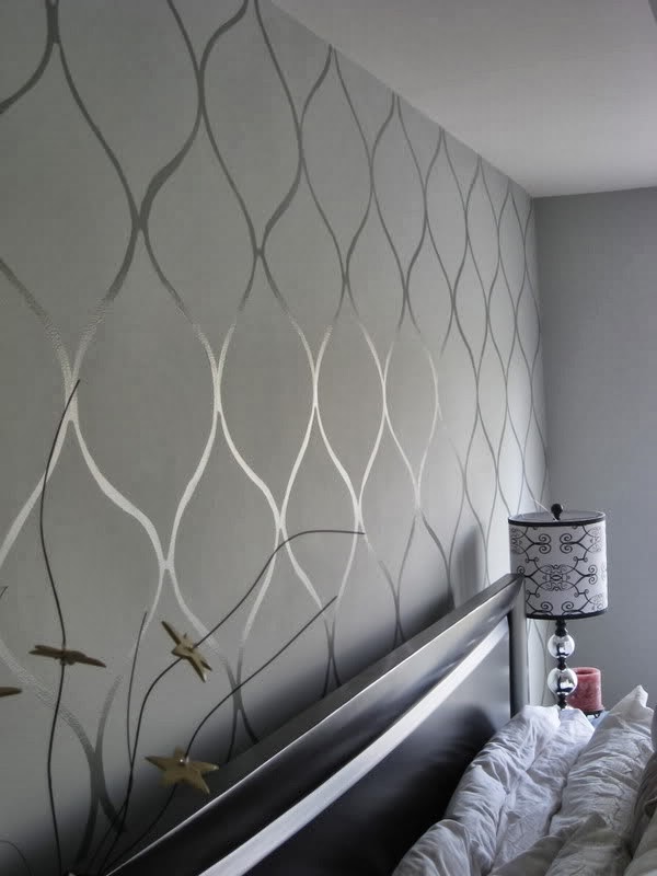
The view from my side of the bed… that’s a pretty realistic image of how the paint color reads in person – like the color of the ocean 40 feet down… gorgeous!
And a few close up images of the hardware against the paint…

Our old problem was that the TV stand that had been in here was too low to the ground so we couldn’t see the TV from the bed… especially once we bought our giant California King, with the extra high box spring.

Now, as you can clearly see, the TV is at optimal viewing height…

This room is SO TRICKY to photograph – it’s not big, and so this was the only angle where I could really get the whole dresser in.  Awesome photography skills – clearly.

And as I’m posting these, I’m realizing that there are a few unintentional selfies where I’m reflected back in the TV.  In my pajamas.  Awesome.

On another topic, how awesome do those navy and white curtains look with the dresser???  Totally baller.

Next up on the list… what do we do with this wall above the TV??

It’s a HUGE improvement to have the TV higher on the wall, but it’s still very empty feeling.  I know I have a bit of a problem and want to put something on every wall, but I swear to god, this wall NEEDS something.  I was thinking sconces, but the lazy part of me is like… ehhhhh.

If we didn’t have so many freaking mirrors in this room already, I’d consider a trio of round convex mirrors, and I haven’t completely ruled that out, but I’m trying to think of something other than another mirror…

Here’s a photo of our lovely dresser from the bathroom door looking back towards the hallway and our dining room / office area.  I love that the spaces have a really cohesive feel…

Oh, and don’t forget to notice our dust ruffle on the bottom of the bed.  It’s a subtle change, but a HUGE improvement since you could see all the crap stuff we were storing under there and it just looked so unfinished, and ugly, and messy, and terrible.  UGH.

Now it’s hidden and I’m SO much happier.

This next photograph was taken from an angle I don’t often capture since the salmon tile in our “art deco” (aka old as hell) bathroom is all up in your face.

What you can’t see (thank god) is that the shower was re-done at some point since the 1930’s, and in an attempt to match the coral tile, they went with pink.  Pepto bismol pink.  That doesn’t match.  Not even close. Oh well…

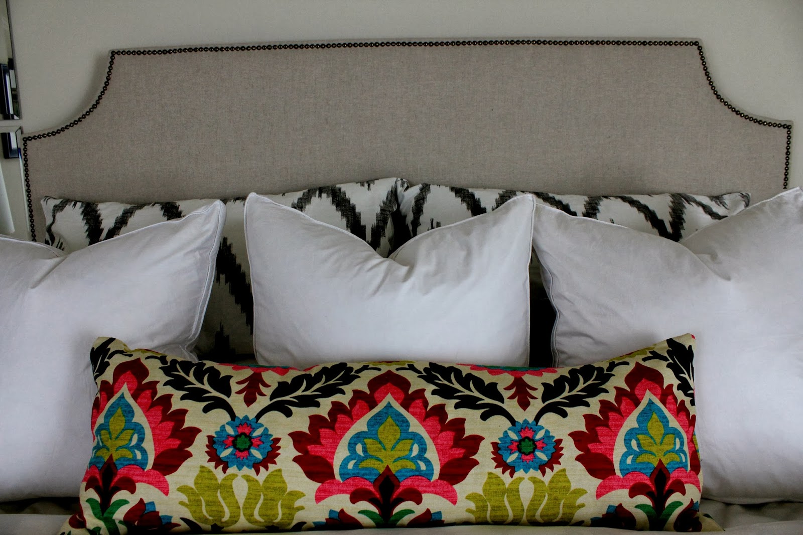
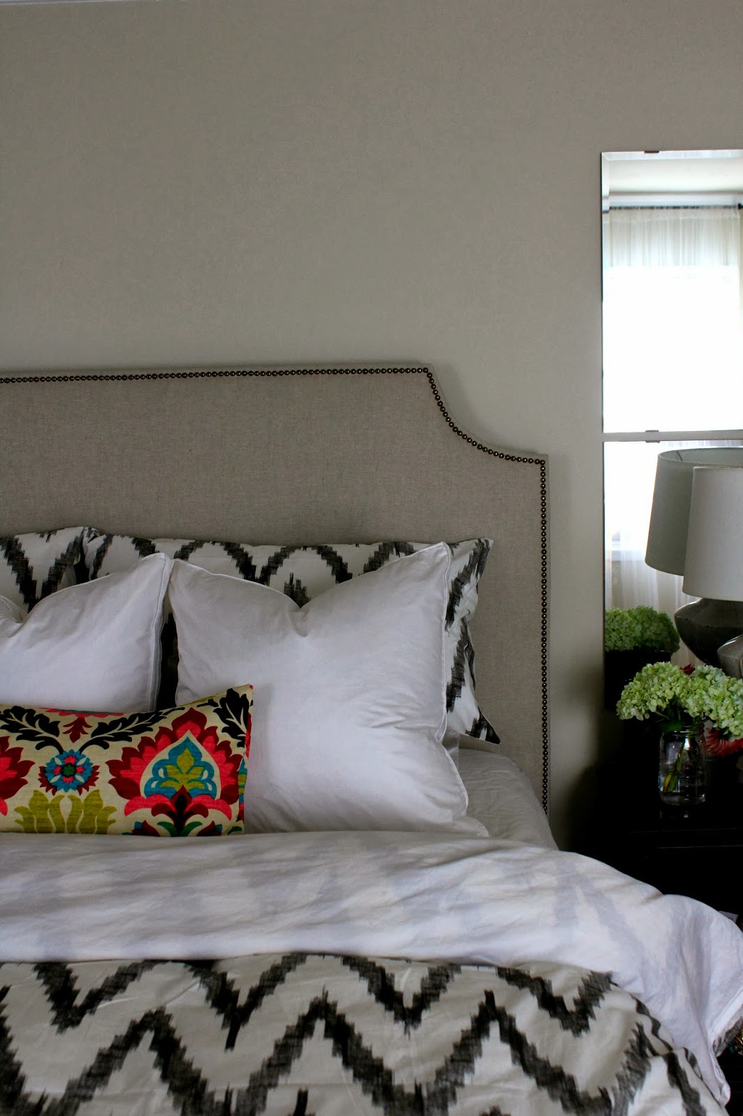
And just for good measure (and since i was already in there with the camera) I got a few photographs of the headboard and new bedding together.

I’m liking this combination for fall, and I love that the Duralee fabric on the bolster ties in with the other colors in the room, and brings a punch of color to wake things up a bit – as you can see, I’m still on the hunt for euro shams.

Standing a bit further back, you can see yet another empty wall that kills me a little every time I see it. The wall above our bed and headboard just needs SOMETHING.

I think I nice oversize clock would be nice here – again, trying to stay away from more mirrors in here… plus it will help keep me on time as I get ready in the morning…

So that’s it!  The new dresser / TV Stand / Ikea hack is complete!  If you need to find me, I’ll be in bed watching TV from now until forever.

Just kidding.  Kind of.

Happy Tuesday!!

Kalah Blue – Painted Curtain DIY

Who doesn’t love royal blue and white paired together??

No one.  That’s who.

I realize how confusing that double negative sounds… read it again… it makes sense… promise

Blue and white is a classic combination for a reason, and one of my all time favorite patterns is the Kalah Blue pattern by Duralee.  You see it everywhere.  Remember this AMAZING bedroom from House Beautiful last year??

Target also has a darn good knockoff of this pattern in a chair that I can no longer find online… if we had somewhere to put it, you can bet your buttons it would be in our house – it’s SOOOO good.

The throw pillows may make an appearance in our house in the next year… perhaps when I’m in my post-Christmas “simplifying phase” in January…

And these curtains??  LOVE.  (Maybe that’s what inspired them to hang that print right next to them… just saying!)

And another pair of curtains… they just bring a little magic to an all white space…

And surprise surprise… more curtains…

Well this post is for a DIY curtain tutorial after all…

Ok, so getting on with it…

Carmel of Our Fifth House is one of the most talented and successful home bloggers out there.  Her house is TO DIE FOR, and her taste is crazy good.  She makes brave choices mixing deep reds, blues, and experimenting with dark paint (check out the color of her bedroom walls… it’s LOVE).  I love bloggers who take risks, and stay true to their taste – it makes their spaces so unique and fun to read about…

Her blog is one of my daily go-to’s for sure, and after going through the archives for ideas in our own place, I ended up stumbling across her tutorial for painted curtains.  You know I have a bit of a thing for experimenting with painted curtains since it’s a) easy and b) cheap

Past posts about painting curtains can be found here and here

Anyway, I’ll let a few of her pictures speak for themselves…

Ok tell me that those curtains aren’t a CLOSE SECOND to the Kalah Blue, which is PRICEY as anything. The cheapest I was able to find the fabric online was for $20 a yard (not including tax or shipping) at Fabric.com.  For one single curtain panel, you’d need around 4 yards… and when you’re making multiple panels, that adds up REAL quick…

To the rescue is the concept of stenciling… I’ll leave you to Carmel’s tutorial at Our Fifth House for the play by play, but she essentially used a stencil from Olive Leaf Stencils (I believe it was the Ikat Pattern #2) and painted away…

Genius right??  I’m dying to try this myself, but we’re all out of windows in this apartment to adorn… perhaps a sweet friend would be willing to volunteer their windows for a little experiment…

Any takers???

The Lion’s are Here!!!

My little lion heads brass pulls are here!!
I was SO STOKED to see these come in the mail yesterday – I rushed home from work just to put them on the dresser, and was able to snap a few photos on my phone before it was completely dark.
With the days getting shorter, there was not a lot of natural light left, so the pictures are fuzzy and dark, but you get the idea… the brass pulls are AWESOME!!  Actually, even better than I hoped they would be!
They are actually quite small – the head itself is maybe an inch, but the ring adds to the size.
In the picture below, you can actually see that I hadn’t screwed the pulls on the other side yet… I was too excited (and the light was fading fast), but there will be more pictures to come soon – promise.
What do we think of the decorative brass corner caps??  I looked into options to antique them a bit, but it involves toxic chemicals to strip off the protective film (I read that the natural stripping methods with lemon juice, etc do NOT work).  
I think I’ll pass on the toxic stuff, and either make do as is, or scratch the idea all together.  I think I like how they look, and the little extra detail (almost called it flair… Office Space anyone??) but they are just so perfectly shiny in comparison to my awesome patina’d lion heads…
I think I’ll sit on any big decisions for attaching the end caps for now, and just keep them resting there for the time being…
More pictures to come, and they will NOT be blurry ones… promise 🙂

Chalkboard Frame with Deer Silhouette

I recently stumbled upon a new blog and it’s love.  I discovered City Farmhouse on Pinterest, and after clicking over to the photo’s source, fell down the rabbit hole.  An hour later, I’d completely stalked her entire house, and trust me when I tell you… it’s AMAZING.  What I love the most is that she’s really into up-cycling furniture and decor she already has… I mean how pretty is her living room all done up for Christmas??

A lot of it is found furniture that she’s slapped some paint on, recovered, or made-over in some fabulously creative way.  A girl after my own heart, since money isn’t exactly growing on trees around here…

The coffee table is a prime example of her creativity… the table is originally from Ikea, and she painted it and nailed wooden slats down after giving them an aged finish.  I’ve thought of doing this exact project SO. MANY. TIMES. But I’ve been too lazy, and I felt really unsure of if it would turn out… seeing her gorgeous home has totally inspired me to go for it.

Baby steps though… before I tackle this coffee table makeover, I have a smaller project in mind.

As you well know, I’m kind of obsessed with the idea of mounted antlers… I’ve posted about it twice already (here and here).

It hasn’t been something I’ve actively pursued though because I’m really on the fence about having real antlers in our house (flashbacks of Bambi are haunting me) and in all honesty, I think that a resin deer head would be way too much for our small space.

That said, I saw Jen’s chalkboard stag silhouette and was sold. Game over.

Her full tutorial can be found here, but it consists of a few simple steps… get a frame (with glass), paint the glass with chalkboard paint (after priming), trace the outline of a stag and color it in…
Voila!
So SO awesome, right??  I prefer the thickness of the wood on the chalkboard frame that hangs above her mantel a bit better, but this would be such a fun project to test out, and it’s virtually risk free.  The deer head is temporary – just erase it when you’re sick of it, and there you have it!
I NEED to try this out soon!  No clue where I’ll hang it just yet, but that can be sorted out later!

Brilliant, right??

Succulent Terrarium DIY

Happy Monday!  Hope you all had a lovely weekend.

It’s been hot here, so I spent my weekend outside – we had a full beach day on Saturday, and spent yesterday picnicking and watching the America’s Cup races.

In between all of that, I also worked on a small succulent terrarium…

Considering, I have the brownest of brown thumbs, I think I did ok!

I read up a bit on how to plant these out, and it turns out, it’s quite simple.  You will need:
  – Assorted rocks and pebbles
  – Soil with smaller pebbles and sand mixed in
  – A planter
  – An array of succulent plants
  – A flat counter space that you don’t mind getting a lot a bit dirty

 
A misconception of mine… succulents don’t like water.  They are desert plants, and like to be dry.

WRONG.

No wonder I’ve killed so many already.

It’s not that they don’t like to be watered… they just don’t like to sit in water… thus the pebbles, rocks, and sandy soil.  This all helps with drainage, and will be key to prevent me from killing these plants.

See the rocks down at the bottom??  I spread a solid foundation of rocks and pebbles before planting the succulents, so that when I do lightly water them, the water is able to drain to the bottom, preventing the roots from being boggy and wet.

This also will allow me to water them pretty in-frequently.  Amen to that!

Want to hear something crazy??  West Elm sells similar terrariums for $99 EACH!

This project was nowhere near that much – the glass bowl was from Ikea, ~$10.  The succulents were from Trader Joes, $2.50 each, and I bought about 5.  I’ve had the rocks for years, but they were from Michael’s, and were about $5 for a big bag of them.  In total, this cost me, about $20.

Pretty good, right?!

I had a lot of issues keeping the dirt off the plants when I was adding soil around them, and unfortunately for me, their waxy texture is holding onto that dirt as though it’s life depended on it.  Ugh.

I tried wiping it off, using a duster… I’m hoping that over time, it will go away on it’s own??

I’m pretty pleased with how it all turned out.  Look how pretty and bright green they are!!  I’m doing my best not to kill them this time, although I’m not entirely sure how long they will last.

Wish me luck!

Fall Wreath

We are having a bit of a heat spell right now – the weather has been around 85 in the city, which is rare! We’ve been loving every second of it, but even with the warmth, the light has somehow changed, and we’re starting to feel the first few hints of fall.  The leaves on the tree’s have a twinge of yellow to them, and the days are definitely shorter!

With the first inklings of fall, I decided to revamp our doorway decor – not that I’m going nuts with pumpkins in the house (too soon) but just something a bit autumnal.

I had a pine-cone wreath from last year that was very… brown.  Lots of twigs, acorns, and pine-cones… and it looked so depressing hung up, so I always took it down pretty quickly.
Well, I bought some berries and autumn leaf sprigs at Michael’s (literally $5 for everything with my coupon) and busted out the glue gun.  This is the finished result…

There is still plenty of green in the leaves to keep it feeling fresh, and the color from the berries makes these pine-cones the opposite of dreary.  Lively?  Inspired? Awake (at the least!)…

A gold ribbon (mainly to hold it to the door) finishes it off…

I’m super stoked about how this turned out!  Last Christmas, I’d bought a live boxwood wreath from Trader Joe’s, and it dried beautifully, so that’s been hanging on our door for the last year.  The new fall wreath brings some new life to this space, and if you ask me looks awesome with the brass door knob, key hole, and numbers.

Not that I’m biased or anything, but I think it also looks fetching alongside the new gold leafed frames…

Ok, enough talk of leaves changing, and temperatures dropping… Indian Summer is here baby, and I’m heading outside to soak up the heat!

xoxo

DIY Embellished Picture Frames

I got my inspiration for this easy DIY from Courtney over at A Thoughtful Place, but she got her inspiration for this project from House Beautiful… it all trickles down folks!
I have jumped wholeheartedly on the “gold” bandwagon, but realize that it’s best used in moderation… it takes serious self restraint from taking a can of gold spray paint, gold leaf, and gold leaf pen (yes, they make a pen my friends) to everything in sight.  I’m in the process of revamping our currently gold framed gallery wall to something a bit more simple (I think)… but I digress…
Back to my little gold edged frames…

Our entryway has had an empty wall ever since I moved out the ornate Ikea mirror into our hallway… I’d been looking for a larger federal mirror, but having put myself back on a budget after a few shopping sprees, and a splurge on new bedding and the dresser DIY for our bedroom, I’ve decided to hold off on a pretty federal mirror for now.

The question of what to hang in this spot plagued me for a while, and then I spotted these frames in Courtney’s living room, and decided to give it a go…

Super cute right??

Courtney ended up spraying tape, cutting it down to size, and then CAREFULLY wrapping it around the corners of each frame.

I took the lazy approach and taped off the corners of the frame, eyeballing about an inch and a half on each side (nope, didn’t even measure), and then with a craft brush and a small pot of Martha Stewart’s gold leaf paint, just dabbed each corner until it was completely covered with gorgeous texture.

Voila!!

I took the tape off the frame after the second coat went on, and the paint was still wet – it just helped get clean lines on the frame.

So… this DIY is actually just a glorified painted frame!  It was so easy – I literally finished both of these in about 10 minutes, and the paint dries fast – maybe 5 minutes until it’s fully dry?

There are a few small mistakes where the paint bled under the tape, but it’s fine – really from a distance, you don’t notice it at all.

The entryway is really simple, but in such a small space, we figure simple is better than overdone.

Look at that crisp edge… I absolutely LOVE them!

The pretty photographs were from one of my all time favorite Etsy shops, Eye Poetry Photography.  The photographs are really dreamy and pretty, and they have a San Francisco series that I absolutely adore!

I’m not normally a HUGE fan of photographs of city landmarks (the Golden Gate Bridge or Eiffel Tower is SO overdone) but the Ferry Building is so classic, and less photographed, and I just loved the photo of the bridge at dusk – it’s not the in-your-face red towers we’re so used to seeing…

So that’s it – the entry way got a small face-lift this week, these old frames got re-purposed, and everyone wins!
Happy Thursday!!

Wicker Chair Makeover

Hey guys!!  I was at a conference for work all week, and have missed my little blog!  It feels good to be back at home, and I am SO excited to share a little project I finished late last night…
I haven’t shared many pictures of our dining room so far because it’s not “finished” but I’m tired of waiting around!!  Remember this lonely little corner?  I was on the hunt for a comfy overstuffed armchair to wedge in here…
As it turns out, comfy, overstuffed chairs come with a hefty price tag, and since we’re about to spend quite a bit on a sofa, I decided to look for alternatives.  This room is now functioning more as an office than as a dining room (side note: I really need to stop referring to it as a dining room) so we just have one chair at the table now.  Since painting the walls, I had put one of the dining room chairs in the corner, but aside from attracting clutter, it was completely non-functional.  So I moved it down to the garage, and turned to plan b…
The wicker chair that used to be in our living room, but has been sitting in our garage all sad and lonely since I haven’t been able to sell for months. 
I couldn’t even give it away, but since I’ve had it since I was a child, I just didn’t have it in my heart to leave it on our street corner.  I wanted it to find a good home, so it just sat in the garage collecting dust…
Remember it from the living room??
It was white, wicker, and oh so perfect for a little girls room… Not so perfect for a city apartment shared by two adults…
Well, it’s nothing that two cans of Rustoleum Bronze spray paint can’t fix! Here is the chair sitting all sassy and happy in the corner of our dining room as of this morning…
              
HUGE CHANGE right??  
The chair is hardly recognizable now that it’s been sprayed a dark brown.  The paint color is “bronze” but it’s not metallic at all – I promise. It’s a nice dark brown when all is said and done.  Here’s a close up:
                     
This is actually a better, more accurate depiction of it’s color:

Chocolate-y.  I kind of love it.

Ok, let’s talk about the new seat cushion and accessories, shall we?  I have a little crush going on with black and white right now, and while I still think our living room could live without SO MUCH black furniture, this space needed to be grounded with some black since everything else was white, and grey.

Both pillow case, and fabric for the seat cushion are from Ikea.  The pillow cover is one of my all time favorite Ikea finds actually.  It’s thick, and woven, and has amazing texture in person.  And that graphic pattern is like mod-meets-aztec.  AND (it gets better)… it was ONLY $10!!!!  I know – run, don’t walk to Ikea – it took all my strength to limit myself to just two.

The striped fabric was $7.99 a yard.  Pretty good as well.

I’d ordered some striped fabric online, and when it arrived, it was sheer.  Clearly not going to work for any sort of upholstery job.  This is thick and durable – perfect for throw pillows, or projects like this.

Well, I’m sure you don’t remember the seat cushion on the chair when it was white, but my mom (who by-the-way is as talented as Martha Stewart, but unlike Martha hasn’t served prison time) had made a custom fitted cover for it when I was in high-school.  It was cute – a tan color with french quotes scattered on it. Again, perfect for a teenage girl.  We needed an updated cushion cover.

I am no seamstress, but I do own a staple gun, and so I improvised…

I went to the Home Depot and got a piece of MDF – super cheap.  It was $5 or something.  I also got a little hand saw that the guy at Home Depot recommended.  It looked like this:

I have no idea what it’s called and I tossed the packaging as soon as I got it home.  Sorry!
Anyway, I traced the cushion onto the MDF, and cut(sawed?) the shape out.  I should have gotten batting to wrap around everything, but I got lazy, so I just stapled the fabric onto the MDF – directly over the existing cushion.  I’m sure my mother is cringing at the idea of this.
Turns out, MDF doesn’t really like staples.  Many of them bounced back.  But some stuck (like REALLY stuck… they aren’t going ANYWHERE).
So about 200 staples later, we had this:

LOVE it!

On a whim, I also quickly tapped in a nail to the wall to hang up my new mantra below the final shelf…

Can’t see what it says??????  Here’s a close up:
AMEN TO THAT!
I’m not sure that the size of the frame is quite right, and since I didn’t even bother measuring anything before tapping in the nail, it’s totally not centered, but it’s fine for now.  Maybe a slightly larger frame would do well here…
Moving on…  Since this is a far cry from an overstuffed chair, I wanted there to be a “cozy factor” and picked up one of the sheep skin throws from Ikea (just $30, and it’s oh-so-soft). Wicker is not the most comfortable to lounge against, so the fluffy throw is the perfect solution.
Cheap.  Cozy.  Textural.  I love it.
As a side note, they do have faux sheepskin throws, but they were not as soft, and looked kind of raggedy… 

You may also notice the art on the wall… also a few new additions.  I’d been obsessing over the abstract black and white brush stroke art FOREVER, and had debated trying to make some myself, but then saw that West Elm was clearing it out.  I snagged it for $60, and it’s BIG.

It’s really hard to see, but you can see it most clearly in the below photo (I’ll take more later – promise)

I’m working to figure out how to take the pesky door down to add one more large photo to this wall, and open things up (you can see the knob peeking out in the photo above) but the hinges have been painted over probably… oh…. a thousand times in the last 90 years… so the screws are not going anywhere for now.  I’m looking into different options… paint stripper?  Dissolver?  I don’t really know… but it’s like cement.  It’s one secure door.

Stay tuned for updates on that one…

But anyway, this little corner is MUCH happier now, and I am SO THANKFUL I didn’t end up getting rid of the wicker chair!  I am really liking how it looks here, after a little TLC.
In total, it cost me around $60 (fabric, throw pillow, sheepskin, + spray paint)… most of the cost comes from the sheepskin throw.  Pretty good though, right?!
We’re making progress!!!

Ikea Hack – Dresser turned TV Stand

Man oh man… is it Friday yet???

This week, I’ve been up to my eyeballs in this…

Accompanied by these – SUPER confusing building instructions…

BTW, what is that first picture trying to say? If you try to attempt this alone, you will fail??  Whatever Ikea… I’m a one woman show!

Just call me Tim the Toolman Taylor!

As of this morning, this is where my newest little project stands.  Give me some credit!  Those are 3 fully functioning drawers on this bad boy!!  They line up and everything!  Woot wooootttt!!!

While I may be celebrating my carpentry prowess a little early, I need to start making some decisions on the direction of this new dresser / TV stand.  It’s moving into our bedroom (hopefully sooner rather than later), and I’m starting to think that my original plan for this dresser makeover needs a major overhaul few updates.

This photo was my original inspiration for the dresser makeover.  Pretty right?  Simple and clean with pretty gold hardware…

What’s the problem you ask??

It’s going in a beige room, with all white bedding, and a creme colored rug.  After giving it some thought, I think it’s going to be too blah in there if I paint this thing white.  We need some wow factor!

I turned to Pinterest for a little inspiration (duh, where else) and saw a few pieces of furniture that I’d pinned long ago.  The little wheels in my head started to turn…

Peacock blue!  Why didn’t I think of this before??

Can’t you just imagine how fabulous this is going to look, in a nice glossy finish with some brass hardware??

Speaking of hardware… check this out:

You like??  I like!!  They are from some random site called eFaucets.com, but at $1.50 each, they could be coming from Timbuktu and I wouldn’t care.

Thinking it’s a bit much?  It’s not.  I don’t think…

Look at these totally tasteful examples of how to incorporate a brass lion’s head drawer pull into any room!

Source Unknown 

See, a traditional take above….

And a little more sassy below…

Source Unknown 

Either way, its $20 total for 12 pulls, so if I hate them, it’s not a HUGE loss, and if I love them… then it’s potentially the best $20 I’ve spent yet!  I mean how cool are those lion heads?!

Wish me luck, I hear that priming and painting pine can be a huge pain in the you know what (apparently pine seeps sap, making the paint harder to adhere??)