Gallery Wall Surrounding the TV

Look who was unable to unearth the camera from the many boxes still piled up in our house!!
Woot woot!
It really is the small victories in life – right??  
Well, I found the camera last night, and snapped a few pictures of the gallery wall in our bedroom this morning before getting ready for work (so ignore my reflection in the TV where I’m in my robe… love that robe btw).
As you can see, I’ve made huge progress since the last updates I’d posted in my “how to hang a gallery wall” post but while the frames are in place, the gallery wall is far from finished…
Want to know why???
Look closer… 
See it now??  Some of the art is hanging the wrong way… upside down, sideways… and some of it is seasonal from Christmas!  Yep, there is one reading “Deck the Halls” hung upside down.  It drives me absolutely nuts. Sadly, Kris didn’t even notice it.  Men!
I’m in the process of pulling together new pieces to hang, that will be more cohesive together.  I want pieces that bring out the pretty blue of the dresser (which by the way photographed REALLY blue, but is more deep teal in real life).  I also want some more color, and lots of bright white.
Some of the prints and paintings will stay… specifically the black and white surf photograph, and a few of the Clare Elsaesser pieces that I still adore.

Originally, I’d been considering spraying all the frames either all gold, all black, or all white, but I’m kind of liking the mix of black and gold…

What do you think?

The two stacked frames in the middle (top) seem a little too thick to me, but perhaps with a wider white matte, and more simple art they won’t look so clunky… the pieces that are in there right now are really dark, and next to each other look like too much.
Overall, I’m really happy with how this wall (and this room) is coming together.  It’s so light and bright, and the gallery wall takes away from the big looming TV that was the lone ranger on that huge empty wall for so long.
The woven hampers flanking the TV and dresser are also new to the room, fill out the wall, and help us (aka help me) keep all the clothes off the floor.
The hampers are from Target. They are amazing.  A little pricey (roughly $50 each) but worth every penny.  They are out in the room, and the woven texture keeps them from being an eyesore.  I actually think they are really pretty! And not to go on and on about the hampers, but they have these super handy detachable liners, so when it’s time to do laundry, you just un-snap them and carry the whole sack to the washing machine.  Genius!
Anyways….

Aside from swapping out the art, and a few of the mattes, I was also thinking that I may also tweak the layout a bit more.

That’s the thing about building a gallery wall… you REALLY have to be flexible as you hang up pieces.  You’ll find that frames you thought you liked in a certain spot don’t look right once they are hung, and that certain spots need something larger, smaller, or nothing at all.  Blank space is as important in a gallery wall as coverage, and slight asymmetry feels purposeful as opposed to aiming for perfect symmetry and having a frame hanging slightly off.  Living with it for a while has really helped me see what I want to move, but it’s really minimal.  Remember the original layout plan?

I don’t want to say our gallery wall has a completely different layout, but it’s definitely different from the original.  There are a few more frames (the mock up didn’t take into account scale accurately… both the scale of the frames and the scale of that enormous wall.

To put it in perspective, some of the large frames that look relatively small here are 27″x20″… not small at all!

More pictures to come once we have hung all our new pieces, but I felt I owed you all a little taste of what’s been happening in there…

Happy Thursday!
xoxo

A Little Bit of this… A Little Bit of that…

Hello hello!  Hope you all had a great weekend!

I feel like the last week has been a complete whirlwind, between our trip to Mexico – which now feels like it happened about 4 months ago – my actual birthday, catching up on work, and some projects around the house.

Can I please be back here already?? This was the view from our room, and the porch was so private and lovely…

Could be a Corona ad, right??

Seriously the perfect way to ring in the big 3-0.

On a different note, our apartment is really coming along!

I need to dig out the DSLR camera from whatever box it’s still packed in to take some GOOD photos of the progress we’ve made on the house so far.

Remember how I’d painted the living room the wrong color grey?

Well I lived with it for about a month, and on Sunday couldn’t take it anymore.  I spent most of the day yesterday re-painting, and it’s now a softer, lighter, brighter color of grey, and it’s pretty much perfection.

Here is a progress picture…

In this picture, you can REALLY see how much darker (and more blue) the first color of grey was.  It looks almost purple in comparison to the first coat of the new paint.
The next picture shows the final “after” of the paint… so light and bright and neutral, which is exactly what I was hoping for!

I snapped this picture really quick on my phone, in the late afternoon when this side of the house gets darker, but even in the low light, it still is so bright!  This color has changed the entire feel of the room!

Remember this post when I had been going back and forth between two shades of grey – either Grey Owl or Intense White, both from Benjamin Moore.  Well, when I went to have the paint mixed up, I walked into the store with my mind set on getting a gallon of Grey Owl at 50% tint – this was the color I’d painted the dining room in our last house, and I figured at 50% tint, it would be even brighter and reflective.

Despite my original decision, I left the store with a gallon of Intense White.

I’m not one to usually change my mind last minute – especially after agonizing over a decision – but I chose Intense White over Grey Owl for a few reasons.

First, the guy mixing the paint said that there is no “recipe” for mixing a color at 50% tint, so the result wouldn’t necessarily be a lighter version of Grey Owl – it might end up more blue, or more beige than intended, and that all he could do was mix an approximation of the 50% tint, and record exactly what was mixed in case I wasn’t happy.

Too risky.  No thank you.

I do not want to paint our living room the wrong color for a second time, and end up needing to paint again.

After that conversation, Intense White was the obvious choice for me – it is actually on the same paint chip as Grey Owl, but is one shade lighter.

The Benjamin Moore paint guy also taught me about the light reflection value (LRV) assigned to each Ben Moore paint color. The number indicates how much light gets reflected vs. absorbed by the paint color.  The first grey I’d painted our living room had a LRV value of ~61, meaning that ~40% of all light got absorbed by the paint color, thus making the room feel darker than it was.  Grey Owl had a value of ~64 (slightly better but not that much) and Intense White had the most light reflection of all these options with a value ~74.

This little tid-bit of info has changed my life.  The light index is a game changer!!

Anyway, I am thrilled with how it all came out, and can now focus on other living room updates I’ve been wanting to make… like on the fireplace… coffee table… side tables… and a new sofa (how long have I been talking about a freaking new sofa???)

Another sneak peak I’ll be posting about soon?

Oh yeahhhhhh!!!  Can you guess where this is?

Happy Monday!
xoxo

How to Hang a Gallery Wall

Unfortunately, 2014 is the year of neglecting this blog a bit… sorry guys!  While I sort of checked out after posting the upholstered headboard tutorial, and the grout makeover, here’s the Readers Digest version of what’s been going on in our world…
We spent the weekend down in Santa Barbara, braving the stormy weather and looking at potential wedding venues.  All I’ll say is we are REALLY excited about what we saw, and it’s all feeling so real now.  Very VERY exciting for us…
In other news, I started hanging art in our bedroom.  The beginnings of a gallery wall are starting to take shape…

I had been holding off on hanging things up, wanting to get the walls repainted first, but I’ve amended that plan.  I just don’t feel like it’s realistic to paint every room at once. It’s a HUGE time commitment (which I don’t have right now), and a lot of work, so this room won’t be getting painted in the next few months (at least!)

Regardless of new paint, I didn’t want to put off adding some character to this space.  In our last apartment, our bedroom got neglected for a long time, but with our pretty bed, and that gorgeous blue dresser I made last year, this room deserves to shine!

Luckily, the bedroom walls actually aren’t in terrible shape (compared with the dining room, living room and hallways) so these will likely be the last to get painted.  I invested in a huge package of Mr. Clean Magic Erasers… those things are certainly magical.  I was able to get almost all the black scuffs off the walls, so it’s already looking a million times better.

After a little minor scrubbing, I grabbed the boxes where I’d packed all our picture frames and art (there are about 5 boxes FULL) and just started eyeballing and hanging.

After hanging a few gallery walls in the past, I have a few helpful tips.

Do not map it out exactly – I’ve found that it’s unlikely that you’re going to stick with the original plan once frames start going up on the wall (remember this post when I attempted my first gallery wall??).  Instead, decide how high you want the art to go (how close to the ceiling, and how far our on the wall) and hold up the frames to get a feel for how much space they will take up.  Simply holding a few of the large “anchor” frames up will give you a good idea of space.

I also like to start with the largest prints first – I call these the “anchor” pieces, because they are naturally where the eye goes on a gallery wall, and their placement affects the placement of everything else.  In this case, I started with the largest “New York” frame, and built next to it.
Once the first frame is hung, decide how far apart you want the other frames to be. The larger the frame, the wider the space between frames… the smaller the frames, the smaller the space between them.  If it’s a small cluster of small frames, 1-2″ should be fine, but if its a large wall with lots of larger frames, I’d go with 3-4″ between.  You’ll see what looks right.
Another thing I’m learning as I hang these frames – since this is going to end up being a largeish gallery wall built around our TV, it’s been easier to start by hanging an “inner layer” of frames around the TV, and finish the gallery wall out with the “outer layer” so you’re building from the center.
No idea what I’m talking about?
Here’s a little diagram to help you envision what I mean…
Once you get the larger, main frames in place, finish the wall out with smaller filler frames where it feels a bit sparse
If you look at the progress I’ve made, the gallery wall is looking a bit triangular… this is because I just started the inner layer, and haven’t done any filling out.  Based on the frames I have, this is how I see the rest of the gallery wall playing out…
The dark frames in the above photo illustrate my “anchor” pieces, and the light blue are the filler that will come later.
Of course this diagram is subject to change, but it will most likely look pretty close to this based on the scale of the wall, and the size and number of frames I’m working with.
A few other tips – if you’re mixing frames (sizes, frames, colors) try to find balance there too – I’m trying to have an even mix of dark frames with gold and white.  There will probably only be two white frames, with the emphasis on gold and black.
Same rule applies for size – don’t pile up all the large frames on one side or in one area.  It will end up feeling super unbalanced.
Along the same lines, vary the frame direction as well – hang some as a portrait, and some as landscape, and I like to have a few square frames mixed in for good measure.
I also want to point out – don’t wait until every frame is filled with art you want to display – I’ve hung frames up that still had the stock photo in them, or framed prints I wasn’t in love with anymore.  Waiting to fill the frames holds the project up, and once the frames have found their home, it’s pretty easy to decide what kinds of prints, photographs, or paintings will look good next to one another – abstract next to a photograph… bright colors near a muted piece… you get the idea.  Let the frames’ size and shape and color determine where they are hung – not the actual art.  Art can be changed.
And finally… don’t be afraid to make a few holes in the wall.  Keep putty, a putty knife and a small sample pot of paint nearby if you think you’ll really mess things up, but so far, I’ve been tapping nails in, hanging the picture, standing back to see it all together, and if it doesn’t look right, moving it around a bit.  Overall, the frames will cover any holes you make, so its small tweaks here and there.  Don’t be afraid to mess up a few times.  It’s just sheet-rock!
As a bad blogger, I forgot to take a “before” picture, so the other half of the empty wall will have to do.
As you can see, its a very bare wall… tall ceilings (11-12′ tall) so the TV was very alone and awkward there.  I think the gallery wall will help fill things in, without crowding the room, and the TV won’t stick out like a sore thumb quite so much.

So that’s that – after messing up a few gallery walls, and learning the ropes, I hope these tips help you attack that big blank wall that’s staring you in the face at home!

More updates, and better photos are coming your way soon once I finish this up!  In the meantime, feel free to message me if you have more specific questions!

Grout Makeover

Yep, that’s right… I said “grout makeover”.  I bet you didn’t even know that was a thing, but it is.  Over the weekend, the grout in our bathroom got a major facelift.  Let me preface this entire post by admitting, this is certainly not the most glamorous “makeover” I’ve ever done, but I am super excited over it.

Prepare your eyes people – the “befores” are pretty bad.

Are you prepared??

If you were wondering, not that is not mold or mildew.  It’s the cracked, peeling grout and caulking in our bathtub and surrounding areas that has been discolored over time.

But it looks gross, doesn’t it??

I was grossed out, even knowing that I’d scrubbed and bleached the hell out of it.

What did we do??

We busted out some fresh caulk, and a little grout paint.

The process of caulking is pretty simple, and there are lots of tutorials online – basically, clean the area to be caulked, and get off all the peeling stuff.  Make sure it’s dry, tape the area off, and squeeze the caulk onto the crack, smoothing it with your finger.  After that’s done, peel the tape off, and you’ve got perfect, smooth, caulk lines.

Unfortunately for me, whoever caulked it last time was sloppy, so it’s not perfect, but it’s certainly better than it was before!!  This is a great tutorial I read that was very clear.

The process of painting the grout is also really simple.

Buy some of this:

And literally just start painting it right on the tile – the grout paint that I bought even had a handy little foam applicator to make it idiot proof…

Also important – be sure the tile and grout are both clean and dry as well – bust out the blow-dryer if you need to.

I was a little wary about getting the paint on the tile, but it turns out it’s no big deal!

Just apply a solid amount of paint to the grout and don’t worry about the tile.  After 4 hours, go back with a wet sponge and wipe the grout off the tile.

This is what it looks like once the paint has dried for 4 hours…

Already a vast improvement…

And this is what it looks like once you wipe the tile down…

**Excuse the fact that these pictures are still yellow… it was night time and the overhead light was on
Let’s look at a few before and afters for comparison, shall we??

Night and day… right?!?!?!

I cannot tell you what a HUGE difference $8 of paint, and $10 of caulk have made in this bathroom…

I also cannot tell you how a nice bar of soap and a pretty orchid do to brighten things up too…

The grout needs a few more paint touch-ups in a few parts, and I’m attacking the grout on the floor next, but these inexpensive changes have really transformed the bathroom already.  It’s a much brighter, cleaner, newer feeling space already!

A framed picture on the wall, a new shower curtain (this one perhaps), a fresh white bath mat, and possibly the addition of my pretty yellow roman shade, and this room will feel completely different.  A coat of paint on the walls also wouldn’t hurt, but that’s pretty much last on my list of apartment updates.

Sometimes its the small updates though that make the biggest impact, right??

DIY Upholstered Headboard Tutorial

So… I’ve sat on this post for just about a year now…

Sorry about that.

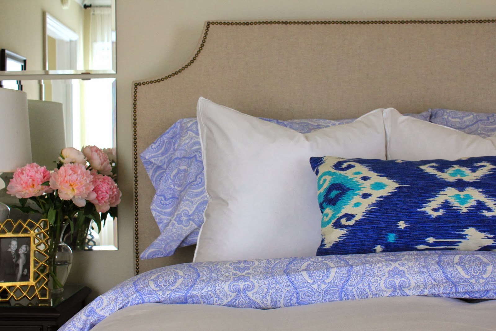
You’ve all seen the glamour shots of my beautiful upholstered headboard, but it took many comments, posts, and private emails from you guys asking me for a tutorial, to get me to put together my upholstered headboard tutorial!!!!!

I’ve conquered my laziness, and prevailed.

For anyone new to the blog, let me rewind a bit… before starting this project (which let me just add, was one of the biggest DIY undertakings I’ve done to date) I’d obsessed for months and months about having an upholstered headboard in our bedroom.  Pinterest was my best friend, and for a while all I was pinning was lovely pictures of bedrooms with overstuffed, soft upholstered headboards.  I loved them all – thick velvet headboards, classic linen headboards, dark headboards, light headboards, tufted headboards, rounded headboards…. headboards with nailheads… headboards with pattern… headboards with detailed cut-outs and sloping sides.

Getting a new bed last year (an upgrade to a California King for my tall honey-bunch) was the catalyst for this project – our brand new shiny bed needed to be decked out, and so the hunt for a headboard started.

To say I felt defeated as I shopped online for an upholstered headboard is an understatement.  They are freaking expensive, people!!  For a California King, we were faced with a thousand dollar price range – especially once shipping and delivery surcharges were factored in.  No way.

After coming up empty handed, I turned to the internet for inspiration, and after reading a few headboard tutorials, I was on board to try my hand at making my own!  This was around the time when I turned to my lovely parents for assistance, so this DIY project became a family affair.

Let’s dive right in, shall we??

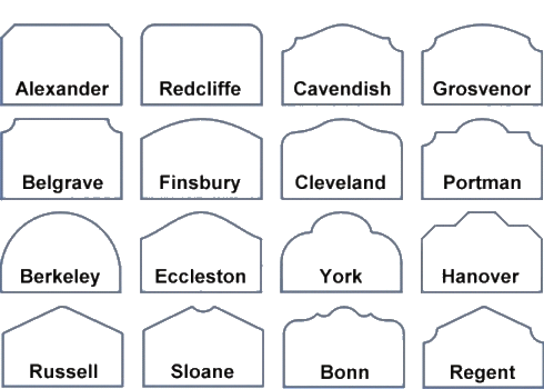
It started with this picture:

It isn’t the sexiest thing, but it really helped me determine what shape I wanted.

Belgrave… for me it was all about Belgrave (and with a strapping name like that, why wouldn’t it be??)

Actually, I wanted something like Cavendish or Grosvenor originally, but decided to KISS (keep it simple stupid… remember that??) and that a simple design = less of a chance to royally mess this up.

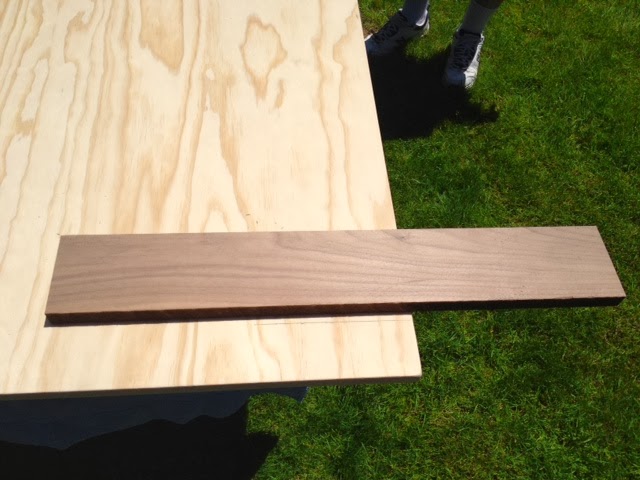
Once the shape was decided on, my mom and I went shopping.  I want to brag for a second… I am the LEAST decisive person ever, but when we walked into the fabric store, and I spotted this fabric it was all over.  Done.  Easiest decision of my life.

It has a beautiful, rough weave, and it’s the perfect color of greige (grey / beige) with nubby bits here and there.

Not only will it conceal dirt fairly well in the long run, but the rough weave promises that it will never look like I was trying (and failing) to “match” other fabrics in the bedding to it (btw, every time I type “rough weave” I can’t help but think of something like this)

Anyway…

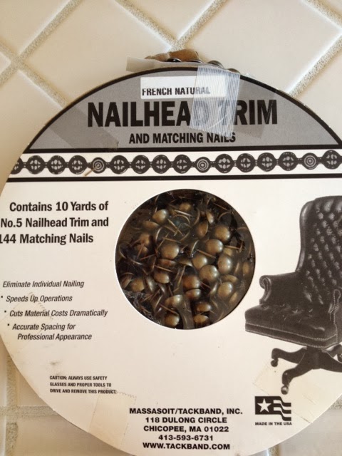
We also ordered us some of these from Beacon Fabrics:

It’s a roll of nailhead trim.  Best. Decision. Ever.

The trim comes as one long strand, and every 5th nailhead or so, you hammer a real nailhead through to anchor it down.  The trim comes in different colors / finishes – we went with the French Natural, and I love it.

Initially, my mom tried to convince me that we should do individual nail heads.

Cannot. Fathom.

We will get to that later… but trust me you guys, nailhead trim is the way to go unless you have about a bazillion hours to kill and the patience of a saint.  As it was, I almost lost my s*** installing the trim so I can’t even imagine the individual nail heads.

Sorry.  It still brings up a lot of emotion thinking about the nailheads.

Ok, moving on.

What else do you need for this project besides fabric and nailheads??

– A big piece of cardboard
– An even bigger piece of plywood (and beware, plywood is heavier than you think!)
– A friend with muscles to help lift and carry heavy plywood
– Batting
– Rubber mallet
– Spray adhesive
– Jigsaw
– Sandpaper
– Staple Gun
– Pencil
– Upholstery Backing
– Straight Edge

If you want to attach legs, you’ll need a few extra items…
– Solid wood (my dad used two pieces of pine)
– Wood Stain (for the legs)
– Bolts (we used 4)
– Bolt cutter
– Industrial Strength File
– Patience

Step one – decide how high you want your headboard to be.  It was incredibly helpful for me to visually see a mocked up headboard behind our bed to determine height with the pillows all stacked up in front of it.  It also helped me determine how big and at what angle I wanted the cut outs to be.

So our bedroom looked really classy for a week or so with this piece of cardboard behind the bed:

Once I decided on my own we agreed on how big the cutouts would be, and how tall it would stand (for reference, I think I went with 68″ tall, and about 5″ wider than our mattress), we went for it.

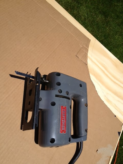
Step 2 – trace cutouts and width on the plywood.

Cut it down to size using a sweet jigsaw.

Side note: I love how easy it was to type out that step.  It’s easy guys!  Just cut it down to size. With your power tools.  That you hopefully know how to use!

That step actually should have said, “Dad, put your safety glasses on before using the saw!!!”

Ok now they are on… now that the saw is off.  Awesome.

Anyway – I have the best dad, who knocked these cuts out in like .2 seconds.  Luckily no eyes were lost or injured in this process.  Bad dad.

Anyway, at this point get out the sandpaper and make sure all the edges are smooth.

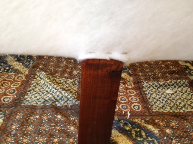
It’s also at this point that if you’re attaching legs to the bottom of the headboard, that you attach said legs.  If you’re in our family and seek perfection in everything, then you stain the legs a few days ahead of time, so that they are pretty (thanks Dad!)

Why attach legs? you might wonder…

Because I wanted the most massive headboard in the world… no because I wanted it to stand higher than our pillows instead of getting hidden behind them once the bed was properly made.  Plywood comes as a standard 4×8′ and so with just 4 feet in height, it needed a little extra from the legs.

This is also a step where you want to be sure to measure everything well!

That should almost go unsaid, and be a general rule in all DIY projects (I can just hear my dad say, “Measure twice, cut once”) but here’s why it’s crucial to be sure on your measurements when attaching the legs…

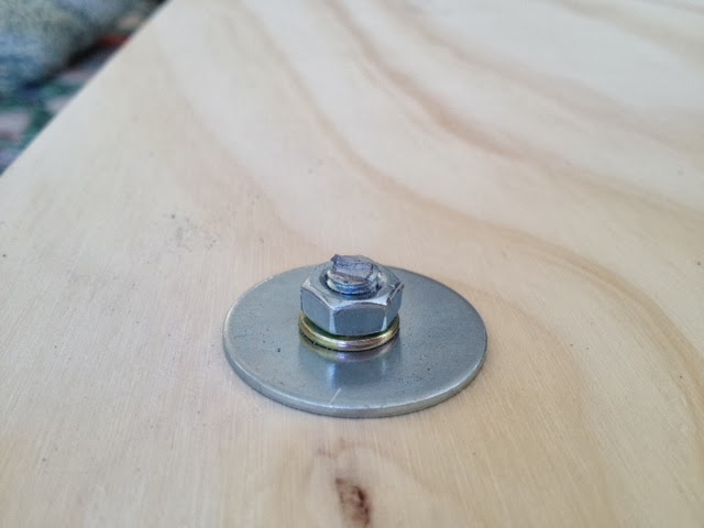
This headboard is really big and heavy, so to be sure it was steady behind the bed, we wanted to anchor it to the bed frame (you CAN anchor it to the wall, but because we rent, wanted to avoid putting massive holes in the wall, attaching the headboard to the bed is key).  Long story short, the legs need to line up with the bed frame, so make note of the bed frame measurements before attaching the legs.

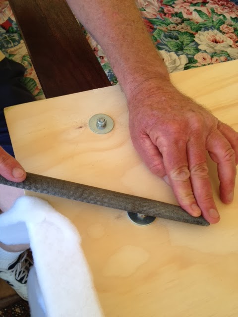
Once the legs are bolted on, we cut down the extra length of the bolts, and smoothed the nub down as much as possible with these tools…

Not sure what the technical term for this tool is (industrial strength emery board?), but it’s basically a huge nail file for metal.  Pretend you’re doing manicures.

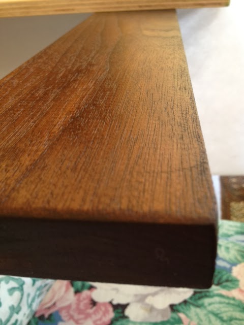
Ok one more glamour shot of the pretty stained legs…

Gorgeous.

Now that you’ve got the base built, and legs attached, take the headboard inside – it’s time to cover it in batting and fabric.

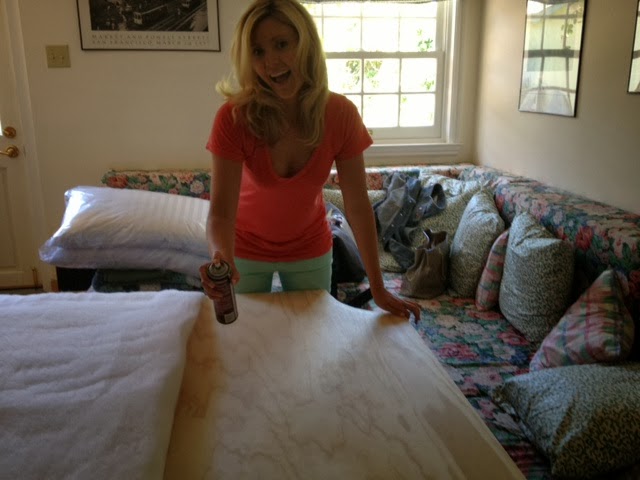
Roll out the batting and bust out the spray adhesive.

Because we’re a family of Type A personalities, we had to steam the batting first.  This is entirely optional (but satisfying).

Once the batting is smoothed out from being bunched up in the package, spray the headboard (the front side) with spray adhesive and smooth the batting from the center to the edges.

The excitement around spraying the adhesive is optional.

Once the batting is attached to the front, you’ll want to pull it tight on the edges and staple it to the back.  Super simple.

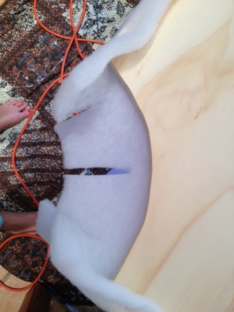
On the curved corners, we cut the batting like this so we could wrap it around the curve nice and tight – no lumps.

See how that works?  Staple it down so it’s secure, and use a hammer to tap in the staples that didn’t sink all the way in.  Cut off the excess batting around the staples.

Repeat this process with the batting another time for a second layer of batting – this will make for a nice cushy headboard.

You’ll notice I didn’t say anything about foam.


We didn’t use foam on the headboard, which is why we wrapped it with the batting twice.  The plywood is really thick, and at first I was really pushing to use foam, but since we weren’t going to do any tufting (that seemed a bit ambitious for first timers) the foam would have made the headboard too thick to have nailhead.

In the end, no foam for us.  Just batting.  If you are going for a tufted headboard, you’ll of course need to use foam, but since we weren’t doing tufting, the batting is plenty cushy.  I believe the batting we used was the high loft as well (in case you were wondering).

At this point, the headboard should really be taking shape! It’s going to feel like you are on the home-stretch…  but you’re not.

Not yet… it still has to be covered with the fabric (and the nailhead trim is still waiting for you).

The obvious next step is to covering the headboard with the fabric – be sure that your fabric is ironed.  To have wrinkles would be a shame after all this work.  We found it was easiest to lay the ironed fabric face-down, lay the headboard face-down over the fabric, and start stapling from there.

Following the diagram below will be the easiest for you to follow where to staple and in what order:

The order goes like this:
  1. Secure the sides
  2. Secure the top and bottom
  3. Secure the curved areas.

Once the core staples are in that hold the fabric to the board, we picked the headboard up and stood it upright to finish the stapling like this.  Having my parents hold it steady while I stapled allowed us to see where the fabric needed to be tighter, etc.

As you go, use as many staples as you want – go to town with the staple gun in fact.  You don’t want the fabric moving anywhere.

After everything was secured, I went back in between all the staples for another round – in the end my staples were about 2 inches apart – one inch in some cases, especially around the corners.

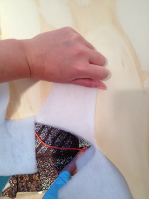
For the curved areas, I used the same method of cutting the fabric towards the board as I did for the batting – this just really helped it hug the curve with no bunching.

For the areas around the legs, just do your best – we turned it under and secured with a staple, but keep in mind, no one is going to see this area pretty much ever.

We forgot that no one would ever see the legs, and ended up trimming it out all pretty with silk tape and nailheads.

Go figure.

We’re Type A, and can’t help it! It’s really an illness!

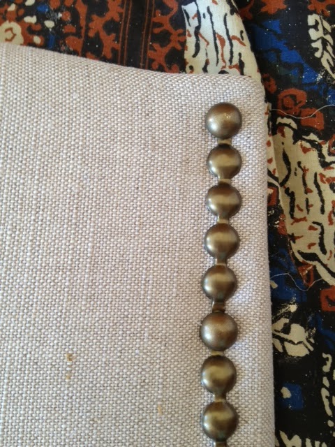
Ok, not to get ahead of myself here… the next step to the headboard is appending the nailhead trim.

I am not going to lie, this was the hardest part, and probably the most time consuming, and frustrating for us because we made a few mistakes (which you can easily avoid).  This is where a straight-edge, two pairs of hands, and an extra set of eyes come in very handy.

All I can say is thank god we got the nailhead trim instead of trying to hammer in individual nailheads.

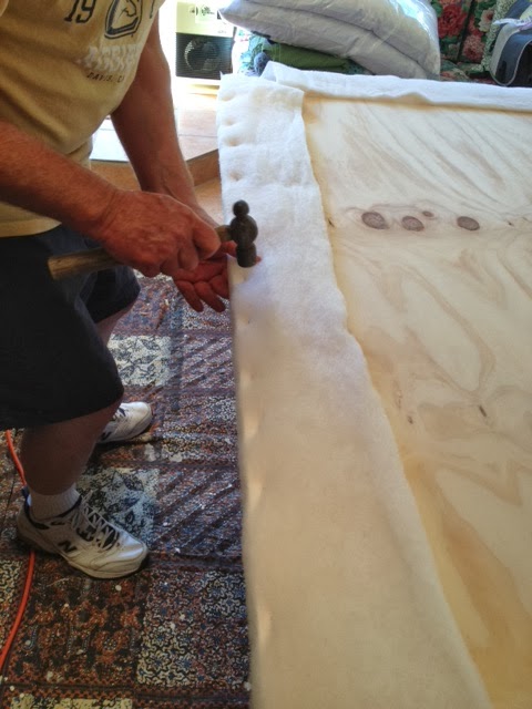
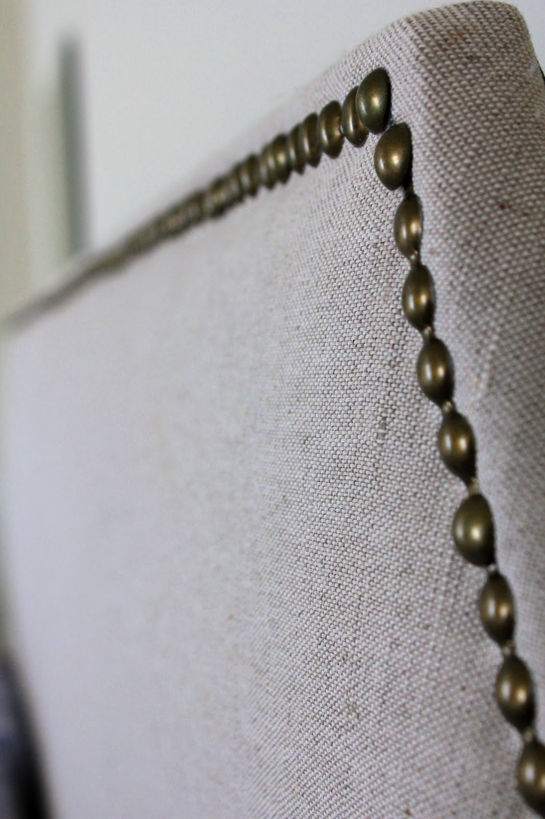
Ok, so this doesn’t take much explanation, but the process here is to lay the nailhead trim down, and use the rubber mallet to pound in a nail head every few beads.  DO NOT USE A HAMMER – you NEED a rubber mallet otherwise all your nailheads will be dented.

When you unravel the trim it should look like this:

There’s a little hole every fourth bead, so you know exactly where each individual nail will go.  Pretty foolproof.  The tricky part is keeping the row running straight.  We used the straight edge and a pencil to lightly draw where the row would go, but use this only as a LOOSE guide.  We layed the nailhead on the line we’d drawn, not realizing that the fabric shifted a bit as we went, so the row started trailing off at a very slight diagonal.

A word from the wise: step back every few nailheads and look at the headboard from a few feet back.

Up close, it looked like we were going straight across the top, but standing back we realized we went off course.  Save yourself the pain because once it’s pounded in – especially to plywood – it’s VERY hard to get it off.

If you keep these tips in mind, go slow, check your work from a few feet back, and be patient, you won’t have to go back and redo all your hard work (like we did).  It SHOULD be easy!

A few other things I wanted to point out…

The trim had really sharp edges! My dad cut himself numerous times on it, and was nearly banished from this project after bleeding on my brand new headboard.

I forgave him.  But only because he’s my dad.

Also, the trim is really easy to bend, so it you’re working on a headboard with curved details, fear not, you can just bend it around very easily.

Finally, it’s relatively thin, so while we used heavy duty snippers to cut it, you could actually even use normal scissors.  It wasn’t that thick.  Promise.

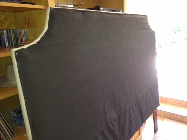
At this point, you’re basically finished – the headboard is cut, legs attached, padding and fabric stapled down, and nailhead applied, but we did finish it off with one final step – which I should add is entirely optional – we finished the back with upholstery backing.

It’s super cheap, and usually comes in black.

We cut it to size and stapled it over the back to cover the raw plywood, and to cover all the unfinished fabric edges and staples.

It really finishes it off, and after spending a full day on this sucker, we were going for perfection!

I mean just look at those glorious nailheads!

And that fabric!!  LOVE!!

So that’s it my friends – the full tutorial on how our DIY headboard came to be.

It’s been almost a year since we built it, and it’s holding up SO WELL!  I mean it’s pretty much still brand new in my mind, and we could not be more happy!

The double layer of batting makes it really cushy to lean against when we’re reading in bed, the nailhead trim adds a little extra detail, and I am still so in love with the shape of the Belgrave.

For the seasoned DIY’ers out there, this project will be a cinch, and even for us first timers, it wasn’t so bad (minus the frustrations with the nailhead being perfectly straight).

If there’s anything I missed in my tutorial, or any other questions, just post them below or email me!  I’m happy to add more detail, or answer any questions you have if you’re attempting this on your own.

I’m not going to make another 50 Shades of Grey Joke…

Oops… couldn’t help myself.

Anyway, I’d posted yesterday about how I made the blunder of painting our living room the wrong color of grey.  That is not going to happen to me a second time around, so I’ve invested many hours since Saturday into researching grey paint colors.

You may remember that I already did quite a bit of legwork on the topic of grey paint last year when I painted the dining room of our last apartment – I’m almost an expert on this topic at this point.

My requisites for the perfect grey:
   1. It must be a very light grey
          *I don’t want to make our living room that gets great light feel like a dark hole.
   2. It cannot have ANY blue undertones
          *I already made that mistake – blue undertones = cold

With that list of requirements, I have narrowed it down to two options:
    – Option 1: Benjamin Moore Grey Owl 2137-60 (but with half-strength tint)
    – Option 2: Benjamin Moore Intense White OC-51

Grey Owl was actually the color that I used in our last dining room (per the recommendation of Emily Henderson), and to put things mildly, I LOVED it.  It was a very pale, true grey, and it reflected light beautifully.  Intense white is a color I recently discovered on several designers’ lists of no-fail paint colors.

Grey Owl is a definite “color” where Intense White comes from Benjamin Moore’s Off White color collection, but you can see how CLOSE they are to one another.  That said, I plan on lightening the Grey Owl (if that’s the route I go) by 50% so it will be even a bit brighter than this sample… a very close match to Intense White.
Intense white has a SLIGHT tan undertone, but it really is minimal.
Want to see some examples of each??
I knew you did.
Here are a few rooms in “Intense White”:

Intense White is a wash of color – nearly white but you can see that next to the white crown moldings in most of these photos that it’s not White.  There is contrast, and that is just exactly what I’m looking for.  Contrast, in a non-color color.
And here is a beautiful space with Grey Owl, where the tint has been cut in half:

I already know which one I’m leaning towards more, but I’m curious to hear your opinions!  Which do you prefer?

Is there another light grey color that I’m missing and should consider as well?

One step forward, two steps back…

Hope you all had a fabulous long weekend! Our was spent unpacking A LOT, organizing, and purging of all the stuff we don’t need.  There is a LONG way to go still, but any progress feels good!  In between all the unpacking, and seemingly endless errands, we enjoyed some pretty sunsets off the back deck…

… we also started up season 2 of House of Cards… in bed… with coffee.  Such an indulgence!  Side note: is anyone else as obsessed with Kevin Spacey as I am??? I love evil Kevin Spacey and his saucy southern accent.

And my honey got me some absolutely GORGEOUS flowers for Valentines day…

Aside from smelling the roses, admiring pretty sunsets and watching TV in bed, I made some progress on the living room… kind of.

I painted.

It all started out great! All the holes were getting patched, cracks, chips and wall scuffs from four years of wear and tear were getting covered up, and the paint was going on as a pretty light grey.
I even had a little fun with the paint before rolling the walls out…
All fun and games right??
Wrong. 
Somewhere between belting out a Taylor Swift song, and starting in on the second coat, the paint started to dry.
That’s when things took a turn…

While I was confident at first, the paint was getting darker and darker as it dried… and more and more blue.

Nooooooooooo!

In direct light it wasn’t so bad, but the blue (lavender almost) undertones were feeling very “baby boy’s room”.  Let me tell you, after painting all day, this was NOT the look I was hoping for.

Can we say dark dungeon??  Ugh, it is not good my friends.

Granted, it was a rainy day, and this picture was taken in the late afternoon… but still.  STILL.  It’s like purple in the above picture!  Ick!

To add insult to injury, the warm lamp shades, tan sofa, and creme colored curtains I hung afterwards weren’t helping matters…  The yellow tone of them accentuated the blue even more.

In this next picture you can see how yellow the curtains looked next to the “grey” and how blue the grey looked next to the creme colored curtains.

Ignore the weird colors in this photo – I used the HDR filter on my phone since the light from the windows washed everything out, but

That night I swapped out the creme colored curtains out for white ones, which dramatically improved things, but the walls still look very blue to me.

More bad iPhone pictures, but I just wanted you to see the grey walls in daylight with the white curtains.

The color is called Silver Screen (by Behr) and while the sample on the paint chip and on the lid of the can looked like a pretty pale grey, it reads as blue/purple on the walls.  Hello Monica Geller’s apartment.

Right??

Needless to say, I’ll be repainting in the near future.  For now it’s livable, but I have grand visions for this space, and they don’t involve lavender walls.

Ok, moving on….

Ok, so what do I see changing in this room??  A lot.
So far, we’re just working with everything we had in our last apartment, but I’m pretty adamant about selling some of this stuff, and replacing it with new things – namely, a comfortable new sofa (this is non-negotiable), and a new coffee table.  Those are the big items on my checklist.
I’ve saved the below pictures to my phone for inspiration in this room.
The name of the game is light and bright… classic, clean lines, and natural fibers.  
In the below photo, I love the bright pretty linen curtains hanging in this room, and the neutral linen couch.  It’s clean, and simple, and inviting.  Everything I want in our living room.

This next photo captures the simplicity and color palette I want – the true grey on the walls paired with lots of white.  It’s clean, inviting, and easy on the eyes.

I love the white sofas, natural wood elements and lots of greenery… so pretty.

And then of course, this next photo is one I’ve posted before…

It’s obviously decked out for Christmas (and has a lot going on because of that), but the pale pale PALE grey walls are perfection, along with the natural fiber rug, white sofa, and lots of black and white sprinkled throughout.

Now that I’ve made my mistakes with the paint on the first go round, I’m going for round 2, and this time, I’m determined to get the right color of grey.

The one thing I’m thrilled about so far??

My new natural fiber rug – it’s looking very handsome with the cowhide.

Stay tuned for more updates my friends…

I’m Back… Oh, and we Moved!

Thank you for all the sweet comments and emails over the past few weeks!  So touching, and it really means so much!  So much has been going on (and so much is STILL going on), but I’ve really missed my little blog and wanted to check in with you all!

In the last month since I checked in, the big update from my world is that we’ve moved!  It was a very tiring Saturday for me last weekend – especially after getting back from NY in the wee hours of the morning – but we survived! Even in the rain!

This is what the dining room in our new apartment looked like on Saturday morning before the movers started unloading…

And…. here’s what it looks like now…

This is my life.

Not to scare you, but this room is looking 100% better in the above picture than it did at the end of moving day!  We’ve probably unpacked half of the boxes that were in there before, so this is a HUGE improvement! Just use your imagination to picture what this looked like Saturday night.  You literally could not walk through it… this is progress my friends!

More exciting news… I finally unearthed the box where I packed my underwear… so that’s a plus.  I’ve been living out of the suitcase I’d packed for NY and was at the end of clean clothes, so it was vital that I found that box last night.  Mission accomplished.

I’ll post more “before” pictures of the apartment for you all before we do anything in regards to updates, but I wanted to talk about the entryway for a few minutes.

This apartment, unlike our last apartment, actually has a little entryway.

This is the view walking in the front door.

Immediately after walking in there are two archways leading to the formal dining room (on the left) and living room (on the right), so this little entryway is the bridge between these two very open spaces.

This picture (above) is taken standing in the middle of the living room, looking back through the hall to the dining room.

And this picture (above) is taken standing in the middle of the dining room facing back through the hall to the living room.

Bright, light, and airy – which we love – but because all the rooms are connected, this means that as we decorate, all the colors and patterns in each space need to speak to one another since you’ll easily be able to see them all.

The hardwood floor is also great, but there is a lot of it in a very open space which means that its EXTREMELY echo-y right now. The answer to this problem is rugs. The entry space is not necessarily wide enough for a 4×6 rug, and I’m not the hugest fan of the circular rug, so I think a runner in the entry is our best bet.

Right now, the walls are a creamy yellow color, and it’s not bad at all, but I really want to accentuate how bright and pretty this space is.  There are holes to be patched, and the place hasn’t been painted in at least 4 years, so it’s the perfect opportunity to freshen things up.

I’m thinking a fresh white paint in the entry will bounce around as much light as possible from the bay windows flanking each of the surrounding rooms, and it will serve as a neutral background between the living and dining rooms (for which I’m thinking a pale grey).

So now that I’ve got the color palette of the walls somewhat settled, I set out looking for a runner, and ended up finding one really quickly that I like.  Oh and did I mention that it’s extremely discounted?? It’s ~$50… With free shipping.

Does it get better??

Isn’t she pretty?

Navy in my mind is the softer, more preppy version of black.  I love it.

If you remember, we also had a somewhat similar grey trellis rug in our living room and in the last two years, it has served us well.  Not only has it held up, but we haven’t tired of it one bit.  In the new apartment it has moved from the living room to our bedroom.  There’s a new natural fiber rug in the living room which totally changes the look and feel of everything.

While the navy runner has a similar feel to the grey area rug we already own, it’s different enough (in both the pattern and colorway) to be distinct.  I’d originally been thinking of a rug with a more linear pattern… maybe black and white… but I think that the majority of this being navy, and that the accent color is creme (not white) will really help mask dirt from heavy foot traffic.

I unfortunately wasn’t able to sell Kris on the look of a worn rug… can’t win ’em all folks… and since he really likes the grey trellis we have, I think this is something we’ll both be really happy with in the end.

Now that I’ve picked out what runner I want… it’s time to think about coordinating rugs for the dining room (that will most likely end up as an office).

I found a few that I like, and threw together a quick inspiration board just to see how they’d mesh next to each other…

Option I: Creme Colored with Abstract Ikat

Pros:
I love that this feels a little masculine, and I love that the pattern is really distinctly different from that of the runner.  I also like that the colors are pretty much identical so in terms of coordinating, they match, and while the colors are identical, each rug has the inverse color-weight of the other (one has more cream, one has more navy)

Cons:
Is it too matchy matchy in terms of colors?  I don’t know.  I also just sold the off white rug that had been in our bedroom because I was never fond of how “off white” it was.  I always wished the colors had been inverse, with the cream color in the trellis print, and the background the richer taup-y color… will I feel the same about this?

Option II: Ikat Damask in muted blues 

Pros:
I love that this looks sort of aztec while also feeling somewhat traditional at the same time.  I love the tassles on the end, and the variation in the blues.  It’s just really pretty to me… and I also like that it’s not only VERY different from the runner which is really geographic, but that it’s different from any other rug we have in our house right now.
Cons:
It looks really flat.. which I like (visually) but I worry that it will move around too much on the hardwood floor because it’s lighter and has less structure.
Decisions, decisions…
Honestly I see the pros and cons to each, and I think I’d be happy with either, but I need input. I know which one I’m leaning towards more, but what do you think??
While I’m not 100% certain about which rug it will be, but I do know one thing for sure…  It feels good to be back!  I’ve missed you guys!
xo

Three Cocktails to Liven up your Holidays

It’s 5:00 somewhere… am I right??  Today I’m participating in the link up party at The Lovely Cupboard, where there is bound to be quite a few yummy cocktail recipes abound!
After getting our new bar cart, I went wild at BevMo, so we are stocked to the gills with delicious holiday beverage accouterments…. everything from brandied cherries (these are just AMAZING in a manhattan), to flavored syrups, whiskey, vodka, mixers, and LOTS of champagne… 
To keep things feeling festive, I’ve devised three holiday cocktails to perpetuate that warm feeling of holiday cheer (or is that warm feeling from taste-testing three different cocktails in the afternoon…)
The hard part about this post wasn’t coming up with three cocktails, but, actually limiting myself to just three!!  I had a little too much fun with this one!
The first cocktail up, is the Rose “merry” and Cranberry Cooler… ya like that name??
I, for one, LOVE mixing savory and sweet flavors, and the rosemary in this recipe gives this cocktail a nice earthy balance.  
It also could not be easier to concoct this bad boy, and it’s as delicious as it is pretty!  I mean come on… red and green??  It doesn’t get more festive!

Ingredients:
  – Vodka
  – Unsweetened Cranberry Juice
  – Simple Syrup
  – Rosemary
  – Ice
  – Campari

Directions:
Muddle Rosemary in your cocktail shaker.  Pour in one part vodka, two parts unsweetened cranberry juice, one part simple syrup, and 1/2 part Campari.  Add 4 large ice cubes, and stir 30 seconds.  Strain into martini class (or here, I used a pretty crystal coupe from my mama).

This drink is sweet, but also bitter (from the campari) and a bit sour from the cranberry juice, and earthy from the rosemary.  It’s a little TOO good…

If you’re not a fan of Campari, just leave it out – I made a second version without it, and it was also absolutely delish!

Next up, is the Orange & Mango Fizz…   This is a bit of a twist on the classic mimosa, but the bitters and the mango spice it up a bit… 
Ingredients
  – 1 orange wedge
  – 2 1/2 cups sparkling wine, prosecco or champagne
  – 3/4 cup mango nectar
  – 1 teaspoon orange bitters
  – orange zest twists, for garnish
Directions
In a large pitcher, combine the wine, mango nectar, and bitters. Serve in a champagne flutes, and garnish with an orange zest twist.
It literally could not be easier, and this serves four! Perfect for Christmas morning if you ask me, and aside from the mango, most people have everything else on hand already!  If you don’t usually keep bitters on hand, you should start!  Great in food (mainly sauces, soups and broths as an aromatic) and drinks.

Finally, onto dessert…. err… I mean dessert drinks.  
The Snowy White Russian is so sweet and yummy, you’ll want to skip the fig pudding… or yule log… or grandma’s fudge, or whatever traditional Christmas dessert you have!

Ingredients
  – Vodka
  – Kahlua
  – Milk (I’ve used non-fat before, but 2% is better)
  – Chocolate Syrup
  – Whipped Cream
Directions
Combine one part vodka, one part kahlua, and one part milk in a glass, stir.  Add three large ice cubes, and top with whipped cream and chocolate syrup.

You can thank me later.

Making this one totally took me back to my college days – my girlfriends and I would make these on a regular basis, regardless of season, and now I remember why.  They are SO GOOD.
I mean… YUM!!  Can we get a close-up glamour shot here??

Ohhh yeahhhh… nom nom…

And how cute are these glasses?

Kris got them from his sister as a birthday present, and I’m kind of obsessed (they originally came from Restoration Hardware although I can’t find them online anymore).  They are labeled to measure out how much “medicine” you might need after a grueling day of caroling, or an especially brutal snowball fight…

Super cute, right??

So that’s it!!  Do you have any favorite holiday beverages??  Mulled cider?  Mulled wine?  Some sort of yummy whiskey cocktail??  A hot toddy???  I could go all day people!

May your holiday’s be merry and bright(er) with these fun cocktail recipes!

xoxo

Holiday Shelf Decor

Hello friends!

I’ve been sick as a dog, spending as much time as I can in bed resting, but I’m stopping in briefly today to post a few pictures of the holiday decor I’ve added to the shelves in our dining room / office.

Everything we added to this space was either re-purposed from past years, or it was free…
One of my favorite parts about the holiday updates on these shelves were the “chalkboard” printouts from online.  I just took the prints that were previously in these frames and swapped them out.  So easy, and it cost me nothing – my favorite kind of update!
I also took the faux holly berry sprigs that had been in our living room last year, and cut the stems short, putting the berry branches in a few small pots we had on hand.  Another super easy, free addition, and it added instant holiday cheer to the shelves.
The faux potted amaryllis was a score from Target last year, and is livening up our pretty little bar cart.
This is not a “Christmas” update, but you might also notice a pretty addition here… my mom gifted me one of her crystal decanters!  I am dying to get some port decanted in there, but for now, it’s just looking very pretty.
Also, not holiday specific, but the striped red straws were another Target find recently!
On the other side is a pretty close mirror image… in a small space, keeping things symmetrical helps keep things from feeling super busy…

Notice the fake snow tucked behind the pot of berries?  It’s actually fake cobwebs leftover from Halloween.  Woot woot!!

On each of these shelves is a little project I worked on – the stacked paper Christmas trees. I got the idea from this post on Style Me Pretty from last year, where they made all these adorable paper Christmas trees. Mine didn’t quite come out the same, but they aren’t terrible either…
I ended up cutting up one of my Sookie Stackhouse books for this project (don’t worry, it was not some piece of classic literature) – different sized square pieces, and stacked away.  I used the leftover branch from cutting down the holly berries for the tree trunk, and called it a day.
Next time around I’d use thicker / stiffer paper, and more of it, so each tree was bushier, but for a first attempt, it wasn’t a total fail.

I especially love this space at night… there are lots of candles in here, and it creates the most cozy atmosphere…

I kind of hated the full mirror wall for the longest time, but while it’s totally 80’s, it also does make the small space feel more open.  I also love that it reflects back the twinkling lights of our Christmas tree…

So that’s all for our dining room holiday updates…

It’s festive, without being over the top, and they were all easy, inexpensive (or free) updates!  Ok, back to bed for me…