Indoor Plants – the Olive Tree

If I could pick the number one thing that I have learned in the past several years while decorating our home, it would be that no matter how good your taste is… how much you accessorize a table, or bookshelf, or how lovely all your furniture is, a room never feels truly complete, or alive, or even as beautiful as it possibly could, without a plant.
Not even kidding.  As soon as I brought our first live plant home, and saw how the added greenery changed that room, I’ve made a conscious effort to bring more plants home.  Not cut flowers – which I do love – I’m talking about a live plant.
For the past several years, I’ve been ALL ABOUT the fiddle leaf fig.  Totally drank the cool-aid, and as much as I still do love them, I’ve been on the hunt for equally beautiful, dramatic indoor plants to bring home, and guess what my friends??  I think I’ve found it…
The Olive Tree.
I love that the dwarf olive tree is a little like a topiary with the round leafy top, and the tall spindly trunk.  The grey-green leaves are more subtle, and earthy, and I just love how they look in these clean, minimalist spaces.
The above picture is one of my favorite images of all time. It was the background on my phone to remind me to simplify, and to remind me how lovely a clean slate can look.
I really like how the rustic look of these mini trees are still elegant while being a little wild.
Can’t you also imagine these flanking a fireplace, or being dolled up for the holidays?

I did a little research already, and apparently they can do well indoors in a pot – they can’t sit in very wet soil, so be careful when potting originally to use a more arid soil that will drain… they also like to be rotated in direct sunlight, but overall, they seem like they could be a real contender for an indoor plant.

Anyone have any expertise on the subject here??  This notorious plant killer novice plant care-taker would love to know!!!

Curtained Bed

Happy Tuesday friends!  Wanted to pop in today to talk about bedrooms – most specifically about curtained beds.
Often, curtains surrounding a bed is associated with the old fashioned canopy bed of the 80’s – oh what the eight-year-old version of myself would have given for a canopy bed… unfortunately, that’s not quite what I’m referring to.  
I’m referring to the revamped version of the traditional canopy bed – the new version where the curtains meet the ceiling, and cocoon the bed while remaining fully detached from any bed frame.
Still not sure what I’m referring to??
See what I mean?  
The curtains are actually connected to a track or curtain rod that is attached to the ceiling, and these new curtained beds offer the softness and same cozy effect as the more traditional canopy bed, without the closed-in, borderline claustrophobic feeling that they sometimes give.
I’m 100% in love with our upholstered headboard, but I do really love the look of these – especially with the white or lighter shades in the curtains.  
So clean, and light feeling, and while a canopy bed can feel a little stuffy, and overly traditional, these actually feel quite modern.
What I love most, is that they seem relatively easy to install, and inexpensive.
They would be fabulous in a studio apartment, for separating the “bedroom” from common living spaces, or even in an open loft space, where it can be really tricky to carve out each “room” from a wide open floorplan.
The other thing about using curtains to flank a bed that I really love, is that you can save some serious money on the bed itself.  
Headboards and bed frames are really pricey, so this would be a really great option for those on a budget, who are looking to make a large impact in their bedroom without spending a fortune.
All you need are some sturdy curtain rods, curtains (or sheers even), and a standard bed-frame, box spring, and mattress.  
I’d also encourage the use of a dust ruffle to hide the less than attractive metal bed frame – something simple like the one in the photo above would be perfect.
On average, the cost of a queen size headboard or bed would range from $800 to upwards of several thousand dollars, whereas if you shop smart for the materials you’d need for a curtained off bed, you could pull off this project for less than $200 easily.  Depending on the hardware, you could even swing it for less than $150.  
What’s great is that the curtains take the place of a headboard, footboard, and bed frame, and make it feel really grand, and expensive.  If I were to do this, I’d probably stick with lighter fabric for the curtains, but there are several different styles for this that I’ve seen and like.  The trick is to find curtain panels long enough to go from floor to ceiling – if the curtains are too short, it’s a no-go.
Ikea is a fabulous source for curtains – some of my favorites are these curtains for the lighter linen look.  I actually have them hanging in our living room (white) and dining room (light grey), and I just love them.  They are thick without being too thick, they are quite long (98″ which would accommodate an 8′ ceiling – add curtain rings for extra length) and they have a really nice organic texture.  
This person actually used the Aina for this exact project (link here):
 **I think I might make the curtain rods just slightly longer so the curtains hang straight down… they look a bit short which is resulting in a bit of a “leaned” feel…
I also like these heavier velvet curtains for a deeper, cozier feel…. and hey, if they are good enough for Emily Henderson, they’re good enough for the rest of us!

These curtains would be really fun in a child’s bedroom flanking a bed… 

Aren’t they just darling?
I’m also no expert, but I feel like they’d create a really peaceful place for nap time.  Heck, maybe I’ll start adopting the daily nap if I got to sleep in a light and airy, curtained off bed.
What do you think? Would you ever try out a curtained bed?  
It seems like it would be so peaceful to be able to close the curtains, and for light sleepers who are easily bothered by light, this seems like an ideal solution to me!

Dark Moody Rooms

Good morning friends!!  The last several posts I’ve had are mainly about progress on our own apartment, but I’ve been thinking a lot about dark moody rooms.

 Maybe it’s because all the fall clothes have hit the stores and I’m waiting for the perfect opportunity to bust out my new faux fur vest.  Maybe it’s because it’s been foggy and cold in San Francisco, and the drippy, dreary days have me ready to hibernate and think about pumpkin spiced lattes, and cozy nights, and big glasses of red wine while the wind howls outside. Or maybe, these rooms are just so beautiful and I can’t resist.

Don’t get me wrong, I’m still craving warm weather and summer nights, but mentally I’m in the fall mindset.  Don’t you think there is something so inviting about a dark moody room?  It is an invitation for dim light, candles and ambiance.

It’s probably (definitely) not something I’ll be trying out in our current apartment, mainly because our place is not super large, and because all the rooms are pretty open to one another, but I’m really into this look – dark walls, dark furniture.  IF (and that’s a big IF) I were to test this in our current place, it would probably be in our bedroom since it’s the most separate from the rest of the house, and because the dark walls, and dark furniture would feel really calm, cozy, and sleep inducing.

Normally, you’ll find rooms with dark walls and lighter furniture, or lighter walls and dark furniture, but I’m loving the combination of dark with dark.

I’m also finding that the rooms I love best with this dark on dark use rather monochromatic hues – the first picture (and one of my favorite spaces in general) has the ink curtains next to the ink sofa, next to the dark grey window frames, and everything is on top of the inky purple rug.
In the photo above, everything is painted in the same dark taupe.  And below the walls, and rug are nearly the same shade of grey.
This next photo, the walls, columns and ceiling are the same shade of grey, and only the sofa and flowers bring color to the space.
What I find really interesting too about all of these spaces, is that they seem to work best with more traditional details.  The moldings, and more ornate mirrors.  Classically tailored sofas, chairs and ottomans, panel curtains, and a good dose of brass.  
I think that these traditional elements keep these spaces from feeling cold, even through there is so much dark, and drama going on.  They still feel inviting.  They say, come bring your cup of tea and tattered copy of Pride and Prejudice in here for the afternoon.

What do you think?
Would you ever experiment with a dark and moody room in your own home?

Fab Finds in an Unexpected Place

It’s been a while since I last checked in here, but after browsing through the World Market site, I felt compelled to stop in.

Is it me or is World Market having a moment right now??  Have you been??  I’m dying to check out some of their stuff – furniture, lighting, and especially kitchen supplies.  I’m not getting paid in any way by them to post this – I just am very VERY impressed right now.
Case in point??  This chair.
I feel like it belongs in Mad Men.  A far cry from those papasan chairs that my sister and I used to roll around in when we were kids. 
We’re looking for a comfortable side chair for the living room right now, and if this is comfy, it could be a real contender!  I am dying to go check this out in person!!  Gorgeous!
Another favorite find?  This pendant.
And such a good price too!
I’ve been keeping my eye peeled for a different overhead lighting options for our dining room, entry, and bedroom, to replace the boob lights that are everywhere in our place.  Don’t know what a boob light is?  Google image it… there are thousands of examples.
Don’t get me started on these nesting tables…
The top is beautiful with the hexagonal wood inlay.  They look so much more expensive than they are!
There are some really cook kitchen finds as well… I LOVE the marble lazy susan, although a part of me wishes it was just a cheese board.
This Utensil Canister is also really lovely, and I’ve been looking for a replacement for our sad little one I’ve had since my college days.
I love the look of this “dipped” salad bowl – super organic and simple.
And speaking of simple, organic stuff… I’m loving the grain-sack napkins and tea towels that look like they came straight out of a small shop in Provence.

And how cute is this cutting board???
Finally, for a little glam… this tray is really lovely.  Looks like something you’d find from Horchow…
What do you think?  
Have you found any inspiring pieces in unexpected places recently?

Pineapples are the "Owl" of 2014

Anyone else agree??

Do you know what I’m even talking about??

I’m calling 2013 the year of the owl.  Everywhere you turned, everything was in the shape of an owl…

Owl shaped lamp bases, owls on thank you notes, in photographs, on plates, baby clothes, salt and pepper shakers… seriously… they were everywhere, and I’m not even going to lie. I was onboard.  I have several owl figurines, a framed print of an owl (which I still love very much) and I’m sure several other “owl” things.  I got totally caught admiring “owl” things here, here, and here

This year, it’s the pineapple.  They are everywhere – do you notice them?  If you didn’t before you certainly will now!

You can’t walk down an aisle of lamps without seeing a pineapple among the group… here are a few that I’m admiring:

I love this white one from Pier One – for one, it’s totally affordable ($99!!!), and the white / gold combo keeps it looking classic, and glam.

The yellow on the next two is just so fun. This one above is a take on the Horchow version (below) – very playful, but not for those that are shy of color…
If you’re not into a pineapple lamp, perhaps incorporating pineapples via a piece is art is more up your alley?
Again, the burst of color in this print below is super fun, and kind of a great way to transition a space from winter and spring, to summer.
If a pineapple print doesn’t say “summer” I don’t know what does!

Still too in-your-face with pineapple art?  Turn to your bookshelves – the perfect place to display more funky pieces.
I love this white ceramic pineapple – would look really pretty against a dark back of a book-shelf.
Or go for book-ends to corral your books… these brass bookends are quirky without being “out there”.

What do you think?  Are you going to jump on the pineapple band-wagon??

I’d love to personally – I think the pineapple lamps are really fun, and it’s actually a really classic image – I’m sure Williams Sonoma would agree:

While I want to get my hands on something pineapple (because they are sooo cool), I’m exercising restraint.

My next endeavor is to clean through all the accent pieces I already have, and weed out the ones I’m no longer in love with before I can add any pineapples to the mix.  We have about 3 boxes in storage that are full of decor accents, and we just don’t need them all.  A purge is on the horizon, and maybe as a reward when I’ve finished, we can see about a little pineapple piece 🙂

Happy Friday my friends!!

Our Finished Shelves and a few Bookshelf Styling Tips

Big week for the blog… second post this week!  Woot woot 🙂
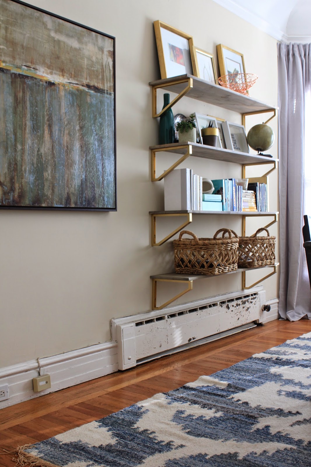
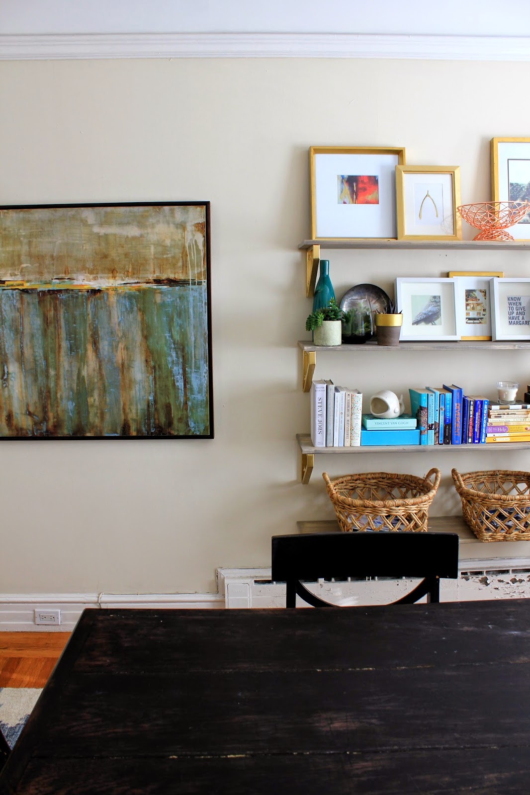
Earlier this week I posted about the rustic shelving DIY project that I worked on, and today I wanted to share some photos of the completed project, now that the shelves have been styled.
I am certainly no expert on styling bookshelves, but I did learn a few things as I went – especially after several failed attempts at styling them.  They were looking messy.  Cluttered.  And I was frustrated because I loved them with nothing on them, and was hating them with all our stuff.
The challenge for me, is that these shelves are not just for display.  They actually needed to be practical (ugh, I hate practical) and store things – mainly books and magazines.  It’s not like we have a ton of books since I have done most of my reading on a Kindle for the last several years, but we do have SOME, and I’m not willing to part with most of them.
All my design books, which happen to be big and beautiful and perfect for styling a bookshelf are all in the living room for easy grabbing.  I like to leaf through them on weekends or at night when we’re watching TV, so those weren’t going on the bookshelf.  
All my cookbooks that are also large and gorgeous are in the kitchen for obvious reasons.  So that left me with only a few hardcovers, and a lot of paperbacks.  Not ideal for “beautiful” styling, but that’s what needed a home, and we live in the real world… not the pages of House Beautiful… unfortunately.
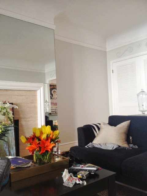
Ignore the radiator… looking at these photos makes me realize how badly that needs to be sanded and re-painted…

All the shelves I loved on Pinterest and in design magazines weren’t necessarily functional… they housed gigantic seashells, and cool candlesticks… driftwood… cloches with cool weird stuff inside.  Not helpful.
So per usual, I turned to Google. 
“How to Style Shelves”.
Search.

OODLES of results came up, and I recognized a few of my favorite bloggers among the results. Little Green Notebook. Censational Girl. Emily Henderson.  Queen of bookshelf styling.  Seriously.  She wins.

After reading all the tutorials, there were a few key points that stood out. As I worked at re-styling the shelves, these tips REALLY helped me put together an arrangement that I was satisfied with in the end…
Here are the tips I found most helpful as a guide:

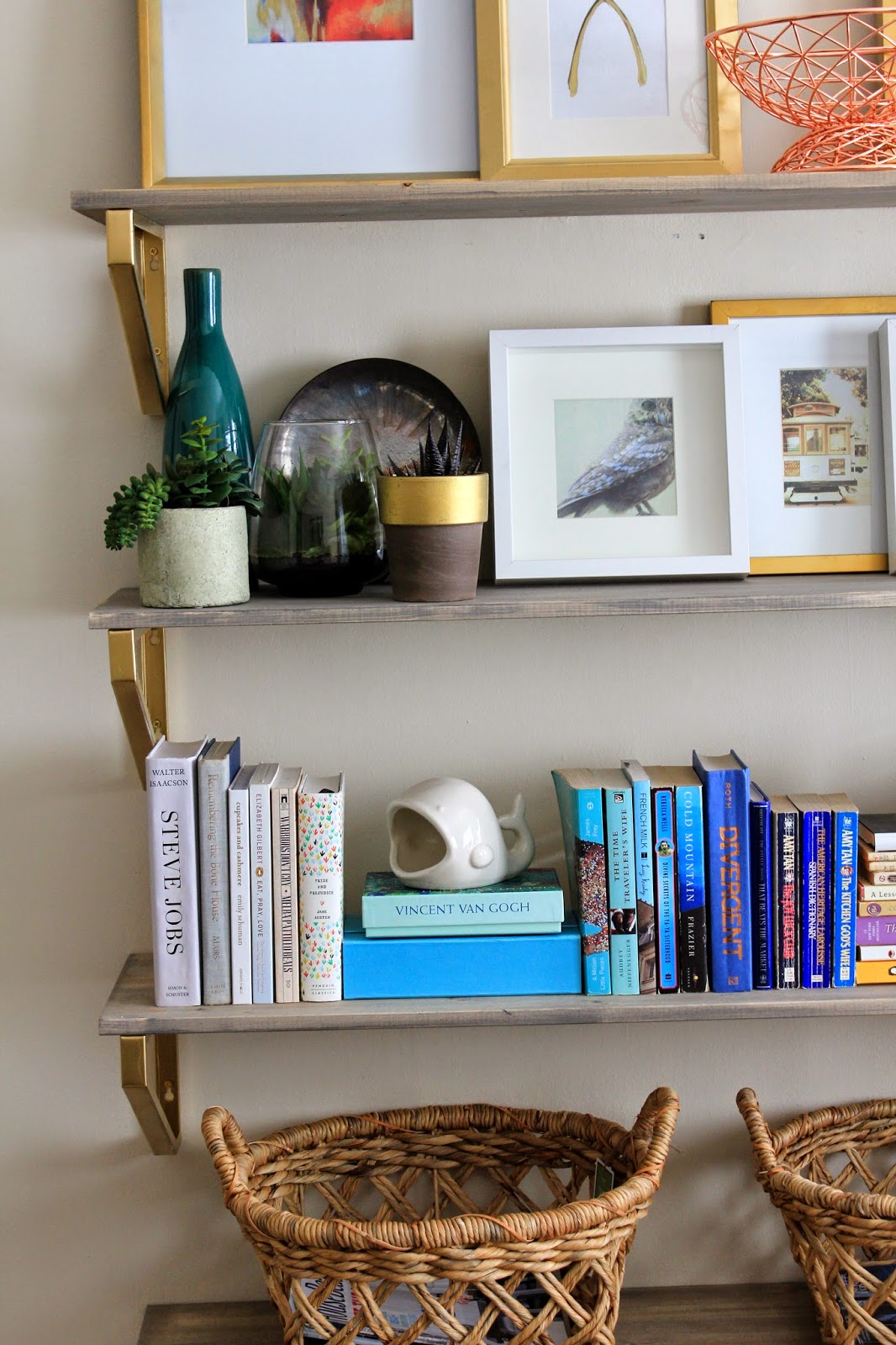
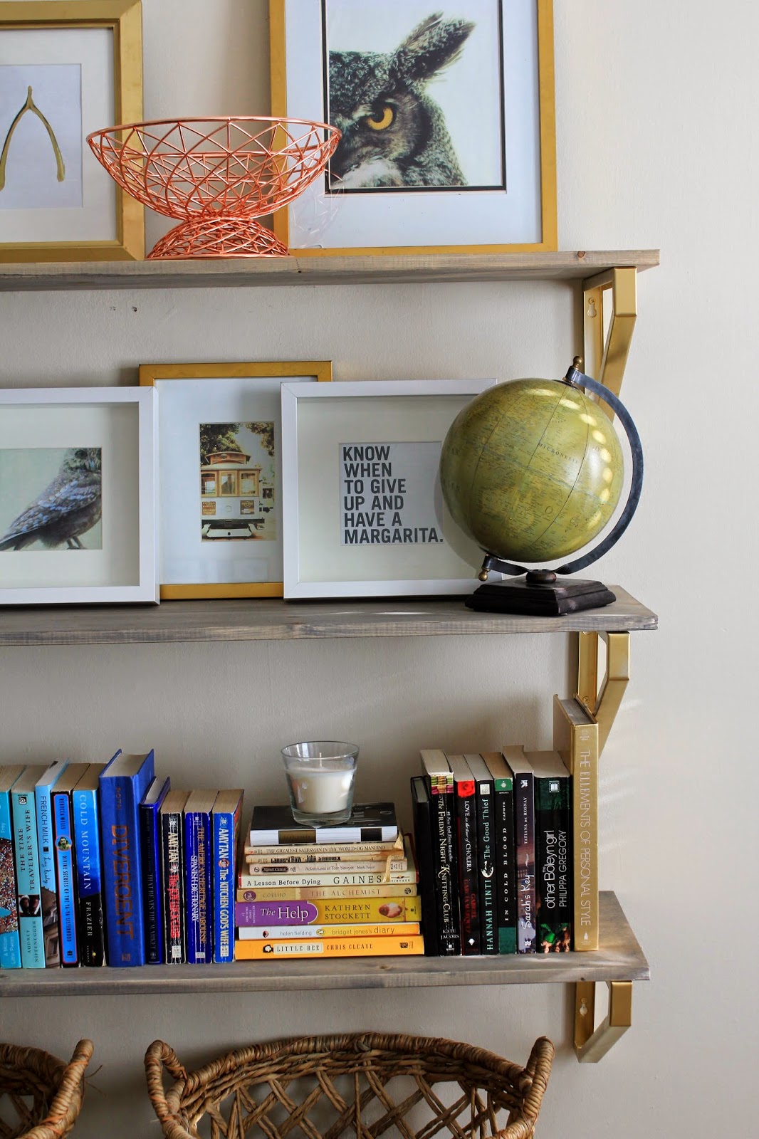
Start out with the largest pieces and then add the smaller.
By arranging the large pieces first, and filling in sparse space after, the end result was more balanced, although even looking at these pictures I see a few things I’d like to change.
Group like with like.
I kept photos together, books together, and small decorative items together.  In my first attempts, everything was too scattered, and there was no place to rest your eyes.  There were books on every shelf, photos on every shelf, and it ended up feeling really busy.
By grouping things together, it instantly “makes more sense” when looking at it – especially keeping the books together… which brings me to my next super helpful tip…

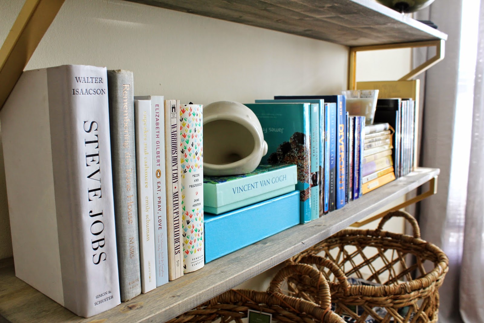
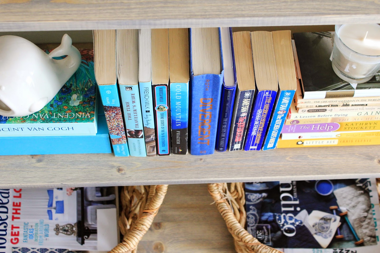
When organizing books, group by color.

Game.  Changer.

I started sorting books by color category and quickly realized that with the exception of maybe 4 or 5 books (that as a result aren’t on the bookshelf), everything fell into the following color palates:
   – white / neutrals
   – blue / teal
   – yellow / gold
   – black

Grouping by color is not only pretty, but also cleans up the chaos of the book spines when they’re all lined up

While on the topic of arranging books, alternate books by stacking them vertically AND arranging them in rows.

This will also help to make everything more visually appealing.  Apparently (and this was news to me)  there are seven… yes SEVEN… ways to stack books.  If you’re curious like me, you can read about them all here.

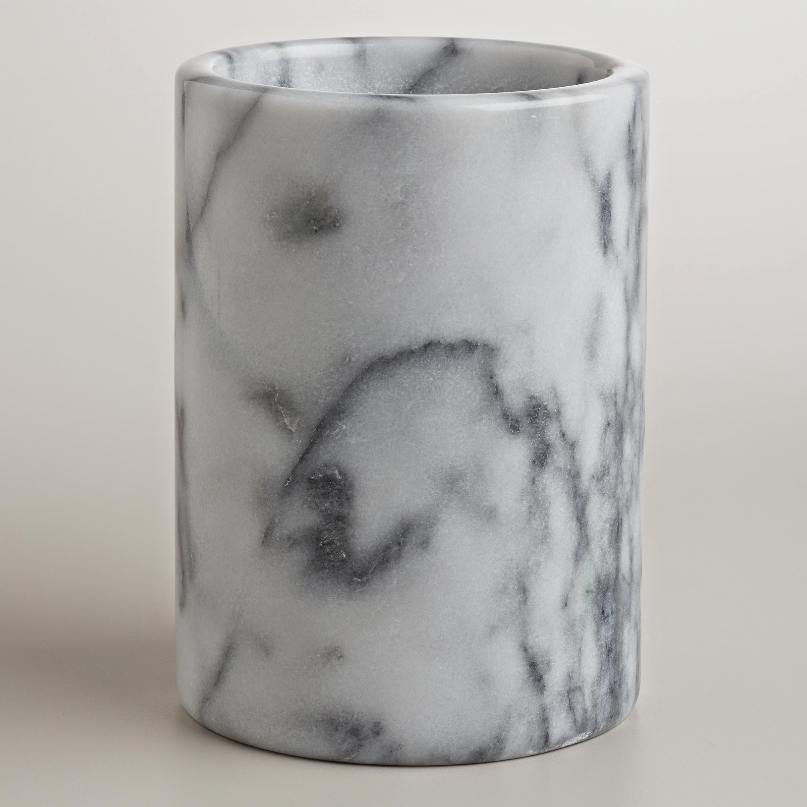
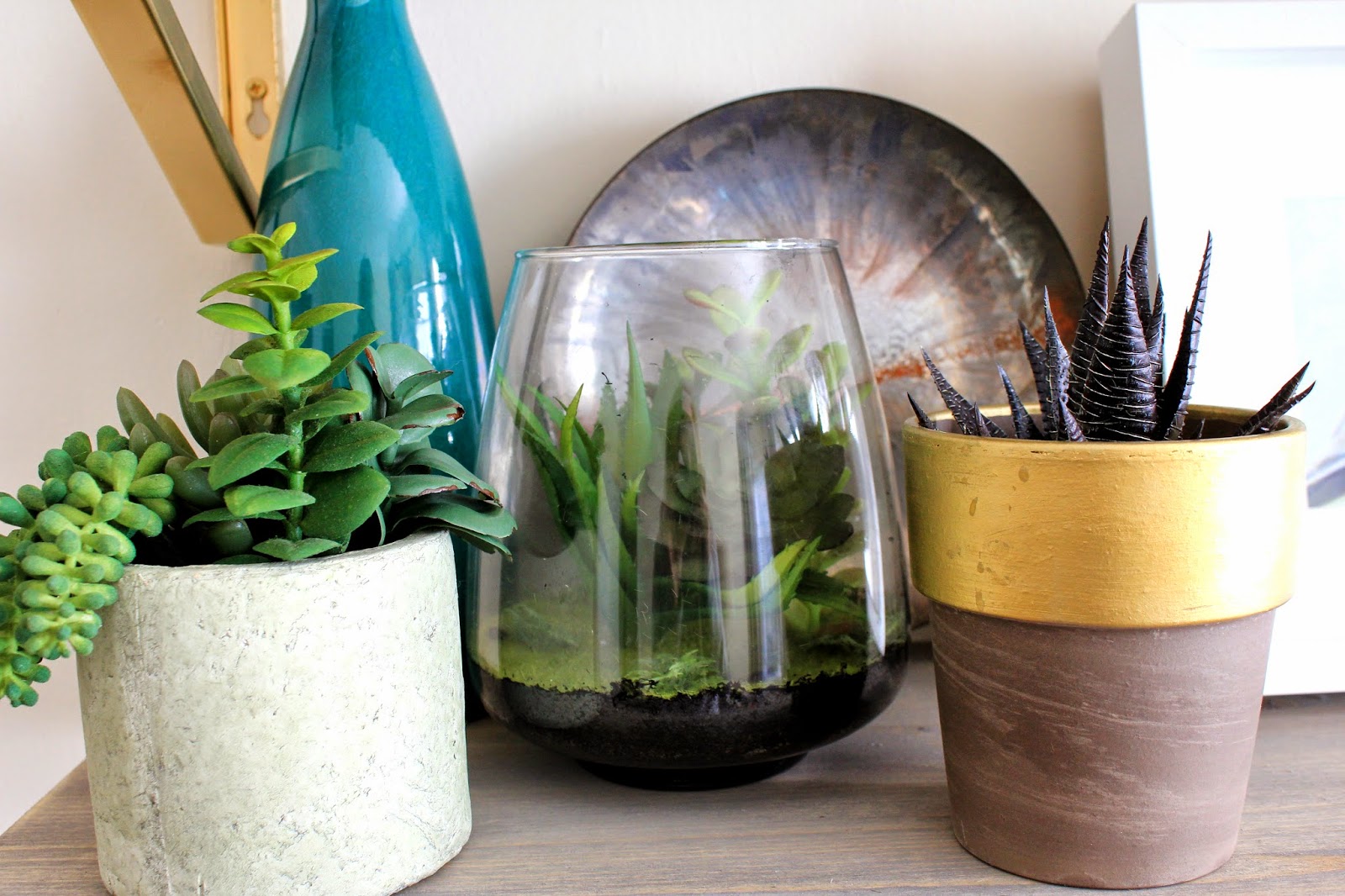
With the big objects in place, and the books stacked by color, it was time for the decorative items…

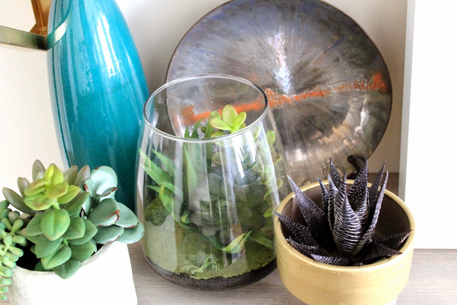
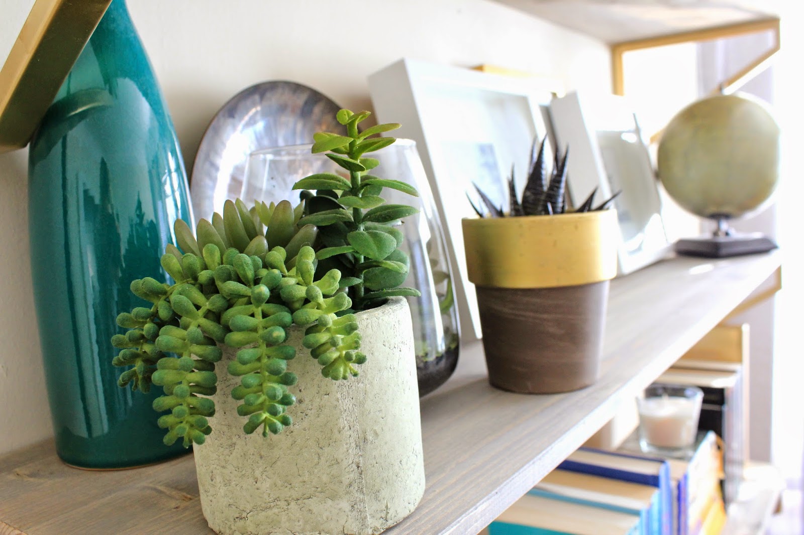
I think I may be the only person on the planet that cannot keep succulents alive.  These are fake.  BUT they look real… which is what matters (don’t judge me).

I liked the varied heights, and the varied textures of the glass, concrete, and terracotta, and I thought it all looked really pretty against the greyed out wood.

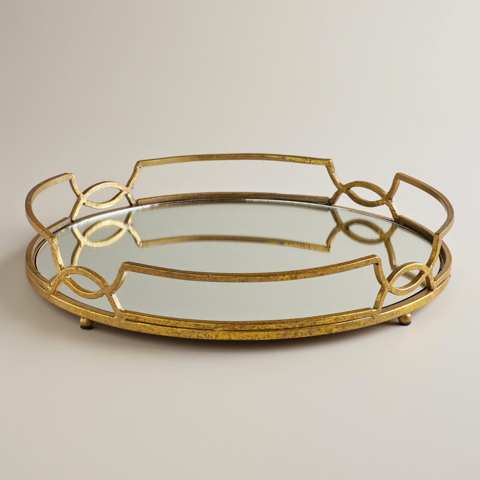
The wire basket on the top shelf just looked cool to me, and I like the rose gold color.
It’s actually a fruit basket, but it felt really sculptural, and I like it.  So it’s on the bookshelf now instead of in the kitchen.  Just thinking outside the box a little…

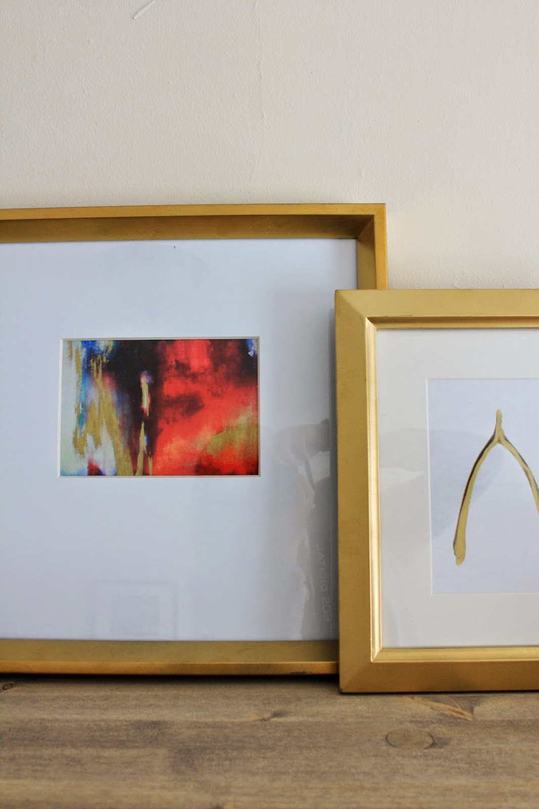
Another tip I read was to anchor the shelves with a collection on the top… I don’t have any collections of lovely milk glass, ginger jars, antique vases, African masks, or all the classically beautiful and cool things you see on styled shelves, but I felt that a few large frames staggered would do the trick.

They add height, and in a way sort of anchor all the shelves below.

Plus I just like them…

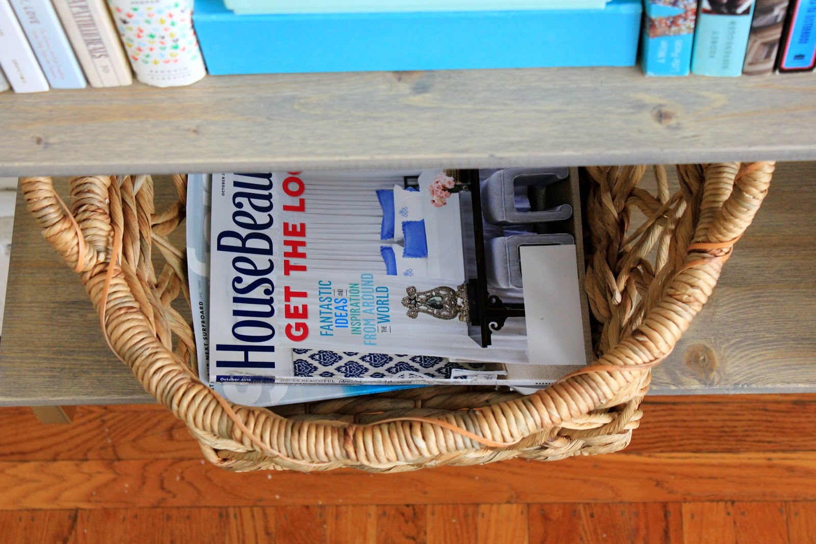
Finally, one of my favorite tips – use baskets as a catch-all.

We have magazines for days, and I like to save a lot of them for inspiration to come back to.  These baskets are perfect for collecting them, without having a million magazines on the coffee table.

This tip is actually a good rule of thumb in general – we have baskets all over the house – in the living room to corral blankets and throws, in the kitchen for spices, and rarely used gadgets.  They hide clutter beautifully, and bring together the best of both worlds – function and aesthetics.

I also think that having fewer visible “things” on the lower shelves serve the same purpose as having a collection (or in my case, picture frames) on the top of the shelf – it anchors everything, while letting the books organized by color, and the pretty decorative items shine.

So that’s it!

What do you think?

I do not pretend to be an expert on this topic, so if you’re curious about my favorite articles on the topic of bookshelf styling, here they are:

     Emily Henderson: Living Room Styling (there aren’t a ton of tips, but good photos)
     The Lovely Cupboard: How to Style a Bookshelf (I really liked this one too)
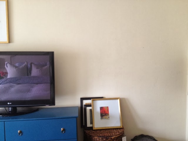
A few of these pictures give you a sneak peek into the progress of our dining room – and I can promise you that while it’s still a work in progress, there are more pictures coming your way soon.
Happy Wednesday!!

True Style vs. a Truly cool Lamp??

So I know that yesterday I posted about staying true to your style.  Mine is classic.  Clean. Contemporary. Comfortable. Preppy.
But let’s talk about this lamp for a moment.

You all know this lamp.

Nate Berkus blew everyone away with his last collection for Target.  It flew off the shelves and was only available online.  I of course lusted after it, and finally caved.  I ordered two of them.

They arrived last week, and after setting one of them up, Kris came home… his immediate response was:

“I can’t tell if I hate that lamp or if it’s my favorite thing in the house.”

I couldn’t have said it better myself.

After just posting yesterday about staying true to your style, I am evaluating EVERYTHING against that lens now, and these lamps do not really reflect my “true style”… but they are so dang cool!!!  I had originally wanted them for the living room, but they are not at all right in that space.

I’m thinking that on our desks in our soon-to-be-office they could be great, so I’ll hang onto them for now…

To give you a little visual, this is sort of how I see them playing out in the office…

I’m not ready to let go of the lamps yet, but I know I need to make some decisions soon!!

What do you think?

Fabulous??

Or do they need to go back to the store?

Back to Basics: What’s you’re "True" Style?

This year is going by so fast!  There has been so much going on that I’ve really taken to posting on here when I feel inspired… or more often than not, when I feel guilty that it’s been too long.

To be honest, I haven’t been feeling all that inspired, and when it felt like “work” to come up with something to write about, I didn’t… but now that we’ve moved, and unpacked (most) of the boxes, I’m feeling more settled in, and less overwhelmed.  Maybe it’s that I don’t feel like I’m living in complete chaos anymore… maybe that with spring I’m feeling re-inspired to rejuvenate our space, and inject life back into it… or maybe my focus is naturally shifting back to the things I love… design, decor and DIY.

Last night, I hunted for our DSLR camera with the intention of being able to post some updates on our new apartment today, but since it’s still packed somewhere, I wanted to take today to talk about where my head is at, and where I see my style trending for our new place.  After moving, and being presented with the opportunity to re-vamp our house, I’ve adopted an “out with the old / cluttered / things I hate or have grown out of” state of mind, and want to re-focus our space, keeping only things I love that reflect Kris any my personalities and tastes. Whether it’s to Craigslist, or to Goodwill… the clutter is slowwwwlllllllyyyyyyy dissipating.

I’ve found that it’s so easy to see a beautiful space or a cool home accessory and think, “I NEED to recreate that in my own house”.

Put on the brakes Becky.  Stop.  Think.

Is that new rug / lamp / fabric / style really you?  Does it fit in with the aesthetic you are going for??  What IS my true style???

That last question is the one I have been  rolling over in my mind.  In a few words, this is what I’ve come up with… my TRUE style is:

Classic – but not necessarily traditional.  

Nothing stuffy… but leaning on tradition with classic lines, and finishings.

Clean – but not minimal.

Out with the clutter!  That’s my new mantra for 2014!

Relaxed – but not sloppy.

I want our home to be inviting where the furniture says “come in and sit down”!

Contemporary – but not modern.

This is definitely a nod to Kris’ aesthetic… he likes modern clean lines, so as long as there is balance between modern and classic, we’re all good

Color infused – but not color saturated.

The one thing all these spaces have in common are their light colors – pale walls, white furniture, but I need my home to have small punches of color in the accessories… a bright bunch of flowers… art.

Preppy, a little bit elegant, and a little bit rustic.

A touch of gold here, a little rustic wood or raw linen there… a few stripes interspersed… that’s my jam.  I cannot forget.

So with that list fresh in my mind, I’m in the process of going through my things – pillows, vases, frames, art, accessories – and purging. This process has been combined with unpacking, which makes both take doubly long.

I can fully admit that I’ve made purchases that were not necessarily “me” but from here on out, I’m going to keep this list fresh in my mind.  I’ll admire the mid-century rooms from afar.  Classic, clean, natural, comfortable, welcoming with a bit of color and a bit of glam.

What is your true style?  Girly and glam? Minimalistic?

I’m curious!

A Little Bit of this… A Little Bit of that…

Hello hello!  Hope you all had a great weekend!

I feel like the last week has been a complete whirlwind, between our trip to Mexico – which now feels like it happened about 4 months ago – my actual birthday, catching up on work, and some projects around the house.

Can I please be back here already?? This was the view from our room, and the porch was so private and lovely…

Could be a Corona ad, right??

Seriously the perfect way to ring in the big 3-0.

On a different note, our apartment is really coming along!

I need to dig out the DSLR camera from whatever box it’s still packed in to take some GOOD photos of the progress we’ve made on the house so far.

Remember how I’d painted the living room the wrong color grey?

Well I lived with it for about a month, and on Sunday couldn’t take it anymore.  I spent most of the day yesterday re-painting, and it’s now a softer, lighter, brighter color of grey, and it’s pretty much perfection.

Here is a progress picture…

In this picture, you can REALLY see how much darker (and more blue) the first color of grey was.  It looks almost purple in comparison to the first coat of the new paint.
The next picture shows the final “after” of the paint… so light and bright and neutral, which is exactly what I was hoping for!

I snapped this picture really quick on my phone, in the late afternoon when this side of the house gets darker, but even in the low light, it still is so bright!  This color has changed the entire feel of the room!

Remember this post when I had been going back and forth between two shades of grey – either Grey Owl or Intense White, both from Benjamin Moore.  Well, when I went to have the paint mixed up, I walked into the store with my mind set on getting a gallon of Grey Owl at 50% tint – this was the color I’d painted the dining room in our last house, and I figured at 50% tint, it would be even brighter and reflective.

Despite my original decision, I left the store with a gallon of Intense White.

I’m not one to usually change my mind last minute – especially after agonizing over a decision – but I chose Intense White over Grey Owl for a few reasons.

First, the guy mixing the paint said that there is no “recipe” for mixing a color at 50% tint, so the result wouldn’t necessarily be a lighter version of Grey Owl – it might end up more blue, or more beige than intended, and that all he could do was mix an approximation of the 50% tint, and record exactly what was mixed in case I wasn’t happy.

Too risky.  No thank you.

I do not want to paint our living room the wrong color for a second time, and end up needing to paint again.

After that conversation, Intense White was the obvious choice for me – it is actually on the same paint chip as Grey Owl, but is one shade lighter.

The Benjamin Moore paint guy also taught me about the light reflection value (LRV) assigned to each Ben Moore paint color. The number indicates how much light gets reflected vs. absorbed by the paint color.  The first grey I’d painted our living room had a LRV value of ~61, meaning that ~40% of all light got absorbed by the paint color, thus making the room feel darker than it was.  Grey Owl had a value of ~64 (slightly better but not that much) and Intense White had the most light reflection of all these options with a value ~74.

This little tid-bit of info has changed my life.  The light index is a game changer!!

Anyway, I am thrilled with how it all came out, and can now focus on other living room updates I’ve been wanting to make… like on the fireplace… coffee table… side tables… and a new sofa (how long have I been talking about a freaking new sofa???)

Another sneak peak I’ll be posting about soon?

Oh yeahhhhhh!!!  Can you guess where this is?

Happy Monday!
xoxo

How to Hang a Gallery Wall

Unfortunately, 2014 is the year of neglecting this blog a bit… sorry guys!  While I sort of checked out after posting the upholstered headboard tutorial, and the grout makeover, here’s the Readers Digest version of what’s been going on in our world…
We spent the weekend down in Santa Barbara, braving the stormy weather and looking at potential wedding venues.  All I’ll say is we are REALLY excited about what we saw, and it’s all feeling so real now.  Very VERY exciting for us…
In other news, I started hanging art in our bedroom.  The beginnings of a gallery wall are starting to take shape…

I had been holding off on hanging things up, wanting to get the walls repainted first, but I’ve amended that plan.  I just don’t feel like it’s realistic to paint every room at once. It’s a HUGE time commitment (which I don’t have right now), and a lot of work, so this room won’t be getting painted in the next few months (at least!)

Regardless of new paint, I didn’t want to put off adding some character to this space.  In our last apartment, our bedroom got neglected for a long time, but with our pretty bed, and that gorgeous blue dresser I made last year, this room deserves to shine!

Luckily, the bedroom walls actually aren’t in terrible shape (compared with the dining room, living room and hallways) so these will likely be the last to get painted.  I invested in a huge package of Mr. Clean Magic Erasers… those things are certainly magical.  I was able to get almost all the black scuffs off the walls, so it’s already looking a million times better.

After a little minor scrubbing, I grabbed the boxes where I’d packed all our picture frames and art (there are about 5 boxes FULL) and just started eyeballing and hanging.

After hanging a few gallery walls in the past, I have a few helpful tips.

Do not map it out exactly – I’ve found that it’s unlikely that you’re going to stick with the original plan once frames start going up on the wall (remember this post when I attempted my first gallery wall??).  Instead, decide how high you want the art to go (how close to the ceiling, and how far our on the wall) and hold up the frames to get a feel for how much space they will take up.  Simply holding a few of the large “anchor” frames up will give you a good idea of space.

I also like to start with the largest prints first – I call these the “anchor” pieces, because they are naturally where the eye goes on a gallery wall, and their placement affects the placement of everything else.  In this case, I started with the largest “New York” frame, and built next to it.
Once the first frame is hung, decide how far apart you want the other frames to be. The larger the frame, the wider the space between frames… the smaller the frames, the smaller the space between them.  If it’s a small cluster of small frames, 1-2″ should be fine, but if its a large wall with lots of larger frames, I’d go with 3-4″ between.  You’ll see what looks right.
Another thing I’m learning as I hang these frames – since this is going to end up being a largeish gallery wall built around our TV, it’s been easier to start by hanging an “inner layer” of frames around the TV, and finish the gallery wall out with the “outer layer” so you’re building from the center.
No idea what I’m talking about?
Here’s a little diagram to help you envision what I mean…
Once you get the larger, main frames in place, finish the wall out with smaller filler frames where it feels a bit sparse
If you look at the progress I’ve made, the gallery wall is looking a bit triangular… this is because I just started the inner layer, and haven’t done any filling out.  Based on the frames I have, this is how I see the rest of the gallery wall playing out…
The dark frames in the above photo illustrate my “anchor” pieces, and the light blue are the filler that will come later.
Of course this diagram is subject to change, but it will most likely look pretty close to this based on the scale of the wall, and the size and number of frames I’m working with.
A few other tips – if you’re mixing frames (sizes, frames, colors) try to find balance there too – I’m trying to have an even mix of dark frames with gold and white.  There will probably only be two white frames, with the emphasis on gold and black.
Same rule applies for size – don’t pile up all the large frames on one side or in one area.  It will end up feeling super unbalanced.
Along the same lines, vary the frame direction as well – hang some as a portrait, and some as landscape, and I like to have a few square frames mixed in for good measure.
I also want to point out – don’t wait until every frame is filled with art you want to display – I’ve hung frames up that still had the stock photo in them, or framed prints I wasn’t in love with anymore.  Waiting to fill the frames holds the project up, and once the frames have found their home, it’s pretty easy to decide what kinds of prints, photographs, or paintings will look good next to one another – abstract next to a photograph… bright colors near a muted piece… you get the idea.  Let the frames’ size and shape and color determine where they are hung – not the actual art.  Art can be changed.
And finally… don’t be afraid to make a few holes in the wall.  Keep putty, a putty knife and a small sample pot of paint nearby if you think you’ll really mess things up, but so far, I’ve been tapping nails in, hanging the picture, standing back to see it all together, and if it doesn’t look right, moving it around a bit.  Overall, the frames will cover any holes you make, so its small tweaks here and there.  Don’t be afraid to mess up a few times.  It’s just sheet-rock!
As a bad blogger, I forgot to take a “before” picture, so the other half of the empty wall will have to do.
As you can see, its a very bare wall… tall ceilings (11-12′ tall) so the TV was very alone and awkward there.  I think the gallery wall will help fill things in, without crowding the room, and the TV won’t stick out like a sore thumb quite so much.

So that’s that – after messing up a few gallery walls, and learning the ropes, I hope these tips help you attack that big blank wall that’s staring you in the face at home!

More updates, and better photos are coming your way soon once I finish this up!  In the meantime, feel free to message me if you have more specific questions!