
Polka dots are a classic, but I’ve been obsessed with irregular spotted prints most recently. Patterns that are animal-esque. Almost dalmation-esque. Cruella DeVille would approve.
Spotted patterns are showing up everywhere, and while Kris thinks I’m on the verge of losing it (what else is new), I feel our house is NEEDING a splash of spots.
Case in point… this bench?!?!?!


Jenny Comenda got the memo long ago when she reupholstered this awesome bench… looks great in every space she puts it. LOVE.
What about that pillow?!?!?!

This awesome pillow from Furbish – an amazing source for home decor… bedding, pillows, furniture, art, entertaining… the online shop is amazing. Highly encourage you to check it out.
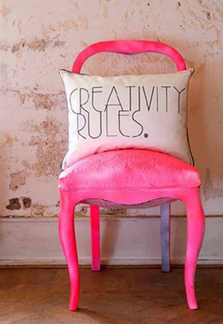
And this chair?!?!?!
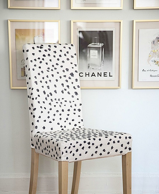
This chair is an Ikea hack if you can believe it or not. Originally featured on Little Green Notebook, and later picked up by DecorPad, this stylish number cost next to nothing, and it’s a pretty close replica to the ultra pricey Brunschwig and Fils Snowleopard fabric.

Creativity at it’s best!
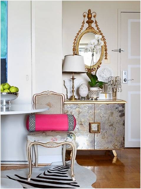
Holy spotted rug….
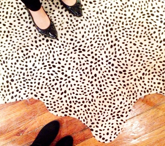
How fab is that? And it’s a free-form cow hide. I feel like I don’t even need to say any more!
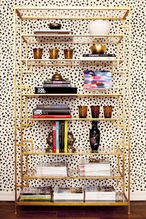
And the grand finale… my favorite wallpaper of all time…

It’s a personal favorite of mine that I’ve blogged about before… the Thibaut Tanzania Animal print – comes in wallpaper and fabric, but I sort of favor the wallpaper. It’s SO amazing. And becuase I love it so SOOO much… here is my ALL TIME FAVORITE space that uses it. It’s like wallpaper porn for me…
Tiffany Richey’s office?!?! OMG.


So what do you think?? Have I totally changed your mind about what I lovingly refer to as the “dalmation trend”?
After bringing these images together, I’m THISCLOSE to pulling the trigger on the pillow from furbish…


